Design leads always start with portfolios when reviewing candidates. So, all UX designers – juniors and seniors alike – need an impressive UX portfolio. Though putting one together might seem daunting, once you get an idea of what it takes, the rest will come quickly. So, let’s get started by checking out some stunning UX portfolio examples:
Kyle Kovacs
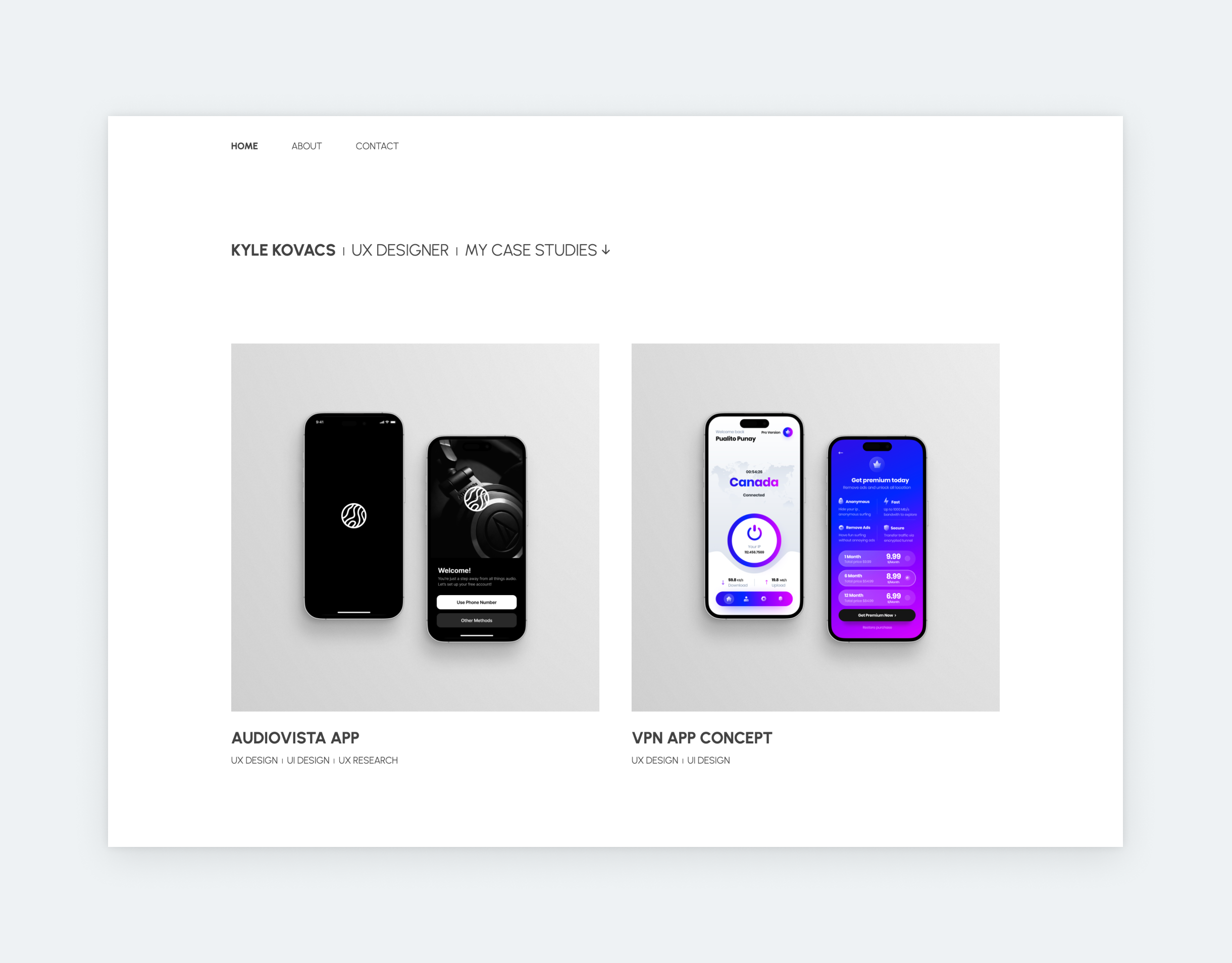
This example shows: consistency is the key to creating a stunning UX portfolio on a tight schedule. Kyle uses the same font throughout the portfolio, adjusting only its size or weight. This results in a sleek look. Also, he’s frugal with words on his portfolio’s landing page. This is in line with the newest UX portfolio trend: minimalist writing. Many designers add long sentences of eloquent introduction to their home page, and in most cases, it reads awkward or even forced. Don’t be afraid to keep it brief on your landing page! Design leads and recruiters care about design skills first. And your personality can shine on your About page, like Kyle’s.
Victoria Tu
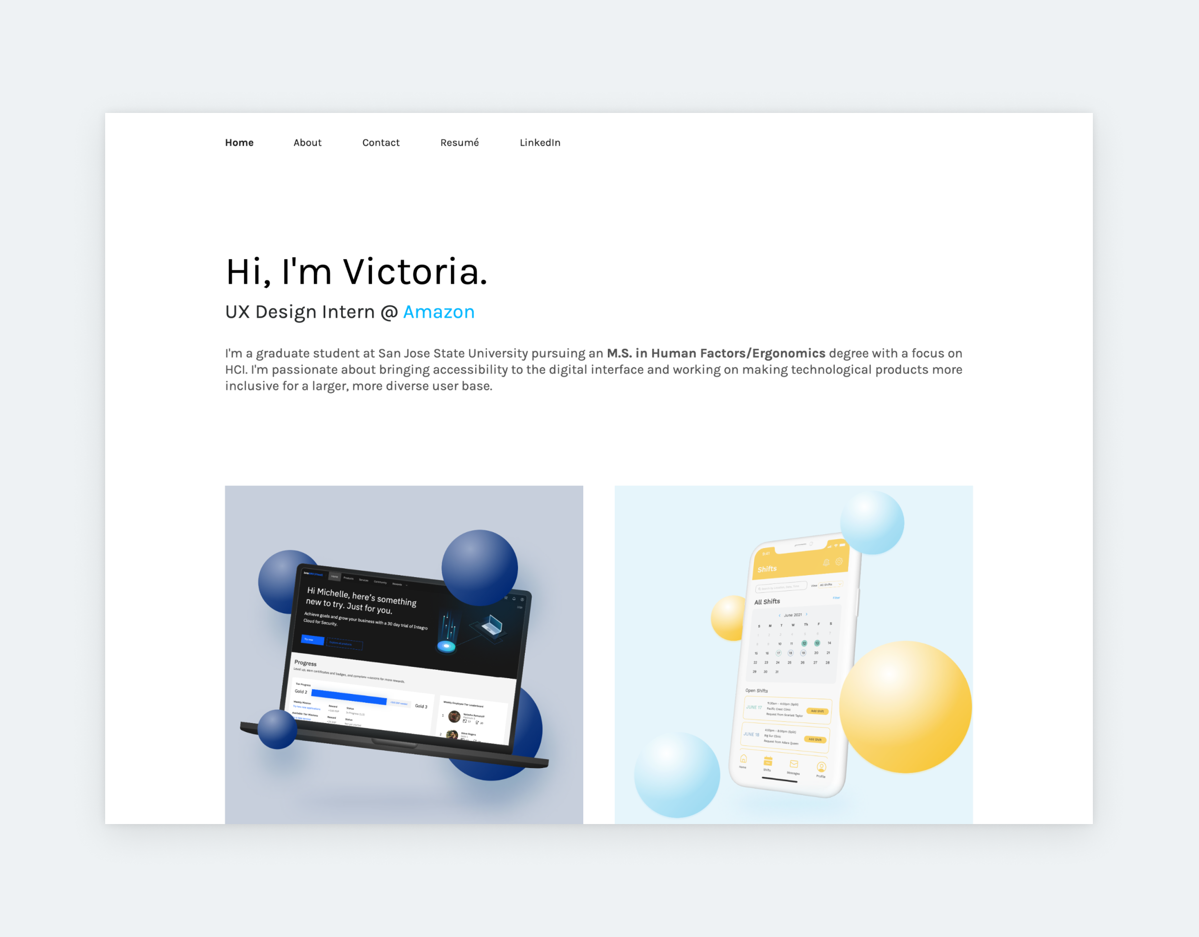
It’s not only colors that account for consistency in a UX/UI portfolio. Check out how Victoria utilizes shapes, depth of field, and device mockups to coordinate her thumbnail layouts. The result is eye-catching. What’s more, thanks to the compositions, this UX intern portfolio looks dynamic without forcing elements to actually move around on the page.
Maxwell Marra
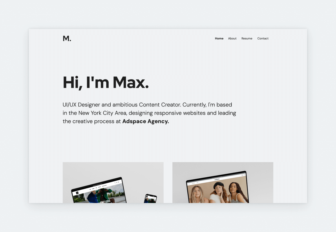
Maxwell’s UX portfolio website is an impressive showcase of his skills as a UI/UX designer & creative lead. The site’s design is pristine and intuitive, reflecting Marra’s commitment to user-centric design principles alongside his understanding of the latest UX portfolio trends. His projects – which range from the redesign of a budgeting app to a winter sports app – highlight his ability to translate innovative ideas into delightful digital experiences.
Max Berger
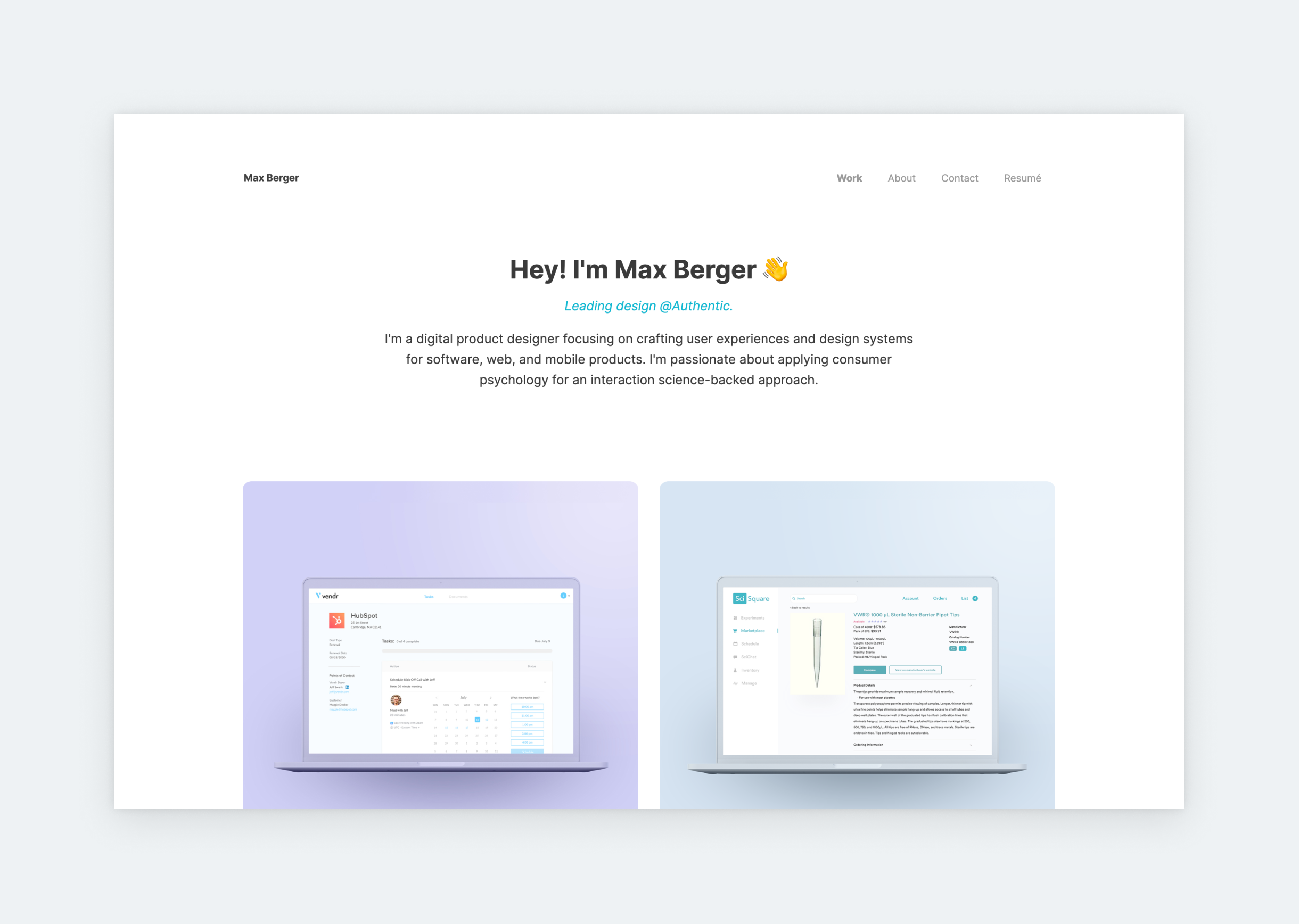
Max’s is the perfect example of what a UX portfolio should look like. Here’s why: it’s light and airy, with satisfying, pastel colors and soft, rounded corners. The UX of Max’s portfolio is also on point since the case studies are easy to reach, and the content is concise. And by making the case studies’ titles appear on hover, he didn’t compromise on the UI either. So, Max’s is a solid UX portfolio in all aspects.
Adrian Weber
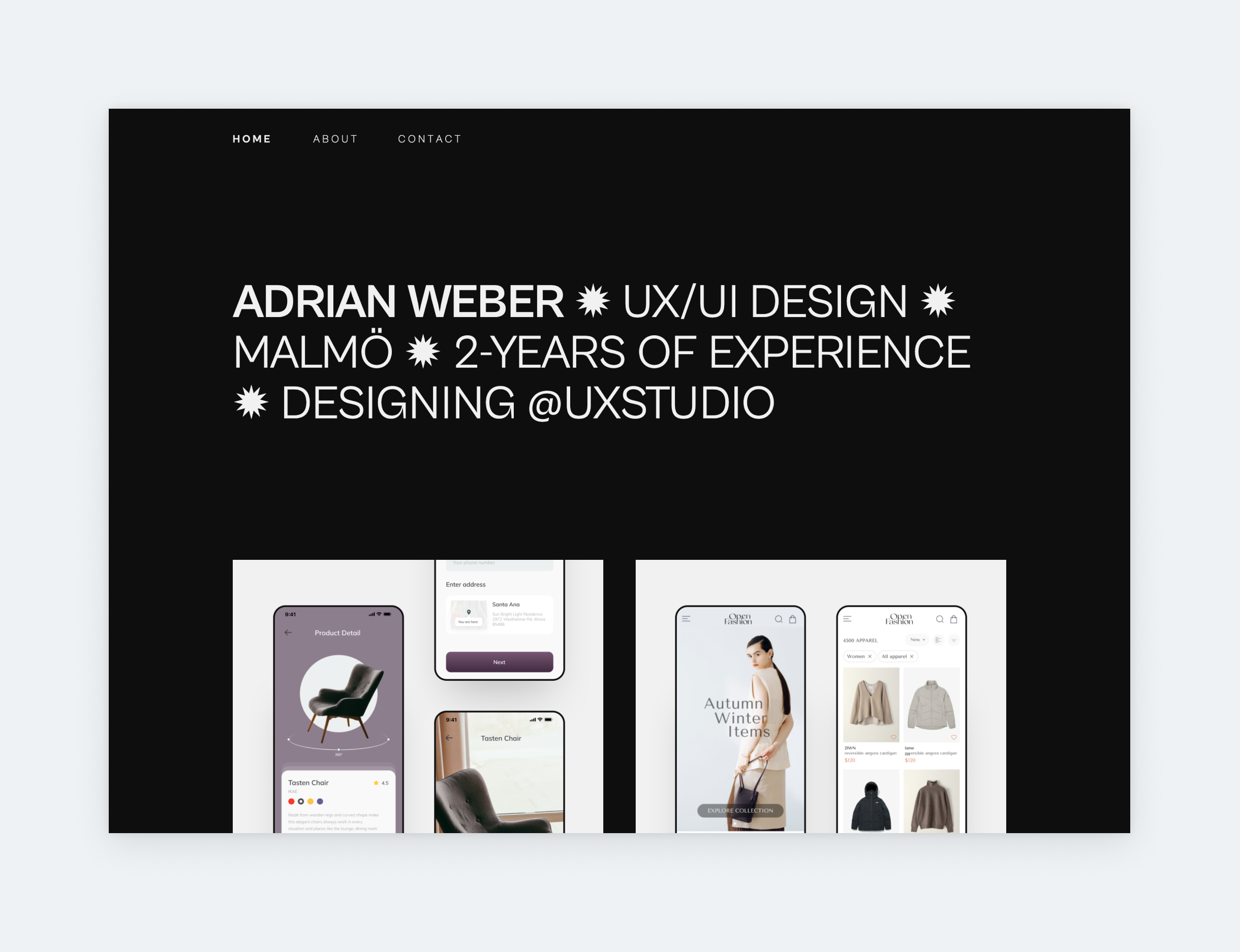
Look no further for a portfolio to use as a basis for yours. Roland’s portfolio conforms to all UX portfolio best practices: only the basics in his hero section, 3 of the most important pages in the navigation, and 2 case studies presented matching thumbnails. It’s effortless, usable, and elegant.
Karl Ligeti
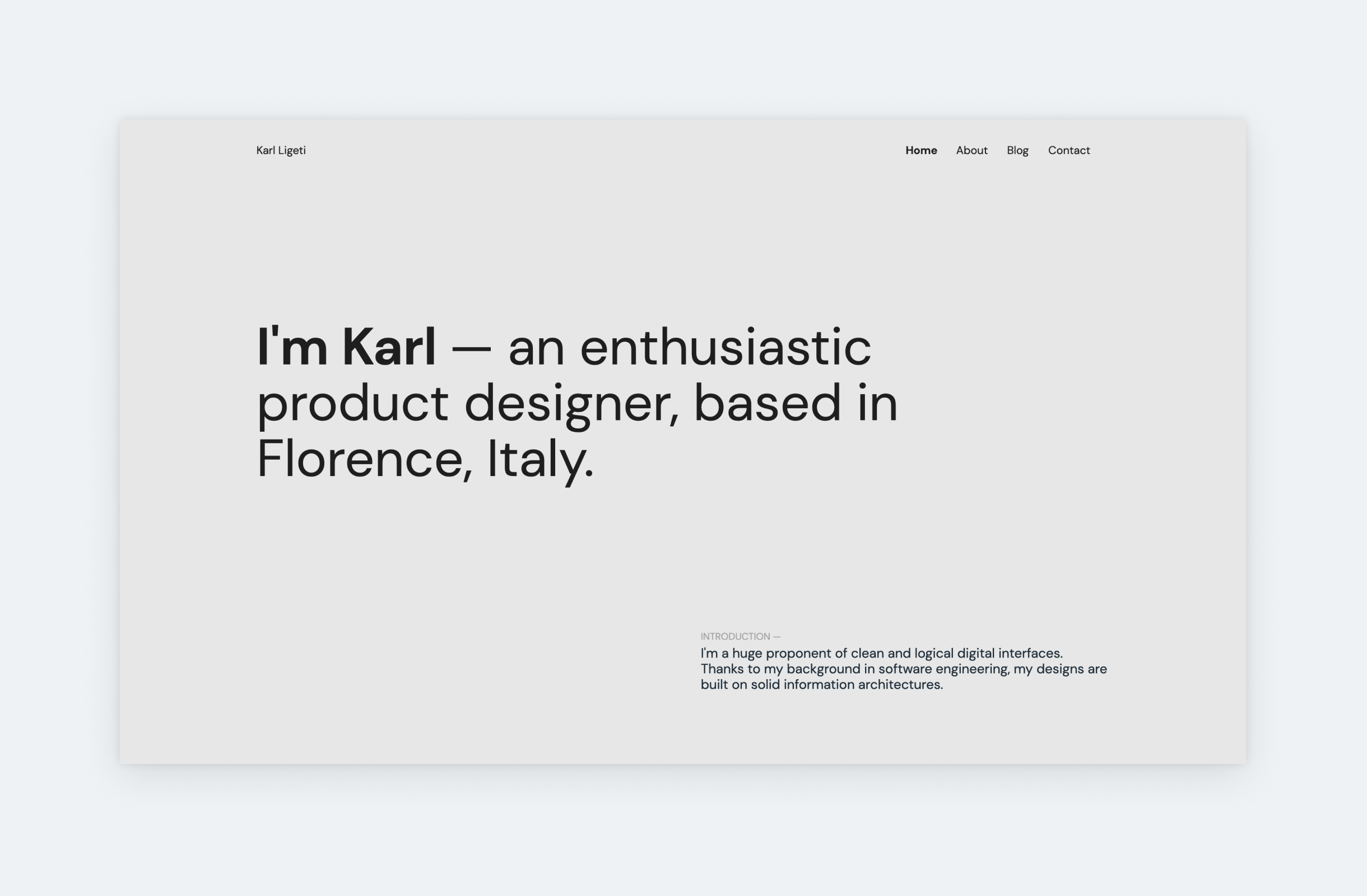
If you take a look at the best UX design portfolio examples, you’ll soon realize that the liberal use of whitespace is fundamental to all of them. Yet still, many designers – especially juniors – are frugal with it because they fear that their portfolio will look empty. If you’re unsure about whitespace, check out Karl’s portfolio: it has a minimalist design with plenty of whitespace, yet the portfolio doesn’t look empty.
Nicola Petrie
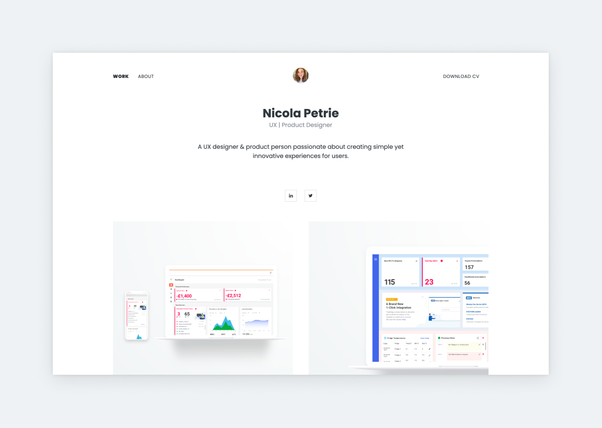
Nicola’s UX design portfolio is a love letter to minimalism. Her custom thumbnails use the same device mockup styles, yet they don’t look repetitive at all since Nicola experimented with the arrangement on each thumbnail. The result speaks for itself. Her case study titles and subtitles are effective too: The title reveals the purpose of the app/project. Meanwhile, the subtitle describes the scope of the project. This way, we open each project with some background knowledge.
Rachel Baek
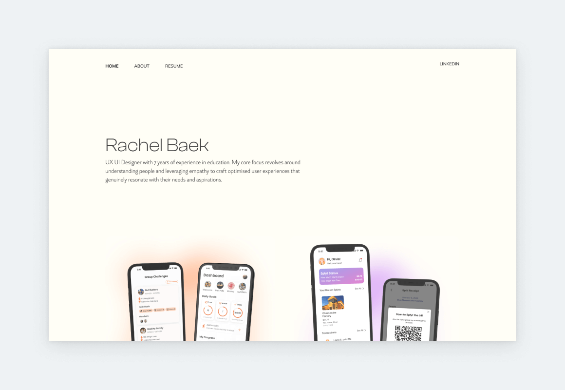
Rachel B is a UX designer and researcher who translates academic research into user-friendly products. Rachel’s portfolio is easy on the eye with its refined design and a comforting color scheme that reflects her personality and style. She follows UX portfolio best practices by using a consistent layout and clear navigation through and through. Her UX case studies highlight her hard skills, such as UX research, wireframing, and prototyping, as well as her soft skills, such as communication and collaboration. Rachel’s portfolio is a great example of how to portray, promote, and showcase a wide range of design skills in a captivating manner.
Hana Nakano
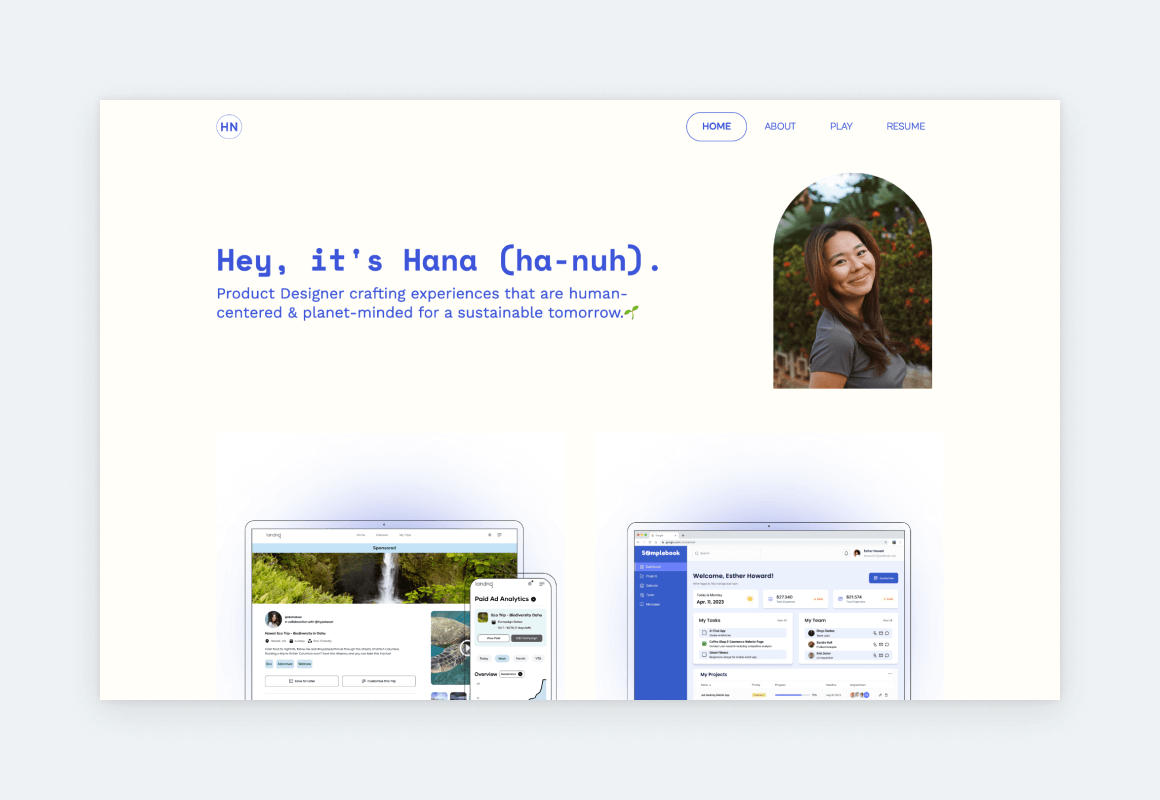
Hana used UXfolio’s Norman template as her base, transforming it into something unique with the available customization options and features. The intense blue accent color creates an exciting contrast with the white background. Her thumbnails are in perfect harmony because she created them with UXfolio’s Thumbnail Designer. This feature allows you to design professional thumbnails inside UXfolio: just bring your designs and the rest is on us! Hana’s portfolio is proof that you can create a memorable UX portfolio without overdesigning it.
David Bornfirend
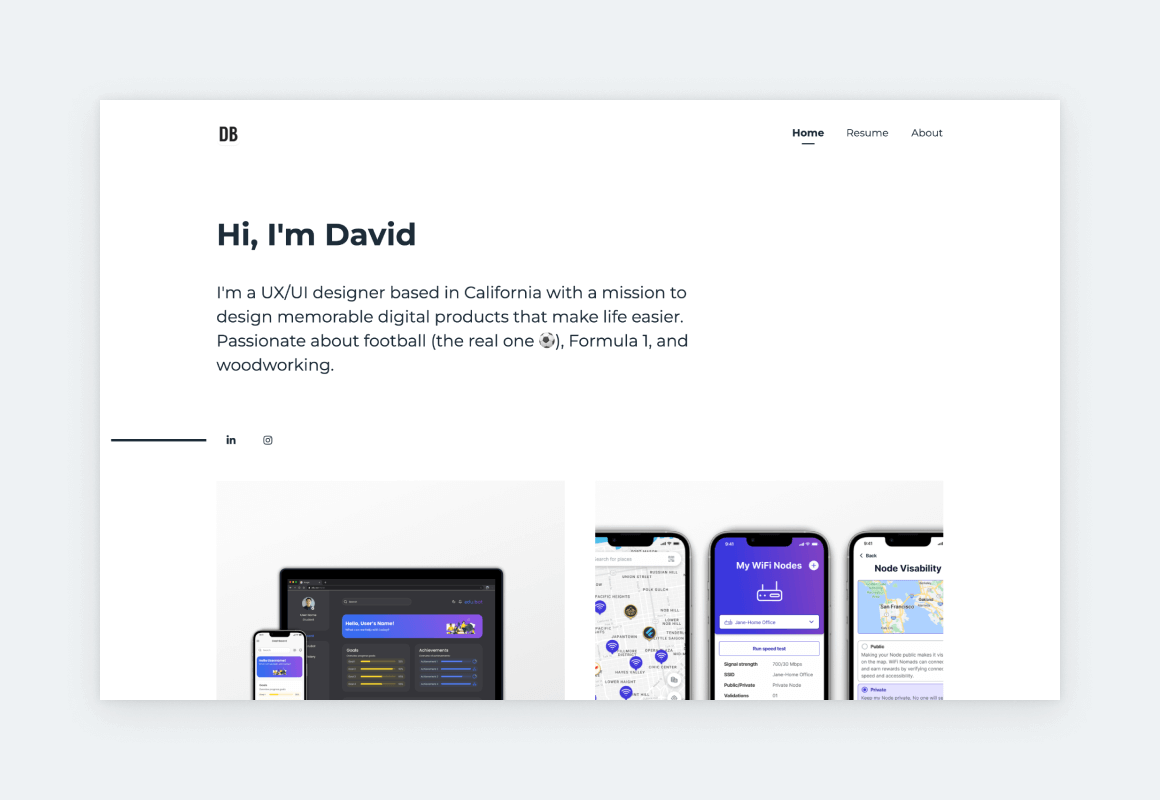
David’s UX portfolio website is a masterclass in clean and modern design. The homepage is pure yet attention-grabbing thanks to the large headline that sets the tone for the rest of the website. This direction, combined with the black-white-gray color palette, underlines David’s professionalism also apparent from his well-structured and stunning case studies, in which he achieves the perfect balance between copy and visuals.
Aniela Carolina
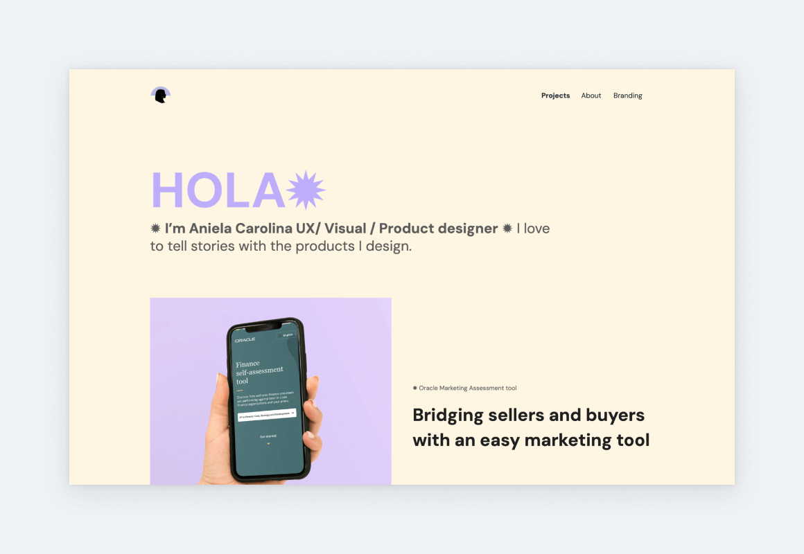
Aniela has been a designer for 10 years and her experience is obvious from the way she presents herself and her work. First of all, she chose a lovely accent color and applied it consistently throughout various elements of her pages. Furthermore, she uses icons and typography to create a sharp content hierarchy. The longer case study titles on her home page act as super-descriptive snippets into the projects. She included 3 projects in her portfolio, yet, as you scroll through her home page, it feels and looks more because of the project grid she chose in UXfolio’s editor.
Annie Nguyen
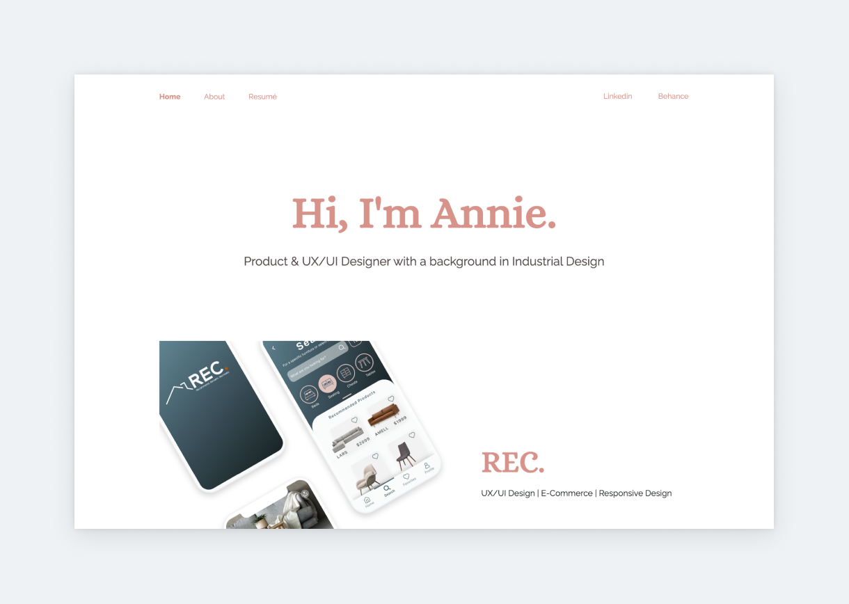
Annie’s portfolio stands out for its sharp design, fonts, and clean thumbnails. She keeps the copy minimal on her home page, which prompts us to jump right into one of her detailed UX case studies. We like the way she tagged each case study: her role, the field, and the design type. This way, if someone’s looking for a mobile designer, they can jump right into the mobile design case study. Saving time for your users is among the top 3 things you can do for them. This applies to all products, including your UX portfolio.
Kevin Hursey
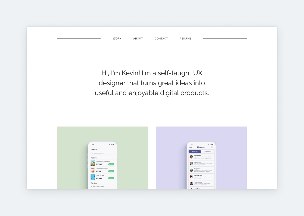
An effortless and chic portfolio that’s proof: you can never go wrong by keeping your UX portfolio’s design lowkey. Here, the focus is on elegant typography and fantastic case studies. And the result is top-notch. It’s evident that Kevin’s confident in his skills and work. He doesn’t need to compensate with an overdesigned portfolio like so many designers. If you wonder why just check out the Brightminds case study. It has a solid structure, crisp visuals, and engaging storytelling that highlights UX. It’s one of the most popular UX case studies on UXfolio’s Showcase.
Melysia C
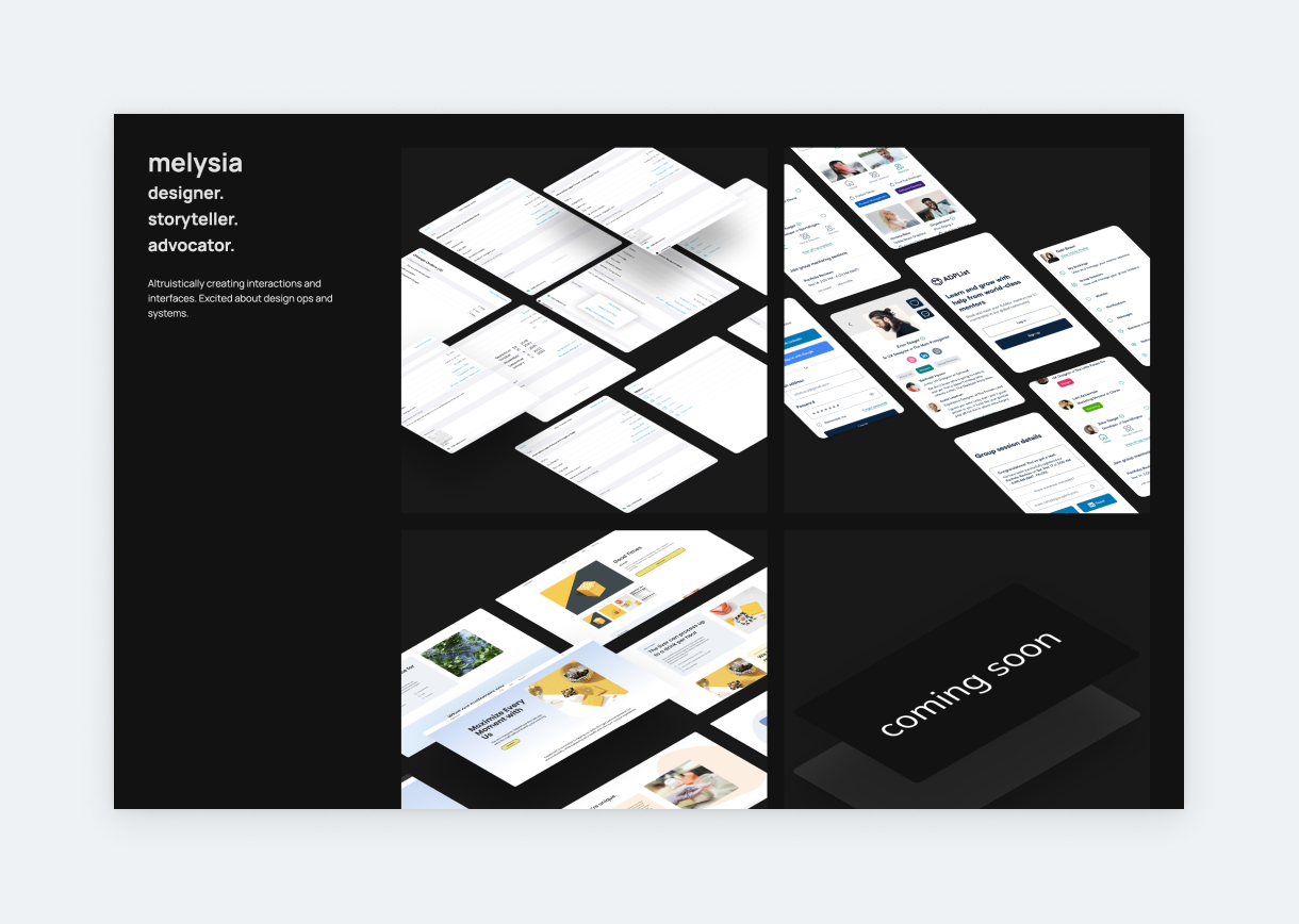
Since the 2020s we’ve been seeing more and more dark UX portfolio examples. As you can see from Melysia’s example, dark templates are especially beautiful when the content is kept to a minimum, and there are bright elements to break up the darkness. Melysia uses UXfolio’s password-protection feature on her case studies. This feature allows you to set up passwords for individual case studies or your entire portfolio to protect sensitive material.
Robyn Hines
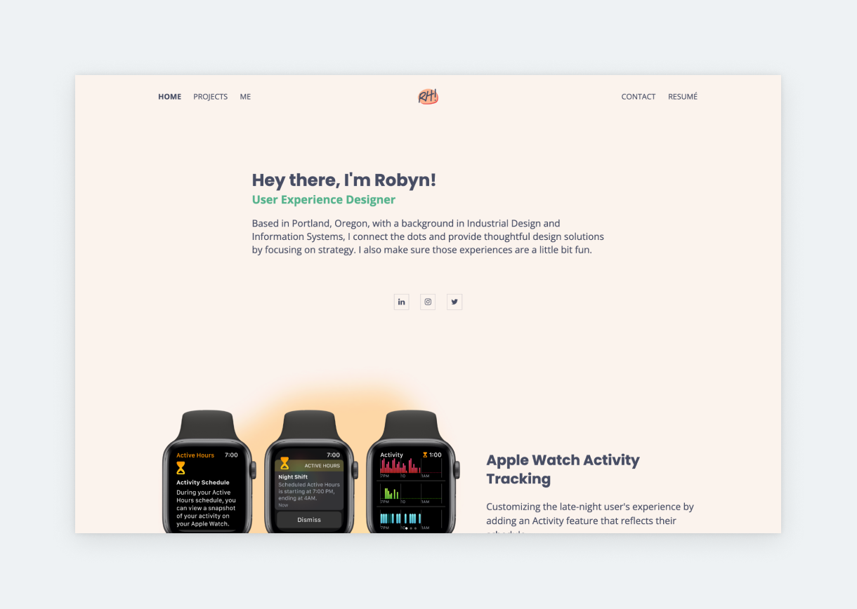
Here we have a fun yet still elegant portfolio. There are a few fantastic tricks up Robyn’s sleeves that we’d like to highlight. First, check out how she uses those diffused, colorful blobs in the background of her thumbnails to tie them together. The thumbnails link to very different projects, yet they are in perfect harmony on the home page. Second, Robyn uses a layout that fills up her portfolio. By making the thumbnails bigger and presenting them in a vertical list, the portfolio doesn’t look empty. If she’d use small thumbnails on a grid layout, the perception would be quite the opposite.
Jaclyn Chao
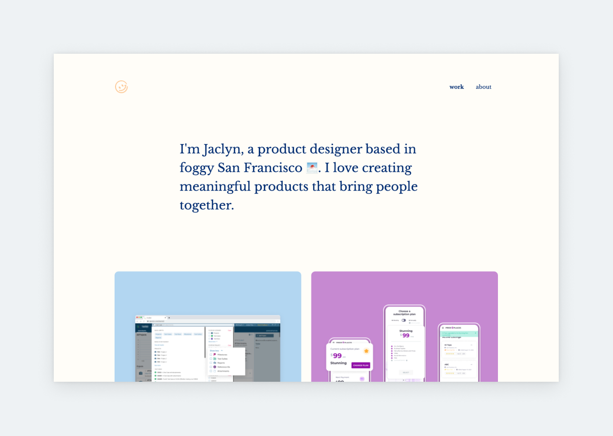
Jaclyn describes herself as someone with “[an] eye for simplicity, keen observational skills, and obsession with organization” – traits that can be traced in her UX design portfolio. She took a minimalist portfolio template and made it her own through careful font selection, dynamic project thumbnails, and harmonizing colors. What’s more, Jaclyn wrote an engaging and memorable About page, which is a rather challenging feat.
Alyssa Ignacio
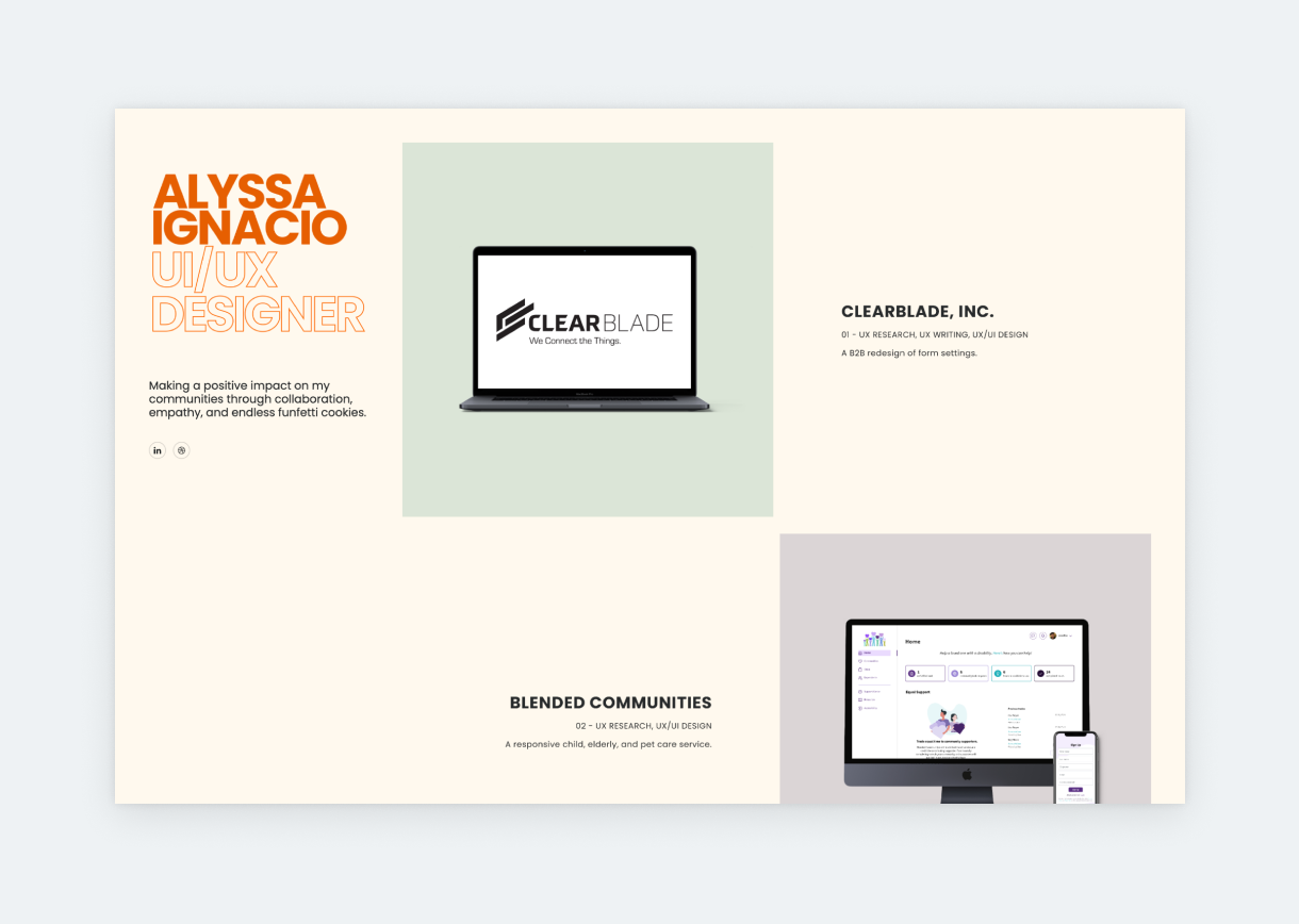
If you’re looking for the perfect, non-cliché designer statement, check out Alyssa’s: “Making a positive impact on my communities through collaboration, empathy, and endless funfetti cookies.” As simple as it is, this intro – mixed with the warm tones of her portfolio – makes her instantly likable. She keeps to this much-welcome conciseness throughout the portfolio. Though the whole UX/UI portfolio looks amazing, we’d like to highlight the type she used for the descriptions on her thumbnails: it’s small, stylish, yet still readable. Many designers are afraid of small font sizes, but with the right type, going small can create a chic effect without affecting usability or accessibility.
Madison Green
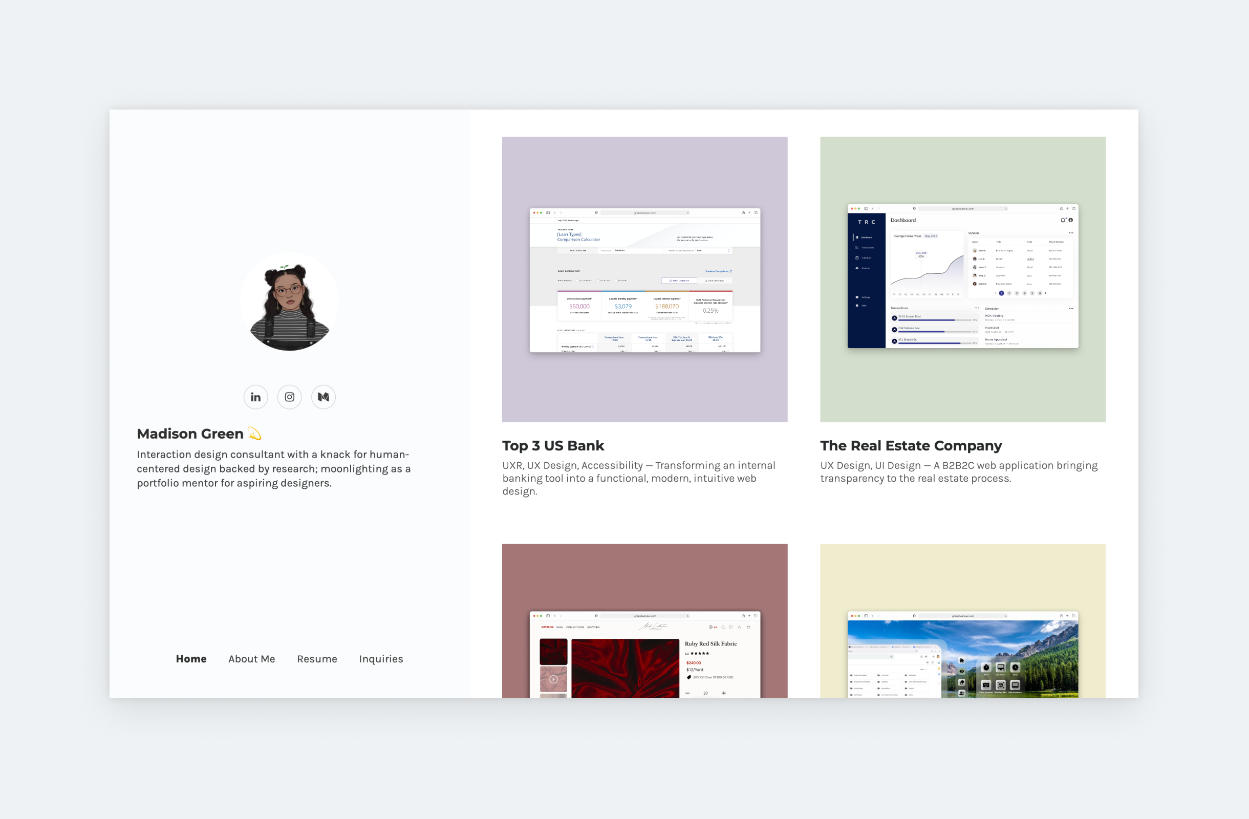
Madison mixes various colors in her portfolio – green, blue, lilac, and red – yet it looks coherent. That’s because she uses similar, dusty shades of each color. And just like that, without even reading a word, we know she has an eye for design. She features four case studies on her home page, each represented by consistently designed thumbnails, a short title, and the right amount of description. Before even opening the project, we learn what her role was and what was the project scope. So, this is an excellent example of great UX meeting good taste.
Natalie Kyle
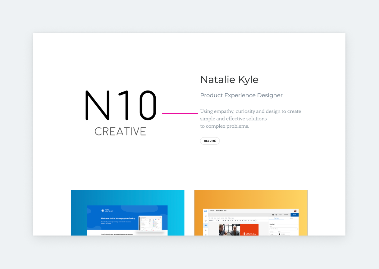
When you hover over Natalie’s project thumbnails, you can read project subtitles like “The days of hunting your data are over” or “Show me the money!” These are only really small details, but you can’t help but smile while reading these subtitles. Allowing your personality to shine via funny or unexpected copy is always a great direction. Recruiters and UX professionals have to look through dozens of case studies each day. Therefore, including a small but unexpected detail might just be your ticket for an interview.
Saba Fathi
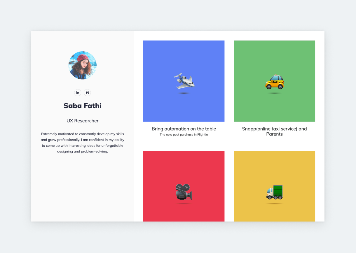
We hear many stories of researchers struggling with their UX research portfolio. Saba shows you how to tackle this challenge. Instead of going with the usual serious look, she created a playful portfolio, using bright colors and a handful of matching emojis. Emphasis on matching. This look works for Saba because the emojis on her project thumbnails are from the same source, and the colors she uses on her backgrounds are in perfect harmony.
Nuwanthi Illukkumbura
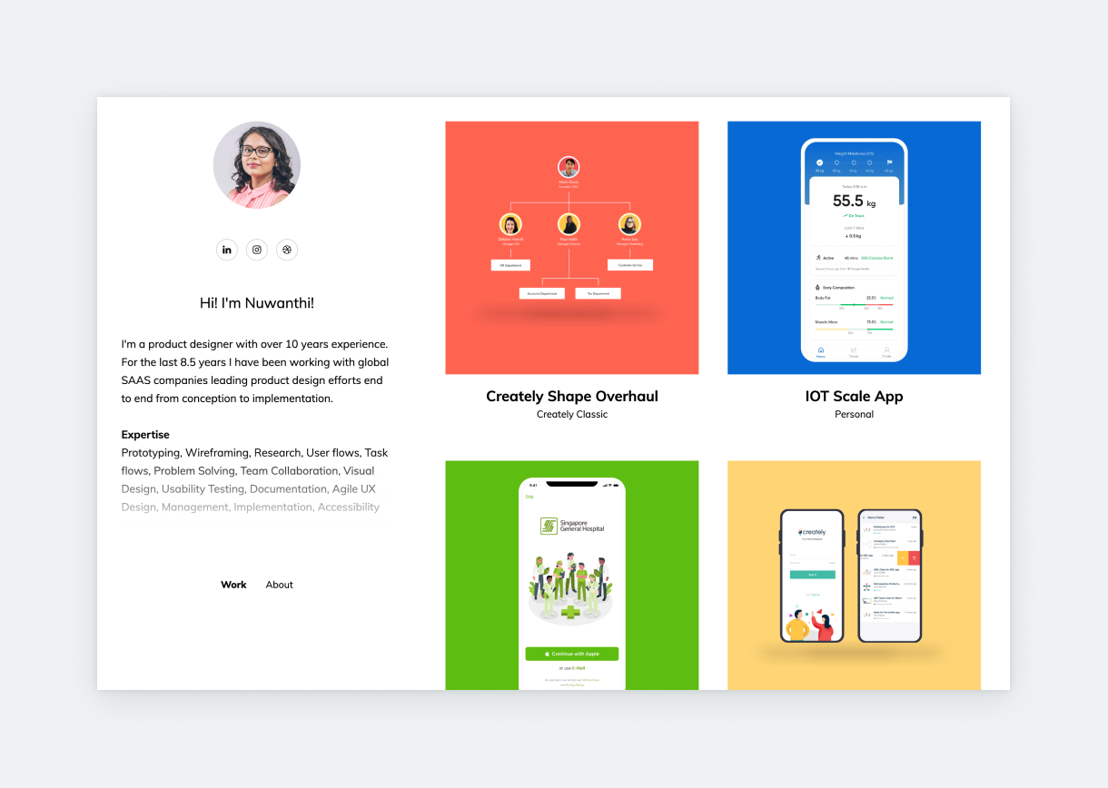
If you’re wondering what a senior UX designer portfolio looks like, check out Nuwanthi’s! With 10 years of experience under her belt, Nuwanthi knows a thing or two about curating her work. She showcases her expertise and skills in 4 impactful case studies, focusing on
- UX design,
- UI redesign, and
- UX overhaul.
Many designers believe that the more you’ve worked in the industry, the more case studies you need in your portfolio. This isn’t exactly the case. What’s important is that you showcase your range through your best work. Design leads or recruiters will not read through 10 case studies, so it’s better to curate your best work only like Nuwanthi does.
Benny Sun
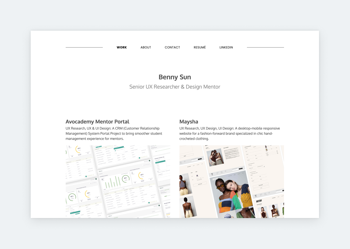
Benny’s portfolio is clean and professional. He saves his introduction to his About page to pull our attention toward the projects. That’s how we know we’re looking at a senior UXer’s portfolio. Experienced designers know that in UX, case studies get you the job. The reason is simple: case studies showcase your UX skills and process in action, underpinned with examples. Therefore, as our research revealed, most design leads go for case studies right away when opening a portfolio. Benny understands this, and he crafted this stunning, consistent portfolio accordingly.
Jack Bernstein
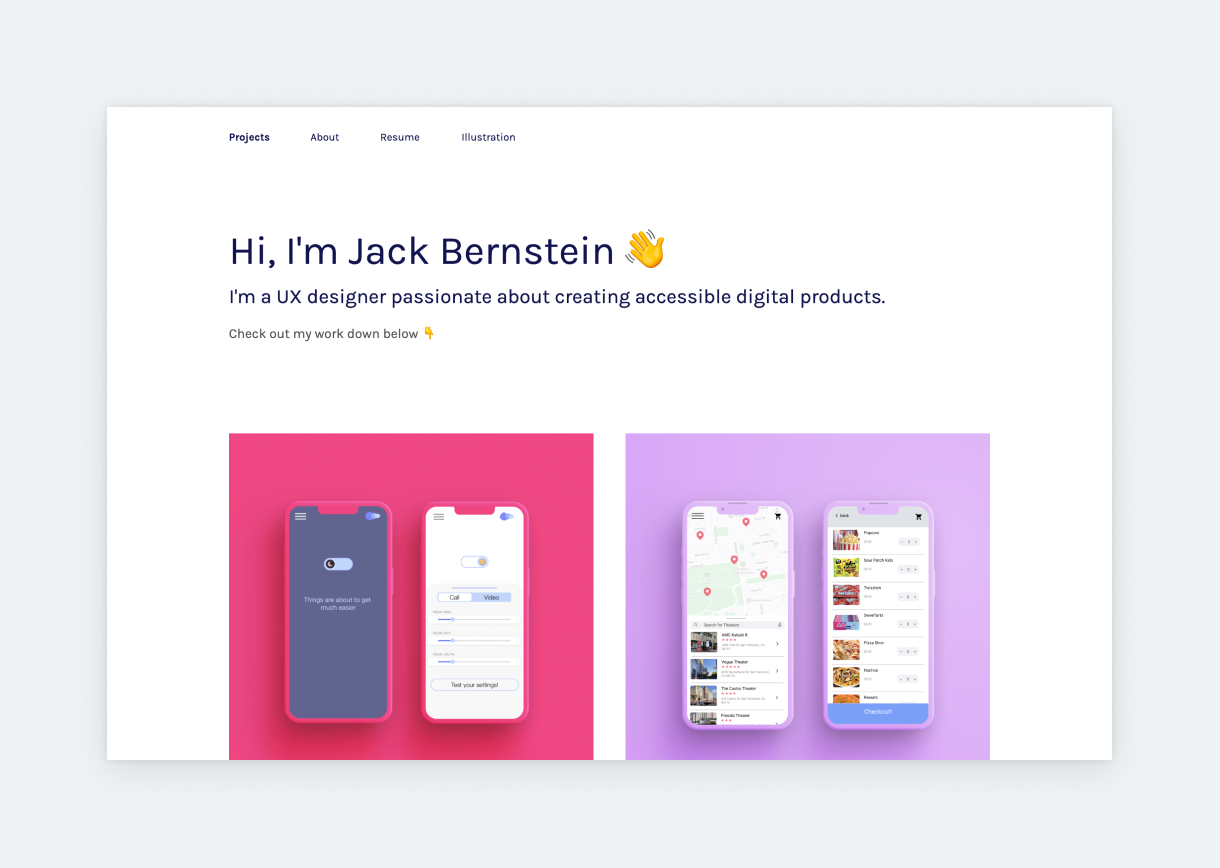
Jack uses bold colors to upset the clinical minimalism of UXfolio’s Otis template. The good thing about templates so subdued is that they work great with bold design choices as well as a serious tone. It’s up to you which route you go down. Jack went with vibrant pink, lilac, sky-blue, and mustard. Each of these colors is fantastic on its own, but they also work perfectly together. We love the inclusion of the simple “Illustration” page. When clicking it, you’d expect to see static images laid out on a page or maybe a gallery. Instead, Jack embedded an adorable video of him drawing with a baby in his lap. This small gesture makes the entire portfolio even more personal.
Otilia Pandelea
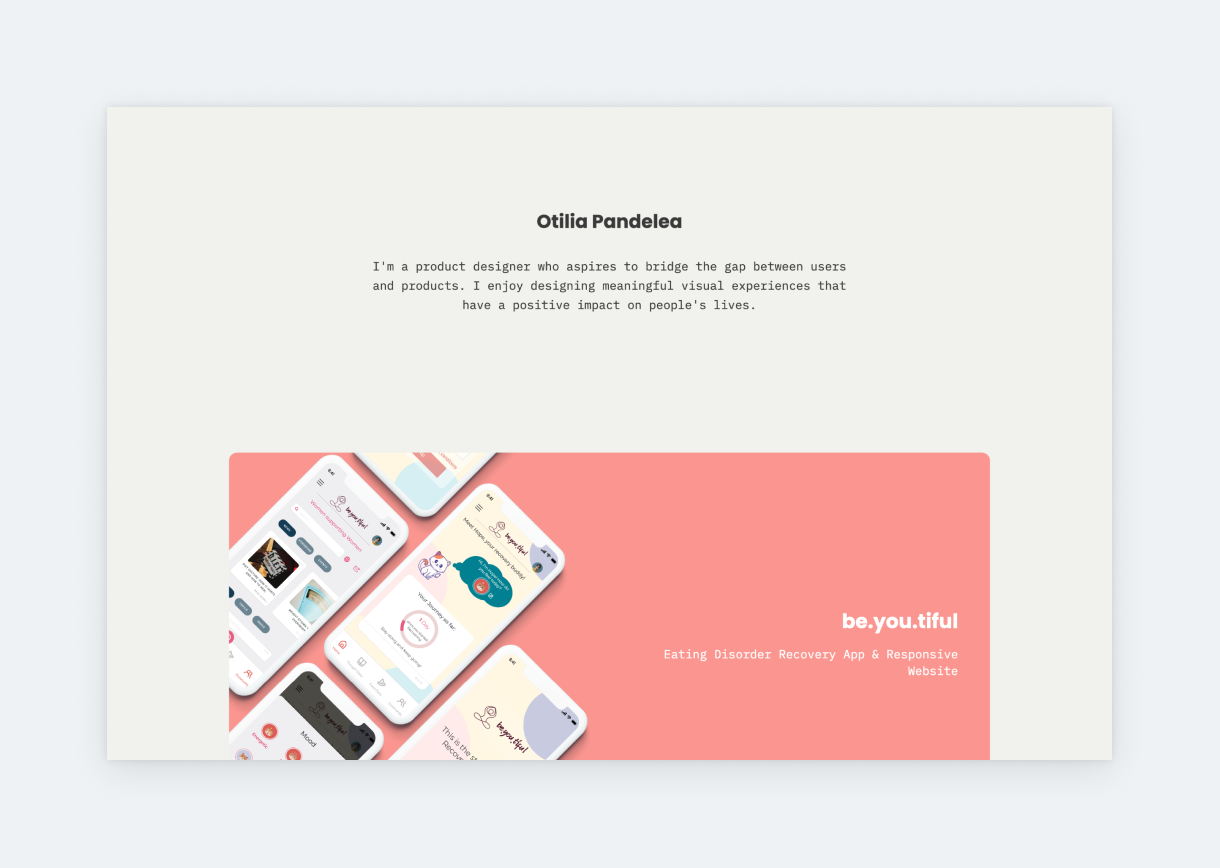
Otilia made her portfolio unique by using a stunning font pairing: Poppins with IBM Plex Mono. This pairing and the harmonious color story look wonderful throughout the entire portfolio. Her about page, with custom graphics, is another highlight. We love the two lists: one about her goals and another about her frustrations. It’s new. It’s fresh. Also, the two lists balance each other perfectly and make us feel in tune with her.
Quentin Muraz
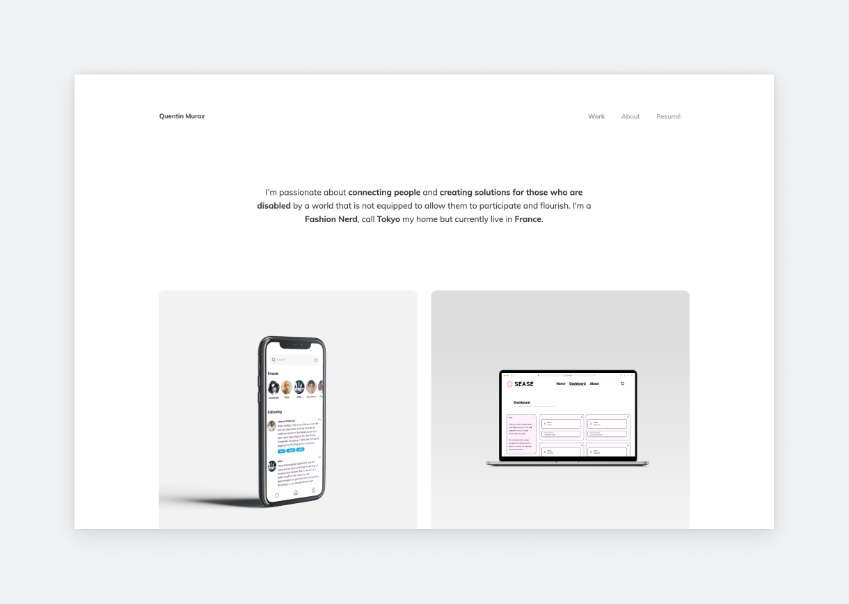
Quentin’s UX portfolio was built according to the “less is more” principle. The look is on point, and so is the content. Using UXfolio’s thumbnail styles, he made sure that the case study titles appear on hover only. And it’s worth hovering for these titles and subtitles! They utilize a great formula for naming UX/UI case studies: the app’s name for the title, and a short but revealing sentence for the subtitle.
Bjorn Gulpen
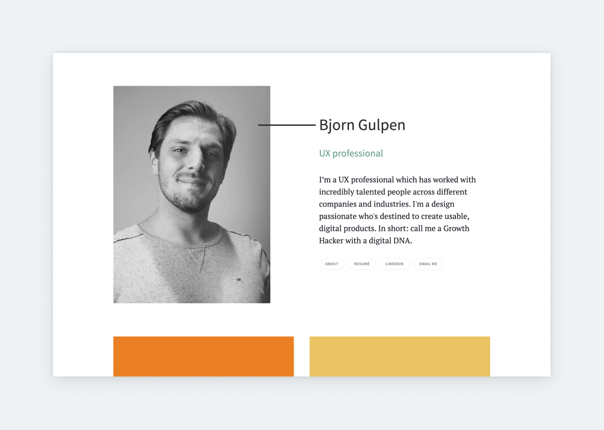
Here’s proof that you don’t have to overthink your UI/UX portfolio to achieve something great. Bjorn’s hero section is simple and welcoming. The first thing we see when landing on the portfolio is a high-quality portrait, with a friendly smile on his face, alongside a short design manifesto. Bjorn’s case study thumbnails don’t follow an obvious color story, yet they work together perfectly because he used the same text styles and naming formulas on each.
Rachel Platt
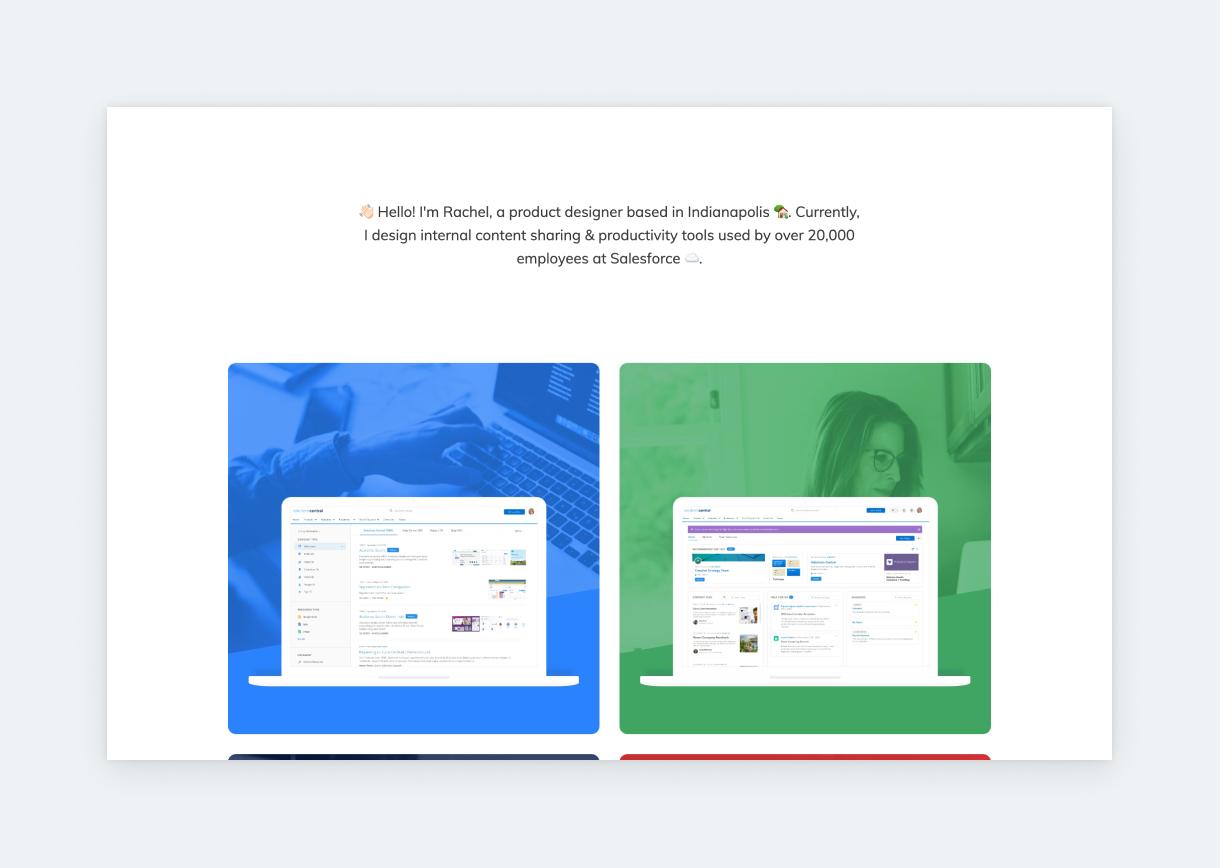
Salesforce Product Designer, Rachel used UXfolio’s thumbnail generator to create stunning thumbnails that match the style of the case studies they’re linking to. The thumbnail generator takes your case studies’ hero section and your images (with or without device mockups) and offers you various thumbnail options. It’s up to you which one you chose. When clicking one of the thumbnails, you’ll see that most of Rachel’s case studies are password-protected. This feature allows you to build case studies based on sensitive materials while keeping control over who can view them.
Ellen Shin
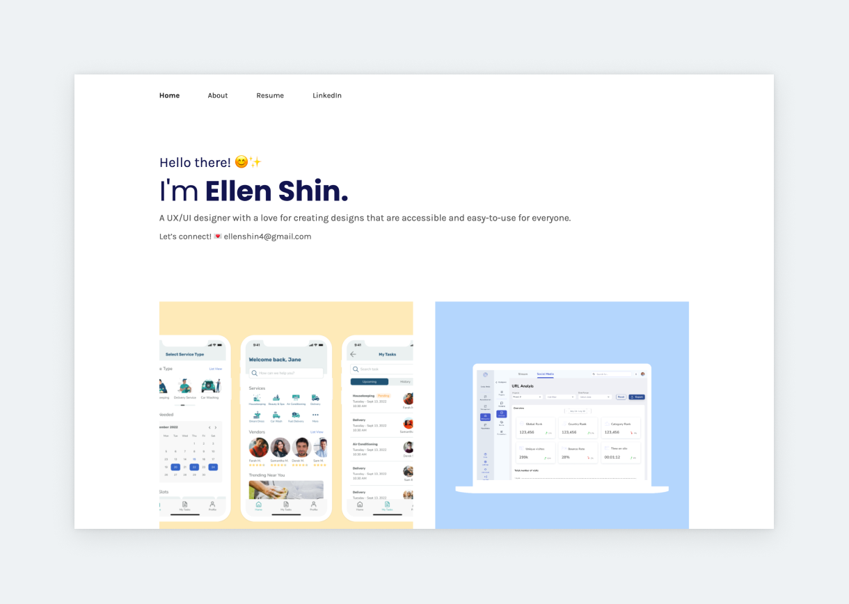
With positive emojis in her bio and colorful project thumbnails, Ellen brings warmness to this otherwise strict and minimal template. By using large typography under her thumbnails, she drives attention to the copy, which describes each project in a concise style. Ellen’s Neurotime case study is also featured on our showcase since it’s the textbook example of how it should be done: clear structure, plenty of visuals, and descriptive but not overlong. She uses UXfolio’s built-in device mockups to present her examples, ensuring that the case study looks visually consistent.
Dae Hyun Baek
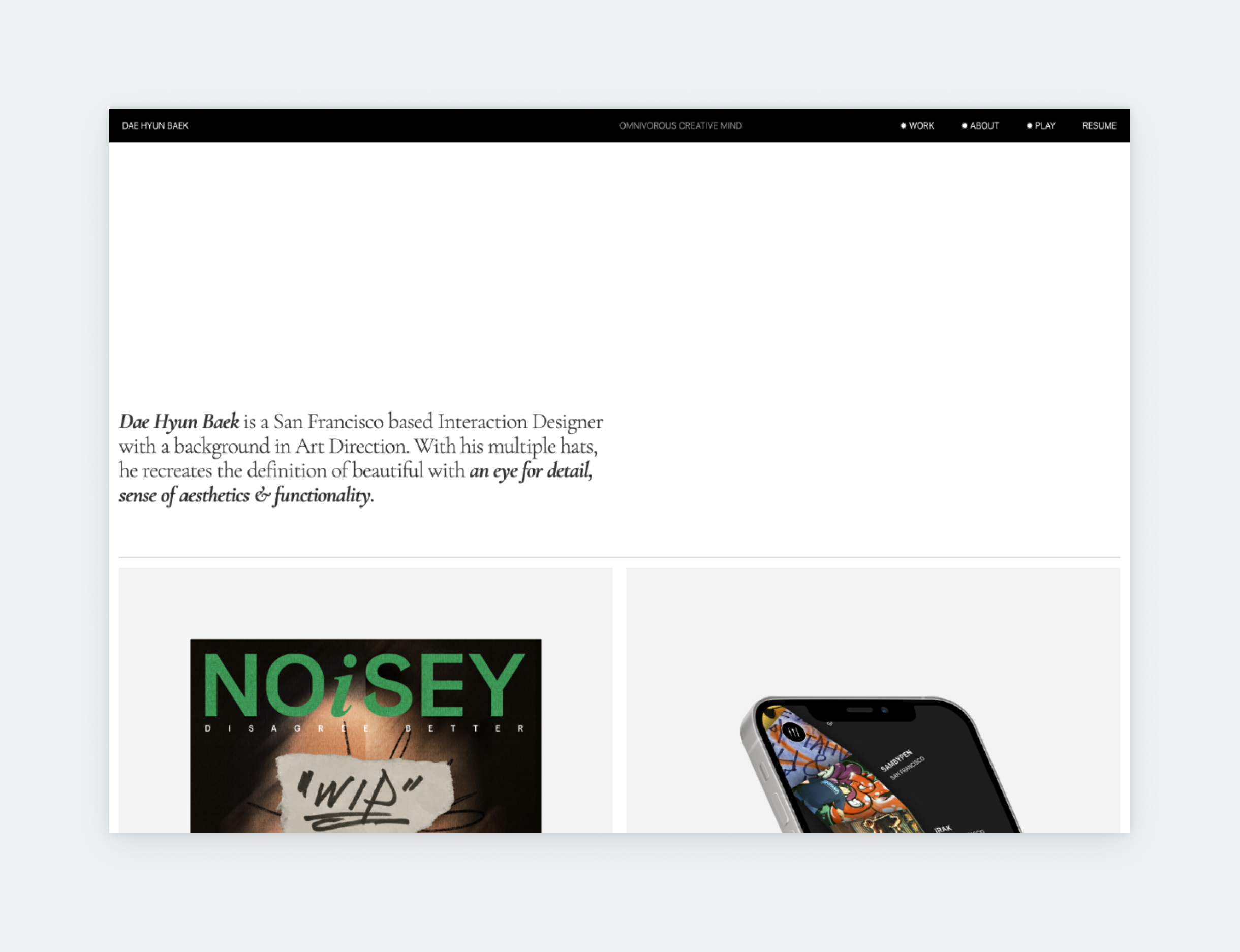
Dae Hyun’s portfolio is simple yet appealing. While the project thumbnails are quite large, their contents are perfectly sized. This gives the whole portfolio a light and modern feel. When you are designing your own portfolio homepage, pay attention to whitespace and margins. Nobody wants to look at a cramped portfolio, and as much as you want to squeeze everything into a thumbnail, you need to make some cuts to keep it simple.
Alexander Kirov
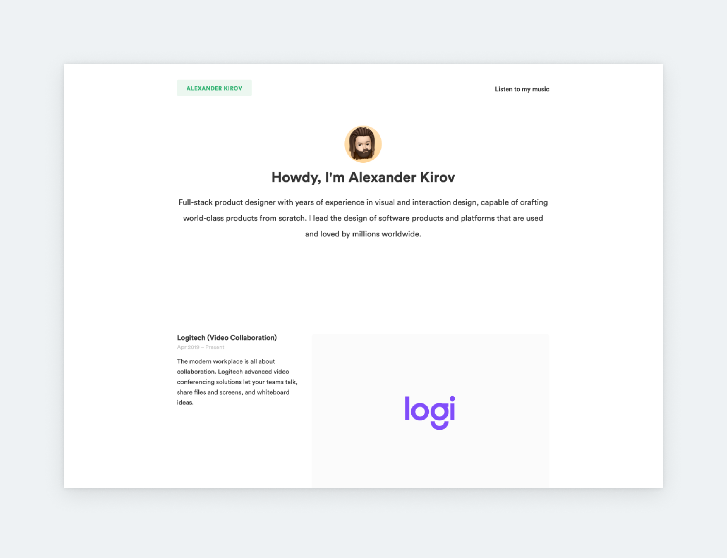
Alexander’s portfolio has some password-protected projects, which is a great way to protect sensitive data or case studies that are not strictly public. What is even better is that he still shows some final UIs or design elements on the thumbnails, so you can get a sense of his overall work even though you can’t peek further. It’s also an option to present more information about the projects right on your own portfolio home page.
Takeaways from the best UX portfolios
Now that you’ve seen some of the best UX/UI portfolios out there, you’ve probably realized that they share many similarities. That’s because they use a portfolio formula that works; a structure which the industry is familiar and comfortable with:
Home page
Your home page is your visitors’ first touchpoint with your portfolio. It’s the starting point and the first impression you make. Therefore, it has to
- look great -> so your visitors want to see more.
- help with orientation -> make it easy for them to see more.
Content on your home page:
- Name,
- Occupation/title,
- Designer statement,
- Links/thumbnails to case studies,
- Navigation (to various pages, like About me, Resume, and Contact).
Case study thumbnails
All things considered, your thumbnails are the most important part of your portfolio’s home page. Even more important than your navigation, for example. If you think about it, the point of a portfolio is to showcase your skills and process through case studies. Therefore, you need to get your visitors to open your case studies. The best way to do this is by creating enticing case study thumbnails and featuring them right on your home page.
The 4 golden rules of case study thumbnails:
- Your thumbnails must look good individually and together since they’ll be laid out close to each other.
- Use the same device mockup style for every thumbnail.
- Make sure that the thumbnails’ backgrounds are identical or harmonizing.
- The thumbnails have to match the home page, not the case study.
UX case studies
We all know that UX goes beyond pretty screens. Therefore it’s understandable that UX leads and recruiters want to see your approach and process. And through case studies, you can show it to them. Great case studies combine the following ingredients:
- Logical thought processes.
- Skills, both hard and soft, including
- Communication,
- Teamwork,
- Ability to work independently,
- Decision-making based on research and data,
- Ability to learn from mistakes, and
- Problem-solving.
- Design process.
- Knowledge of UX methods and their application.
- Openness to feedback.
- Desire to improve.
Nice-to-haves in a UX portfolio
While your home page and case studies are the most important elements of your portfolio, you should take it a step further. Adding pages like About/Bio, Contact, UX designer resumé, and social links can make your portfolio more usable, revealing, and personal.
How to showcase skills in your UX portfolio?
Our job at UXfolio includes talking to world-renowned design leaders to find out what they’re looking for in portfolios. We had to pleasure of talking to some of the most innovative and influential UX designers in the industry, such as
- Design Spring inventor Jake Knapp,
- behavioral scientist Susan Weinschenk,
- UX industry veteran Jared Spool, and
- InVision lead designer Pablo Stanley.
They all mentioned that the best UX portfolios show the design process and decisions. Of course the final design is important too, but they want to see how you’ve arrived there. They want you to explain your decisions and to tell why you decided to go with those specific solutions.You need to share design stories. Present your design process step-by-step, from the beginning to the end.
Tell your design story with UXfolio!
In case you need a tool to help build your portfolio quickly and easily, we made a great one: UXfolio. We created it specifically for UX professionals, so it’s packed with powerful features that’ll help you through the portfolio-building process. These features include text ideas and guiding questions for copywriting, prototype embedding, scrollable mockups, galleries, statistics section and many, many more. Give it a try!