Even strong UX projects can appear weak in portfolios if the story does not clearly communicate your design thinking. Many junior designers invest effort into research, ideation, and interface design, but miss the key link between insights and decisions.
Recruiters scan dozens of portfolios quickly, unclear narratives are skipped. Understanding common case study mistakes and how to avoid them is the fastest way to strengthen your UX portfolio.
This article highlights the structural points where case studies often fail and shows how to fix them using clear frameworks and templates, so you can build a portfolio that is easy to scan, easy to understand, and easy to trust.
Page content
- Why many UX case studies fail to impress recruiters
- Mistake #1: Starting with the design instead of the problem
- Mistake #2: Explaining the process but not the decisions
- Mistake #3: Showing methods and tools instead of insights
- Mistake #4: Treating your case study like a design gallery
- Mistake #5: Writing too much without structure
- Mistake #6: Ending the case study without reflection
- Mistake #7: Publishing your case study without feedback
- How to avoid these UX case study mistakes
- Frequently asked questions
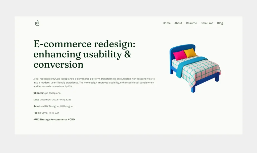
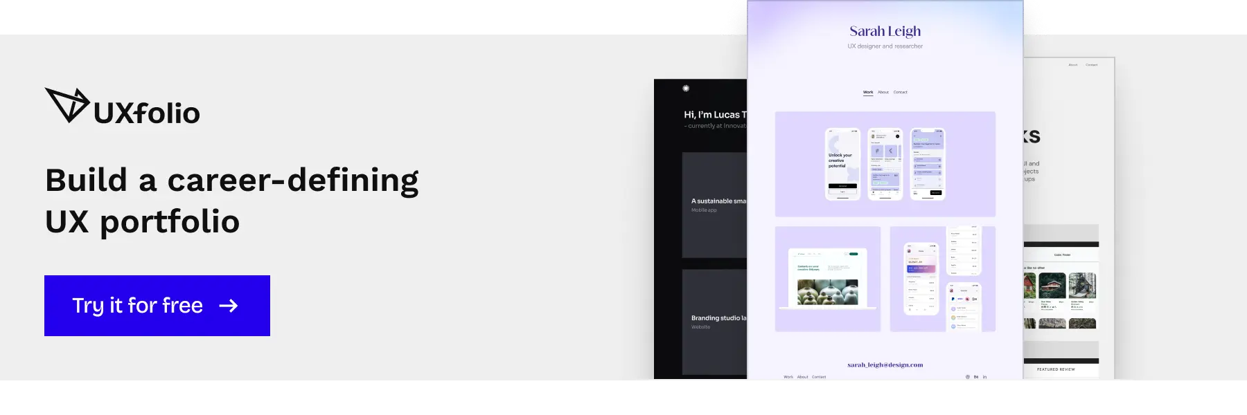
Here’s some inspiration to kick off this article: a strong UX portfolio done right with UXfolio.
Why many UX case studies fail to impress recruiters
A UX case study is not simply a record of the design process. Its purpose is to help recruiters quickly understand how you approach problems and how your decisions influence the final product.
Many projects fail to communicate this because they focus too heavily on activities. Designers describe research methods, workshops, or tools, but these details alone do not reveal the thinking behind the work.
From a recruiter’s perspective, the key questions are straightforward:
- What problem were you solving?
- What did you learn?
- How did those insights influence the design?
If these connections are unclear, even a strong project can appear superficial.
What recruiters actually try to understand from a case study
When reviewing a portfolio project, recruiters are usually looking for four things.
- First: They want to understand the original problem. What user challenge or business objective required a design solution?
- Second: They look for design reasoning. Recruiters want to see how research findings became insights and how those insights shaped design decisions.
- Third: They want to understand what you learned. What changed during the project? Which assumptions were challenged, and how did new information influence your direction?
- Finally: They evaluate the outcome. A strong case study connects the initial problem, research insights, and final design decisions into a clear narrative that is easy to follow during a quick portfolio review.
Why strong projects often turn into weak portfolio stories
One reason is an overly mechanical presentation of the UX process. The story moves through research, ideation, and design phases but does not highlight the key moments when new information changed the direction of the project.
Another common issue is missing context. If the case study does not clearly explain the users, the product environment, or the constraints of the project, the reader cannot properly evaluate the final design decisions.
Recognizing these structural issues makes it easier to avoid common case study mistakes and present your work in a way that reflects your actual design thinking.
Many designers work on complex and interesting projects during their studies or early roles. However, these projects do not always translate into strong portfolio stories.
Mistake #1: Starting with the design instead of the problem
A common portfolio mistake is starting the story with the design itself.
Many projects open with polished screens, UI components, or a quick description of the feature that was built. While this can create a strong first impression, it often shifts the focus away from the most important part of the story: the problem that made the design necessary.
Without context, design is difficult to evaluate. Recruiters can see the interface, but they cannot understand the reasoning behind it or the challenge the team was trying to solve.
A strong case study begins with the problem space and uses visuals to support that story, not replace it. Once the reader understands the challenge, every research activity and design decision becomes easier to interpret.
Note: Starting with a few final screens can work well as an entry point, but they should create interest, not carry the explanation. Your role is to guide the reader from what they see to why it exists.
The role of problem framing in UX case studies
Problem framing provides the foundation for the entire project story. It explains the context in which the design work happened and clarifies why the problem mattered.
Without this context, even well-executed design can appear arbitrary. The reader sees the result but cannot understand the reasoning behind it.
Consider two ways to introduce the same project.
- The designer starts with a redesigned onboarding screen and explains the visual changes.
- The story begins with the problem: new users were abandoning the product because they did not understand its core value.
The difference is significant. In the first case, the recruiter evaluates visual decisions. In the second, they evaluate your ability to understand and frame a product problem.
Note: Strong case studies always start with the problem space.
What context recruiters need before they look at your design
When recruiters scan the beginning of a case study, they are usually looking for three pieces of information:
- What the problem was.
- Who experienced it.
- Why solving it mattered.
If these elements are missing, the rest of the project becomes harder to evaluate.
Design decisions only make sense relative to a problem. For example, a simplified checkout flow might improve usability, but the reasoning behind it depends on the original issue. Was the problem payment drop-off, pricing confusion, or friction during account creation?
Each scenario would lead to different design decisions.
Providing clear context allows the reader to understand the logic behind your work and see how your design thinking connects to the broader product problem.
If the problem is not clearly framed, the rest of the case study loses meaning. This is exactly why a clear structure matters from the very beginning.

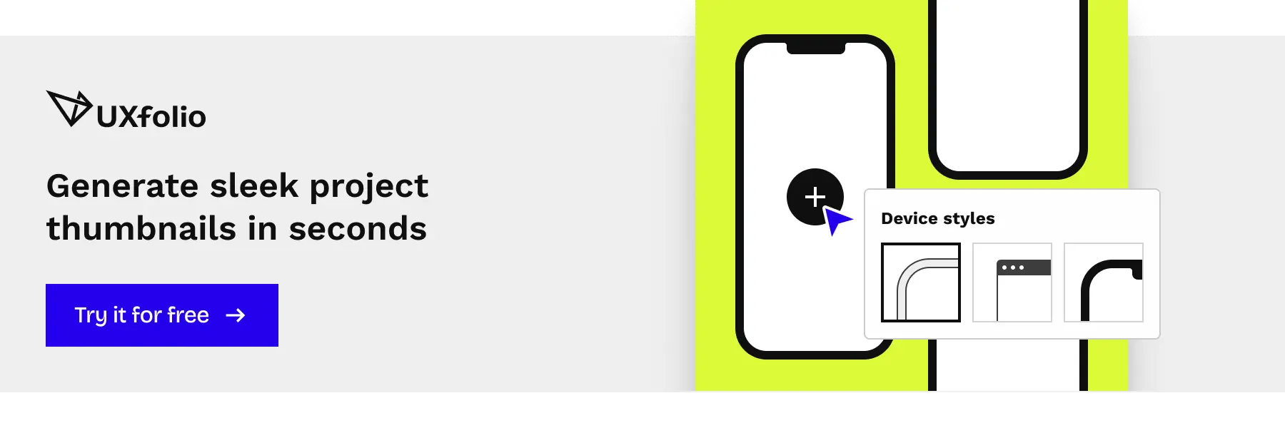
UXfolio’s Case Study Generator guides you through the key sections of a strong case study, helping you clearly connect research insights to design decisions without starting from a blank page.
Mistake #2: Explaining the process but not the decisions
Another common UX case study mistake is describing the design process without explaining the decisions that shaped it.
Many portfolio projects follow a familiar structure. Designers list the stages of the UX process, such as research, ideation, wireframing, and prototyping. While this structure shows that you understand the design workflow, it does not automatically reveal how you think.
From a recruiter’s perspective, the process itself is rarely the most important part of the story. What matters is how you interpreted information, what influenced your decisions, and how each decision shaped the next, leading to the final design.
A strong UX case study highlights the moments when decisions were made. These moments often happen when research findings challenge initial assumptions or when multiple design options compete with each other.
Showing these turning points makes the case study more credible. It demonstrates that your design work is not simply following a predefined process but responding to real information.
When recruiters review a portfolio, they want to see how you think through uncertainty. Explaining your reasoning helps them understand how you evaluate trade-offs, prioritize user needs, and translate insights into design decisions.
Why a step-by-step process is not enough
The UX process is widely known. Recruiters already understand that design projects typically involve research, ideation, and prototyping.
Because of this, repeating the entire process step by step rarely adds much value. In fact, it can sometimes make a case study harder to read, especially when large sections describe methods without explaining their outcomes.
Example: A designer might write that they conducted five user interviews and created affinity diagrams. While this shows activity, it does not explain what the research actually revealed.
A stronger approach is to focus on the most important insights that came out of the research and explain how those insights changed the design direction.
Instead of documenting every step, the case study becomes a story about how new information influenced decisions. This makes the narrative more engaging and easier to evaluate during a quick portfolio review.
Showing the reasoning behind key design choices
One of the clearest indicators of UX thinking is the ability to explain why a specific design decision was made.
Good case studies do not simply present the final interface. They reveal the reasoning that connects the original problem, the research insights, and the chosen solution.
Example: Imagine a project where users struggled to complete a multi-step onboarding flow. After analyzing interview results and usability tests, the designer might discover that users were confused by the order of steps.
In the case study, the important detail is not only the redesigned interface but the reasoning behind it. The designer explains how the research findings led to reorganizing the flow and reducing cognitive load for new users.
This type of explanation shows how insights translate into concrete design decisions.
When recruiters can follow this chain of reasoning, they gain a much clearer understanding of your design thinking.

Mistake #3: Showing methods and tools instead of insights
A common pitfall in UX portfolios is focusing too much on methods and tools rather than the insights they generate. Many junior designers feel compelled to showcase every UX technique they’ve used, wireframes, journey maps, surveys, affinity diagrams, but the mere presence of these artifacts does not demonstrate design thinking.
Recruiters do not evaluate you based on how many methods you can list. What they care about is the story that emerges from your research: what you discovered, why it mattered, and how it influenced your decisions.
Methods describe activity, insights describe thinking
Methods are about what you did, insights are about what you learned. While methods show that you understand the UX toolkit, insights reveal your analytical and problem-solving abilities.
To make your case study compelling:
- Summarize the key research outcomes instead of every method used.
- Highlight surprising findings or patterns that changed your approach.
- Connect insights directly to design choices, showing cause-and-effect.
This not only makes your case study shorter and more readable but also aligns with how recruiters evaluate portfolios: clarity, relevance, and reasoning over exhaustive process lists.
Turning research findings into meaningful case study content
A UX portfolio should translate data into digestible stories. Instead of presenting raw charts or lengthy transcripts, extract the key insights that shaped your design decisions.
For example, if usability testing reveals that users skip a feature, don’t just show a heatmap. Explain:
- What users struggled with?
- Why it was important for the product?
- How this insight informed a redesign or workflow change?
By framing research findings this way, you demonstrate impact and ensure that your portfolio communicates not just activity, but intelligent design thinking.
Note: Insights are the bridge between your research and your design solutions. Tools and methods are supporting actors, insights are the protagonist of your case study narrative.
UXfolio’s AI Text Enhancement helps you turn raw notes into clear explanations, so your insights come through without over-explaining or losing focus.
Mistake #4: Treating your case study like a design gallery
One of the most frequent UX portfolio mistakes is presenting your case study purely as a collection of visuals. Screenshots, wireframes, and mockups can look impressive, but without context, they tell only half the story.
Recruiters need to understand why each design choice exists, not just what it looks like. A portfolio that feels like a gallery may leave them guessing about your thinking, research, or the problem you were solving.
Imagine a portfolio showing a series of beautifully designed screens for a mobile app. Without accompanying explanations, a recruiter sees the result but cannot trace how the team arrived there.
- Did the interface change based on user testing?
- Was a particular layout chosen to improve accessibility or reduce friction?
These insights are what differentiate a good portfolio from a truly strong one.
Why visuals alone rarely convince recruiters
Visuals are powerful but insufficient on their own. They demonstrate skill in execution but not in strategic thinking. If a recruiter cannot see the link between your research, ideation, and final designs, they may assume the project was completed without thoughtful decision-making.
A gallery-only approach often signals:
- Focus on output rather than outcome.
- Lack of clarity about the original problem or user needs.
- Missed opportunity to show cause-and-effect reasoning.
Note: A portfolio is a story of problem solving, not just an art exhibition.
Connecting research, ideas, and final UI decisions
To make visuals meaningful:
- Contextualize every key screen or prototype with the problem it solves.
- Highlight decisions influenced by research findings. For example, explain why a specific interaction was chosen based on user feedback.
- Include reflections on trade-offs. Even small decisions like reordering form fields or simplifying navigation, demonstrate your thinking process.
By combining visuals with insights and explanations, your case study communicates not only what you designed but also how and why. This approach helps recruiters quickly evaluate your UX thinking while appreciating the quality of your design execution.
Mistake #5: Writing too much without structure
Another common UX case study mistake is trying to include too much information without organizing it clearly.
Many junior designers assume that more detail makes a stronger case study. They try to document everything: every research step, every idea, every iteration. While the intention is to be profound, the result is often the opposite. The case study becomes difficult to scan, and the key points get lost.
Recruiters do not read case studies line by line. They scan them. If the structure is unclear, they will not spend time trying to figure it out.
Note: A strong case study is not defined by how much you write, but by how clearly you communicate the most important parts of your work.
How recruiters actually read UX case studies
When reviewing a portfolio, recruiters typically follow a quick scanning pattern.
They look at headings, skim the first sentences of sections, and focus on highlighted elements such as key insights or outcomes. This means your case study needs to communicate value even when it is not read in full.
Large blocks of text make this difficult. If everything looks equally important, nothing stands out.
Instead, structure should guide attention. Clear sections, concise paragraphs, and well-placed emphasis help the reader quickly understand the flow of the project.
Note: Think of your case study as something that needs to work in two modes: a quick scan and a deeper read.
Creating scannable case study sections
Improving readability does not require rewriting your entire case study. Small structural changes can make a significant difference.
Break long paragraphs into shorter ones so each idea is easier to process. Use headings to separate different parts of the story and make the structure visible at a glance.
You can also highlight key insights or decisions within the text. This helps recruiters quickly identify the most important takeaways without reading everything in detail.
Example: Do not describe an entire usability testing session in one long paragraph. Focus on the most important findings and present them clearly. This keeps the narrative concise while still communicating value.
Well-structured content reduces cognitive load and makes your case study easier to evaluate. It also shows that you understand not only UX design, but also how to communicate complex information effectively.
Note: At this point, most issues are no longer about content, but structure. If your case study is hard to scan, the problem is usually not what you wrote, but how it is organized. A clear framework eliminates most of these issues upfront.
UXfolio helps you present your case studies in a clean, structured layout, so recruiters can scan your work quickly and still understand your key decisions.
Mistake #6: Ending the case study without reflection
A surprisingly common UX case study mistake is ending the project right after presenting the final designs.
Many portfolios stop at the solution. Screens are shown, flows are explained, and the case study simply ends. While this might feel complete, it leaves out one of the most important parts of the story: what you learned from the project or what would you do differently now?
From a recruiter’s perspective, this is a missed opportunity. Without reflection, it is difficult to understand how you evaluate your own work or how you grow as a designer.
Note: A strong case study does not end with the solution. It closes with perspective.
Why reflection signals professional maturity
Reflection shows that you can step back and critically assess your own decisions.
In real-world UX work, projects are rarely perfect. There are constraints, trade-offs, and decisions that only become questionable afterwards. Designers who can recognize these patterns demonstrate a deeper level of thinking.
Example: Imagine a project where the final design improved usability but did not significantly impact conversion rates. A reflective case study would acknowledge this gap and explore possible reasons behind it.
This kind of honesty does not weaken your portfolio. It strengthens it. It shows that you understand outcomes, not just outputs.
Note: Recruiters often look for signals of this mindset because it indicates how you might perform in a team environment where iteration and learning are continuous.
What a strong UX case study conclusion looks like
A strong conclusion does not summarize the entire project again. It highlights the most important takeaways.
This can include key lessons, unexpected challenges, or decisions you would approach differently in the future. The goal is to show how the project influenced your thinking.
Example: Instead of ending with a sentence like “The final design improved the user experience,” a stronger conclusion might explain what you would refine further or what limitations affected the outcome.
You can also briefly reflect on constraints such as time, scope, or available data. This adds realism to the project and helps the reader understand the context in which decisions were made.
Note: A well-written reflection signals that you are not just executing tasks, but actively learning from your work. This is one of the clearest indicators of long-term potential as a UX designer.
Mistake #7: Publishing your case study without feedback
A common but often overlooked UX case study mistake is publishing your work without validating whether it is actually understandable to others.
After spending hours or days working on a project, it is easy to assume that your case study is clear. You know the context, the decisions, and the reasoning behind everything. However, for someone seeing it for the first time, the story may not be as obvious.
A portfolio case study is a form of communication. If the reader cannot quickly understand your thinking, the value of your work gets lost.
Important: Testing your case study before publishing it is essential.
Why outside feedback improves case study clarity
When someone else reads your case study, they bring a fresh perspective. They do not have prior knowledge about the project, so they can immediately identify unclear explanations, missing context, or confusing structure.
Even small gaps become visible through feedback. A section that feels obvious to you might raise questions for someone else. For example, they might not understand why a certain design decision was made or how a research insight connects to the final solution.
Note: This type of feedback is extremely valuable because it mirrors how recruiters experience your portfolio.
You do not need a large group of reviewers. Even one or two thoughtful readers can highlight the most critical issues. The goal is not perfection, but clarity.
How to test whether your case study is understandable
There are simple ways to validate your case study before publishing it.
Ask someone to read it and explain the project back to you. If they can clearly describe the problem, the key insights, and the final solution, your story is working. If they struggle, it is a sign that something needs to be simplified or clarified.
Another useful approach is to step away from your case study for a few days. When you return, read it as if you were a recruiter seeing it for the first time. This helps you notice unclear sections or unnecessary complexity.
You can also check whether your case study works when scanned quickly. If the main points are not visible through headings and short sections, the structure likely needs improvement.
Important: Testing your case study ensures that your work is not only well-designed, but also well communicated.
UXfolio’s review features let you share your portfolio through a simple link, so others can review it, leave comments, and highlight where your case study may be unclear or incomplete. This makes it easier to spot gaps in your story and refine your content before publishing.
How to avoid these UX case study mistakes
Most UX case study mistakes are not isolated problems. They come from the lack of a clear underlying structure.
Most of the issues covered in this article fall into three areas: problem framing, decision-making, and communication clarity. If you improve these, your case studies will become significantly stronger without requiring more projects or redesign work.
Do not try to fix each mistake separately, it is more effective to approach your case study as a structured narrative.
Using a clear UX case study structure
A strong structure helps you avoid multiple mistakes at once.
When your case study follows a clear logic, it naturally guides the reader from the problem to the final solution. This makes it easier to understand your decisions, your research insights, and the impact of your work.
A simple but effective structure usually includes:
- a clear problem definition
- relevant research insights
- key decisions and their reasoning
- the final solution and its outcome
- a short reflection
This structure ensures that your case study is not just a sequence of activities, but a coherent story of problem solving.
If your current case study feels unclear, the issue is often not the content itself, but how it is organized.
Choosing the right scope for your case study
Another common issue behind weak case studies is scope.
Many junior designers either try to present too much or focus on projects that are too small to demonstrate meaningful decision-making. In both cases, the story becomes difficult to follow.
A strong case study focuses on a problem that allows you to show:
- How do you interpret user needs?
- How did you make decisions based on research?
- How did your work influence the outcome?
This does not require a large or complex project. Even a smaller project can work well if the problem is clearly defined and the reasoning is well explained.
Good scope makes your case study easier to structure and more convincing to read.
Building your portfolio with a UX case study template
Using a structured template can help you avoid most common case study mistakes from the start.
Instead of thinking about what to include, a template guides you through the key elements of a strong case study. It ensures that you provide context, explain your decisions, and connect your insights to the final design.
Templates are especially useful when you are revisiting older projects. They help you identify missing parts of the story and reorganize your content without rewriting everything from scratch.
If your goal is to improve your UX portfolio, working with a clear case study template is one of the most efficient ways to do it.
UXfolio templates are built specifically for UX case studies, guiding you from problem framing to final outcomes. Instead of figuring out what to include, you can focus on making your thinking clear and easy to follow.
Frequently asked questions
What are the most common UX case study mistakes?
The most common UX case study mistakes include starting with the design instead of the problem, describing the process without explaining decisions, focusing on tools instead of insights, and presenting the project as a visual gallery without context.
Other frequent issues are writing too much without clear structure, skipping reflection, and publishing case studies without testing their clarity. These mistakes make it harder for recruiters to understand your thinking and evaluate your work.
What makes a strong UX case study?
A strong UX case study clearly explains the problem, presents relevant research insights, and connects those insights to design decisions.
It shows how you think, not just what you created. Recruiters look for a clear cause-and-effect relationship between the problem, the research, and the final solution. A well-structured narrative and concise communication are key to making your case study effective.
How long should a UX case study be?
A UX case study should be long enough to explain your thinking, but short enough to remain easy to scan.
In most cases, 500 to 800 words per project is a good range. The exact length depends on the complexity of the project, but clarity and structure are more important than word count.
Instead of trying to include everything, focus on the most important insights and decisions.
How can I improve my UX case study?
You can improve your UX case study by focusing on clarity and structure.
Start by clearly defining the problem, then highlight the most important research insights and explain how they influenced your design decisions. Remove unnecessary details and organize your content into easy-to-scan sections.
It is also helpful to get feedback from others to identify unclear parts and improve the overall narrative.
Do recruiters read UX case studies in detail?
Most recruiters do not read case studies line by line. They scan them first and only read deeper if something captures their interest.
This means your case study needs to communicate value quickly. Clear structure, concise explanations, and visible key insights help recruiters understand your work even during a quick review.
You must be logged in to post a comment.