Recruiters and design leads always start with portfolios when reviewing candidates. That’s why all UX designers – juniors and seniors alike – need an impressive UX portfolio. Though putting one together might seem daunting, once you get an idea of what it takes, the rest comes quickly.
Page content
- Portfolio templates for UX professionals
- Portfolio examples by UX professionals
- What is a UX portfolio (and what hiring teams actually look for)?
- How to create decision narratives?
- How hiring teams evaluate a UX portfolio
- Why do most UX portfolios fail?
- What a UX portfolio needs to show
- Takeaways from the best UX portfolios
- 9 takeaways from the best UX portfolios
- Prioritize clarity over visual complexity
- Context appears before solution
- Tell a coherent story in each case study
- Highlight key decisions
- Use evidence to support your story
- Make your portfolio communicate quickly
- Show consistency across projects
- Ground work in real product environments
- Reflect on professional growth
- Home page
- Case study thumbnails
- The formula for great case study thumbnails
- 9 takeaways from the best UX portfolios
- UX case studies
- Nice-to-haves in a UX portfolio
- How to showcase skills in your UX portfolio?
- Tell your design story with UXfolio
- Frequently asked questions
Portfolio templates for UX professionals
Finding a stunning portfolio template is easier than ever. Finding a template that’s not only stunning but also matches the expectations of the UX industry is a different story. UX design portfolios have to go beyond aesthetics. They must signal that you’re a professional who considers the user of your portfolio. Let’s check out a few template examples that achieve this:
Rams
The Rams portfolio template was built for UX designers who want to highlight their impact for the ideal first impression during the hiring process. It combines a modern, stark look with a highly optimized layout, shaped by research findings from interviews with design leads and HR managers. With Rams, there’s no clutter; your work remains in the center of attention. What’s more, the template is highly customizable, so you can easily adjust it to your own personality and story.
Tesler
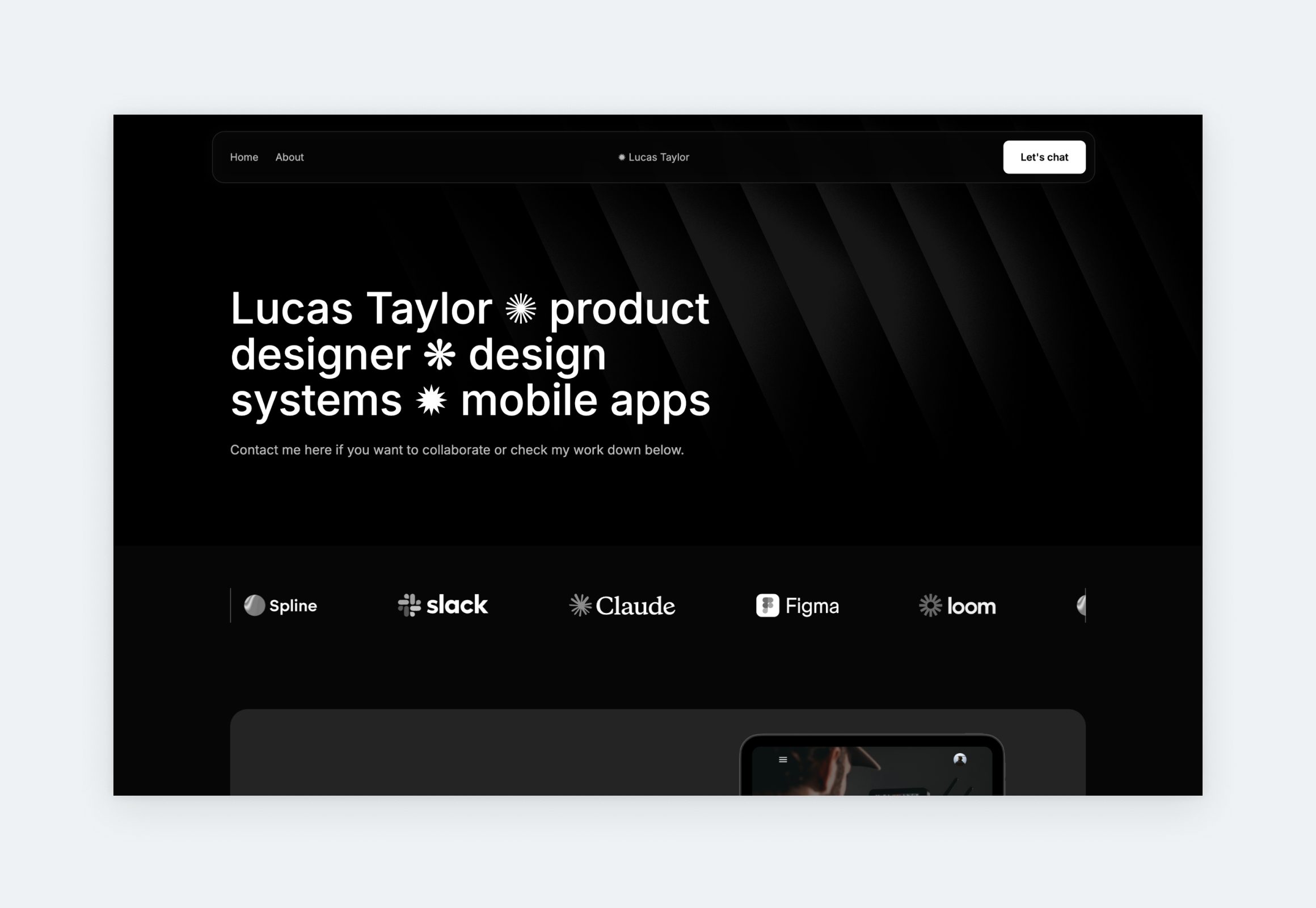
Tesler is a product designer portfolio template that leans into sharp contrast and editorial confidence, the kind of presentation that signals craft even before a case study is opened. Structured project cards surface role, platform, and context at a glance, while the stripped-back navigation keeps the visitor experience frictionless. It was built for product designers who have a strong vision and want a portfolio that matches it.
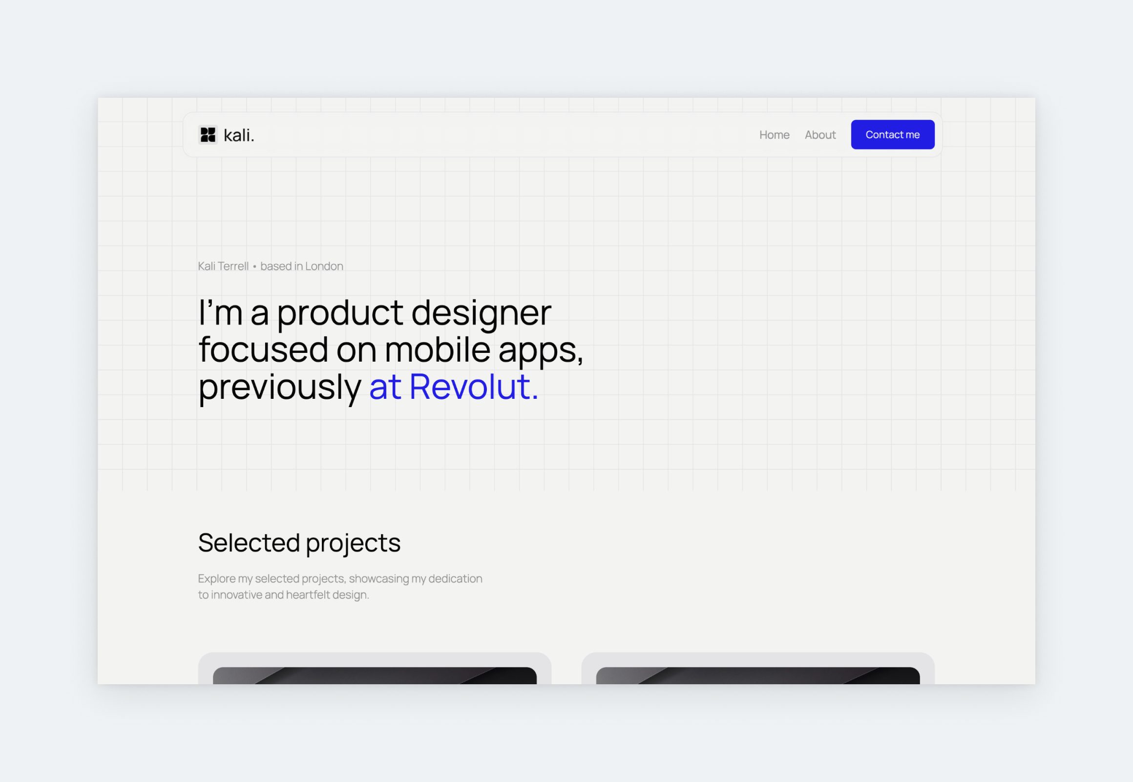
Lora
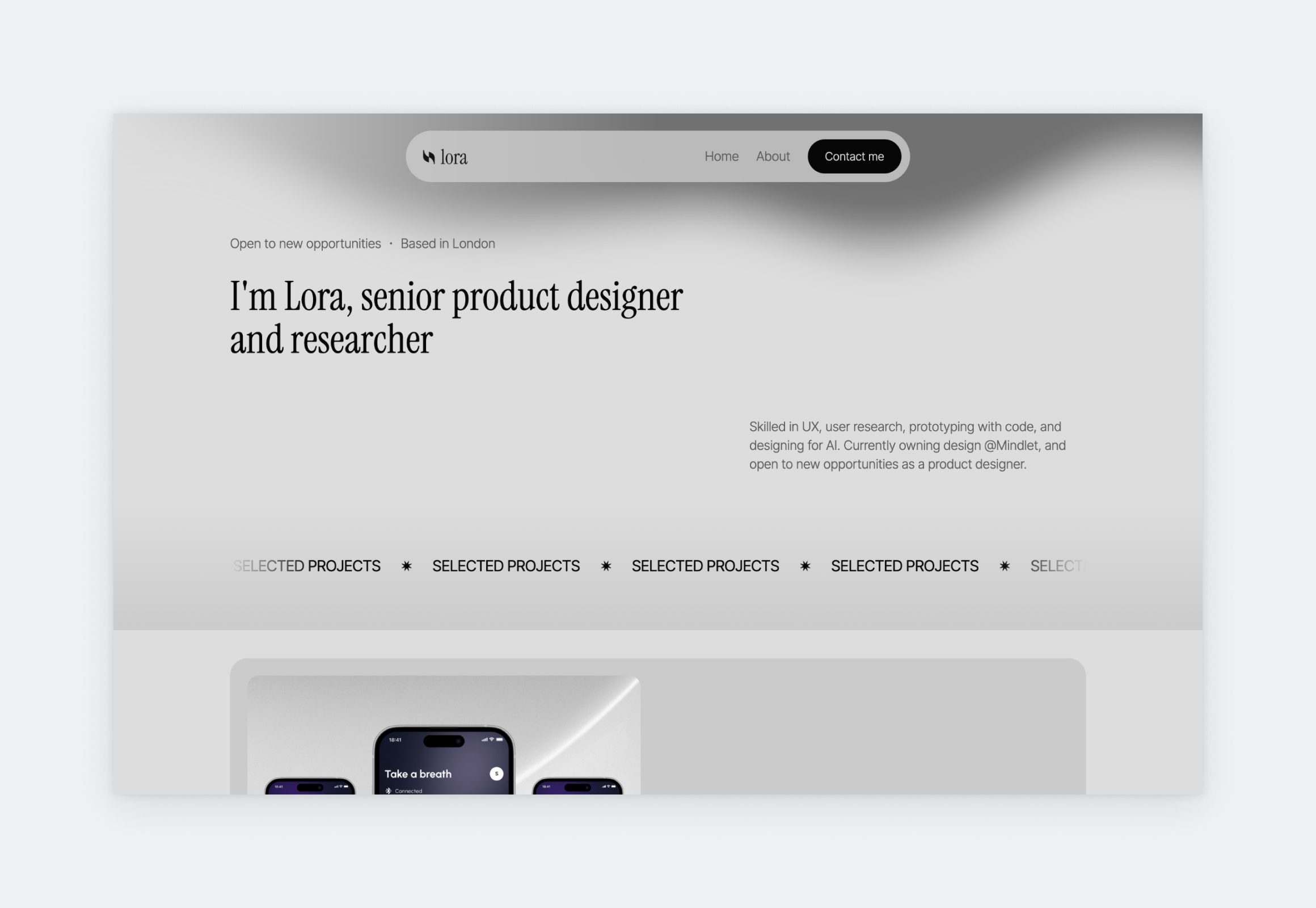
Lora is the perfect basis to showcase your UX work with intention. It offers a clean and stunning design with zero distractions. The large project thumbnails are optimized for descriptive titles and stunning snapshots that beg to be opened. The interactions are minimal, yet Lora looks dynamic thanks to the strategic use of color, shadows, and animated elements – a UX portfolio template through and through.
Neville
Neville is a dark, contemporary template that gives you the framework to establish a professional online presence as a designer. Your visitors’ attention is directed to your work immediately after the hero section, which is in line with expectations from decision makers. If you’re not a fan of dark color palettes, you can change the color story and fonts in just a matter of clicks, while keeping the structure intact.
Sora
Sora features soft neutrals, generous white space, and a layout that lets the work carry the weight. Your personal brand will feel immediate and human thanks to the hero headline paired with a streamlined, sticky navigation. The project cards lead with outcome-driven summaries that pull the reader in before they even click.
Portfolio examples by UX professionals
When you’re looking for examples and inspiration, it’s crucial that you stick to UX portfolios. The expectations towards UX designers and other designers, for example graphic designers, are very different. A well-adjusted UX portfolio will be much simpler: limiting distractions, preferring clear structure, and highlighting project information. Here’s a curated selection of portfolios that fit this description:
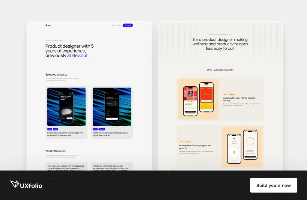
Max Marra
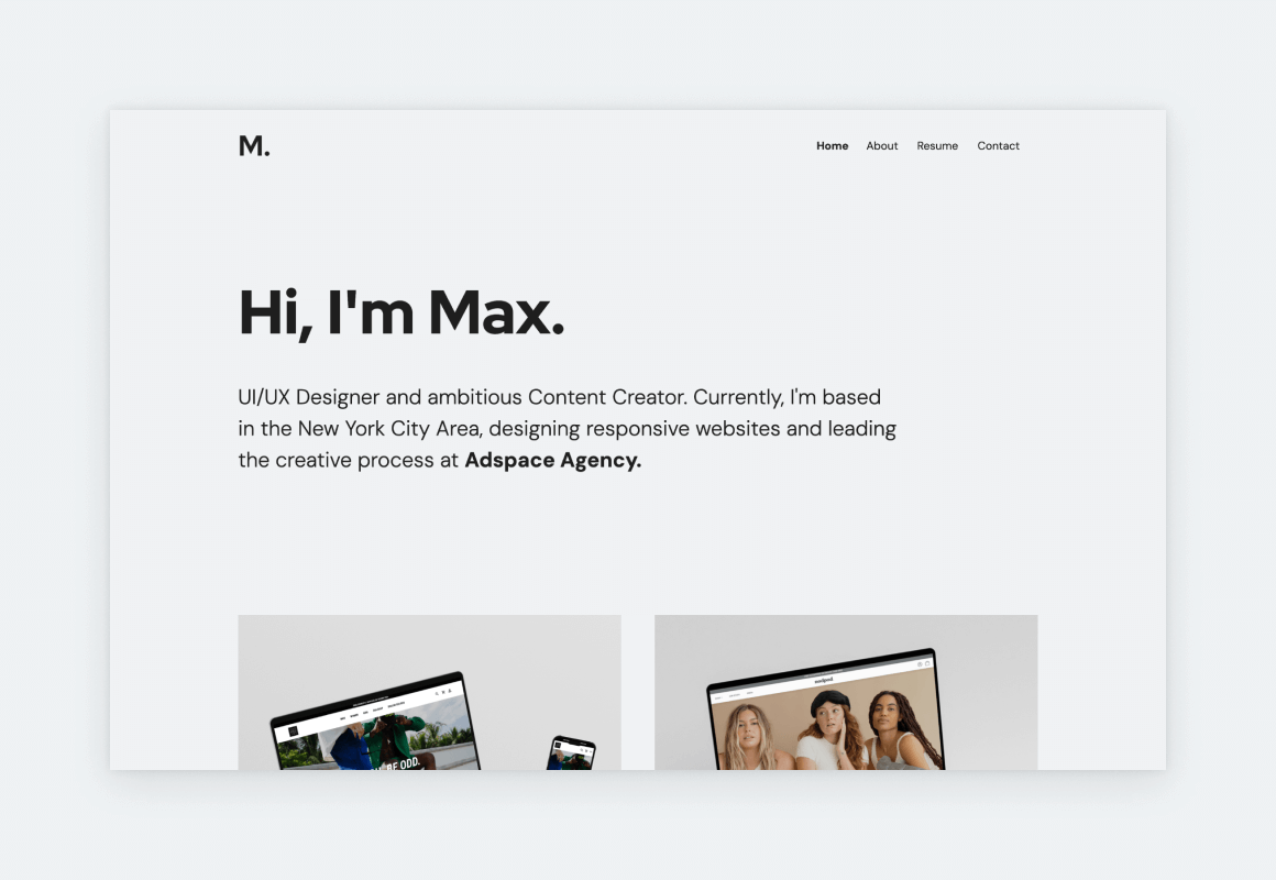
Max’s UX portfolio website is an impressive showcase of his skills as a UI/UX designer and lead. The prtfolio’s design is pristine and intuitive, reflecting Marra’s commitment to user-centric design principles alongside his understanding of UX portfolio best practices. His case studies span industries including fintech, e-commerce, and lifestyle apps, each following a tight structure with clear problem statements, design rationale, and measurable outcomes.
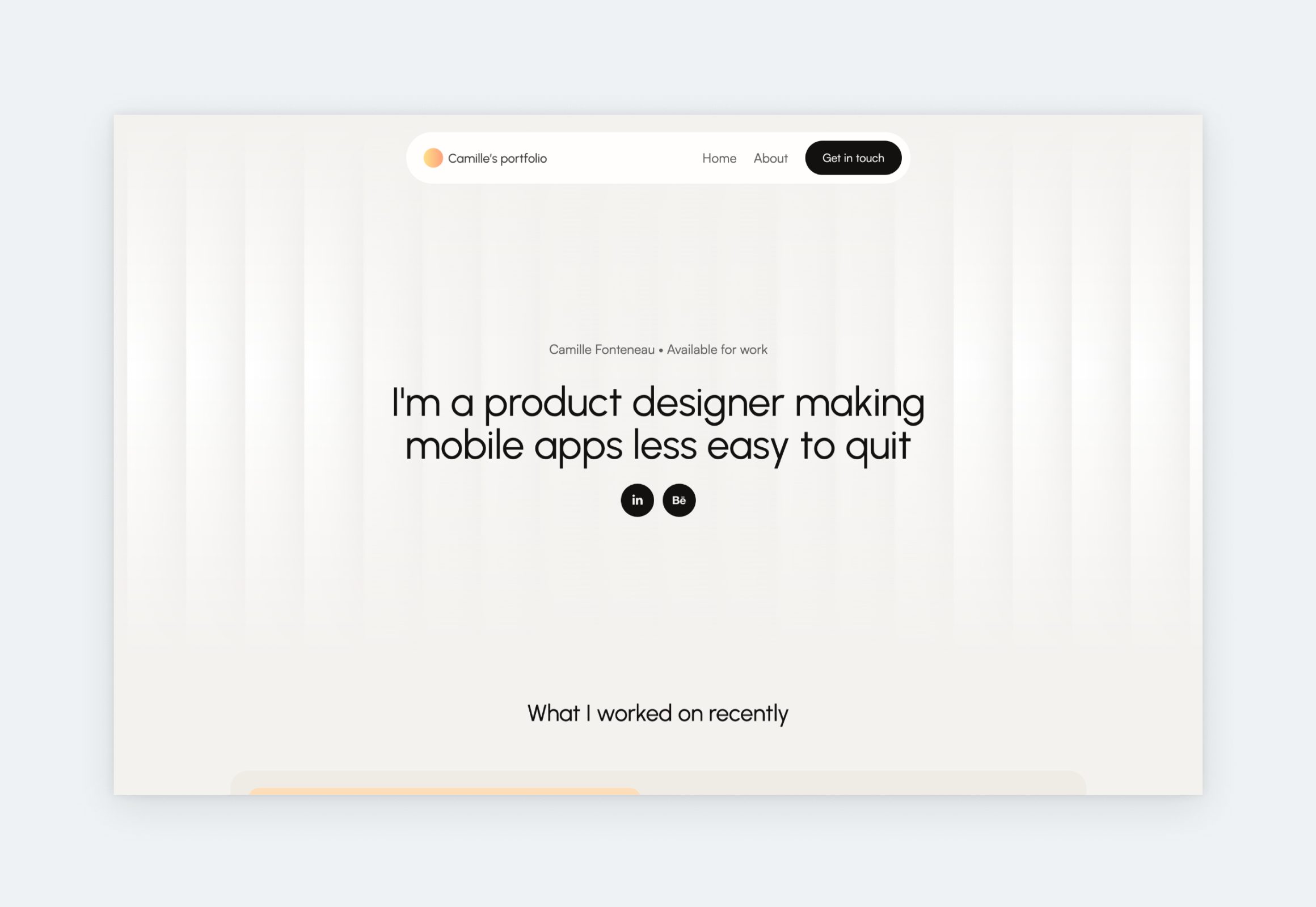
Matt Orton
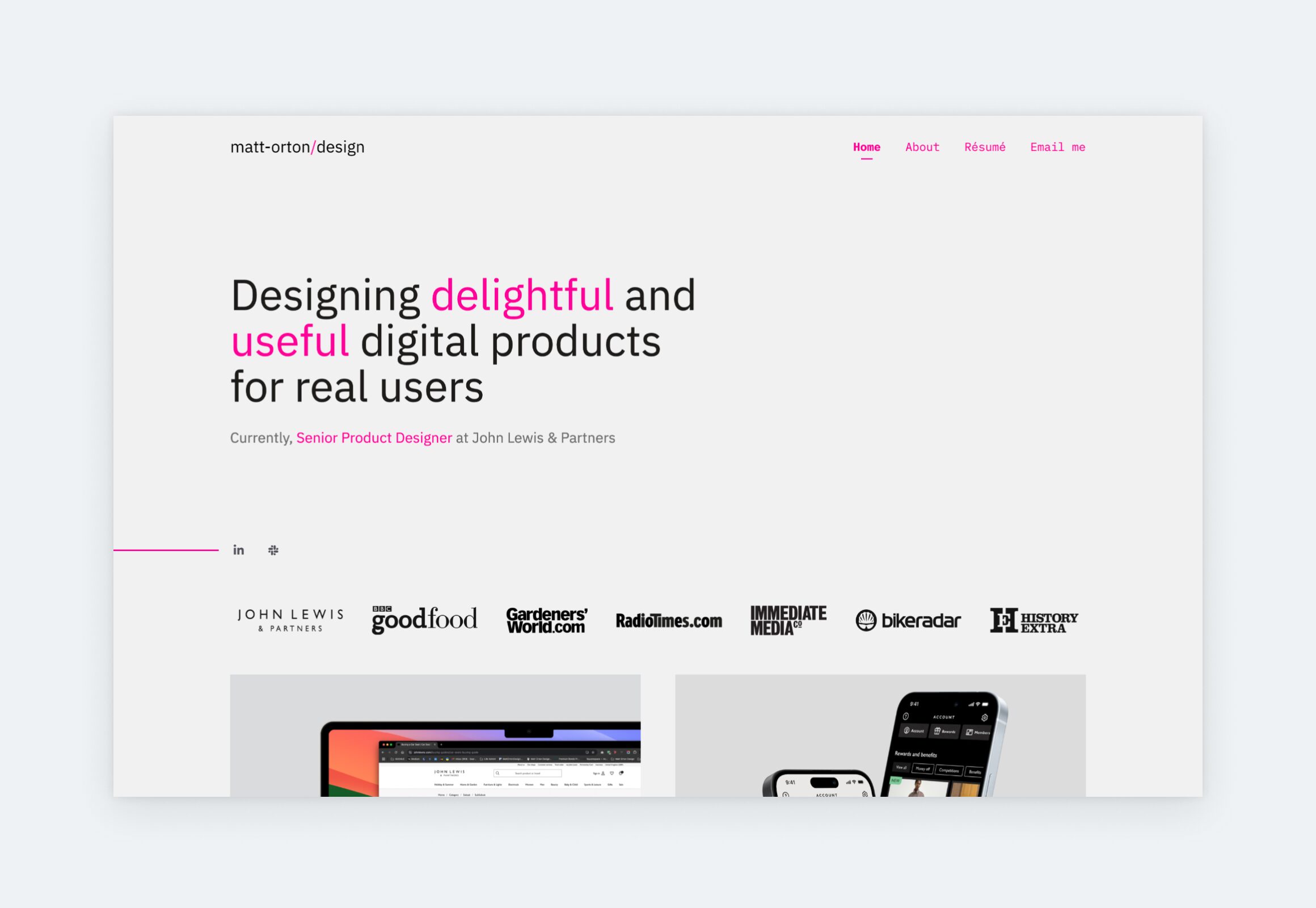
Matt’s Senior UX Designer portfolio is an excellent example of strong content paired with equally strong visual design. He uses a strong pink accent color, which brings a much appreciated playfulness to this polished showcase of projects. His case study titles are thoughtfully written, demonstrating expertise through clear, descriptive phrasing, like: “Improving scalability, reusability and consistency for e-commerce app card components.”
Divya Murthy
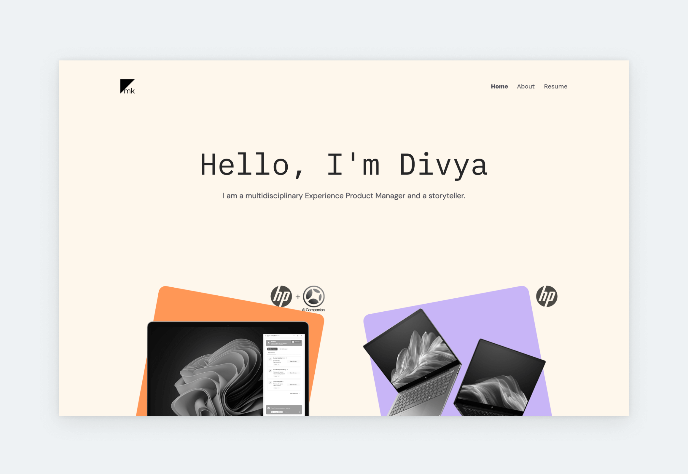
Divya, an Experience Product Manager at HP, crafted a portfolio website that’s professional yet inviting. A muted beige backdrop sets a calm tone, while bold, custom-designed project thumbnails draw immediate attention to her projects. On the homepage, she applies smart portfolio strategy by opening with her most relevant, high-impact UX case study: an AI project that walks through user research, wireframing, and iterative testing, culminating in a streamlined workflow solution. Her About page strikes the right balance, sharing her professional journey and personality with clarity and restraint.
Emilio Fransson
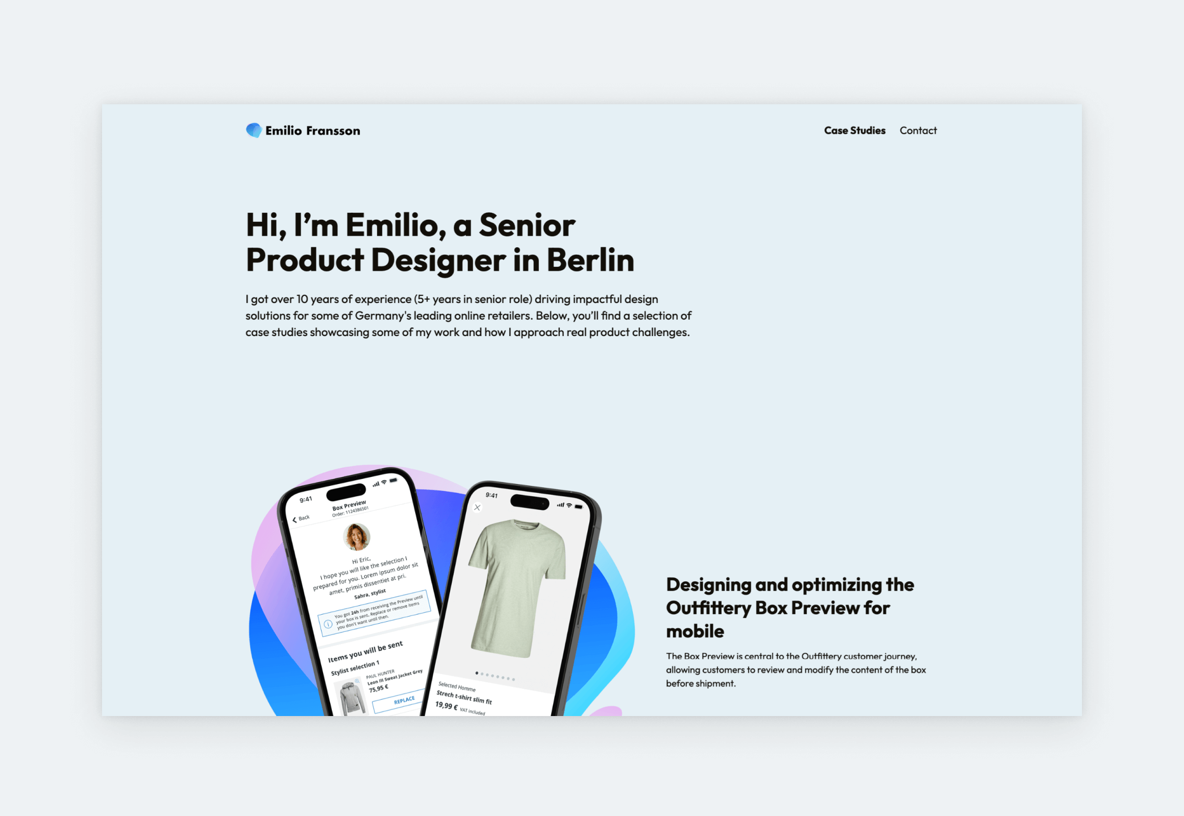
Emilio’s Senior Product Designer portfolio stands out as a strong reference for any UX designer looking to build their. His headline immediately communicates his experience level and area expertise. This is followed by descriptive case study titles and subtitles that clearly state the project type and company. The case study thumbnails are impactful and inviting, with cohesive pops of color and crisp, high-quality screens that beg to be clicked.
Phil Nguyen
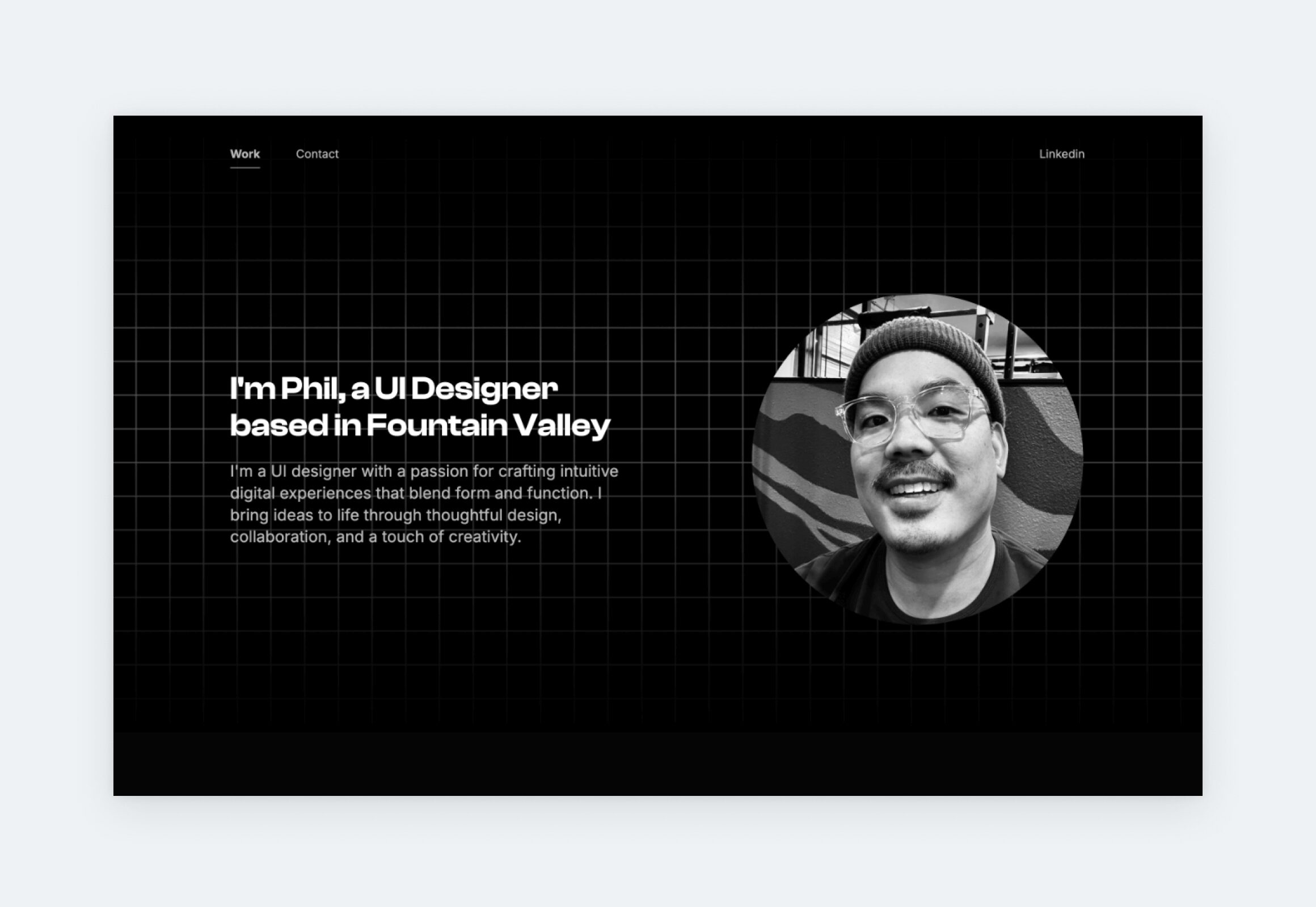
Phil, UI designer at Chipotle, created a dark portfolio with minimal content outside of his projects. This is a smart way to shift our focus to his case studies, where we can see more his design through emedded Figma prototypes and screenshots. When it comes to showcasing screens, like Phil does in some of his projects, UXfolio’s built-in device mockups come extremely handy. With this feature, all you have to do is choose a device (mobile, laptop, desktop, tablet, or browser), pick a style for it (realistic, stylized, outline, etc.), and upload your screens.
Albert Hong
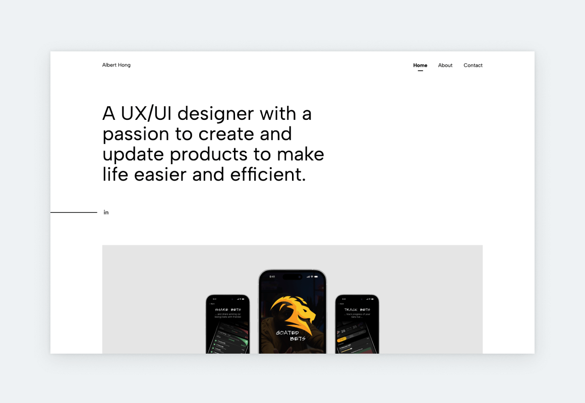
Albert customized his UX portfolio template using two UXfolio features: Case study grid layouts and the Thumbnail designer. The Case study grid layouts determine how case studies are arranged on the homepage. Since the grid takes up most of the landing page, changing its layout significantly alters the overall look of your portfolio. The Thumbnail designer is used to build and customize each case study’s thumbnail. You choose a layout, select a device mockup style (phone, tablet, computer, browser, realistic, stylized, etc.), and upload your screen inside. This gives you full control over how each project is presented in the grid without hassle.
Chloe Pence
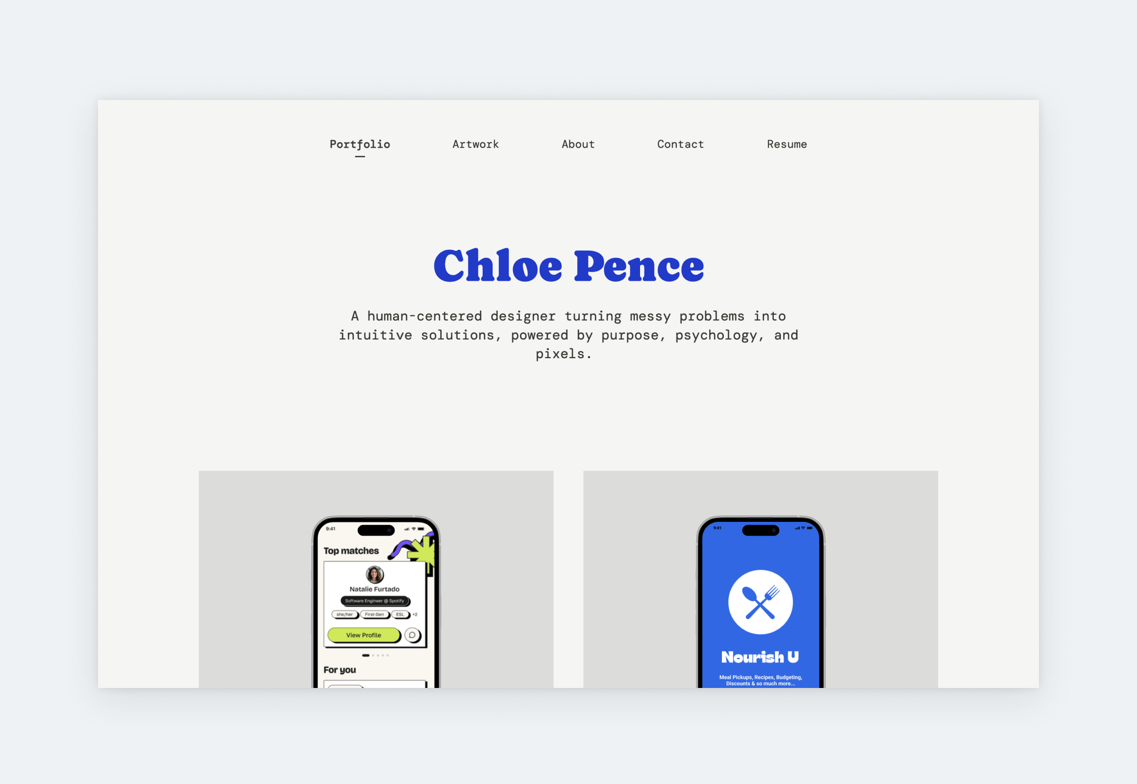
Font choices speak volumes about a portfolio’s owner. In Chloe’s case, they reflect great taste. She pairs Caprasimo, a nostalgic, rounded accent font, with the modern, monospace DM Sans. It’s a bold combination that could easily clash, but here it works. That’s because both fonts share a subtle playfulness that ties the visual language together. Her case studies are extremely detailed. The first one, Nume, for example, tells a well-rounded story starting with the brief, and touching on research, defining goals, ideation, usability testing, prototypes, results, and final reflections.
Kyle Kovacs
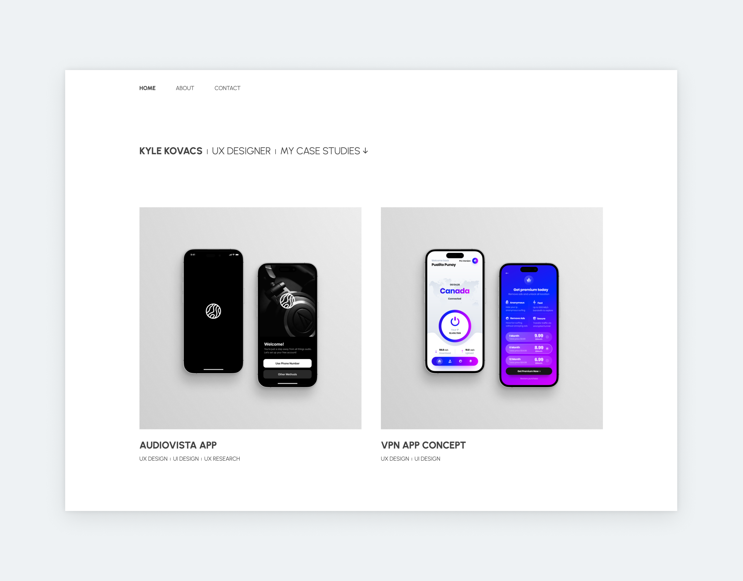
This example shows: consistency is the key to creating a stunning UX portfolio on a tight schedule. Kyle uses the same font throughout the portfolio, adjusting only its size or weight. This results in a sleek, ultra-minimalist look. To enhance this effect, he’s also frugal with his words, letting his projects do the talking. This is in line with the newest UX portfolio trend: less-is-more style writing. Many designers add long sentences of eloquent introduction to their home page, and in most cases, it can feel awkward or uninspired. Don’t be afraid to keep it brief on your landing page! Design leads and recruiters prioritize design skills above all else. And your personality can shine on your About page, like Kyle’s.
Hana Nakano
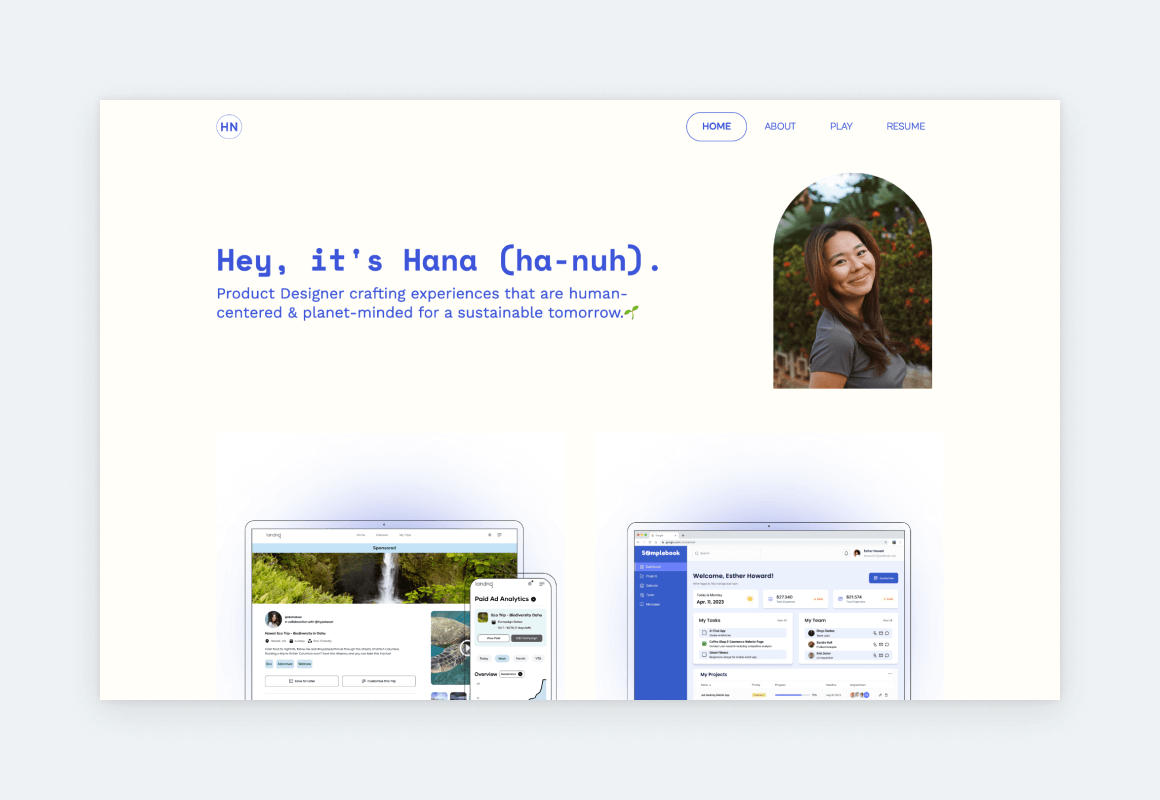
Hana used UXfolio’s Norman template as her base, transforming it into something unique with the available customization options and features. The intense blue accent color creates an exciting contrast with the white background. Her thumbnails are in perfect harmony because she created them with UXfolio’s Thumbnail designer. This feature allows you to design professional thumbnails inside UXfolio: just bring your designs and the rest is on us! Hana’s portfolio is proof that you can create a memorable UX portfolio without overdesigning it.
Karl Ligeti
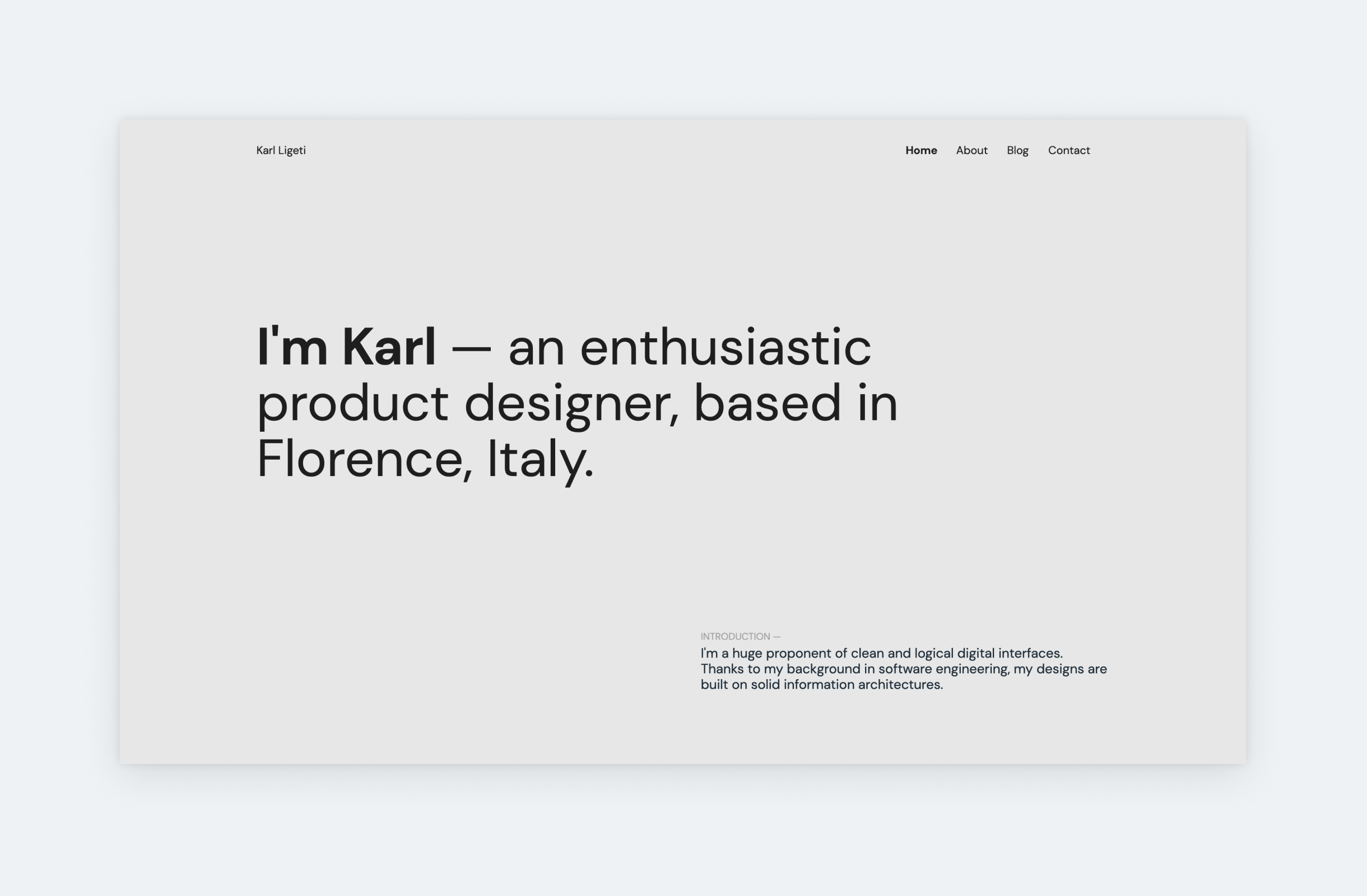
If you take a look at the best UX design portfolio examples, you’ll soon realize that the liberal use of whitespace is fundamental to all of them. Yet still, many designers – especially juniors – are frugal with it because they fear that their portfolio will look empty. If you’re unsure about whitespace, check out Karl’s portfolio: it has a minimalist design with plenty of whitespace, yet the it doesn’t look empty.
Tamera Atu
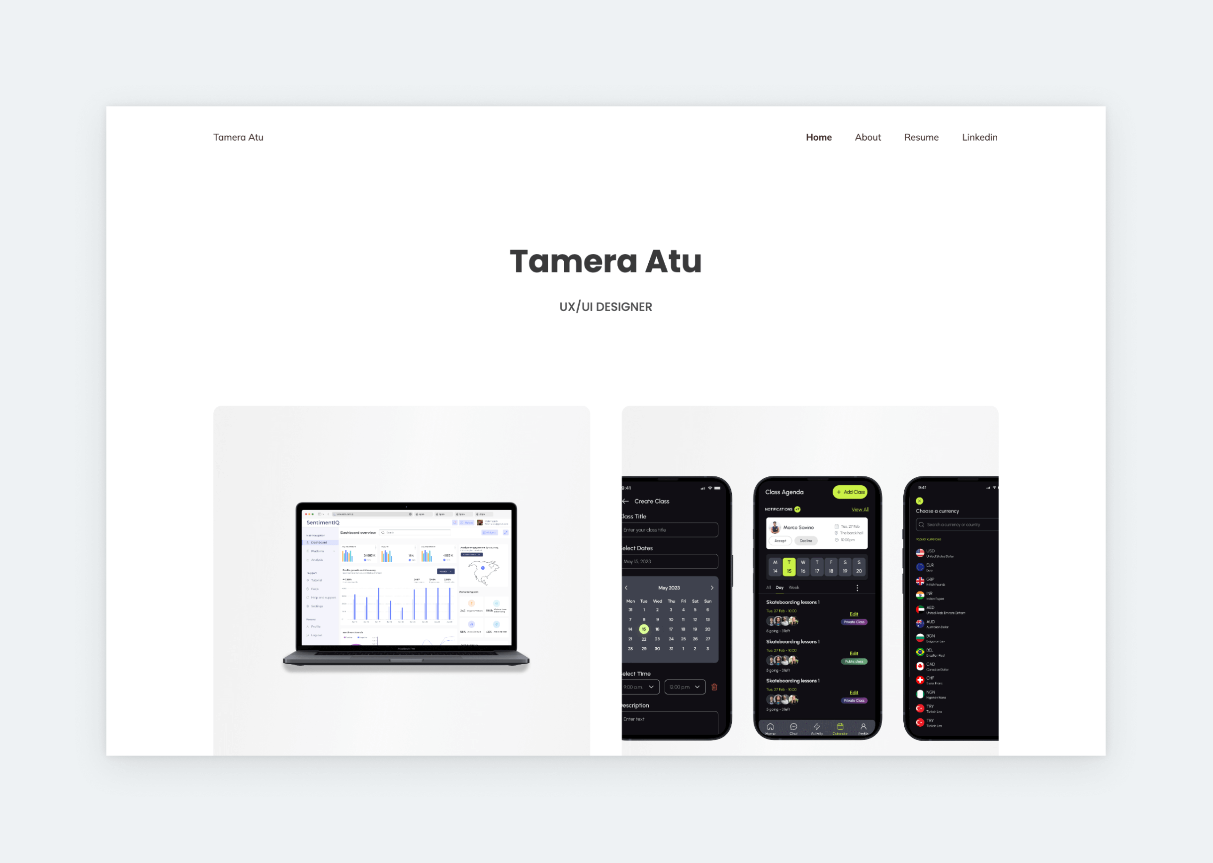
Since minimalism is always in style, you can’t go wrong with a stripped-down UX/UI portfolio, like Tamera’s. She utilized her architectural design experience to build a highly effective portfolio home page, using UXfolio’s Nominee template. The plain white background leads our attention to the pops of colors in the designs on her case study thumbnails, which is always the goal in a UX portfolio. Under the thumbnails, she writes quickfire summaries of the projects, including her role and the product profile. Like a true professional, she keeps everything short and sweet, luring you into opening a project to see more.
Max Berger
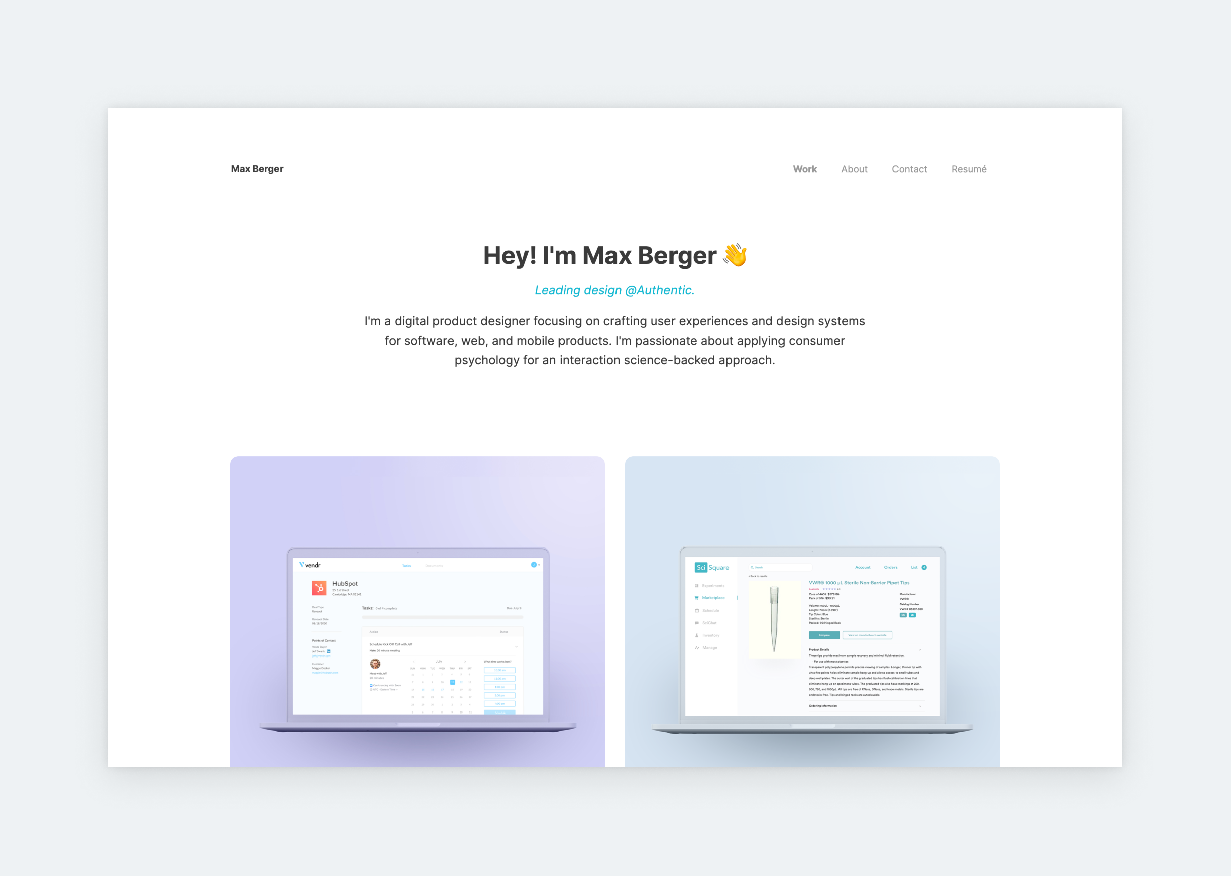
Max’s is the perfect example of what a UX portfolio should look like. Here’s why: it’s light and airy, with satisfying, pastel colors and soft, rounded corners. The UX of Max’s portfolio is also on point since the case studies are easy to reach, and the content is concise. And by making the case studies’ titles appear on hover, he didn’t compromise on the UI either. So, Max’s is a solid UX portfolio in all aspects.
Oscar Pantoja
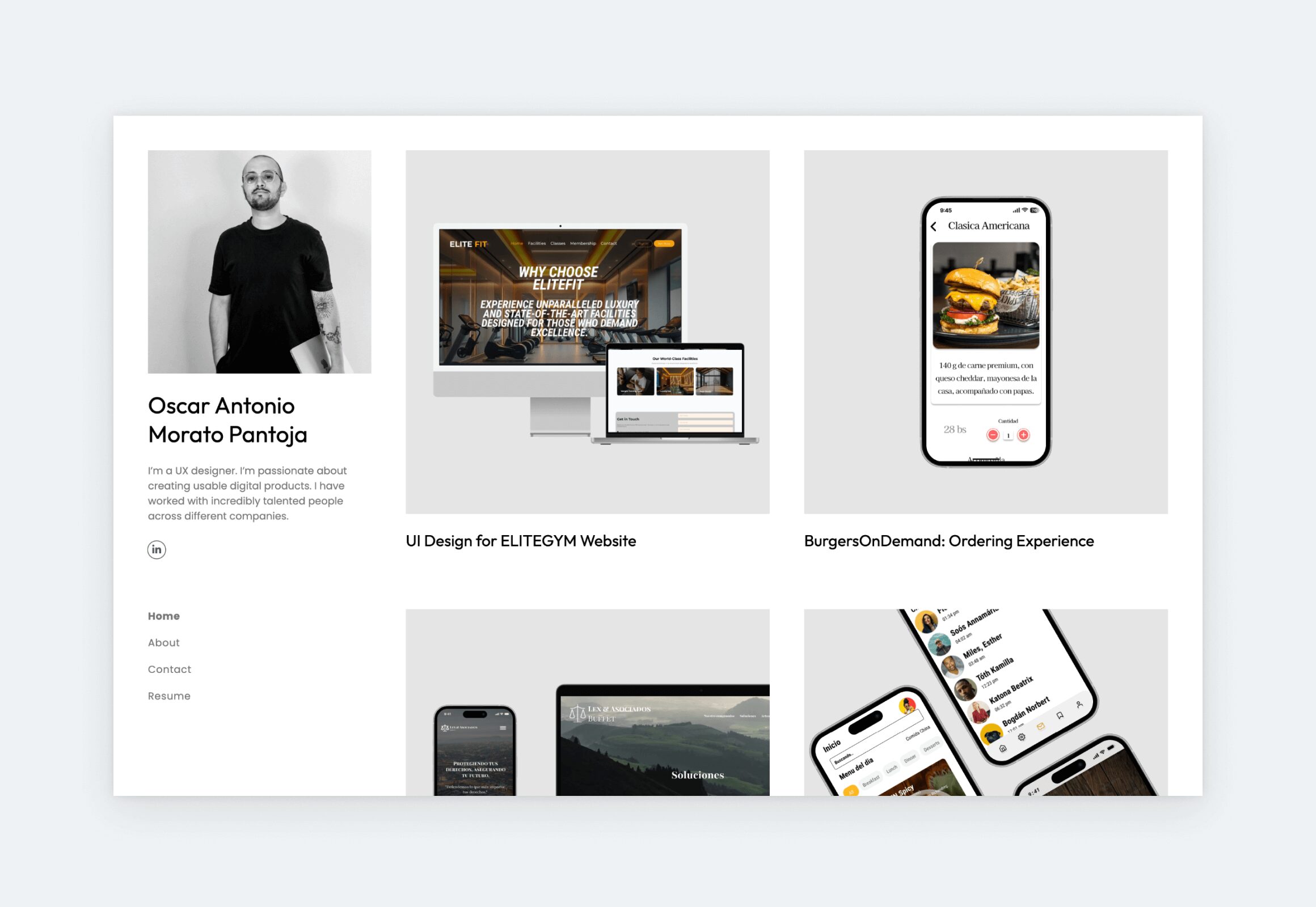
With five years of experience, it’s clear that Oscar knows how to present his work effectively. The UX portfolio template he chose skips a hero section and puts his case studies front and center. This choice reflects a strong understanding of his audience: recruiters, design leads, and others who want to get straight to the work. Featuring six UX case studies feels right for his level of experience: substantial without being too overwhelming. His project thumbnails were created with UXfolio’s Thumbnail designer, which explains their consistent, professional look.
Adrian Weber
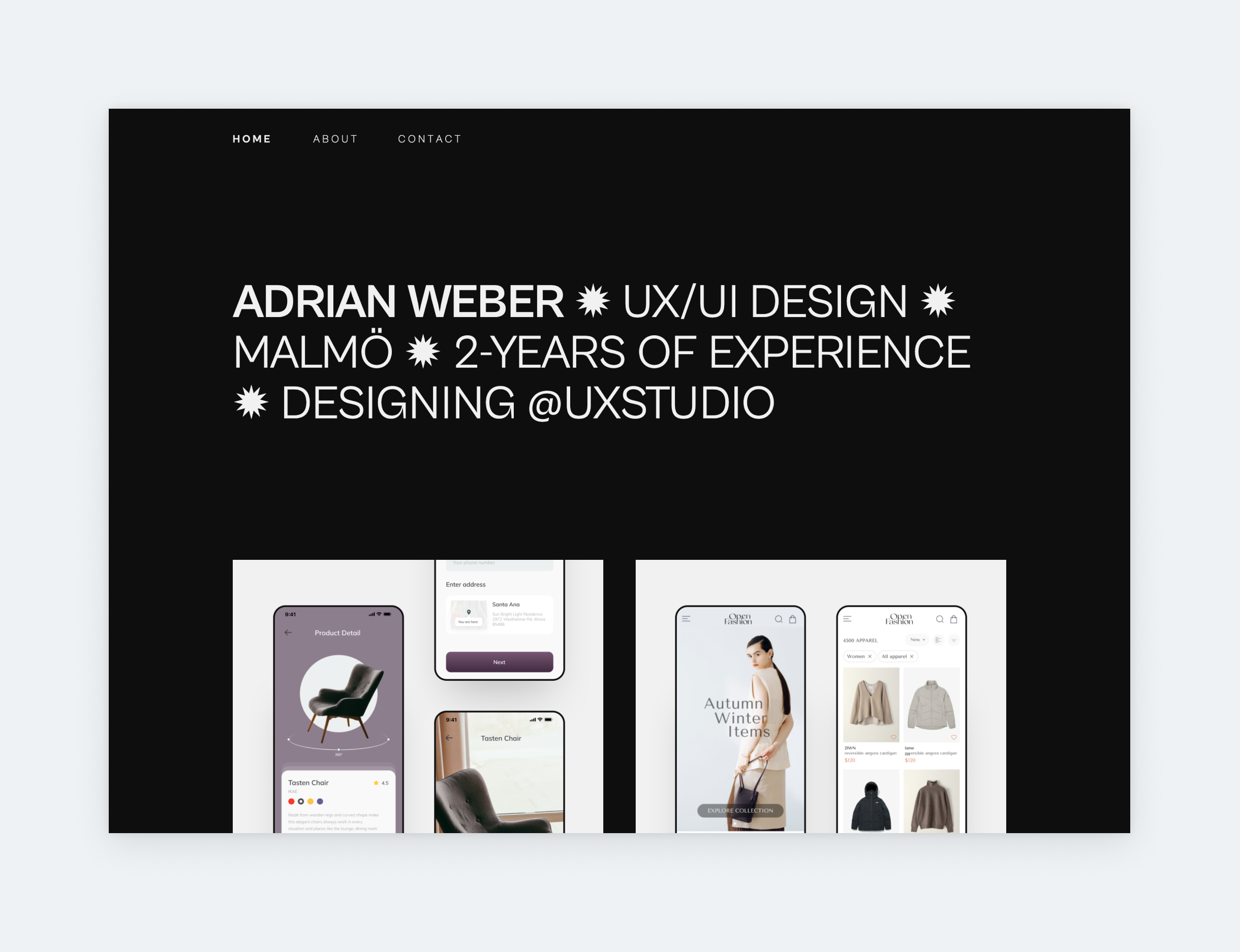
Look no further for a portfolio to use as a basis for yours. Roland’s portfolio conforms to all UX portfolio best practices: only the basics in his hero section, 3 of the most important pages in the navigation, and 2 case studies presented by matching thumbnails. It’s effortless, usable, and elegant.
Benny Sun
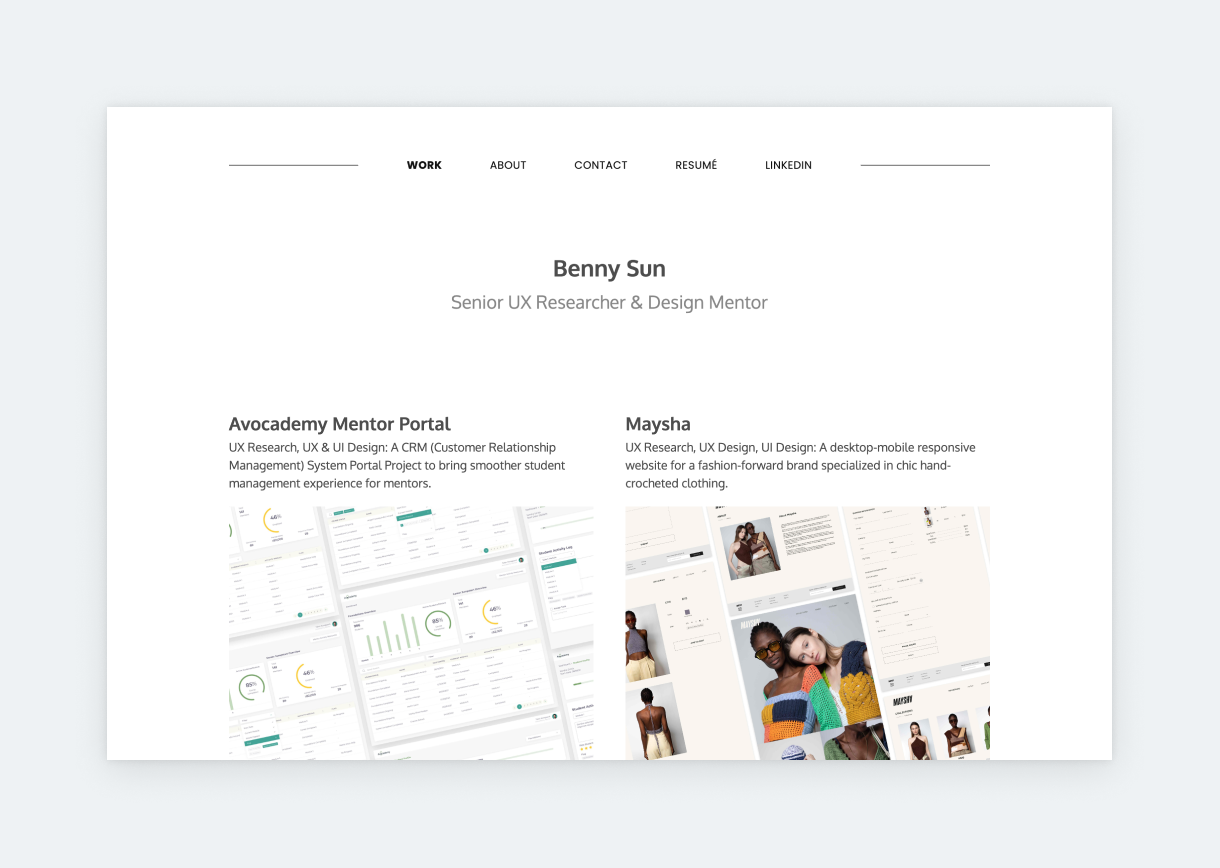
Benny’s portfolio is clean and professional. He saves his introduction to his About page to pull our attention toward the projects. That’s how we know we’re looking at a senior UXer’s portfolio. Experienced designers know that in UX, case studies get you the job. The reason is simple: case studies showcase your UX skills and process in action, underpinned with examples. Therefore, as our research revealed, most design leads go for case studies right away when opening a portfolio. Benny understands this, and he crafted this stunning, consistent portfolio accordingly.
Jessica
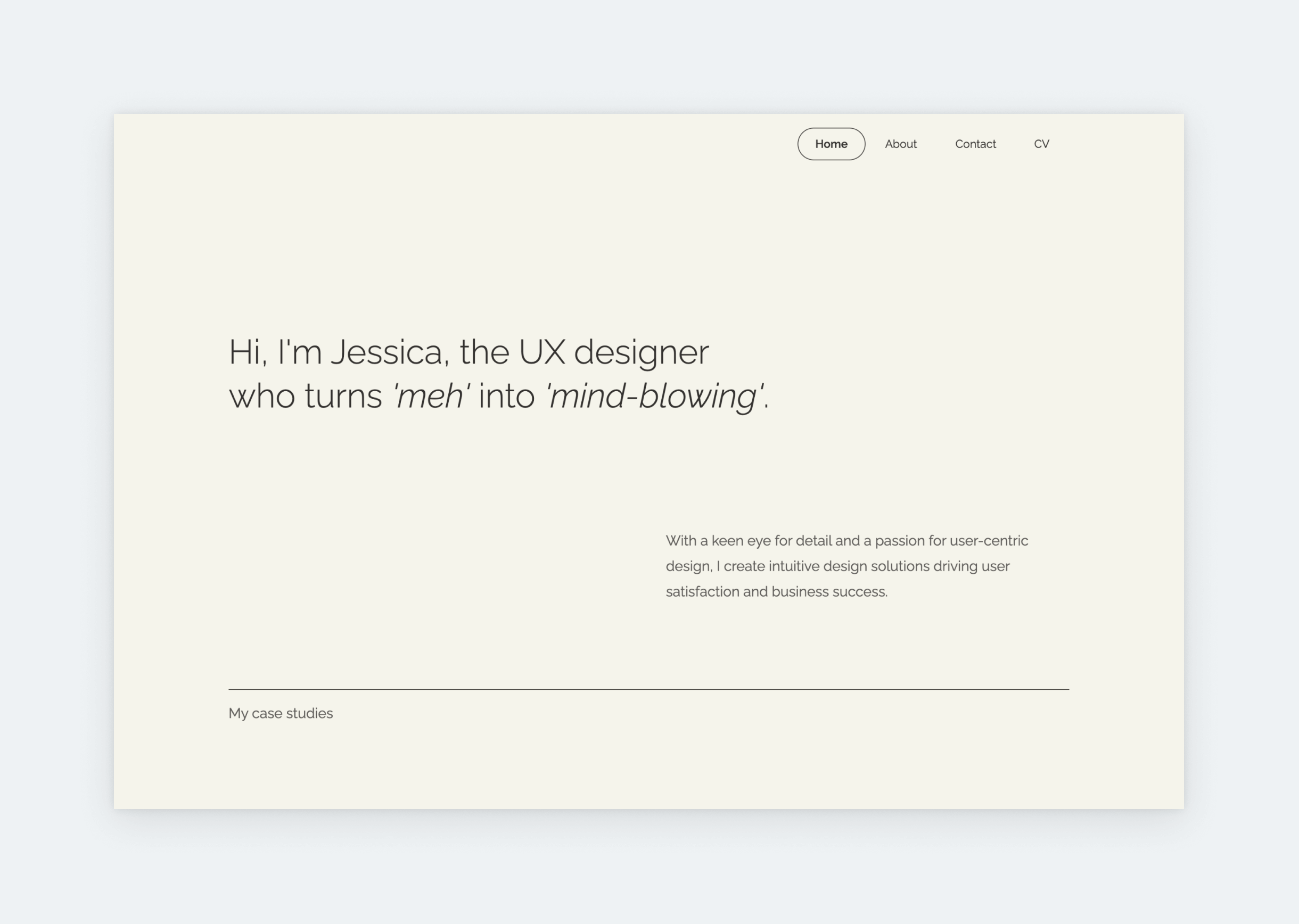
The right template with the right typography is all you need for a stunning UX design portfolio. The cream background of Jessica’s portfolio is in perfect harmony with the elegant, thin Raleway font she chose. Scrolling down, you’ll see harmonized case study thumbnails that she created with UXfolio’s Thumbnail designer. The outcome is just amazing. As soon as you land on this portfolio, you know that you can relax because its creator knows what she’s doing. This sense of relief is very important when it comes to landing a job, and it’s best achieved by following 5 simple guidelines: soothing color palette, consistent typography, brief copy, abundant whitespace, and coordinated visuals.
Rebeca Gordo
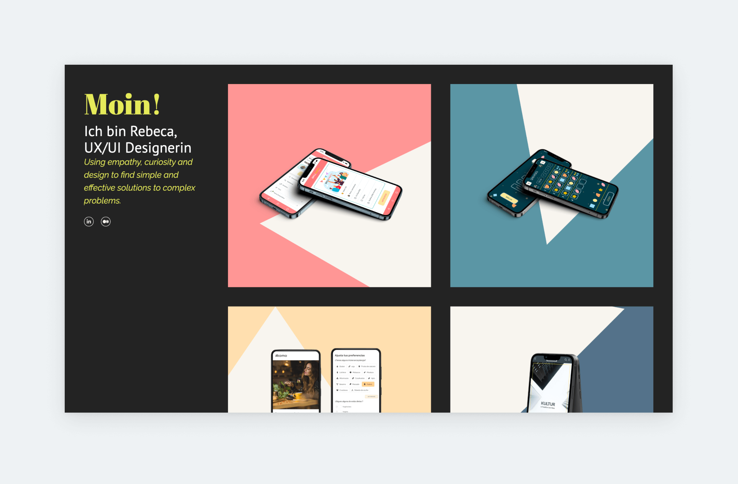
Combining neon colors with dark shades results in a modern and stylish look. But only if you hit the right balance with the neon, as it can turn obnoxious very easily. The best way around this is to use the neon as an accent, instead of a primary color, like Rebeca did in her UX/UI portfolio. As you can see, she used it to highlight some of her text, while keeping the rest of her portfolio, including her UX/UI case study thumbnails, easy on the eye. Don’t forget, that a solid dark background color – like Rebeca’s – is just as universal as a simple white background, however, it lends an effortless edge to the portfolio’s vibe. If it fits your personality, give it a try!
Rachel Baek
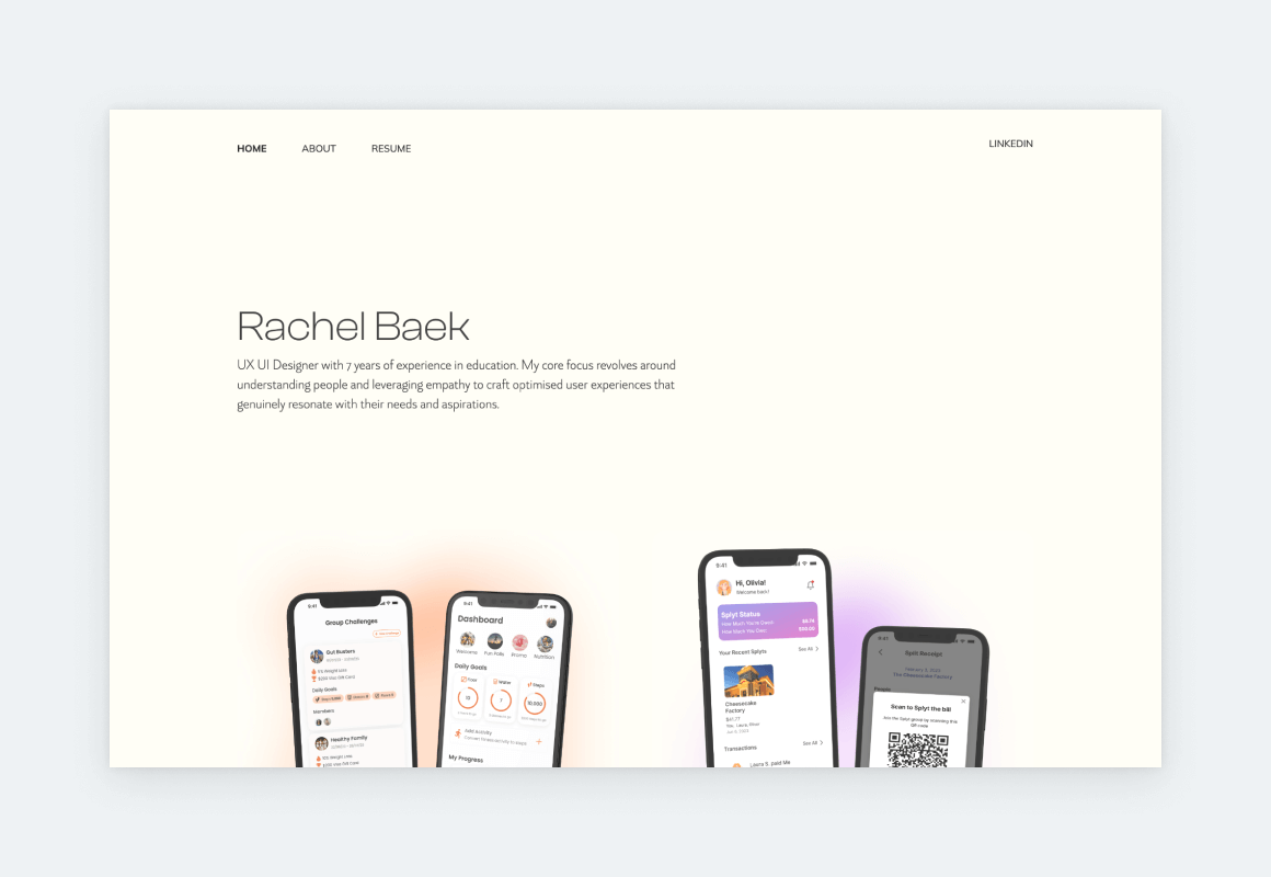
Rachel B is a UX designer and researcher who translates academic research into user-friendly products. Rachel’s portfolio is easy on the eye with its refined design and a comforting color scheme that reflects her personality and style. She follows UX portfolio best practices by using a consistent layout and clear navigation through and through. Her UX case studies highlight her hard skills, such as UX research, wireframing, and prototyping, as well as her soft skills, such as communication and collaboration. Rachel’s portfolio is a great example of how to portray, promote, and showcase a wide range of design skills in a captivating manner.
David Bornfirend
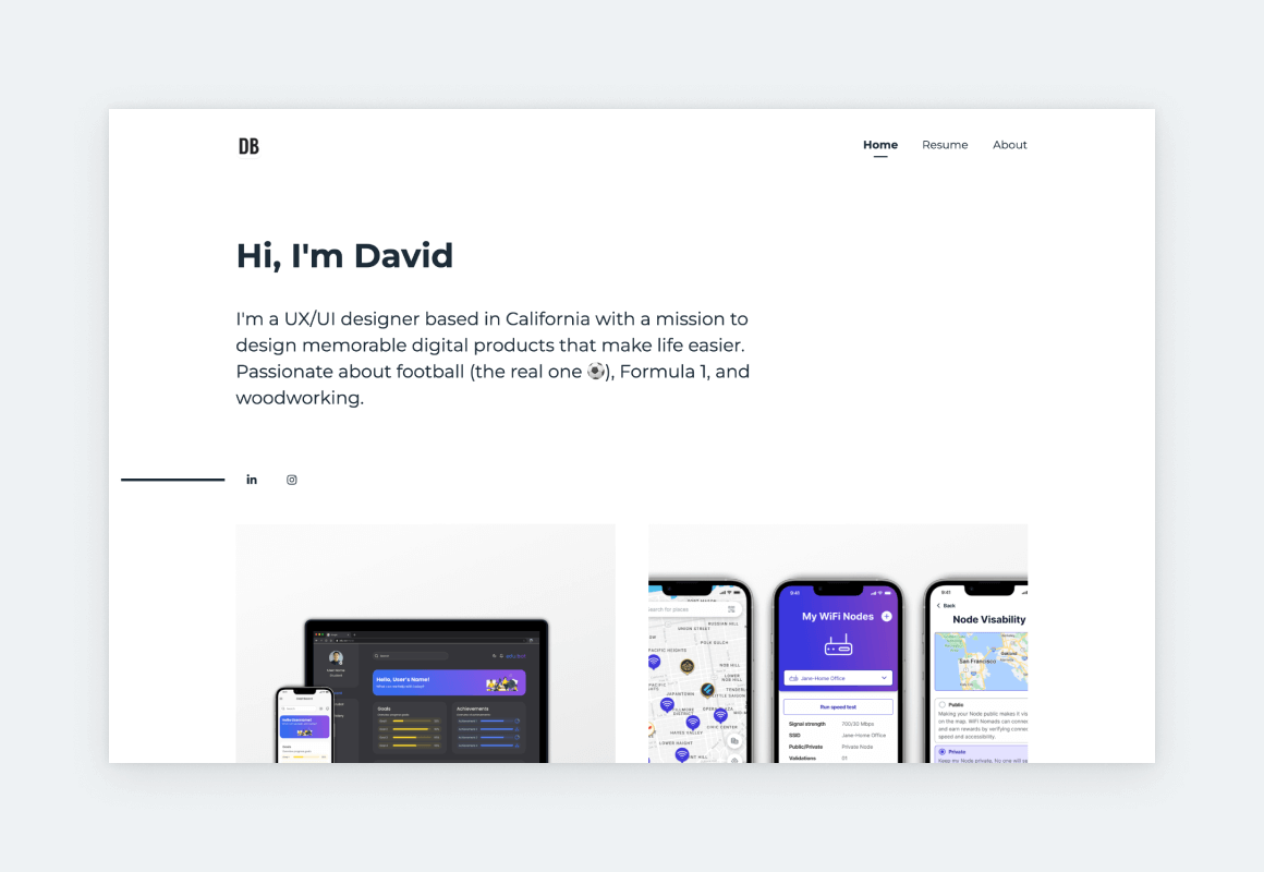
David’s UX portfolio website is a masterclass in clean and modern design. The homepage is pure yet attention-grabbing thanks to the large headline that sets the tone for the rest of the website. This direction, combined with the black-white-gray color palette, underlines David’s professionalism also apparent from his well-structured and stunning case studies, in which he achieves the perfect balance between copy and visuals.
Krista Laiho
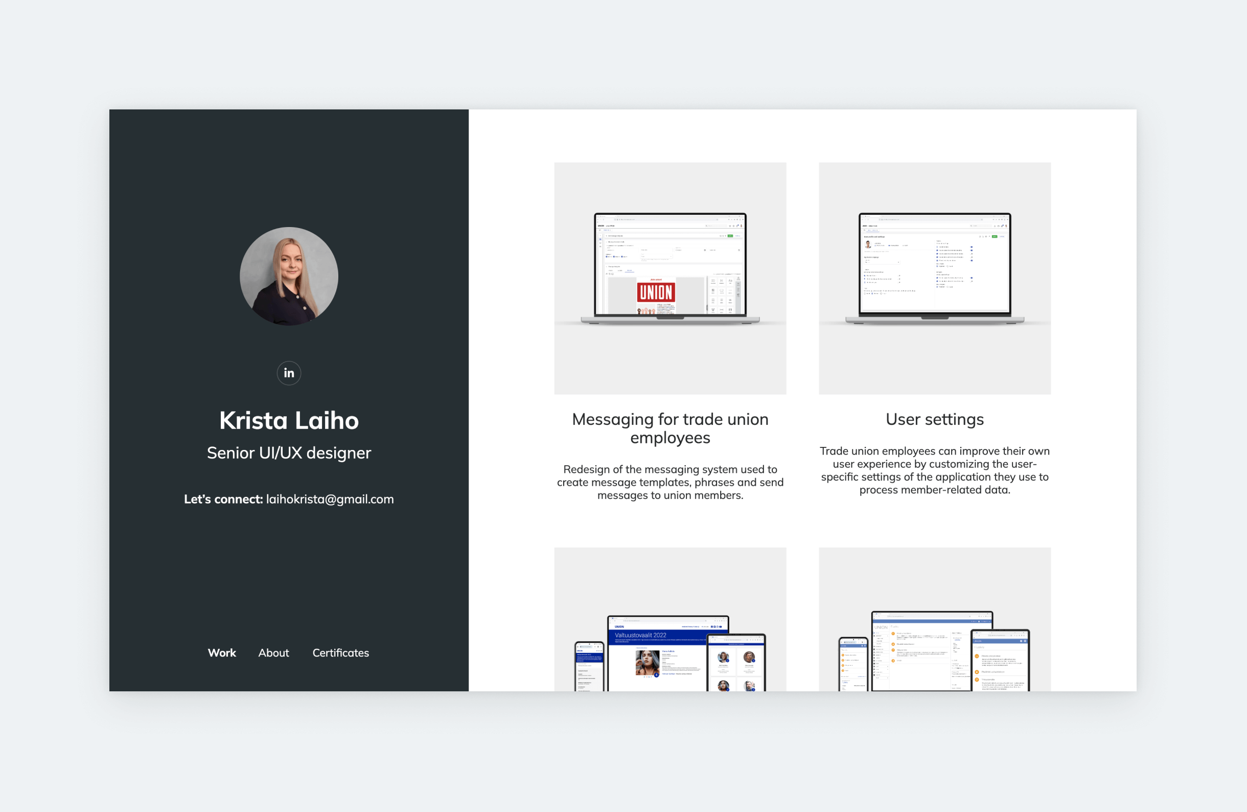
Krista is a senior UI/UX designer with nearly ten years of experience, which is clearly reflected in her portfolio. She uses a UX portfolio template with a sidebar, which calls for a specific approach to ensure that her visitors’ attention is on her projects. This involves keeping the intro on the right side brief and eliminating unnecessary design elements, so as to not steal the attention from the project grid on the other side of the screen. Krista included a portrait of herself right on the home page, which is usually advised against. However, in her case, it elevates the overall impression because it looks professionally done. Finally, she coordinated her project covers perfectly by using the same device mockup styles and colors, achieving an uber-polished effect.
Aniela Carolina
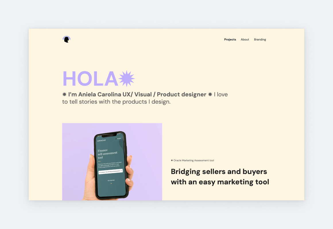
Aniela has been a designer for 10 years and her experience is obvious from the way she presents herself and her work. First of all, she chose a lovely accent color and applied it consistently throughout various elements of her pages. Furthermore, she uses icons and typography to create a sharp content hierarchy. The longer case study titles on her home page act as super-descriptive snippets into the projects. She included 3 projects in her portfolio, yet, as you scroll through her home page, it feels and looks more because of the project grid she chose in UXfolio’s editor.
Alyssa Ignacio
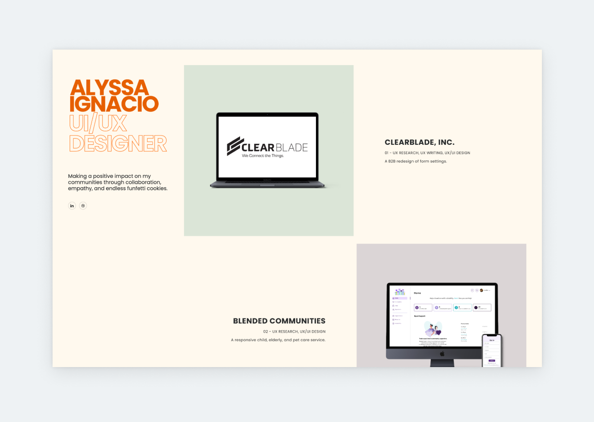
If you’re looking for the perfect, non-cliché designer statement, check out Alyssa’s: “Making a positive impact on my communities through collaboration, empathy, and endless funfetti cookies.” As simple as it is, this intro – mixed with the warm tones of her portfolio – makes her instantly likable. She keeps to this much-welcome conciseness throughout the portfolio. Though the whole UX/UI portfolio looks amazing, we’d like to highlight the type she used for the descriptions on her thumbnails: it’s small, stylish, yet still readable. Many designers are afraid of small font sizes, but with the right type, going small can create a chic effect without affecting usability or accessibility.
Julia Lauren
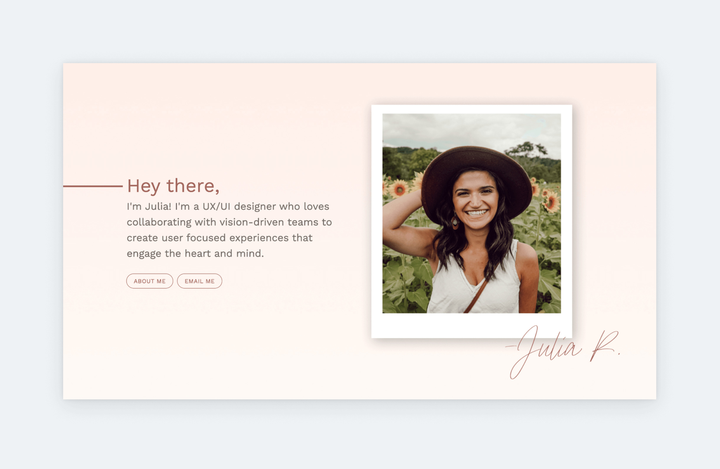
The best word to describe Julia’s portfolio is “cozy”. There’s something about a beige color palette that’s immediately comforting. These vibes are further strengthened by her portrait, which shows her with a beautiful, welcoming style. The only time you should feature your portrait as prominently on your home page as Julia does, is if you have a professional portrait that matches the color palette of your portfolio. Otherwise, it results in a tacky, resume-ish look, that’s not ideal for a designer. The rest of Julia’s portfolio is also exemplary. Take for example, how she ties her case study thumbnails together by using matching, soft gradients for their backgrounds.
Saba Fathi
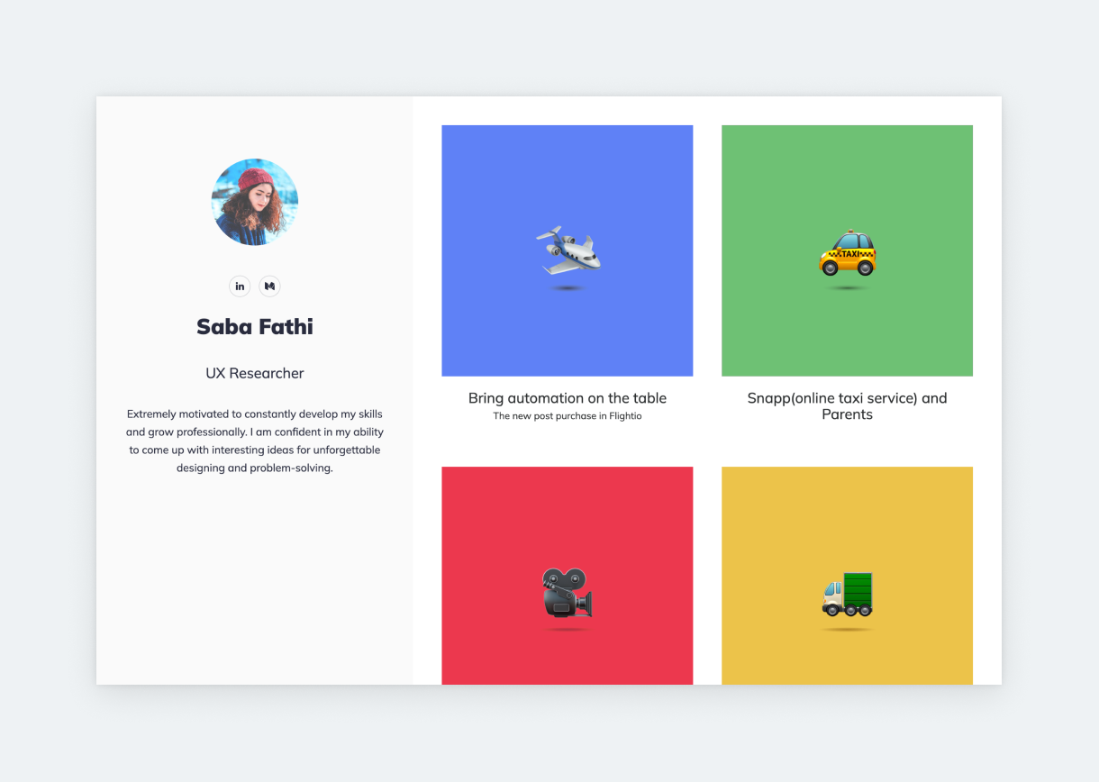
We hear many stories of researchers struggling with their UX research portfolio. Saba shows you how to tackle this challenge. Instead of going with the usual serious look, she created a playful portfolio, using bright colors and a handful of matching emojis. Emphasis on matching. This look works for Saba because the emojis on her project thumbnails are from the same source, and the colors she uses on her backgrounds are in perfect harmony.
Otilia Pandelea
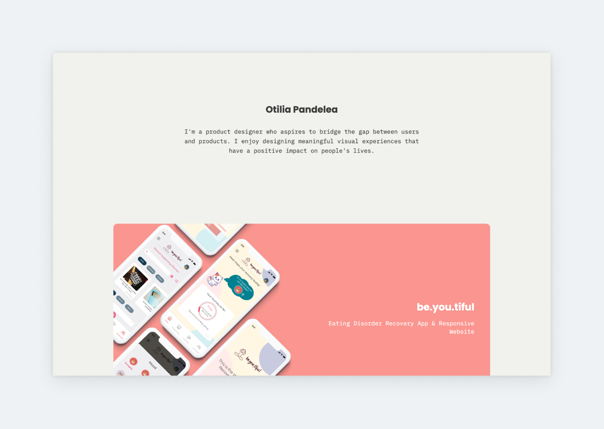
Otilia made her portfolio unique by using a stunning font pairing: Poppins with IBM Plex Mono. This pairing and the harmonious color story look wonderful throughout the entire portfolio. Her about page, with custom graphics, is another highlight. We love the two lists: one about her goals and another about her frustrations. It’s new. It’s fresh. Also, the two lists balance each other perfectly and make us feel in tune with her.
Ellen Shin
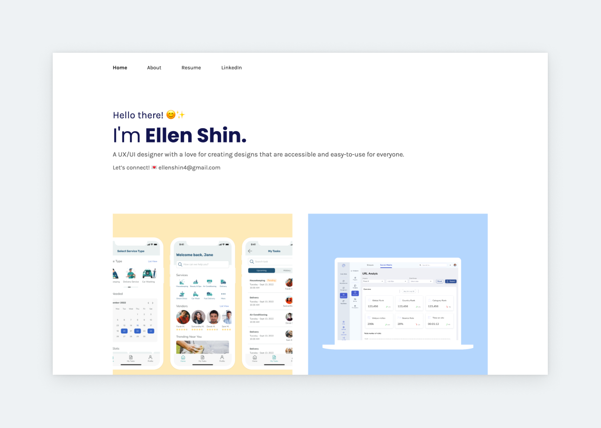
With positive emojis in her bio and colorful project thumbnails, Ellen brings warmness to this otherwise strict and minimal template. By using large typography under her thumbnails, she drives attention to the copy, which describes each project in a concise style. Ellen’s Neurotime case study is also featured on our showcase since it’s the textbook example of how it should be done: clear structure, plenty of visuals, and descriptive but not overlong. She uses UXfolio’s built-in device mockups to present her examples, ensuring that the case study looks visually consistent.
Amanda Su
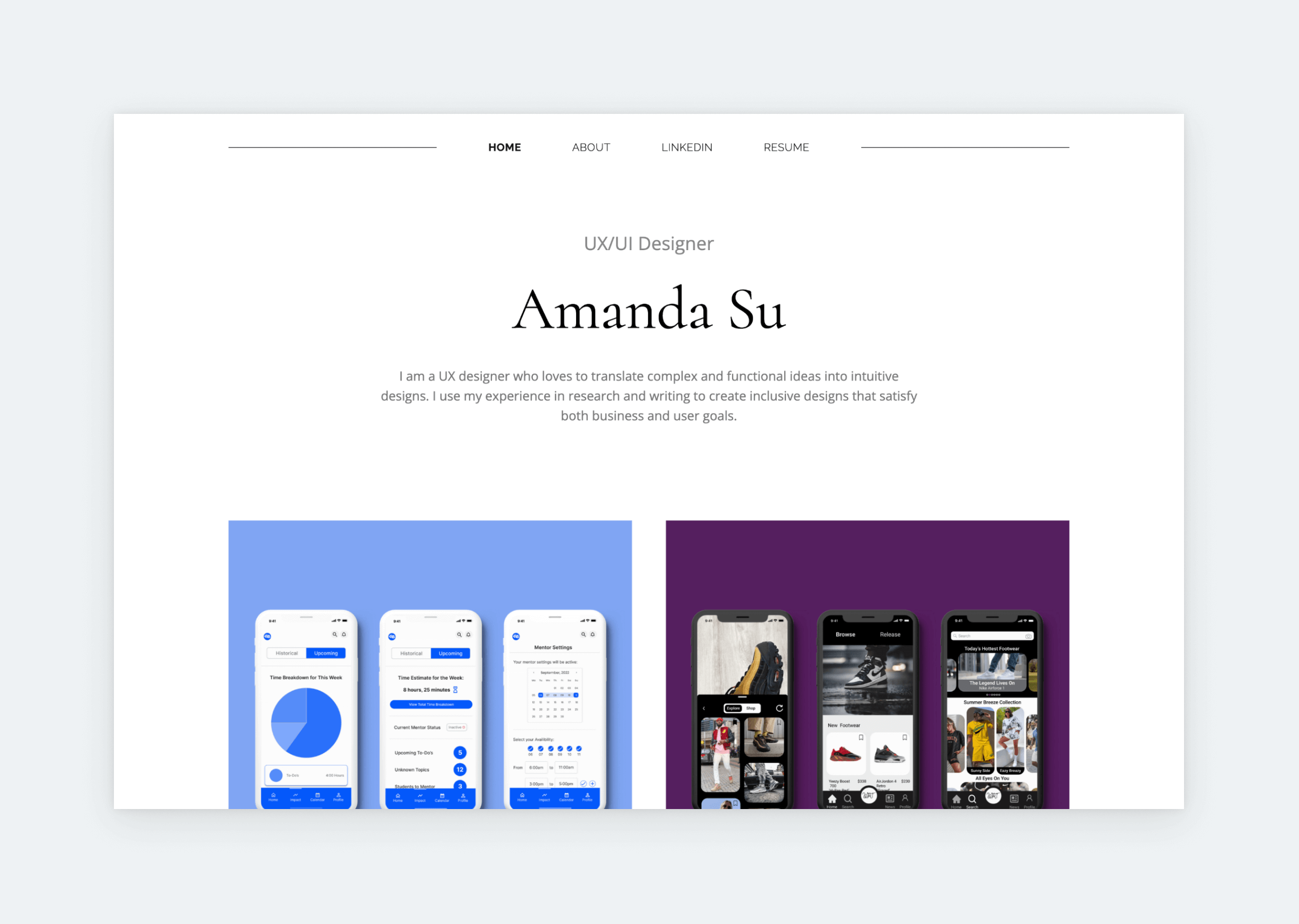
It’s rarer and rarer to find serif fonts in UX design portfolios. Amanda doesn’t feature them heavily either, but she found a way to include a stunning one – Cormorant – in her hero section in a very tasteful way: using it only for her name and matching it with a simple sans serif font. This creates a sleek, slightly serious, and very professional look that’s underpinned by the rest of her portfolio’s aesthetic choices, such as the solid-color thumbnail backgrounds. She did an excellent job with the case study titles as well, as they provide concise yet intriguing descriptions about the products in question.
What is a UX portfolio (and what hiring teams actually look for)?
A UX portfolio is a structured presentation of how you approach problems, make decisions, and create measurable outcomes through design. It’s built for hiring managers and design leads who need to evaluate not only your visuals, but your judgment under uncertainty.
At its core, a great UX portfolio demonstrates how you turn research signals, user needs, and business goals into solutions and measurable outcomes. Through well-structured UX case studies, it shows how you identify problems, weigh trade-offs, collaborate with stakeholders, and arrive at decisions that create value.
This is why effective portfolios don’t simply display finished screens. They communicate the reasoning behind key design choices, making the decision path visible to the viewer.
Pro tip: In real hiring situations, portfolios are rarely read line by line. Recruiters and design leads scan UX portfolios quickly, looking for a few clear signals. Your UX portfolio exists to represent these signals clearly and convincingly.
How to create decision narratives?
In a competitive market, your UX portfolio must show not just what you designed, but how and why you made the decisions that led to results.
When hiring teams review UX portfolios, every section of a case study (research, wireframes, testing, iteration, etc.) should form a clear decision trail. The goal is not to document every activity, but to show how insights led to specific design choices during the process.
Instead of presenting activities chronologically, strong UX case studies emphasize cause and effect:
- What insight revealed the problem?
- How did the team interpret that insight?
- What solution options were explored?
- Why was a specific direction chosen?
- What changed after the solution was implemented?
This creates a clear decision narrative that connects research, constraints, and outcomes.
For example, instead of writing:
“We redesigned the onboarding flow.”
Write:
“User interviews and analytics revealed a 42% drop-off at second step two of onboarding. We hypothesized that cognitive overload was causing friction due to too many options to choose from. After testing two simplified flows, we selected the version that reduced time-to-value by 28% and increased completion rates.”
This structure makes your reasoning visible.
How hiring teams evaluate a UX portfolio
Behind the scenes, hiring teams usually evaluate UX portfolios across three core dimensions: clarity of reasoning, ownership and scope, and measurable impact. These signals help reviewers determine whether a designer can move beyond visual execution and contribute to real product outcomes.
Strong UX portfolios make these evaluation signals easy to identify.
- Clarity of reasoning
Hiring teams want to understand how a designer arrives at decisions. A strong UX portfolio shows the thinking process behind the work, not just the final screens.
Reviewers typically look for clear connections between research insights, design choices, and the resulting product experience. This includes how:
- user research informed the design direction
- usability findings influenced iterations
- competing ideas or solutions were evaluated
- constraints shaped the final decision
Quick example: a well-structured UX case study might show how user interviews revealed a key friction point, how multiple design approaches were explored, and why a specific solution was selected.
- Ownership and scope
Another critical factor is understanding the designer’s role within the project. UX projects are often collaborative, involving product managers, researchers, engineers, and other designers.
Strong UX portfolios clearly explain:
- what part of the problem the designer owned
- which research processes they conducted or participated in
- how they collaborated with cross-functional teams
- whether they influenced product strategy or only visual execution
This context helps hiring managers to understand the scope of responsibility behind the work and the way you collaborate.
Quick example: a case study that explains how the designer worked with the product managers to define the problem space, led usability testing and collaborated with engineers during implementation provides a much clearer picture of their capabilities than a simple gallery of screens.
- Measurable impact
Beyond process and visuals, hiring teams are also interested in the outcomes of design work. UX portfolios that demonstrate measurable impact help reviewers understand whether design decisions produced meaningful improvements.
Even when exact metrics are unavailable, strong case studies often explain observable changes that resulted from the design work. What matters most is showing that design decisions were connected to real product outcomes, not just visual improvements.
Quick example: describing how usability testing revealed fewer errors after an iteration process can still demonstrate impact.
Why do most UX portfolios fail?
Most UX portfolios do not fail because the projects are weak. They fail because the thinking behind the work is difficult to understand.
Recruiters reviewing portfolios are not primarily looking for polished visuals or sophisticated UI patterns. What they want to see is how a designer approaches problems, makes decisions, and learns from the process.
This is where many UX portfolios break down. The case studies often focus on showing deliverables instead of explaining decisions. Screens, flows, and prototypes appear one after another, but the reader never clearly understands why those solutions were created.
Another common issue is structure. Many portfolios present information in the order the work happened instead of the order a reader needs to understand it. As a result, key insights appear too late, design decisions lack explanation, and the narrative becomes harder to follow.
Recruiters first scan the structure to decide whether the project is worth deeper attention. If the structure does not clearly communicate the problem, the process, and the outcome, the project can lose attention within seconds.
A helpful way to think about this is to imagine that a case study guides the reader through your decision-making process. Instead of asking “What should I show?”, the more useful question is: “What does the reader need to understand before the next step makes sense?”
Pro tip: Focus on explaining how research informed the problem definition, how different solutions were explored, and how your final design direction was chosen. Keep in mind that they also clarify your role in the project.
What a UX portfolio needs to show
Decision-makers review UX portfolios under significant time pressure. Your portfolio must communicate its value quickly and without ambiguity. Reviewers should be able to understand the context of your work, the structure of your case studies, and the outcomes of your decisions within minutes.
To make this possible, a strong UX portfolio typically includes several key elements that make your work easier to interpret during portfolio reviews.
- Detailed UX case studies
A strong UX portfolio focuses on depth over quantity. Three to four well-structured case studies are enough to demonstrate range, consistency, and repeatability. Instead of presenting many small projects, concentrate on a limited number of case studies that show different types of product challenges.
When hiring teams review multiple UX portfolio examples from the same designer, they often look for patterns in how problems are approached and resolved.
- Clear project context
Before reviewers can evaluate your design work, they need to understand the environment in which the project took place.
Each UX case study should establish the essential context early. This includes the type of product, the users involved, the goals behind the project, and any constraints that influenced the design process.
Providing this background allows hiring managers to interpret the decisions shown later in the case study.
- Evidence of exploration and development
Strong UX portfolio examples show that ideas evolved through exploration rather than appearing fully formed.
Including selected artifacts (early sketches, simplified wireframes, alternative interaction concepts, or testing insights for example) help reviewers to understand how your thinking developed before reaching the final design.
You should include enough evidence to show that the solution emerged through investigation, comparison, and refinement.
- Business and product context
Real-world design rarely happens in isolation. Strong UX case studies also acknowledge the broader product environment in which decisions were made.
This might include stakeholder expectations, shifting priorities, technical limitations, or time constraints that influenced the direction of the work. Demonstrating awareness of these factors shows that you understand how design decisions interact with product strategy and organizational realities.
- Observable outcomes
Hiring teams ultimately want to understand whether your work created meaningful change.
Whenever possible, include evidence that the design influenced the product experience. This could involve improved usability, higher task completion rates, increased engagement, reduced friction in key user journeys, or other observable improvements.
Even when precise metrics are unavailable, describing the effects of the work helps reviewers understand the impact of your design decisions.
- Consistent problem-solving patterns
A great UX portfolio example reveals patterns in how you interpret problems, structure your thinking, and move from research insights to practical solutions. These patterns suggest that your approach can be transferred to different teams, products, and contexts.
When reviewers see repeatable problem-solving behavior across multiple case studies, they can focus on your long-term potential as well.
- Reflection and professional growth
Reflection might include what you would approach differently today, how the project changed your thinking, or what insights influenced your later work. This kind of perspective signals professional maturity and a willingness to improve over time.
When used carefully, reflection transforms a case study from a simple project description into a record of your development.
- Bringing it all together
At its best, a UX portfolio becomes a structured explanation of how you operate in real product environments. It shows how you move from ambiguous problems to practical solutions, while navigating the constraints and complexities that shape real-world design work.
When your case studies communicate context, exploration, and outcomes clearly, reviewers can evaluate your work more confidently and compare it with other UX portfolio examples during the hiring process.
Takeaways from the best UX portfolios
After analyzing some of the best UX portfolios, a clear pattern emerges. Successful portfolios follow a recognizable structure, not because designers lack creativity, but because hiring teams rely on familiar evaluation frameworks.
This “UX portfolio formula” balances clarity, usability, and depth. It helps reviewers quickly orient themselves while making your decision-making process easy to evaluate.
Let’s break down the structural elements that consistently appear in impactful UX portfolios.
9 takeaways from the best UX portfolios
- Prioritize clarity over visual complexity
Keep layouts simple and information hierarchy clear. Using descriptive headings, lists while highlighting important information would definitely help to guide the reader. This ensures reviewers can scan your work quickly and focus on your UX portfolio examples.
- Context appears before solution
Introduce the problem space before showing the interface. Context helps reviewers see whether your solution addresses real user challenges.
- Tell a coherent story in each case study
Organize projects into a narrative: problem – exploration – solution – outcome. This makes your design thinking easy to follow.
- Highlight key decisions
Focus on meaningful design choices rather than every activity. Reviewers want to understand your judgement and approach.
- Use evidence to support your story
Include selected artifacts like research insights, sketches, wireframes, or testing results. Evidence demonstrates how your solutions evolved.
- Make your portfolio communicate quickly
Show core messages and impact early. Reviewers often form impressions within minutes, so avoid burying essential information.
- Show consistency across projects
Repeatable problem-solving patterns across multiple UX case studies signal reliability and transferable skills.
- Ground work in real product environments
Acknowledge constraints: technical limits, business priorities, or stakeholder influence. This shows understanding of real-world design challenges.
- Reflect on professional growth
Briefly note lessons learned or insights gained. Reflection demonstrates maturity and a capacity to improve.
Keep in mind: Following these patterns helps you create UX portfolio examples that stand out. They show not only polished designs but also thoughtful, repeatable problem-solving and professional growth.
Home page
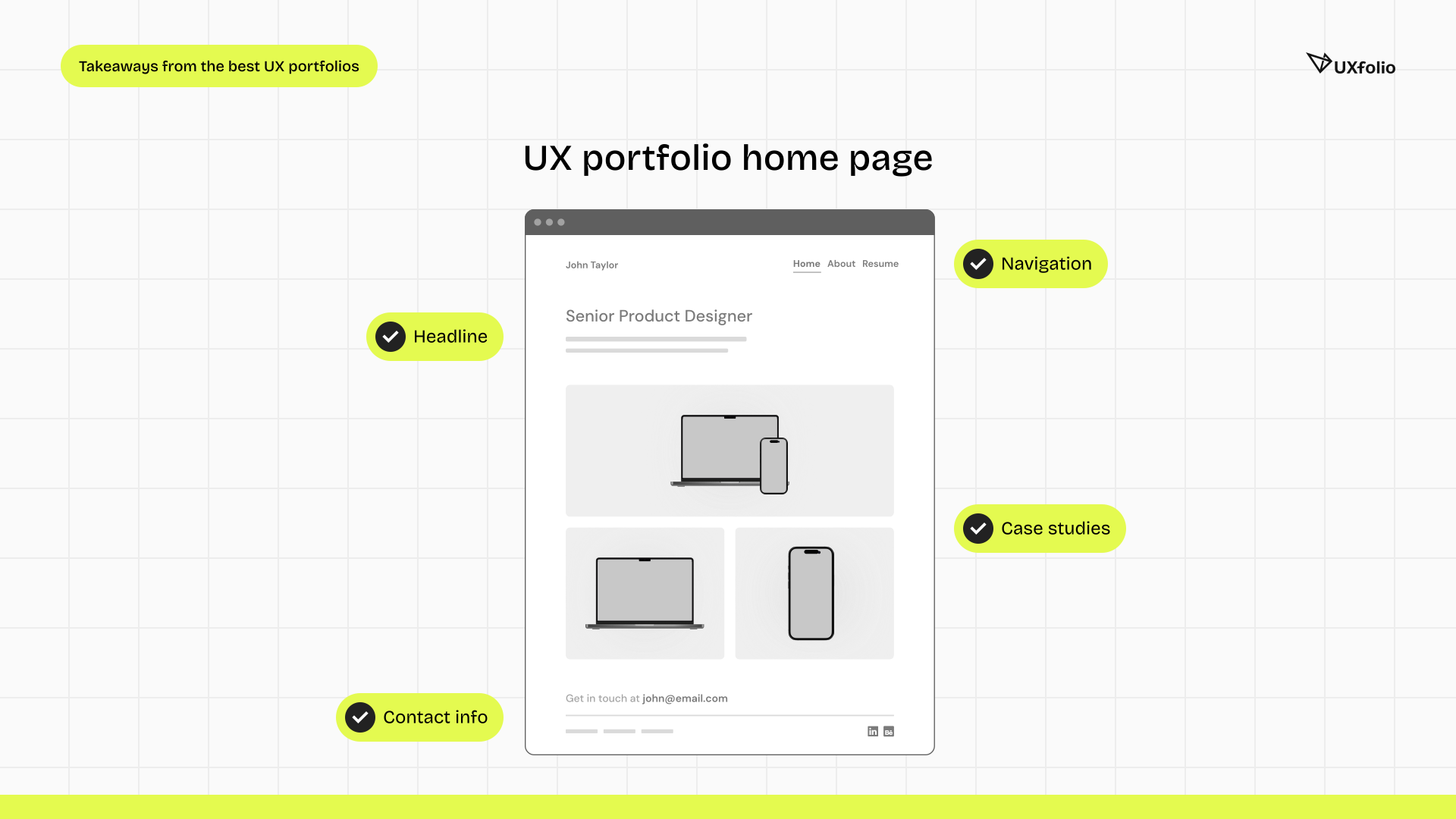
Your UX portfolio home page is your first interaction with a reviewer. Within seconds, they decide whether to continue exploring or leave.
An effective home page must accomplish two things:
- Create immediate visual trust – it should look professional, intentional, and aligned with your design sensibility.
- Provide instant orientation – visitors should understand who you are and where to click next without effort.
A strong UX portfolio home page typically includes:
- Your name
- Your occupation or title
- A concise designer statement or positioning headline
- Clear links or thumbnails to case studies
- Simple navigation to pages such as About, Resume, and Contact
Case study thumbnails
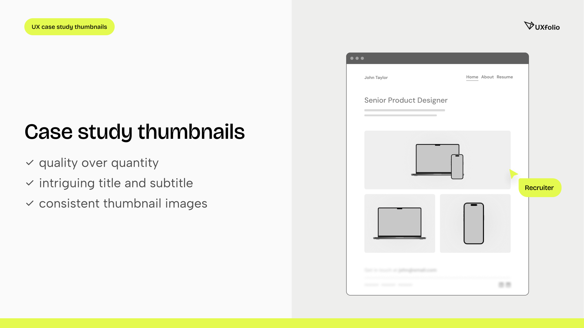
When a reviewer lands on your UX portfolio home page, they make a micro-decision within seconds: which project is worth their time? Case study thumbnails are not just decorative elements, they are navigational triggers. Each thumbnail must communicate context, relevance, and professionalism at a glance.
If a reviewer cannot quickly understand the type of problem, domain, or impact behind a project, they are unlikely to click.
Pro tipp: Thumbnails function as UX components themselves. Their usability directly influences whether your work gets evaluated at all.
The formula for great case study thumbnails
Case study thumbnails are often the most influential elements of your UX portfolio home page, because they determine which projects receive attention and which are ignored.
Because case studies demonstrate your skills and process, your thumbnails must communicate value immediately. A weak thumbnail reduces curiosity. A strong one signals relevance and professionalism.
Follow these five principles:
- Use descriptive titles and subtitles
Your thumbnail title should communicate the project context at a glance. Avoid vague labels like “UX Case Study” or “Mobile App Project.” Instead, use titles that hint at the problem you solved or the product you worked on.
Examples:
- Improving onboarding conversion for a fintech app
- Redesigning a complex B2B analytics dashboard
- Simplifying a multi-step checkout flow
A short subtitle can add clarity by mentioning your role, the product type, or the focus of the project. Clear labeling immediately increases the chance that hiring managers will click into the case study.
- Ensure visual consistency across thumbnails
A strong UX portfolio does not present projects as isolated artifacts. The thumbnails should feel like parts of a cohesive system. When thumbnails use different layouts, spacing, or visual styles, the home page starts to feel chaotic and unstructured.
This is exactly why structured case study grids are so valuable. Instead of manually arranging portfolio cards and hoping they align correctly, tools like UXfolio’s Case Study Grid automatically organize thumbnails into a clean, balanced layout.
- Use the same device mockup style
Many UX portfolios display interface previews inside device frames. While this can work well, mixing different styles across thumbnails often creates visual noise. Most of the time it’s recommended to choose one presentation style and stick with it.
However, manually preparing consistent thumbnails can quickly become time-consuming. This is where dedicated tools make a major difference.
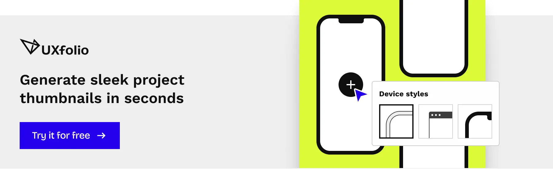
UXfolio’s Thumbnail Designer helps you generate clean, consistent case study thumbnails directly inside your portfolio workflow. Instead of manually designing each cover image, you can quickly create structured thumbnails that maintain visual consistency across the entire portfolio.
You can easily customize thumbnails using different device layouts, switch between a wide range of mockup styles, or set a personal background by selecting an image from our gallery or uploading your own.
- Harmonize backgrounds
Backgrounds influence how cohesive your portfolio feels as a whole. If every thumbnail uses completely different colors, gradients, or textures, the home page can become visually overwhelming. Instead, try to aim for subtle harmony across thumbnails.
This might mean:
- limiting the color palette
- using similar gradient styles
- maintaining comparable contrast levels
A structured portfolio grid helps reinforce this harmony because the thumbnails appear together as a visual system rather than disconnected elements.
- Match the home page aesthetic
Thumbnails should support the overall visual language of your portfolio. If the portfolio uses a minimal, content-first design, overly decorative thumbnails can feel distracting. In case the portfolio has a bold visual identity, thumbnails should reinforce that tone.
When thumbnails align with the design of the home page, the entire portfolio feels more intentional and professionally curated.
Platforms like UXfolio combining two key features:
- Thumbnail Designer, which helps you quickly generate professional case study previews
- Case Study Grid, which automatically organizes those thumbnails into a structured, visually consistent layout
Together, these features ensure that your case studies are not only well written but also discoverable and easy to explore. Keep in mind that this fact can dramatically increase the chances that your strongest UX case studies will actually be seen.
UX case studies
UX goes beyond polished screens. That’s why UX leads and recruiters look for structured thinking, collaboration maturity, and measurable impact within case studies.
A well-written UX case study should explain how a problem emerged, how it was explored, what decisions were made, and what changed as a result.
Great UX case studies used to combine several elements:
- Logical thought processes that connect research to decisions
- Hard skills such as research methods, prototyping, testing, and iteration
- Soft skills including communication, teamwork, and independent ownership
- Evidence-based decision-making grounded in research and data
- Adaptability and learning demonstrated through iteration and reflection
Your case studies should clearly show how you approach problems, apply UX methods appropriately, collaborate with stakeholders, and evolve solutions based on feedback.
This is where your UX portfolio proves professional capability.
The challenge of writing strong UX case studies
Despite their importance, writing effective UX case studies is one of the most difficult parts of building a portfolio.
Many designers struggle with questions like:
- What structure should a case study follow?
- How much process detail is enough?
- How can complex projects be explained clearly?
- How do you present your contribution without sounding vague or overly technical?
As a result, many portfolios end up either too shallow (showing only final screens) or too dense (documenting every step without a clear narrative).
Strong UX case studies require both clear structure and precise communication.
Structuring case studies effectively
A good case study guides the reader through the project in a logical sequence: context, problem, exploration, decisions, and outcomes.
Structuring UX case studies can be challenging, especially when you are unsure what hiring teams expect to see. UXfolio’s Case Study Generator helps by guiding you through the core sections commonly found in strong UX portfolio examples.
You simply select the sections relevant to your project, upload a key screen, and add a short description. The tool then creates a structured starting point, helping you organize your case study around the decisions, trade-offs, and outcomes that matter most.
Instead of struggling with a blank page, you can concentrate on the reasoning behind your design while the framework keeps your case study clear and logically organized.
Communicating ideas clearly
Even when designers know what happened in a project, translating that experience into clear, professional writing can be difficult.
UX case studies must balance several goals at once:
- explain complex work simply
- avoid unnecessary jargon
- highlight key decisions without oversimplifying
- maintain a professional, concise tone
This is where writing support tools can help. Features like UXfolio’s AI Text Enhancement assist designers in refining their case study content by improving clarity, tone, and readability.
The goal is not to replace the designer’s voice, but to make their thinking easier to communicate.

Nice-to-haves in a UX portfolio
While your home page and case studies form the core of your UX portfolio, additional pages enhance usability and credibility.
Consider including:
- About / Bio page – Adds personality and context to your professional story.
- UX designer resume – Provides structured career information for quick scanning.
- Contact page – Reduces friction for recruiters.
- Social links – Demonstrates professional presence and thought leadership.
These elements make your UX portfolio more complete, navigable, and trustworthy.
How to showcase skills in your UX portfolio?
At UXfolio, we’ve spoken with respected design leaders about what they look for in portfolios, including Design Sprint inventor Jake Knapp, behavioral scientist Susan Weinschenk, UX industry veteran Jared Spool, and former InVision lead designer Pablo Stanley.
Across conversations, one principle consistently emerged: strong UX portfolios reveal the thinking behind the work.
While polished visuals matter, hiring teams want to understand how you arrived at your solutions. They want to see your design stories, how research informed decisions, how constraints shaped direction, and how iteration improved outcomes.
To effectively showcase skills in your UX portfolio, present your process step-by-step. Make your reasoning visible. Explain your trade-offs. Share your learning moments.
Design output attracts attention. Decision clarity earns trust.
Tell your design story with UXfolio
If you’re looking for a structured way to build your UX portfolio, UXfolio was created specifically for UX professionals.
It provides guided questions to help you articulate your decision narratives, sections for impact metrics, prototype embedding, scrollable mockups, galleries, and structured case study layouts.
Instead of starting from a blank page, you can focus on what matters most: clearly communicating your process, decisions, and results.
Explore UXfolio and start building a UX portfolio that demonstrates not only what you designed, but how you think.
Frequently asked questions
What makes a UX portfolio stand out to hiring managers?
A strong portfolio stands out when it reduces uncertainty. Hiring managers are not only evaluating visual quality, they are assessing how you think, how you make decisions, and how you handle complexity. Clear reasoning, well-documented trade-offs, and measurable outcomes signal professional maturity far more than polished mockups alone.
How detailed should UX case studies be?
Detail should serve clarity, not volume. A case study needs enough depth to explain the problem space, your reasoning, the constraints, and the results. Overloading it with raw research data or excessive screenshots can dilute the narrative. The goal is structured storytelling that shows decision-making from start to finish, typically within 500-600 words.
Is visual design the most important part of a UX portfolio?
No. Visual execution matters, but it is rarely the deciding factor. Recruiters and design leads primarily look for problem-solving ability, research-informed decisions, collaboration, and impact. Strong visuals support credibility, but the underlying process is what differentiates experienced designers.
Should junior designers include metrics in their case studies?
Yes, when possible. Even small-scale projects can demonstrate measurable change, such as improved usability test success rates, reduced task completion time, or clearer information hierarchy. If hard metrics are unavailable, qualitative outcomes and structured feedback can still demonstrate impact.
How many case studies should a UX portfolio include?
Three well-developed case studies are typically more effective than eight shallow ones. Each project should demonstrate a different challenge or skill dimension to showcase range and adaptability. Quality consistently outweighs quantity.
Do hiring teams expect to see failed experiments?
Increasingly, yes. Transparent reflection on what did not work, and how you adapted signals growth mindset and analytical thinking. Failure, when contextualized properly, strengthens credibility rather than weakens it.
Should a UX portfolio be tailored for different roles?
When possible, yes. Subtle adjustments in emphasis, such as highlighting research depth, business impact, or UI refinement can align your portfolio more closely with specific job expectations without rewriting it entirely.
You must be logged in to post a comment.