Page content
- What makes a good UX case study page design?
- How to use images in your case studies?
- 1. Always start with a plan
- 2. Redesign your visuals specifically for your case study
- 3. Pay attention to image ratios
- 4. Follow the style of your project
- 5. Use consistent typography on your images
- 6. Use matching colors on your images
- 7. Use consistent icons and illustrations
- 8. Shadows and strokes make a huge difference
- 9. Always preview your work
- 10. Use templates, but customize them
- How to use color in your case studies?
- How to use white space in your case studies?
- Why is white space so important?
- Where to add white spaces in your case studies?
- Frequently Asked Questions
In UX portfolios, case studies are where hiring managers spend most of their time. The design and structure of your case study pages directly affect how clearly your thinking comes across.
Well-designed UX case study pages are what separate strong UX portfolio examples from average ones.
This guide focuses specifically on UX case study design for portfolios. It shows how to create visually consistent, scannable case study pages that support fast understanding and strong first impressions.
Follow our designers’ tips to create visually consistent case studies using UXfolio’s editor. This page compiles all the information you need to bring out the absolute most of your work.
What makes a good UX case study page design?
A good UX case study page is not about visual polish or UI trends. Its primary goal is to make your decision-making easy to understand at a glance.
Hiring managers rarely read UX case studies line by line. They scan first. This means your case study design must support fast comprehension through clear hierarchy, consistent layout, and intentional emphasis on key decisions.
A well-designed UX case study page helps reviewers quickly understand the problem you worked on, your role in the project, the process you followed, and the impact of your work without forcing them to search for answers.
How to use images in your case studies?
Planning your case study layout upfront helps reviewers understand your story without having to search for context.
1. Always start with a plan
Before jumping into UXfolio to create a case study, plan out its layout, just as you would do with the layout of an app, landing page, or website. Think about what you want to convey and how you want to do it.
Avoid presenting blocks of text without images or other visual elements. They make your case study look like a chore to get through. Instead, aim for a skimmable layout with straightforward visual hierarchy, plenty of visuals, and generous white space. You can even storyboard your ideas to make your thought process easier for readers to follow.
2. Redesign your visuals specifically for your case study
Visuals are just as important as your copy. Also, as a designer, you are expected to deliver on this front. So, if something does not agree with the overall feel of your case study, you need to find a way to make it work.
Excel/Sheets and PPT screenshots are the perfect example: a single excel screenshot can ruin your entire case study. Readers, who are skilled in design (like design leads) will know that these are lazy solutions. And the word ‘lazy’ is something that you probably don’t want to be used in conjunction with your case study.
The best way to create a consistent case study is to redesign already existing materials and images (eg. test reports or personas) in a coherent manner. That’s why planning is so important.
Let’s say your survey outcomes are saved in Google Sheets. Instead of pasting a screenshot of the results, and wrecking the look of your case study, open your design app and create a chart or a summary that matches the rest of your case study.
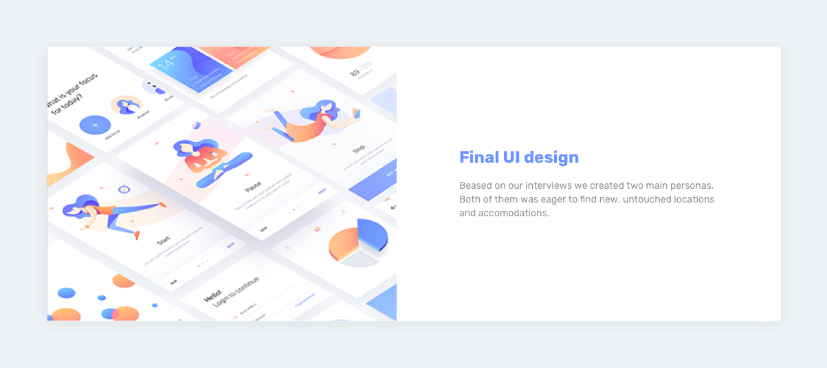
3. Pay attention to image ratios
When planning your case study don’t forget about the images you’ll need and their ratios! If you see that you will need a quadratic persona template, design the image with that in mind. It’ll look much better and you’ll save time, as you won’t have to redo it later.
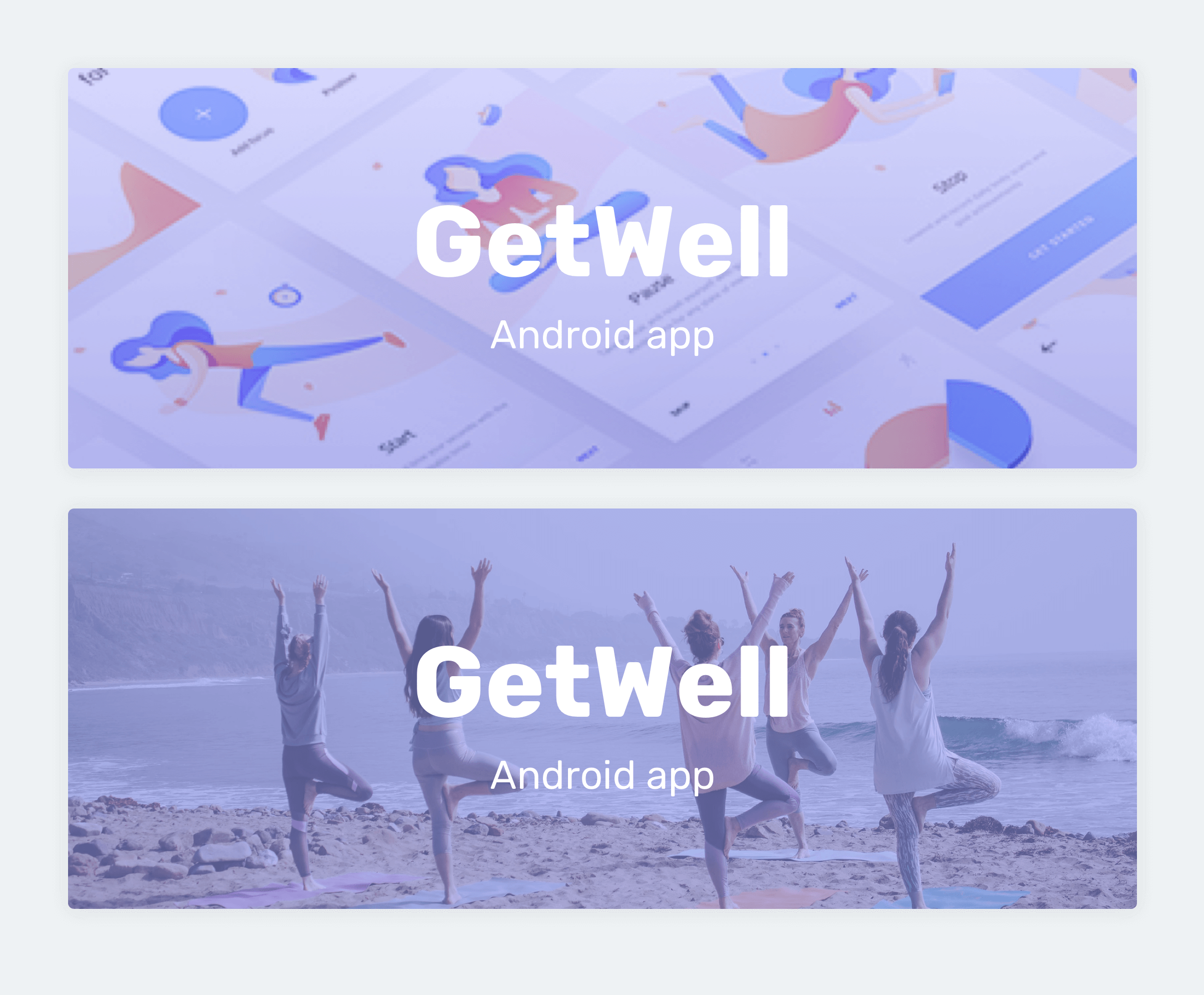
4. Follow the style of your project
Your visuals can follow the style of the project that you are presenting. It’s the easiest way to achieving a coherent look throughout the entire case study.
Was your project a bright-colored app with rounded edges and bubbles? Use the same colors, rounded forms, and harmonizing typography in your case study. If you are writing about a serious-looking website design for a law firm, stick to a similar style in your case study.
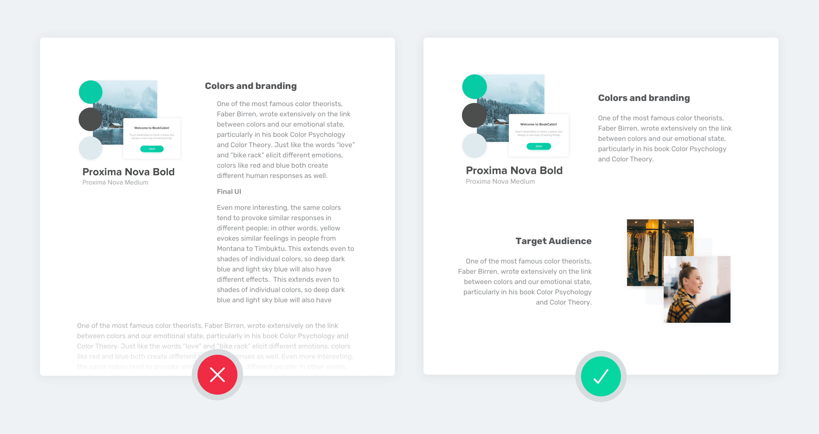
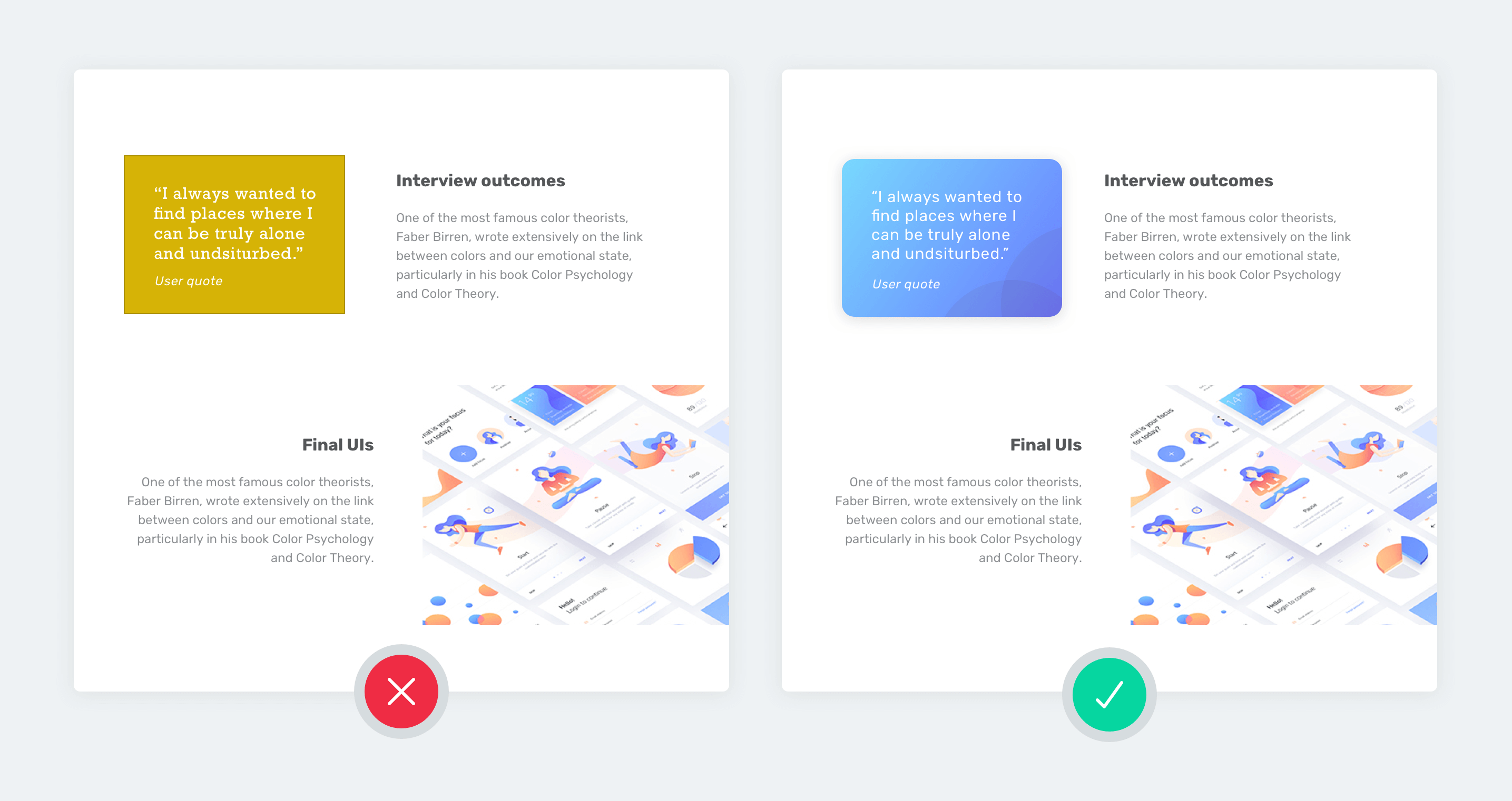
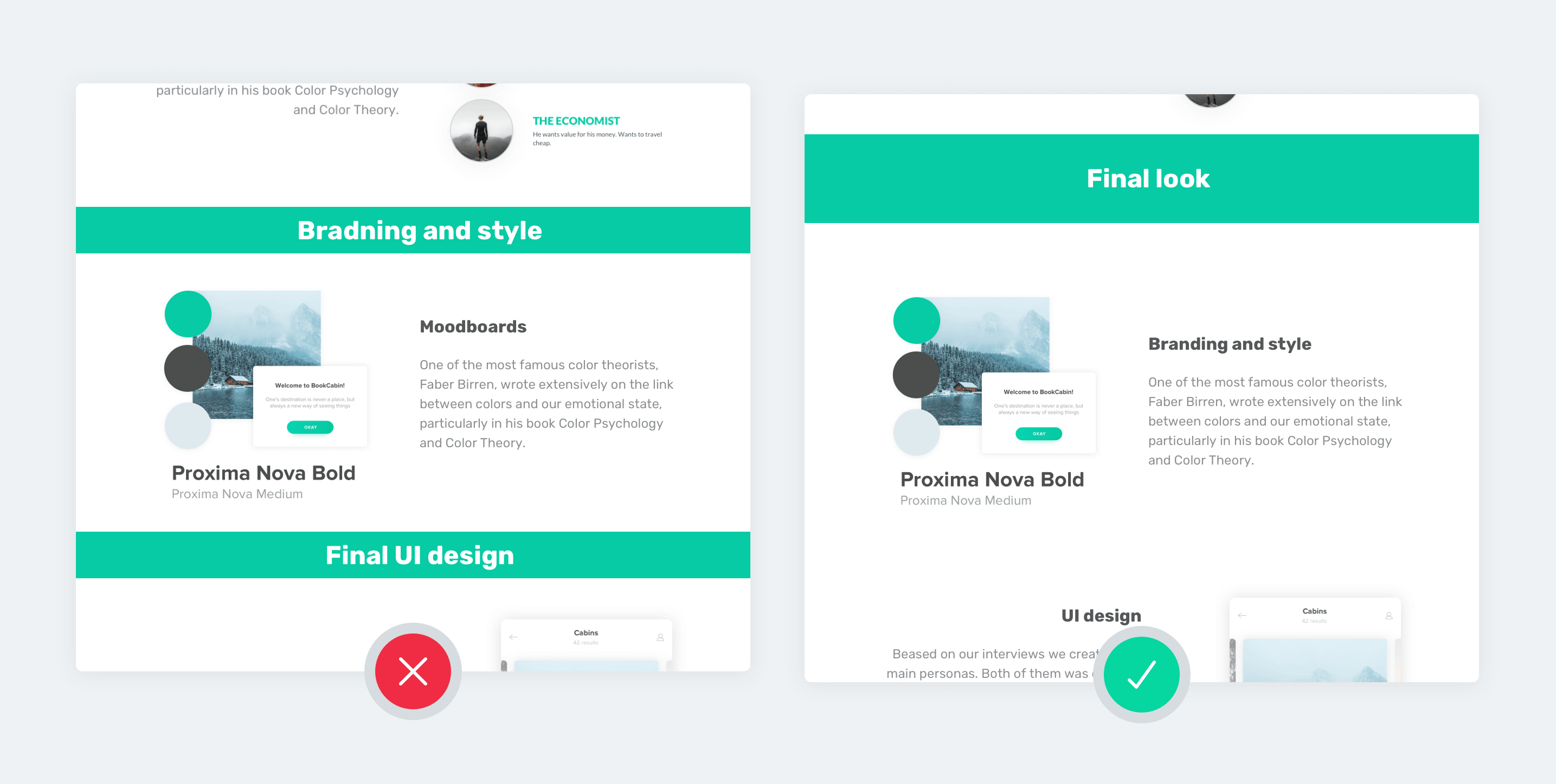
5. Use consistent typography on your images
One of the golden rules of great typography is to either use very different fonts or very similar ones. If they are somewhat similar, it won’t work.
Based on this rule, choose your case study’s typography before getting to work, and use the same typography everywhere, including your images.
This will ensure that your images with text on them will visually blend well with the rest of your case study.
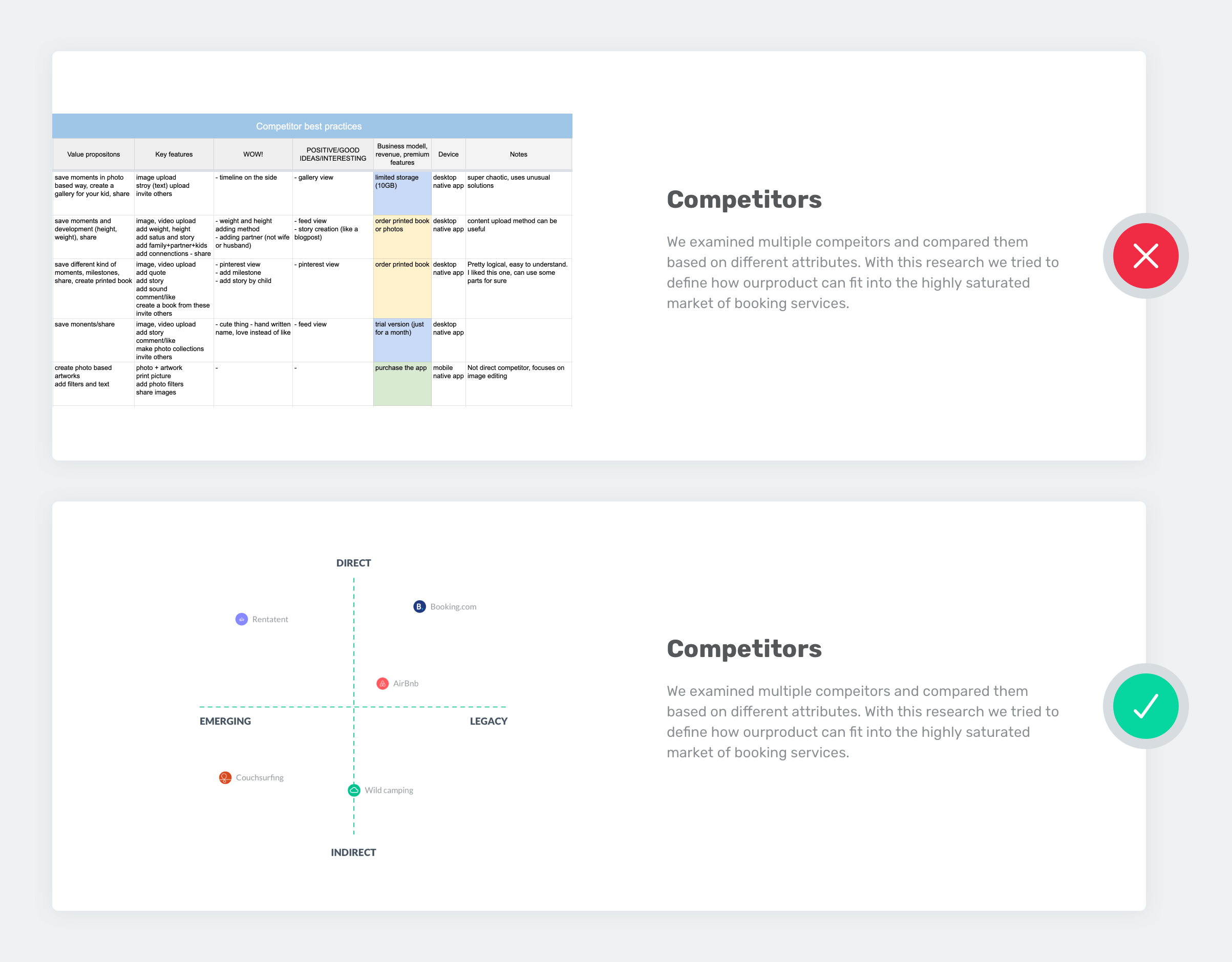
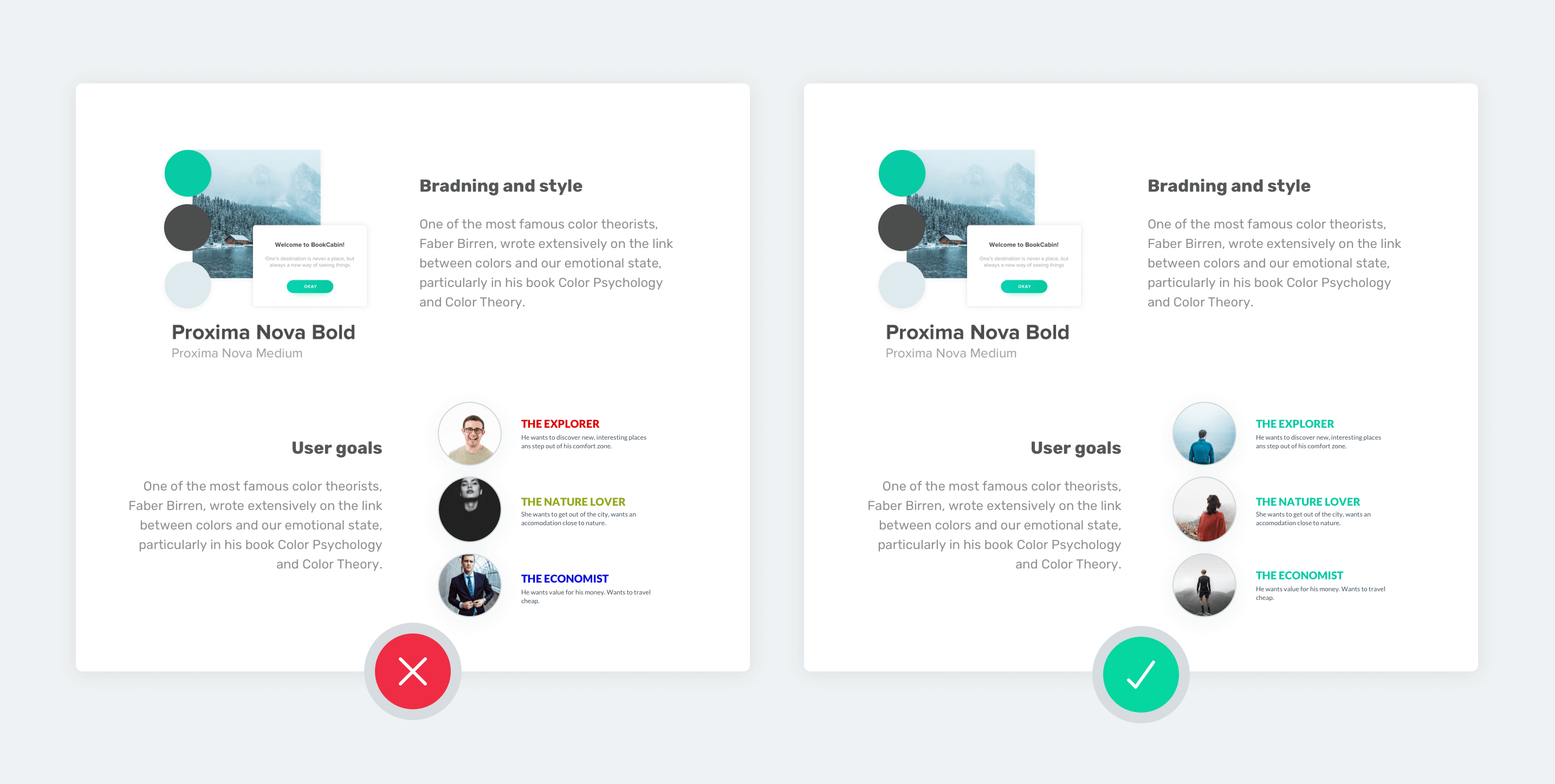
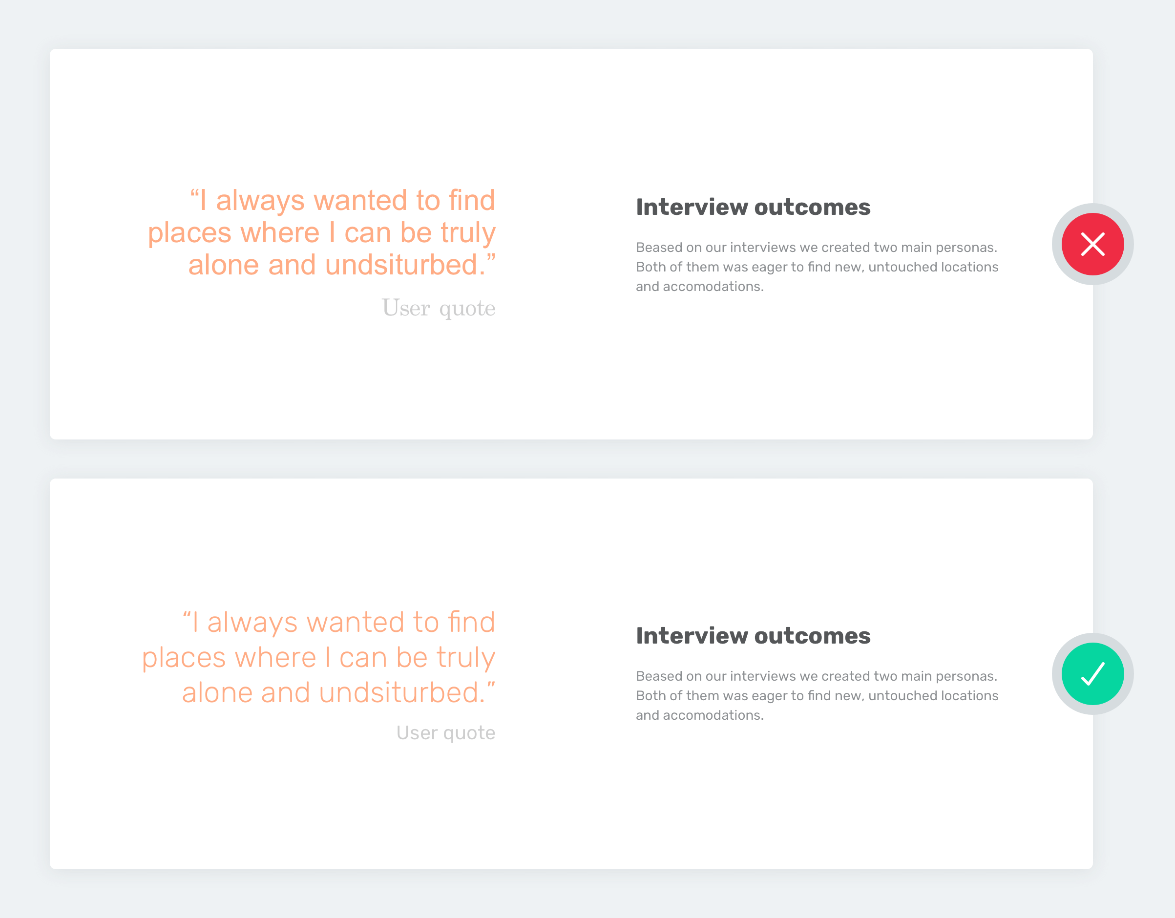
6. Use matching colors on your images
Always use colors that match or harmonize with the colors of the design you are writing about. Recolor personas, charts, or any kind of images you want to show in your case study accordingly.
7. Use consistent icons and illustrations
When using illustrations or icons in your case study stick to one style! If you start off with gray stroked icons to present your process steps, stick to the same icon style throughout the entire case study. Don’t go for colorful, filled icons without strokes two sections later.
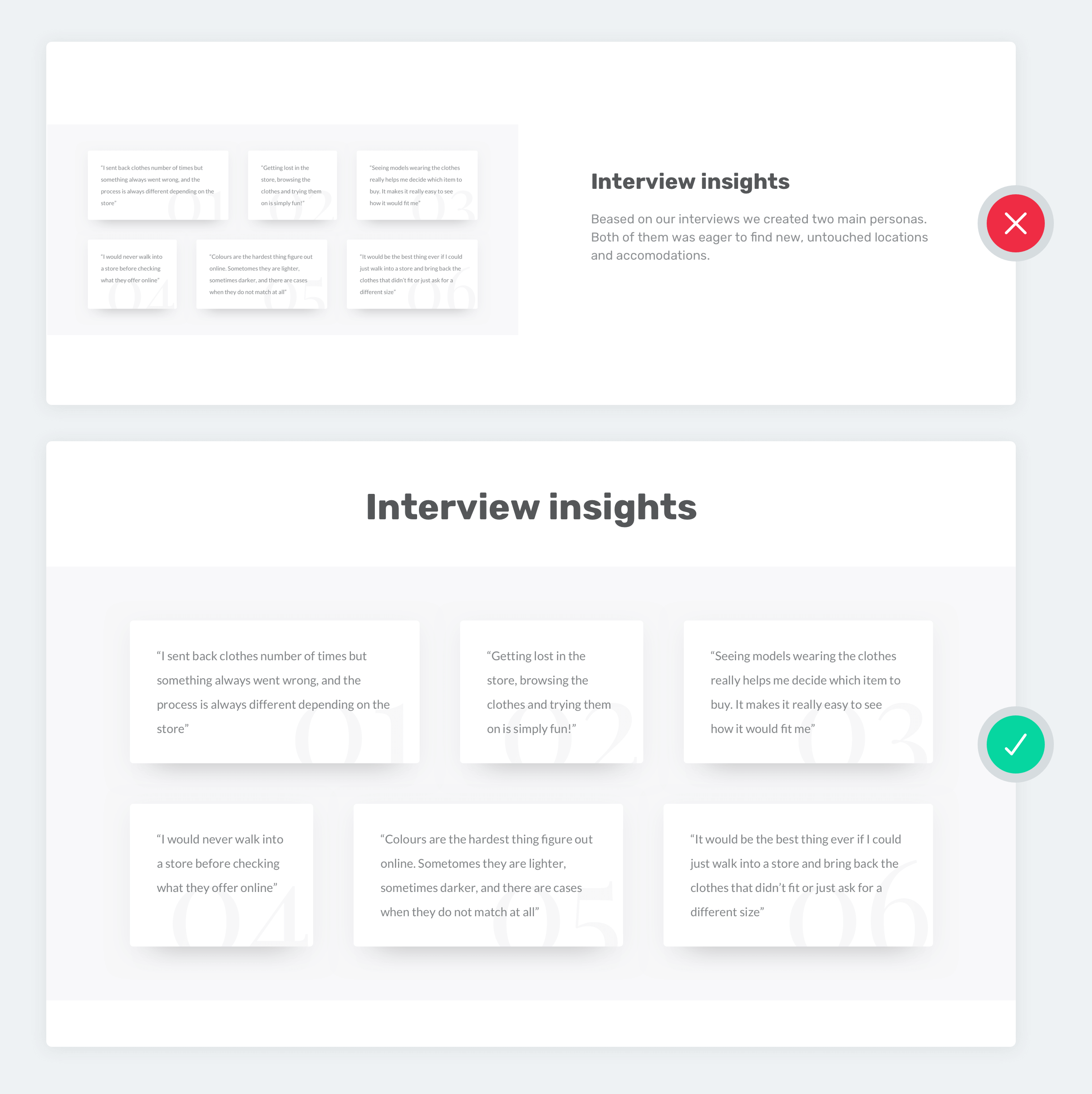
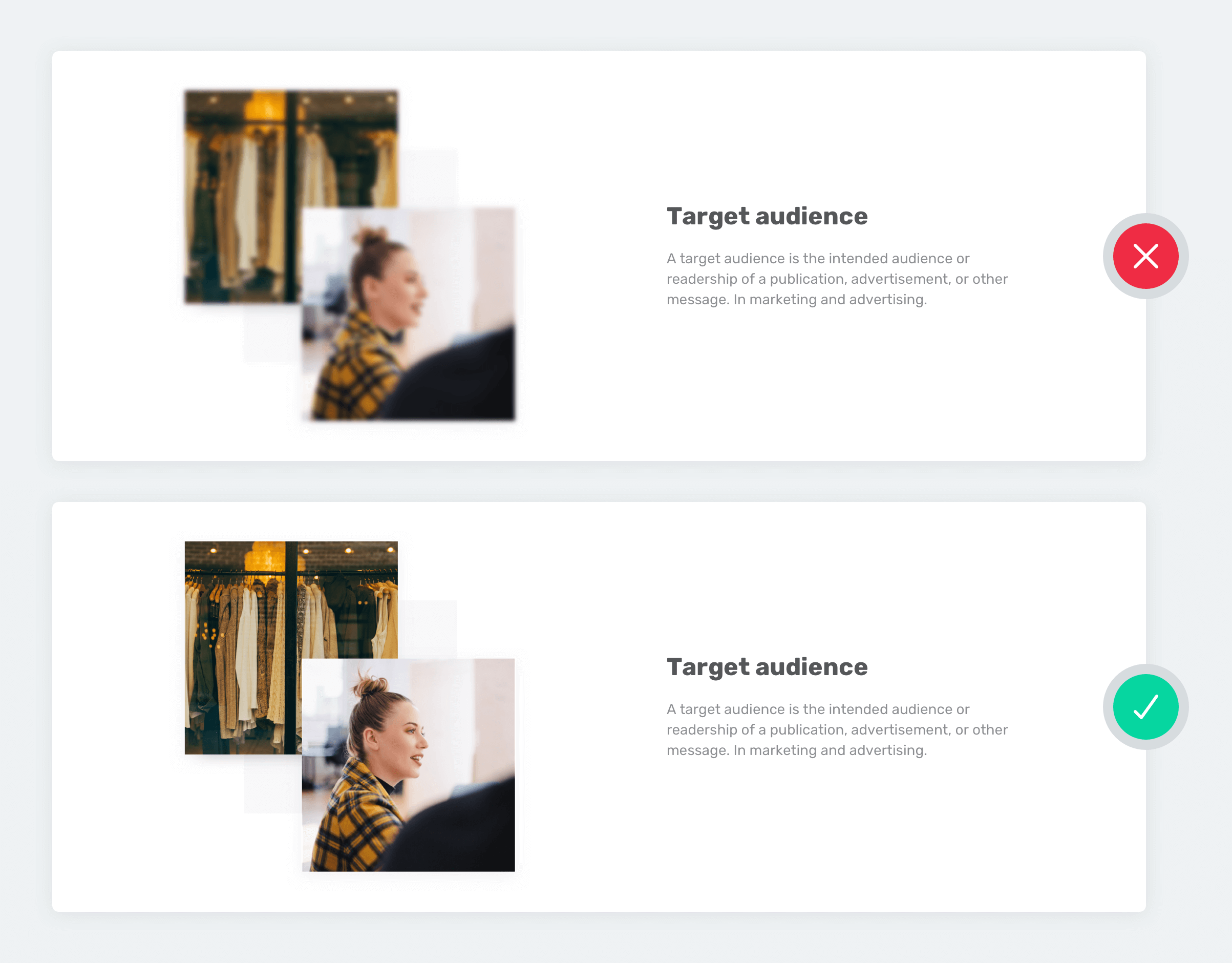
8. Shadows and strokes make a huge difference
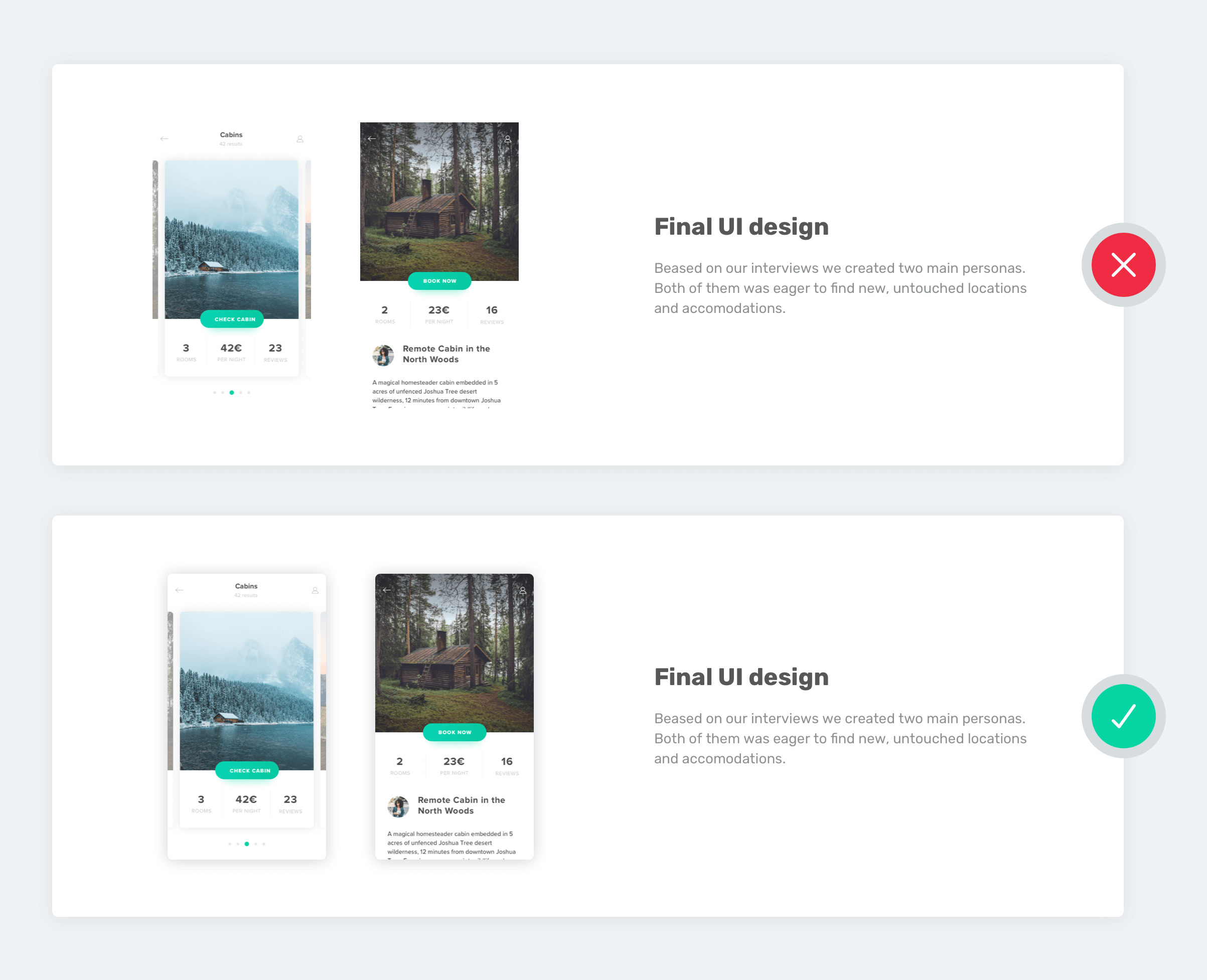
Images with lots of white in them can blend into your case study’s background. Using strokes or putting some shadow will solve this issue. Even the simplest photo illustration will look way better with some shadows.
9. Always preview your work
As you are progressing with your case study, keep checking it in preview mode. Images might look different in draft mode due to the interface. If you have text on your images don’t forget to check their readability and quality.
Pixelated, hardly visible images look very unprofessional. You can save plenty of time by checking the recommended image sizes in the image upload windows. The recommended sizes are always in retina resolution.
10. Use templates, but customize them
It’s totally okay to use templates or generators in your case studies. But you should customize them if you want to end up with a visually consistent case study. So, when using premade templates, change their colors and the typography to match your case study’s style.
How to use color in your case studies?
Color consistency in UX case studies is not about aesthetics. It helps reviewers quickly associate elements, sections, and visual cues across long pages. When colors are used intentionally, they reduce cognitive load and make your case study easier to scan.
1. Choose accent color(s)
We’ve established that it’s best if your case studies follow the color scheme of the project you are presenting. So, select one or two main colors from the project. We will call these colors your accent colors. Use these colors throughout your case study, consistently for a clean and put-together look.
2. Where to use your selected accent colors in your case study?
When you have your accent colors selected you can start building up your case study! Here are some specific uses for the accent colors:
Use the accent color in your on your cover image
Start by infusing your accent color into your case study cover image to set the mood right at the beginning. You can show it as part of the UI design you are presenting, or as a color overlay on your background image, it’s up to you and your taste.
Use the accent color in subheaders

You can use your accent color in the background or as a font color in your case study’s subheaders. Just make sure to stick to the same subheader style throughout your case study.
Use the accent color in your paragraphs header
You can also set your accent color in the colors panel of UXfolio’s case study editor. This way every paragraph title you use and the numbers in case of a statistics section will have the same accent color.
Use the accent color on your images

Feature your accent color on all of your uploaded images. But don’t go overboard! Sometimes recoloring an icon or a single line is enough for the perfect, matching look.
How to use white space in your case studies?
One of the most important parts of design is the empty space around any design element: white space. Its use can make or break the look of a case study.
Why is white space so important?
In UX case study pages, white space plays a critical role in visual hierarchy and content grouping. It directly affects how fast someone can understand your work.
If there won’t be any whitespace on this page you wouldn’t be able to read this article. The space between letters and rows makes this sentence readable. With the help of white space, you can group visual elements together (by arranging them closer to each other) or divide certain elements (by using more space between them).
Using white space wisely is the foundation of your case studies’ visual hierarchy. But how exactly you use it effectively?
Where to add white spaces in your case studies?
1. Between sections
Always leave enough space between sections. This way they will be visually separated from each other. Don’t be afraid that your content won’t fit in one screen. Users will scroll through your case study.
2. Around subheaders
Don’t forget to leave enough space around subheader titles, especially if you use a colored subheader background. The lack of space around your subtitles can make your whole case study look ‘striped’, which is not a good look.
3. Between uploaded images
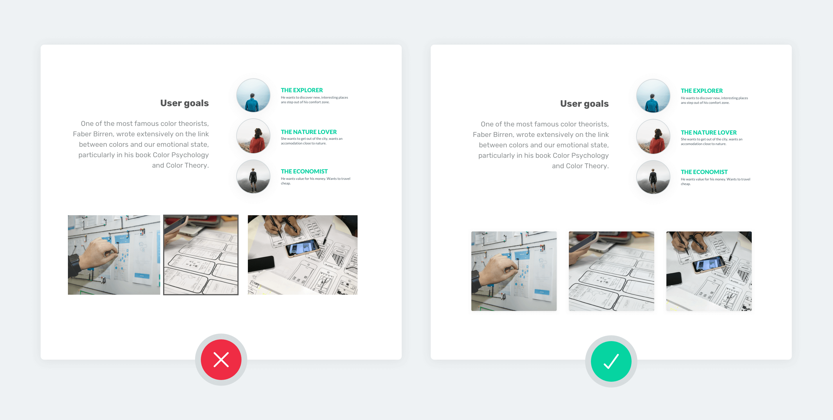
Whenever you upload multiple images or mosaics, galleries made by you don’t forget to pay attention to paddings on those images too. Uploading a lot of images near each other can make your case study look crowded.
Frequently Asked Questions
How many UX case studies should a portfolio include?
Most UX portfolios perform best with 2–4 well-developed case studies. Quality and clarity matter more than quantity.
How long should a UX case study be?
A UX case study should be long enough to explain key decisions but short enough to scan quickly. Most effective case studies can be understood in under five minutes.
What should a UX case study page include?
A strong UX case study page includes the problem context, your role, key process steps, and the outcome or impact of the work.
Are UI-heavy case studies bad for UX portfolios?
Not necessarily, but UI screens should support your story, not replace it. Hiring managers want to understand how you think, not just what you designed.
Should all UX case studies use the same layout?
Using a consistent layout across case studies often improves readability and makes your portfolio feel more cohesive.
You must be logged in to post a comment.