In 2026, UX resumes are scanned quickly by both hiring teams and ATS systems. Visual polish alone will not save unclear structure, irrelevant content, or generic wording.
This guide breaks down what to include and what to leave out of a UX resume, based on how UX roles are actually evaluated today. Whether you are a junior designer or transitioning into UX, the goal is the same: clarity, relevance, and a resume that leads naturally to your portfolio.
Page content
- Target audience and purpose (who this guide is for)
- What to include in your UX resume
- What not to include in a UX resume
- How to format a UX resume that works in 2026
- Examples and mini templates (actionable)
- Common UX resume mistakes and how to fix them
- UX resume + Portfolio pairing strategy
- Final checklist (quick UX resume audit)
- Frequently asked questions
Target audience and purpose (who this guide is for)
This guide is written for junior UX designers who are actively preparing a UX resume for their first or second role. It assumes you already understand the very basics of UX as a discipline, but you may still struggle with translating that understanding into a resume that makes sense to hiring teams.
The core problem this article addresses is simple but critical: UX resumes are often evaluated with non-UX expectations. Recruiters, hiring managers, and applicant tracking systems do not read your resume as a design artifact. They read it as a decision summary. This mismatch is where most junior UX resumes fail, even when the candidate has solid skills and a strong portfolio.
The purpose of this guide is not to help you “stand out visually” or to provide generic resume advice. Its role is to help you decide what belongs on a UX resume, what actively works against you, and how each section supports your portfolio and job search as a system. A good UX resume does not try to do everything. It does a few things exceptionally well: it creates clarity, establishes relevance, and directs attention toward your portfolio.
UX resume basics for beginners
For beginners, a UX resume is rarely a complete reflection of professional experience. That is expected. Hiring teams do not evaluate junior resumes by the same standards as senior ones. Instead, they look for signals of thinking maturity, role alignment, and learning velocity.
At this stage, your resume functions as a filtering tool, not a full narrative. Its job is to show that you understand what UX roles actually involve, that you can frame your experience in UX terms, and that you can communicate decisions clearly. Whether your background comes from coursework, bootcamps, internships, or self-initiated projects, the resume must translate that experience into UX-relevant value, not generic job history.
This is why beginners benefit more from structure and precision than from breadth. A focused resume that clearly communicates a few strong UX-relevant experiences is more effective than a long document attempting to compensate for lack of years with excess information.
Why a UX resume is more about clarity than creativity
Unlike portfolios, resumes are not evaluated as design showcases. In fact, excessive creativity often introduces friction. Visual experimentation, unconventional layouts, or overly branded elements tend to obscure the information recruiters are actively searching for.
Clarity in a UX resume means that each section answers a specific question:
- What role is this person applying for?
- What kind of UX work have they done?
- How recent and relevant is that work?
- What level of responsibility did they hold?
These questions must be answered immediately, without interpretation.
For junior designers especially, clarity also signals professionalism. It shows that you understand the constraints of hiring systems and that you can design within them. This mirrors real UX work, where success is rarely about expressive freedom and far more about working within limitations while still communicating effectively.
How hiring teams and ATS systems scan UX resumes
Most UX resumes are first reviewed under time pressure, often by someone who is not a designer. In many cases, they are also pre-filtered by ATS software before a human ever sees them. This means your resume is scanned, not read, at least initially.
Hiring teams look for alignment: role titles that match the job description, recognizable UX terminology used correctly, and experience framed around outcomes rather than responsibilities. ATS systems, on the other hand, look for structure, consistency, and keyword relevance.
A well-designed UX resume respects both audiences. It uses standard section headings, avoids layout tricks that break parsing, and prioritizes content hierarchy over decoration. From a UX perspective, this is not a compromise. It is a deliberate design decision: optimizing for comprehension under real-world constraints.
What to include in your UX resume
A strong UX resume is not defined by how much information it contains, but by how deliberately information is selected and framed. Especially at junior level, every included element should earn its place by supporting one core goal: helping the reviewer quickly understand what kind of UX designer you are becoming and why your profile is relevant to this specific role.
This section breaks down the components that consistently work in UX resumes in 2026, not because they follow convention, but because they align with how UX hiring decisions are actually made.
Contact info, portfolio link, and social profiles
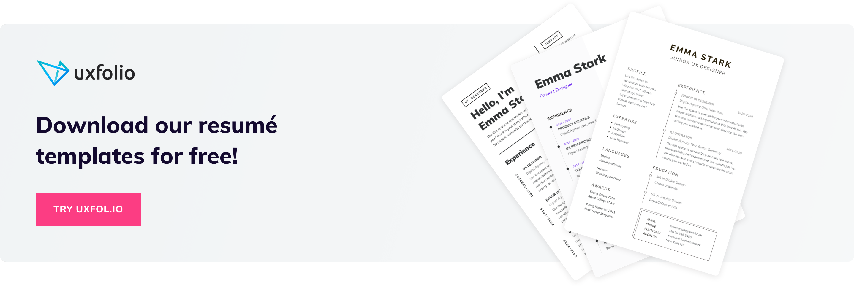
The top of your resume sets the tone for everything that follows. Hiring teams expect to see essential information immediately, without friction or ambiguity. This includes your name, role alignment, location (or remote availability), and most importantly, a clear link to your UX portfolio.
For UX roles, the portfolio link is not an accessory. It is the primary continuation of your resume. If it is missing, buried, or visually de-emphasized, the resume fails at its most basic task: directing attention toward evidence of your work.
Social profiles should only be included if they reinforce your UX narrative. A well-maintained LinkedIn profile that mirrors your resume framing is usually sufficient. Design community profiles or personal sites can add value, but only when they are relevant and curated. Anything that requires explanation or apology should be excluded.
The principle here is simple: reduce decision effort for the reviewer. Make it immediately obvious where to click next and what they can expect to find there.
Relevant UX experience and role framing
For junior designers, “experience” rarely means long-term employment in a UX role. That is normal. What matters is how you frame your experience through a UX lens.
Each role or project should be described in terms of contribution, responsibility, and learning context. Titles matter less than clarity. If your role was hybrid or informal, clarity is more important than precision. Hiring teams are comfortable with non-linear paths, but they are not comfortable with vague ones.
Instead of listing responsibilities, focus on what UX problems you were exposed to, what decisions you participated in, and how your work connected to outcomes. Even student projects or personal initiatives can carry weight when framed around problem definition, constraints, and trade-offs.
This framing shows that you understand UX as a decision-making discipline, not a collection of tools.
Education, UX credentials, projects, and portfolios
Education sections should be concise and relevant. Formal degrees, bootcamps, and certifications are most valuable when they help reviewers contextualize your level and background, not when they attempt to replace experience.
For junior candidates, projects often matter more than credentials. However, projects belong on your resume only insofar as they support and point toward your portfolio. Brief project mentions can help establish relevance and scope, but detailed storytelling belongs in case studies, not on the resume itself.
The resume’s role here is orientation. It helps the reviewer understand what kind of work they are about to see and why it is worth their time.
Action verbs, quantification, and impact storytelling
Language choice is one of the most underestimated aspects of UX resumes. Action verbs are not about sounding impressive; they are about making agency visible. They clarify whether you observed, assisted, executed, or led specific activities.
Quantification, when used thoughtfully, adds credibility. This does not mean inventing metrics, but highlighting scale, scope, or constraints where possible: number of users, project duration, team size, or iteration cycles.
Most importantly, impact storytelling should remain grounded. Junior resumes are not expected to demonstrate massive business outcomes. They are expected to show cause-and-effect thinking: what you did, why it mattered in context, and what changed as a result.
This kind of storytelling aligns directly with how UX work is discussed in interviews and reviewed in portfolios, creating coherence across your application materials.
What not to include in a UX resume
One of the fastest ways to weaken a UX resume is not by missing information, but by including the wrong kind. For junior designers especially, unnecessary content creates noise that works against you: it slows down scanning, confuses ATS systems, and dilutes the signal you actually want hiring teams to notice.
This section focuses on what to deliberately leave out, and more importantly, why these elements tend to hurt rather than help.
Irrelevant work history and buzzwords
Not every past role deserves a place on your UX resume. Early-career designers often feel pressure to include everything they have ever done, assuming more content equals more credibility. In practice, the opposite is true.
Roles that cannot be framed through transferable UX skills should be removed or heavily condensed. Hiring teams are not looking for completeness; they are looking for relevance. If a role does not support your:
- UX narrative
- problem-solving
- collaboration
- research exposure
- decision-making,
It creates cognitive friction.
Buzzwords fall into the same category. Terms like “passionate,” “detail-oriented,” or “team player” are invisible to both ATS systems and human reviewers because they carry no evaluative value. UX hiring relies on evidence, not self-labeling. If a concept cannot be demonstrated through action or outcome, it should not appear on the resume.
Clarity improves when every line earns its place.
Skill bars and graphics that confuse ATS
Visual skill indicators like progress bars, star ratings, and percentage meters are a common design mistake in UX resumes. While they may look expressive, they introduce two serious problems.
First, they are inherently ambiguous. A “four out of five” skill rating has no shared meaning across reviewers. Second, and more critically, these elements often break ATS parsing entirely.
When a system cannot read your skills section, it effectively does not exist.
From a UX perspective, skill bars also conflict with how UX competence is evaluated. UX skill is contextual and applied, not scalar. Hiring managers infer capability from how you describe problems, decisions, and outcomes, not from self-assessed ratings.
Textual, well-scoped skill descriptions aligned with real experience are consistently more effective and more future-proof.
Long paragraphs or generic wording
Dense paragraphs are the enemy of scanability. Recruiters and hiring managers do not read UX resumes linearly, they skim for structure, anchors, and signals. Long blocks of text force effort at exactly the moment reviewers are least willing to invest it.
Generic wording compounds this issue. Phrases that could describe any designer in any role fail to communicate intent or differentiation. When everything sounds familiar, nothing stands out.
Effective UX resumes use concise, intentional language that mirrors how UX work is actually discussed: short statements, clear verbs, and concrete context. This is not about reducing depth, it is about making depth accessible under time pressure.
Removing verbosity is not simplification; it is respect for the reader’s cognitive load.

How to format a UX resume that works in 2026
Formatting a UX resume in 2026 is not about visual flair or originality. It is about reducing friction between three actors: the ATS system, the recruiter doing an initial scan, and the hiring manager looking for evidence of thinking. When formatting fails, content quality becomes irrelevant because it never gets interpreted correctly.
A strong UX resume layout behaves like a well-designed interface: predictable, legible, and intentionally constrained.
ATS-friendly structure and simple layout
Applicant Tracking Systems still struggle with anything that deviates from a conventional document structure. Columns, floating text boxes, icons used as labels, and decorative dividers often break parsing or reorder content unpredictably.
An ATS-friendly UX resume relies on a single-column layout with a clear hierarchy: section headers, role titles, dates, and bullet-level content that follows a consistent pattern. This does not mean your resume has to look boring. It means the structure should never compete with the information.
From a UX perspective, predictability is a feature. Recruiters expect to find specific information in specific places. When they do, scanning accelerates. When they do not, cognitive effort increases and confidence drops. A simple layout signals professionalism and system-awareness, not lack of creativity.
One-two page rule and priority content order
The question is not whether a UX resume should be one or two pages. The real question is whether every section justifies the space it occupies.
For junior and early-career designers, one page is often sufficient if content is focused and well-framed. Two pages are acceptable when additional context genuinely adds clarity, such as multiple UX projects, career transitions, or research-heavy roles. Anything beyond that usually indicates poor prioritization.
More important than page count is content order. Reviewers start at the top and decide quickly whether to continue. Your most relevant information should appear before they have to look for it. This typically means:
- contact information
- portfolio link
- UX experience or projects
- education
- supporting details
Think of the resume as a progressive disclosure system. The most convincing signals come early, secondary information supports rather than distracts.
Fonts, white space, and readability tips
Typography in a UX resume should never call attention to itself. Highly stylized fonts, excessive weights, or tight line spacing reduce readability under fast scanning conditions. Clean, system-safe fonts with clear contrast between headers and body text perform consistently across devices and file conversions.
White space is not decoration. It is a functional tool that separates ideas, improves comprehension, and reduces visual fatigue. When everything is dense, nothing is legible. When spacing is intentional, structure becomes visible without explanation.
A useful rule of thumb: if your resume feels crowded, it is likely trying to say too much. Editing content almost always improves layout more than adjusting margins ever will.
Good formatting does not impress. It disappears – and lets your thinking take center stage.
Examples and mini templates (actionable)
Examples only add value in a UX resume if they reduce ambiguity. The goal is not to copy wording or structure blindly, but to make expectations visible. A good example clarifies how much detail is enough, what level of specificity matters, and where thinking should show up without overwhelming the reader.
This section focuses on patterns, not prescriptions.
UX resume section breakdown example
A well-structured UX resume section follows a predictable internal logic. Recruiters subconsciously look for this logic even if they cannot articulate it.
Take a typical experience or project section. The most effective versions answer three questions in sequence:
- What was the context?
- What did you do?
- What changed because of it?
When this order is respected, scanning becomes effortless and interpretation stays consistent across reviewers.
For example, instead of listing responsibilities in isolation, a strong section frames the role, then anchors actions to decisions, and finally signals impact. Even when the project scope is limited, this structure allows reviewers to infer maturity of thinking rather than just output volume.
What matters here is not length, but alignment. Each line reinforces the same story about how you approach problems.
Real-world bullet points
Bullet points are often where UX resumes collapse into generic phrasing. The issue is rarely vocabulary, it is missing intent.
Compare a vague description of activities with a decision-driven one. When a bullet point explains why something was done, not just what was delivered, it invites questions rather than closing the conversation. This is especially important for junior designers, where the learning process and reasoning carry more weight than polished outcomes.
Effective bullets usually combine three elements naturally: a clear action, a concrete UX method or constraint, and a measurable or observable result. Not every bullet needs numbers, but every bullet should communicate consequences.
When bullets read like interface labels, they fail. When they read like compressed case study insights, they work.
Tailored UX resume based on job type
A UX resume is never neutral. It either aligns with a role or competes against itself.
A junior product designer role prioritizes different signals than a UX researcher or a service design position. The mistake many candidates make is keeping content static and hoping reviewers will connect the dots. In reality, reviewers reward relevance, not completeness.
Tailoring does not mean rewriting the entire resume. It means adjusting emphasis. For some roles, research framing moves up. For others, collaboration, systems thinking, or delivery constraints take precedence. The underlying projects may remain the same, but the narrative lens changes.
From a UX standpoint, this is an adaptive content strategy. The resume responds to context, just like a well-designed product does.
Common UX resume mistakes and how to fix them
Most UX resumes are not rejected because they are “bad”. They are rejected because they create friction. Reviewers hesitate, infer incorrectly, or simply move on because the resume makes them work harder than necessary.
The mistakes below are common precisely because they feel harmless. In practice, they weaken clarity, distort signals, or break alignment with how UX hiring actually works.
Overcrowded design vs. focused content
One of the most frequent issues in UX resumes is visual overload disguised as creativity. Dense layouts, excessive color use, icons competing with text, or overly compressed sections often aim to demonstrate design skill. Instead, they obscure the very information reviewers are trying to extract.
Hiring teams do not evaluate resumes as design artifacts. They evaluate them as decision-support tools. When layout choices slow scanning or force interpretation, the resume stops serving its purpose.
The fix is not to make the resume “plain”, but to make hierarchy explicit. Content should breathe. Sections should be visually predictable. White space should guide attention, not decorate the page. A focused resume communicates confidence in both content and prioritization.
Leaving ATS optimization out
Many UX designers underestimate how early automation enters the hiring process. Even when a human eventually reviews the resume, an ATS often filters, parses, or ranks it first.
Common mistakes here include unconventional section titles, text embedded in images, multi-column layouts that break parsing, or keyword avoidance due to fear of sounding repetitive. These choices may look refined but can silently reduce visibility.
An ATS-friendly resume does not mean keyword stuffing or robotic phrasing. It means using industry-standard role titles, clearly labeled sections, and readable text structures that machines and humans can interpret consistently.
From a UX perspective, this is about designing for multiple users with different capabilities and constraints.
Not tailoring resume to UX job description
A resume that tries to fit every UX role usually fits none particularly well. This is especially risky for junior designers, where signal strength matters more than breadth.
When resumes remain generic, reviewers are forced to guess relevance. Guessing introduces doubt, and doubt leads to rejection. Even strong candidates lose momentum when their resume does not clearly map to the role in question.
The fix is selective emphasis. The same experience can be framed differently depending on the role’s focus: research-heavy, delivery-oriented, or cross-functional. Tailoring is not manipulation, it is contextual clarity.
A good UX resume behaves like a good interface. It adapts to user intent without changing its core structure.
UX resume + Portfolio pairing strategy
A UX resume is not meant to stand on its own. Its real function is to act as an entry point into your portfolio, shaping how reviewers approach your work before they see a single case study. Strong applications treat the resume and portfolio as two layers of the same system: one optimizes for speed and orientation, the other for depth and proof.
When these two layers are aligned, recruiters move through your materials with confidence. When they are not, even strong portfolio work can be misread or overlooked.
How your resume leads recruiters to your portfolio
Hiring teams rarely open portfolios out of curiosity. They open them because the resume gives them a reason to. In practice, the resume answers three unspoken questions before the portfolio is even clicked:
- What kind of designer are you?
- What problems have you worked on?
- Why is your work relevant to the role?
This is why vague role descriptions and generic bullets are risky. If the resume does not clearly signal what kind of thinking your portfolio demonstrates, reviewers either delay opening it or skim it without context. A good UX resume quietly guides attention. It makes the portfolio feel like the natural continuation of a story that has already started.
For junior designers especially, this guidance is critical. With limited professional experience, clarity and intent matter more than volume. The resume sets expectations, and the portfolio fulfills them.
What to emphasize in the resume so it matches portfolio content
The resume should not summarize your case studies. It should frame them. Its job is to highlight the aspects of your work that deserve closer inspection.
Instead of listing deliverables, effective resumes emphasize decision-making moments. They point to the type of problems you faced, the constraints you worked under, and the role you played in navigating trade-offs. This framing prepares the reviewer to read your case studies through the right lens.
When a portfolio is opened with a clear mental model already formed, reviewers spend less time figuring out what they are looking at and more time evaluating how you think. This alignment is one of the most reliable ways junior portfolios outperform expectations, even with relatively simple projects.
Using portfolio links and case study hooks effectively
A portfolio link should never be a neutral element. Where and how it appears in your resume influences how it is perceived.
Rather than treating the portfolio as a single destination, strong resumes create subtle hooks toward specific kinds of content. A short project reference, a problem statement hint, or a learning-focused outcome can all function as an invitation to explore further. The goal is not to tease, but to orient.
When done well, reviewers arrive at your case studies already primed for what matters. They know what to look for, which decisions are important, and which parts of the process deserve attention. This dramatically improves the quality of interview conversations later, because the portfolio has already been read with intent rather than curiosity.
In this sense, the resume does not compete with the portfolio. It designs the way the portfolio is experienced.
Using UXfolio to turn your resume into a portfolio entry point
A strong UX resume does not try to explain everything. Instead, it creates clear entry points into your portfolio, signaling where recruiters should continue their evaluation.
This is where tools like UXfolio become relevant. Rather than acting as a generic website builder, UXfolio is structured around how UX portfolios are actually reviewed, making it easier to align resume bullets with specific case studies and outcomes.
If you want a deeper understanding of how recruiters assess portfolios after reading a resume, the UX Portfolio Playbook explains what they look for, what they skip, and how design decisions influence hiring outcomes.
Final checklist (quick UX resume audit)
This final review is not about polishing details. It is about verifying that your resume does what UX resumes are supposed to do in real hiring situations: pass automated screening, support fast human review, and lead naturally into your portfolio.
Treat this section as a short diagnostic pass before submission, not as a template to blindly follow.
Before you send: top resume checks
At a glance, your resume should answer who you are, what kind of UX work you do, and where your proof lives. If any of these require effort to interpret, friction is already introduced.
Check whether your role labels are specific enough to anchor expectations. “UX Designer” alone is often too vague. Context such as product type, team size, or problem space helps reviewers immediately categorize your experience. Also verify that every bullet earns its place. If a line does not clarify impact, decision-making, or relevance to UX work, it is likely noise.
Finally, confirm that your resume reads well without design support. If meaning relies on layout tricks, icons, or visual grouping, it will likely break in ATS environments.
Quick clarity checklist
- My role and UX focus are clear within the first few seconds
- My resume communicates what kind of UX problems I work on
- My portfolio link is visible, explicit, and unambiguous
- Every bullet explains why it matters, not just what I did
- The resume remains understandable without visual styling
ATS scan checklist
An ATS does not evaluate quality, only structure and match. Your goal is not to impress it, but to pass through it invisibly.
Make sure section headings are standard and predictable. Creative labels slow parsing and reduce keyword recognition. Dates, roles, and organizations should follow consistent formatting throughout the document. Irregular patterns increase the chance of misinterpretation.
Keyword alignment matters, but stuffing does not. The safest approach is mirroring the language used in the job description when it naturally fits your experience. If a human would find the phrasing forced, an ATS likely will too.
ATS safety checklist
- Standard section headings are used (experience, education, skills)
- Dates, roles, and company names follow one consistent format
- No icons, graphics, tables, or layout-dependent meaning
- Keywords align naturally with the job description language
- The resume remains readable in plain text
UX hiring manager friendly checklist
Once past the system, your resume is read quickly and selectively. Hiring managers scan for signals, not completeness.
They look for evidence of judgment: how you frame problems, how you describe trade-offs, and whether you understand your role within a broader product context. A strong resume makes these signals visible without explanation.
Ask yourself whether your resume invites questions. Good resumes do not try to answer everything. They create clear entry points for discussion, especially ones that connect directly to your portfolio case studies. If an interviewer can naturally say “Tell me more about this,” your resume is doing its job.
Hiring signal checklist
- My bullets show decisions, constraints, or trade-offs
- Context (product, team, problem space) is consistently present
- Resume content clearly maps to portfolio case studies
- At least one line invites deeper discussion
- Nothing feels included “just because it should be there”
Final gut check
Before submitting, step away from optimization and ask a simpler question: does this resume reflect how you actually think and work as a UX designer?
If you can confidently walk through every line, explain your decisions, and connect your resume naturally to your portfolio, you are ready to send it.
Final readiness check
- I would feel comfortable discussing every line live
- The resume leads naturally into my portfolio
- This document reflects judgment, not just experience

Frequently asked questions
Should a UX resume be different for junior, mid, and senior roles?
Yes, but not in length or visual style. The difference is in signal density. Junior resumes emphasize learning, decision rationale, and scope awareness. Senior resumes emphasize ownership, impact, and system-level thinking. What should never change is clarity, structure, and the resume’s role as an entry point to your portfolio.
Is a UX resume still necessary if I have a strong portfolio?
Absolutely. Hiring teams usually see your resume before they decide whether to open your portfolio. The resume frames expectations and determines how your portfolio will be read. A weak resume can cause even strong case studies to be misinterpreted or ignored.
How much design is “too much” for a UX resume?
As soon as design interferes with scanning, hierarchy, or parsing, it becomes counterproductive. A UX resume is not a visual experiment. It is a communication artifact optimized for speed, comprehension, and consistency across systems and reviewers.
Should I tailor my UX resume for every job application?
You should tailor emphasis, not structure. Reordering sections, adjusting bullet priorities, and aligning language with the job description is usually sufficient. Rebuilding the resume from scratch for every role is inefficient and often introduces inconsistency.
What if I don’t have enough UX experience to fill a full resume?
Then scope matters more than volume. One or two well-framed projects with clear problem definition, decisions, and outcomes are more valuable than padded content. Hiring managers are trained to assess potential from limited material when it is presented thoughtfully.