Ever wondered what goes on in the head of a hiring manager reviewing UX portfolios? We have.
We review hundreds of UX portfolios every week. We’ve seen the good, the bad, and everything in between. Today, we’ll present and review some of our favorites that we’ve come across on UXfolio.
- Hana Nakano – Product designer
- Rachel Baek – UX/UI designer
- Ian Chambers – Interaction designer
- Adrienne Schofhauser – UX writer
- Aniela Carolina – Product desginer
- Alesia Ciocan – Product designer
These talented UXers included some impressive designs, however, as part of our review, we’ll solely focus on the portfolio itself. This way, you’ll find advice that you can apply to your case.
We’re here to celebrate the amazing choices they made, but we’re also not turning a blind eye to the areas of improvement that could raise the bar. A UX project is never completely finished and thus even great portfolios can be improved.
Ready to take your portfolio from forgettable to exceptional? Let’s dive in!
1. Hana Nakano
Hana is a US-based product designer, passionate about sustainable digital products and the people using them. Her portfolio effectively showcases both her strong UI design skills and her UX design expertise.
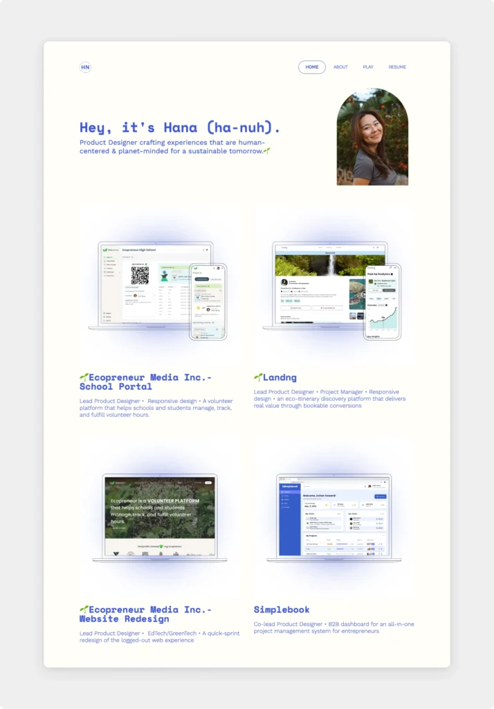
We love how she created an immersive experience by the consistent design in her portfolio and case studies, but also her resume. She chose a vibrant blue color, which livens up the portfolio pages. She consciously left out this electric blue from the case studies—realizing that it would clash with her images. The typeface is consistent throughout the portfolio and the CV as well, tying the whole application material together.
Why we love this portfolio:
- Hero section: It’s spot on with a welcoming introduction and a profile picture that shows not just professionalism but also her bright personality.
- Design credo: She not only said that she’s interested in sustainable design, but—practicing what she preaches—she cleverly marked her sustainable projects with a 🌱.
- Clear next step: With the clear contact info in the footer, the hiring managers have zero doubt about how she can be reached.
- Graphic design: Hana also included evidence of her graphic design skills to give a well-rounded overview of her experience.
- Thumbnails: The consistent design of the thumbnail mockups creates visual balance and ties the whole portfolio together.
Areas of improvement:
- Project description: Hanna shares all the relevant information right below the project thumbnail, but some of them go over three lines, making it visually a bit too bulky.
- Highlighting headings: While we love the electric blue color, the headings get a bit lost in her written content.
All in all, Hana created an outstanding portfolio that she can be proud of. She got started with UXfolio’s Norman template but customized it extremely well to reflect her way of thinking.
2. Rachel Baek
Rachel is a talented UX/UI designer based in Australia with a background in education. Besides the interdisciplinary approach, she brings a high level of creativity and empathy to her UX design projects.
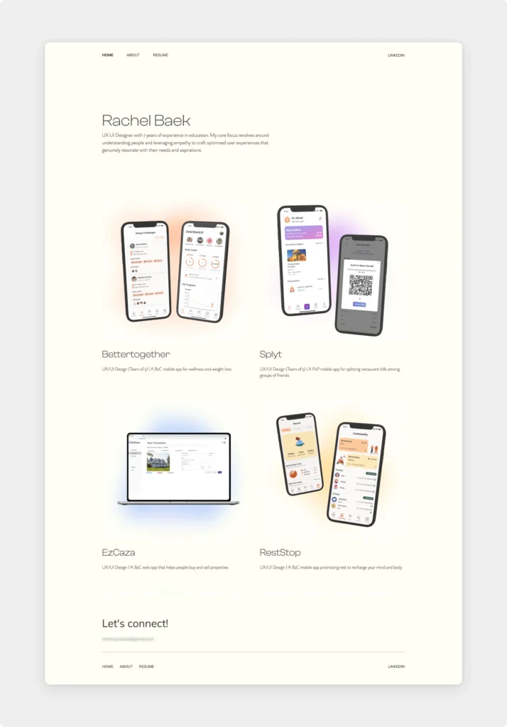
Her portfolio was chosen by our expert team because of the well-structured information architecture and consistent design decisions. She kept the same gradient theme throughout her portfolio, but she made it dynamic through the clever use of different colors.
Why we love this portfolio:
- Colorful home page: Rachel utilized the projects’ colors as low-key but lively backdrops in her thumbnails. Then she consistently uses the same colors throughout her case study pages.
- Recruiter-optimized case studies: Right away, you’ll see the final design on top and then brief, skimming-optimized texts and high-quality visuals walk us through the design process. She also has a back-to-top button on the long case studies.
- Collaboration: In projects where she collaborated with other designers, she gives credit to her teammates, while stating clearly what she was in charge of and which designs are hers.
- Visible contact info: Recruiters won’t have a hard time getting ahold of her, as she conveniently placed it in the footer of her site.
- Answers the hows: Other than just showcasing the project designs, she dives deep into how she conducted user research, synthesized the findings, and ideated about the end result.
- Descriptive project titles: Without even opening the case studies, we have a good overview of what we’ll see. The titles and the thumbnails give the context a recruiter needs to find what interests them.
Areas of improvement:
- Different experience on CV: Despite her colorful portfolio, her CV is very traditional. It may have been a conscious choice from her side, however many designers choose a similar design for their resume. This ensures a seamless transition between reviewing the portfolio and the CV.
- Missed opportunity: At the end of a case study, it’s untapped potential not to guide visitors to the next one.
Overall, Rachel’s portfolio is an amazing source of inspiration for anyone creating a portfolio. It’s clear, optimized, and beautifully executed. The base of her portfolio is the Otis template by UXfolio.
3. Ian Chambers
Ian is a fourth-year UX/UI Interaction Design student based in the US. His passion and talent in UX design can’t be missed as you visit his portfolio website.
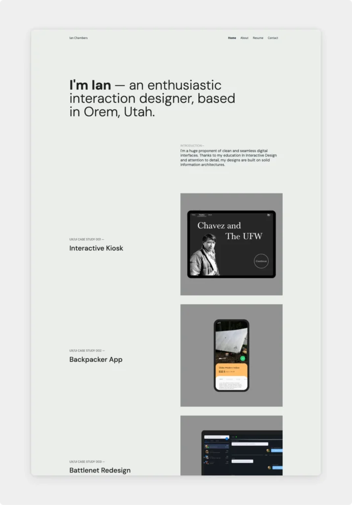
Minimalism has been the main style of portfolios in the past decade, yet it’s refreshing to see how vibrant and elegant Ian’s portfolio is. With the right amount of whitespace and a well-thought-out layout, it creates visual interest that will guide us to the stars of his portfolio: the projects.
Why we love this portfolio:
- Minimalistic approach: The portfolio design is low-key, but still radiates Ian’s creativity and keen eye for design.
- Typography: He chose impressive font pairs and let them shine as they take center stage in his portfolio hero.
- Before-after images: The way he showcased the designs before and after the user test tells a thousand words about his design process without huge chunks of text.
- Professional contact page: Besides his conveniently placed email address in the footer, Ian created a contact page that follows the same minimalist approach.
Areas of improvement:
- Presentation of sketches: Nothing shows the true design process better than pen-on-paper drawings. However, use a scanner instead of simply taking a photo to present them in the best light possible.
In summary, Ian’s portfolio is the perfect example of how less is more. By skillfully manipulating UXfolio’s Jacob template, he created a portfolio that leaves a lasting positive impression.
Ready to see more bite-size UX reviews? Check out our Instagram page
4. Adrienne Schofhauser
Adriene is an accomplished content designer and UX writer with 10+ years in communications and brand strategy. She takes pride in solving problems with clarity, and this sentiment carries through her whole site.
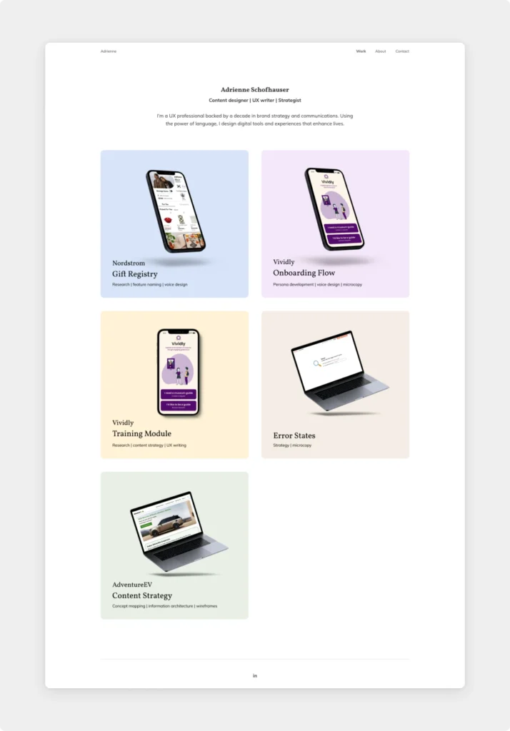
We appreciate the way she found the sweet spot between keeping her site strictly professional and showing her personality. While her main focus is on the written content, her portfolio is just as visually appealing as it is well-written.
Why we love this portfolio:
- Thumbnail design: Adrienne created impressive thumbnails for her projects. They are cohesive in their style and structure, but by varying the colors, the whole site is fresh.
- Stands the 10-second test: Whenever you create a portfolio, you need to make sure that it provides the most important information and context within the first 10 seconds. Adrienne’s site is the perfect example.
- Hero copy & microcopy: No wonder Adrienne makes a living from UX writing. Her brief and powerful tagline and thumbnail microcopies complement the visuals and help with the smooth navigation.
- Skill Stack: On her About page, Adrienne showcases her skills in a comprehensive but digestible way.
- Just enough interaction design: Upon hover, the thumbnails in her portfolio zoom in just a tiny bit. We love this bit of detail.
Areas of improvement:
- Contact information: While Adrienne’s contact page is top-notch, she only provides a contact form and her LinkedIn profile to connect. Many people still prefer getting in touch via email, so making it as convenient as possible is the way to go.
All in all, Adriene’s UX writing portfolio strikes the perfect balance between being informative—showcasing her skills and expertise efficiently—and keeping it short. Combining UXfolio’s Nominee template with Adrienne’s creativity adds up to an exceptional portfolio.
5. Aniela Carolina
Aniela is a gifted senior product and visual designer based in Mexico. Before working in UX design, she worked as a graphic/visual designer, which really shows in her portfolio.
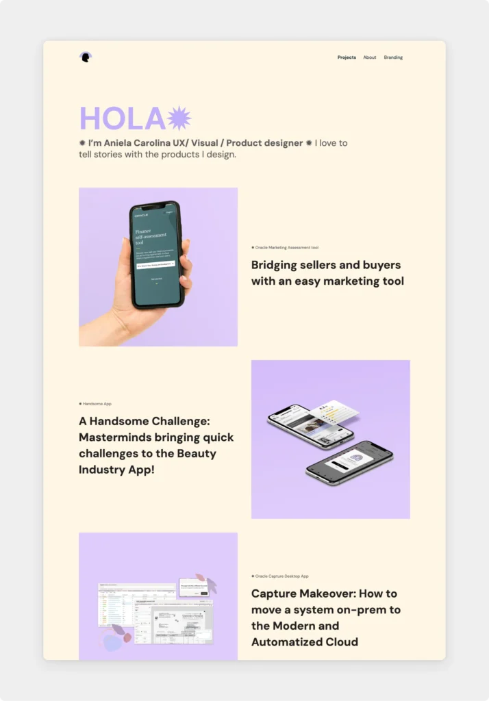
A knack for branding helps one stand out tremendously during their job search. Just by choosing a memorable color palette and symbols, Aniela immediately makes a lasting first impression.
Why we love this portfolio:
- Uncomplicated structure: Short bio, projects, contact info. These are the most important elements, and she makes them effortlessly available right away.
- Unique tone of voice: Her writing style in case studies and her about page is smooth and personal while keeping the content professional.
- Memorable application: With her conscious branding (logo, custom domain, color palette, fonts, symbols, graphics), her portfolio stands out.
- Honest design process: Aliena breaks with the traditional case study structure and does something recruiters appreciate much more. She tells the honest process she and her team went through and how they ended up with a stunning result. Way to go!
- Visual storytelling: Through captivating (and real) visuals and well-written descriptions, Aniela effectively communicates the story behind each project.
Areas of improvement:
- Role in the project: While she gives credit to her coworkers in her case study—rightly so—, she doesn’t explicitly state her exact contribution to the project. A sentence about this would elevate the value of her case study for a recruiter.
6. Alesia Ciocan
Alesia is a product designer with 5+ years of experience in graphic and visual design. In her UX career, she demonstrates a strategic approach to UX design, which she effectively showcases in her portfolio.
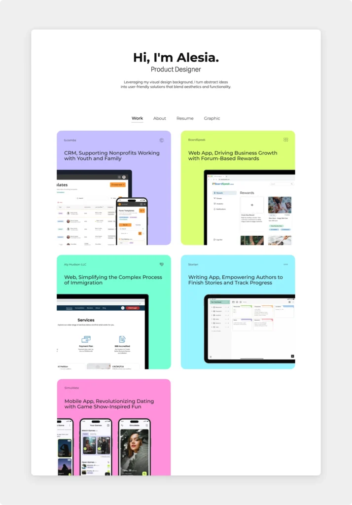
Her website is not only aesthetically pleasing but also consciously structured. By separating her UX and graphic design works, she manages to keep her website laser-focused on the goal it serves.
Why we love this portfolio:
- Impressive introduction: Other than the exceptional tagline, she also structured her About page cleverly. She gives us a glimpse into her real personality outside work, but still keeps it professional and creative.
- Interactive case study: Alesia embedded her beautifully designed high-fidelity prototype in her Storian case study, which not only is the visual cherry on top of the page but also presents her prototyping skills.
- Thumbnails: Her colorful, but cohesive project thumbnails bring visual interest to her homepage. The stunning little additions show her detail-oriented mindset.
- Addresses the lack of user validation tests: While the project timeframe didn’t allow it, Alesia states that she would’ve liked to have the opportunity to validate the design through user testing. It is a common situation in UX design projects, and this is the way to go about it in a case study.
Areas of improvement:
- Highlighting Impact: Including information about the measurable outcome achieved through design can demonstrate a good business sense. Alesia could include KPIs, metrics, and success stories to show the tangible value of her designs.
- Sell yourself, not the product: While the project descriptions are well-written, recruiters are much more interested in the work than the project or company she’s doing it for. Keep the product sales pitch, and focus on setting the scene effectively.
Final thoughts
As you wrap up these UX portfolio reviews, remember: they’re more than just inspiration. We wanted to show you why the portfolios that work actually work.
Getting a second eye on your portfolio can mean the difference between a good application and an amazing one. Send your portfolio over to your mentors, senior colleagues, or ask for feedback on UX design forums to gather actionable feedback.
Don’t know where to start? Sign up to UXfolio and get started on your career-defining portfolio.
You must be logged in to post a comment.