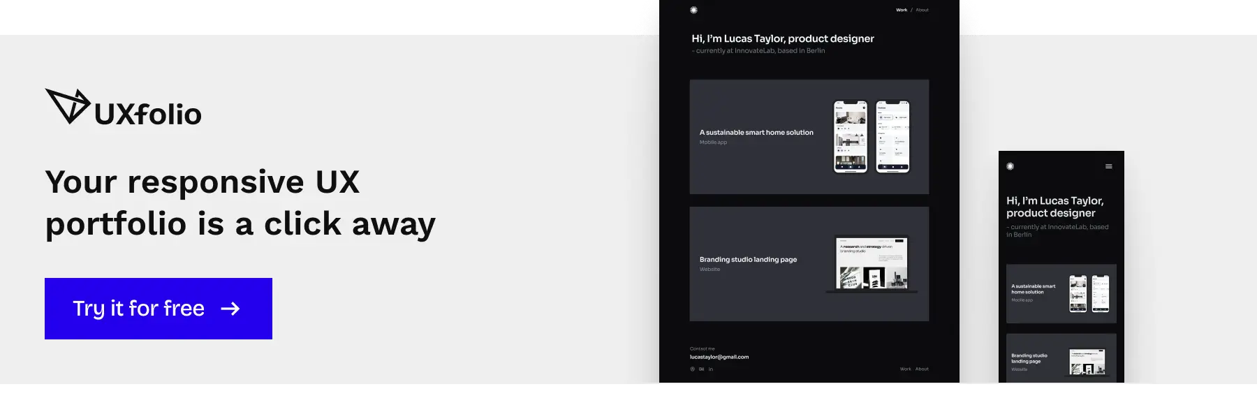
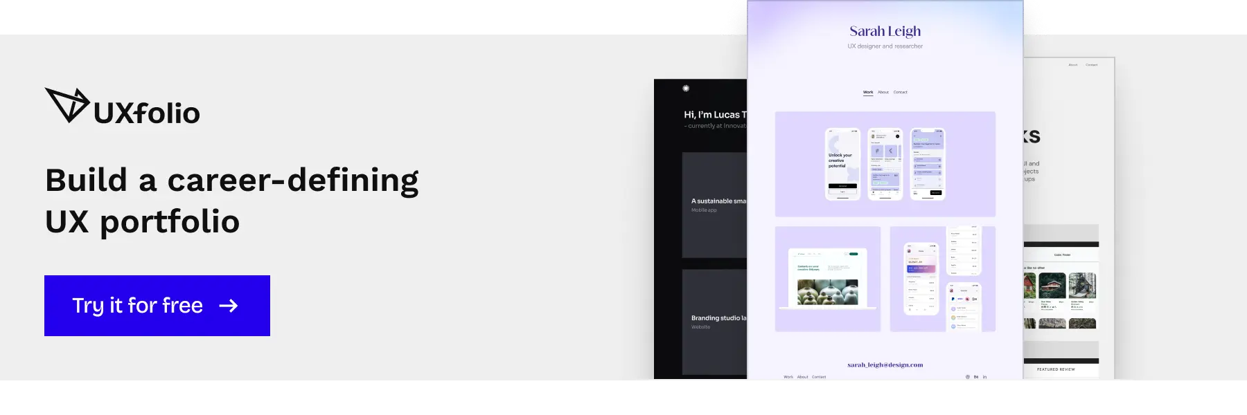
Beginner UX portfolio examples are often treated as inspiration galleries or layout references, but that approach misses their real value. If you are building your first UX portfolio, examples matter not because of how they look, but because they show how UX thinking is translated into evidence that hiring teams can evaluate.
Page content
- Why beginner UX portfolio examples matter more than templates
- How to analyse beginner UX portfolio examples the right way
- Beginner UX portfolio examples are not about showing everything
- What makes a beginner UX case study feel real
- Beginner UX portfolio examples without real-world experience
- Patterns that weaken beginner UX portfolio examples
- How beginner UX portfolio examples should support your job search
- Turning beginner UX portfolio examples into a coherent portfolio
- Frequently asked questions
Why beginner UX portfolio examples matter more than templates
At junior level, structure alone is not what differentiates a strong portfolio from a weak one. Templates help you organize and present your work clearly, but the way you frame problems, highlight decisions, and explain trade-offs still comes from your own thinking. Beginner UX portfolio examples, when used correctly, do exactly that.
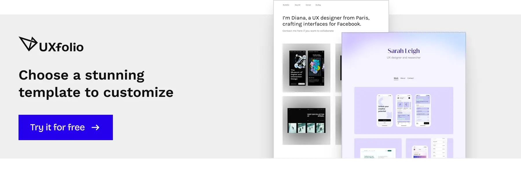
Examples show judgment, templates only show structure
A template tells you where to place information. An example shows you why certain information exists in the first place. When you look at a strong beginner UX portfolio example, you are not just seeing sections like problem, research, or solution. You are seeing how someone decided what was worth explaining and what could be left implicit.
That judgment is what reviewers pay attention to. Junior designers are not expected to solve complex problems perfectly, but they are expected to recognize what matters in a project. Examples make this visible. They show how constraints are framed, how trade-offs are acknowledged, and how incomplete outcomes are still communicated clearly.
Templates cannot model this kind of decision-making. They encourage completion rather than prioritization. That is why portfolios built strictly from templates often feel correct but unconvincing.
How real examples help you understand expectations, not just format
Beginner UX portfolio examples also help you calibrate expectations. Many junior designers overestimate how polished their work needs to be and underestimate how clearly their thinking needs to be explained. Examples counter this by showing realistic levels of depth, detail, and imperfection that are still acceptable and often preferred.
When you study real examples, patterns emerge. You see that strong junior portfolios rarely document everything. Instead, they focus on moments where decisions were made, assumptions were challenged, or insights changed direction.
In this sense, examples function as interpretive guides. They do not tell you what to copy, but they help you understand how your own work might be read, questioned, and evaluated by someone on the other side of the hiring process.

How to analyse beginner UX portfolio examples the right way
Beginner UX portfolio examples are easy to misread. Many junior designers look at them through the lens of aesthetics, feature sets, or perceived complexity. Reviewers do the opposite. They read portfolios as compressed narratives of how you think, decide, and adapt under constraints.
What signals experience even in junior-level work
Experience at junior level is not measured by the number of tools you know or the scale of the product you worked on. It is inferred from how you frame your decisions. When a beginner UX portfolio example feels credible, it usually shows awareness of trade-offs, not confidence in outcomes.
Signals of experience often appear in small moments.
- You explain why a research method was chosen instead of listing multiple methods.
- You acknowledge uncertainty instead of presenting assumptions as facts.
- You describe what changed after feedback, even if the change was minor.
These signals suggest that you understand UX as a decision-driven practice, not a checklist of activities. Reviewers recognize this quickly, even in short case studies.
Which decisions matter more than the final screens
One of the most common mistakes when reading portfolio examples is focusing on the final UI. Screens are easy to compare, but they carry little information about how you arrived there. Strong beginner UX portfolio examples shift attention away from polish and toward reasoning.
The decisions that matter most are usually upstream. How the problem was framed. Which constraints were accepted and which were challenged. What you chose not to pursue and why. These choices reveal far more about your readiness as a designer than visual refinement.
When examples emphasize these decisions, they feel grounded, even if the visual execution is simple. This is a useful calibration point for your own work.
What reviewers look for in small UX case studies
Junior projects are often small, artificial, or time-boxed. Reviewers know this and do not expect depth everywhere. Instead, they look for consistency in how you approach problems, even within limited scope.
Beginner UX portfolio examples demonstrate this by being selective. They go deeper in one or two areas rather than staying shallow across many. Reviewers infer thinking from how well you use the space you have. A single well-explained decision can outweigh several loosely documented steps.
Understanding this helps you read examples more critically. The value is not in the volume of content, but in how deliberately each part is used to communicate intent and reasoning.

Beginner UX portfolio examples are not about showing everything
A common misconception among junior designers is that portfolios are evaluated based on coverage. The assumption is simple: more projects, more artifacts, more steps equal stronger proof of competence. In reality, beginner UX portfolio examples tend to fail not because they lack work, but because they lack editorial judgment.
Portfolios are reviewed under time pressure. Hiring managers are not looking for exhaustive documentation. They are looking for signals that suggest how you think, what you prioritize, and how you decide what matters. Showing everything often hides those signals instead of strengthening them.
What separates stronger beginner UX portfolio examples from weaker ones is not ambition, but control. The ability to decide what deserves attention and what does not is itself a UX skill, and portfolios are one of the earliest places where that skill becomes visible.
How many case studies are enough at junior level
At junior level, quality saturates quickly. After two or three well-articulated case studies, additional projects rarely add new information for the reviewer. Instead, they increase cognitive load and fragment attention.
Strong beginner UX portfolio examples usually rely on a small number of projects that are explained thoroughly enough to reveal patterns. Reviewers are not only assessing individual projects. They are comparing how consistently you approach problems across different contexts.
A portfolio with three coherent case studies allows reviewers to answer questions quickly:
- Do you frame problems similarly?
- Do you adapt your approach when constraints change?
- Do you learn and apply insights across projects?
A portfolio with five or six shallow case studies often answers none of these questions clearly.
What weakens a portfolio even if the work looks “complete”
Completeness is often mistaken for credibility. Many beginner UX portfolio examples include extensive process documentation, yet still feel unconvincing. The issue is not missing steps, but missing intent.
Portfolios weaken when artifacts are presented without explanation of relevance. Screens, flows, or diagrams appear polished, but the reasoning behind them remains implicit or absent. Reviewers are left to infer meaning instead of being guided through decisions.
Another common issue is linear storytelling. Listing every step in chronological order creates the illusion of rigor, but it rarely reflects how decisions were actually made. Real UX work is uneven. Some moments matter more than others. Portfolios that treat all steps equally flatten that reality.
Stronger portfolios edit aggressively. They emphasize moments of uncertainty, constraint, or trade-off, and remove material that does not actively support the case study’s central argument. This selective framing makes the work feel intentional rather than overproduced.
What makes a beginner UX case study feel real
A beginner UX case study does not feel real because it follows a standard structure. It feels real when the reader can reconstruct the situation in which decisions were made. Authenticity in junior portfolios is not about originality or scale. It is about plausibility.
Reviewers are constantly asking a silent question while scanning beginner UX portfolio examples:
Could this project have actually unfolded this way?
When the answer is unclear, credibility drops quickly, even if the visuals and documentation look refined.
What makes a case study believable is not the absence of mistakes, but the presence of constraints. Real UX work is shaped by limits: time, access, incomplete data, conflicting goals. Beginner case studies that acknowledge and work within those limits create a stronger signal of readiness than ones that present idealized, frictionless processes.
Context, constraints, and why they matter
Context is not background decoration. In beginner UX portfolio examples, context functions as the boundary within which decisions gain meaning.
When constraints are vague or missing, decisions feel arbitrary. When constraints are specific, even simple design choices become interpretable. Reviewers can follow the logic and assess whether the response fits the situation.
Effective case studies define constraints early, but briefly. The goal is not to justify the project’s limitations, but to anchor the reader’s expectations. A well-framed constraint reduces the need for later explanation and prevents over-defensive storytelling.
Your role explained without over-justifying
Junior designers often feel the need to prove their contribution. As a result, beginner UX portfolio sometimes over-explain responsibilities, tools, and ownership. This tends to weaken credibility rather than strengthen it.
Clear role definition is not about listing tasks. It is about identifying where decisions came from. Reviewers are less interested in what you touched and more interested in what you decided, influenced, or challenged.
Strong case studies describe roles with precision and restraint. They show involvement through decisions and outcomes, not through exhaustive task inventories. This signals confidence and an understanding of how UX work is distributed in real environments.
Research depth versus research volume
More research does not automatically mean better research. In beginner UX portfolio examples, long research sections often obscure insight rather than clarify it.
What matters is not how many methods were used, but which findings shaped the direction of the work. Reviewers look for selectivity: the ability to identify which insights were strong enough to influence design decisions.
A smaller set of clearly connected insights creates a more credible narrative than an exhaustive but unfocused research summary. Depth is demonstrated through synthesis, not accumulation.
Design decisions that show prioritization
Design decisions become meaningful when trade-offs are visible. Beginner UX portfolio examples often describe what was designed, but not what was intentionally deprioritized or excluded.
Prioritization reveals judgment. When a case study shows why one problem was addressed while another was postponed, reviewers gain insight into how the designer balances constraints and goals.
Even simple projects can demonstrate this skill. The key is not complexity, but intentional choice.
Reflection as proof of growth, not self-criticism
Reflection sections often fail because they turn into self-evaluation essays. In stronger beginner UX portfolio examples, reflection serves a different purpose: it shows how experience modifies future behavior.
Effective reflection focuses on transferable learning.
- What would you approach differently next time, and why?
- How did this project change the way you frame problems, conduct research, or collaborate?
This kind of reflection signals trajectory. It shows that the portfolio represents a moment in development, not a fixed skill set.
Beginner UX portfolio examples without real-world experience
A lack of real-world experience is not the primary weakness of most junior portfolios. The real issue is how that absence is handled. Beginner UX portfolio examples often try to compensate by inflating scope, overstating impact, or framing hypothetical work as if it were production-ready. These strategies tend to backfire.
Reviewers do not expect juniors to have extensive client histories. What they assess instead is whether the designer understands what real constraints look like, even when working without them. Credibility comes from how realistically a project is framed, not from whether it involves a real company.
When student projects are stronger than real client work
Not all real-world projects make good portfolio material. Some client work limits decision-making so heavily that it leaves little room to demonstrate UX thinking. In contrast, well-structured student projects often allow deeper engagement with problem framing, research, and iteration.
Stronger beginner UX portfolio examples use student projects deliberately. They acknowledge the academic context while showing how UX principles were applied within it.
Reviewers tend to trust student work more when its scope is honest and its learning objectives are clear. Over-polishing or reframing it as pseudo-agency work usually reduces that trust.
What makes a concept project credible
Concept projects are risky, but not inherently weak. Their credibility depends on how grounded the problem definition is.
Concepts fail when they start from imagined solutions rather than observed problems. They succeed when they originate from real, everyday frictions that can be plausibly researched and reasoned about. Even without user access, designers can demonstrate methodological thinking through assumptions, validation logic, and constraint awareness.
Strong beginner UX portfolio examples make it clear where evidence ends and assumptions begin. This transparency signals maturity. Reviewers are not looking for certainty; they are looking for responsible reasoning.
Turning everyday problems into UX-relevant case studies
Some of the most convincing junior case studies come from reframing ordinary experiences through a UX lens. Workplace inefficiencies, service breakdowns, or digital habits can all become valid starting points when treated analytically rather than personally.
The transition from observation to UX problem requires discipline. Designers must abstract the issue, define affected users, and articulate why the problem matters beyond personal inconvenience. When done well, this demonstrates core UX skills without relying on formal project settings.
Beginner UX portfolio examples that use everyday problems effectively show initiative and analytical ability. They also reveal how the designer identifies opportunities, not just responds to assignments.
Patterns that weaken beginner UX portfolio examples
Most junior portfolios fail not because the designer lacks skill, but because the work is framed in a way that hides it. Certain patterns consistently reduce clarity, credibility, and signal-to-noise ratio, even when the underlying project is solid.
These issues rarely come from ignorance. They usually come from trying to appear more experienced than necessary.
Focusing on outputs instead of reasoning
Screens are easy to show. Decisions are harder to explain. Many beginner UX portfolio examples lean heavily on polished UI because it feels tangible and impressive. Unfortunately, this often shifts attention away from the actual UX work.
Reviewers do not assume that good-looking screens equal good UX thinking. When outputs dominate the case study, they start asking questions the portfolio does not answer.
- Why was this flow chosen?
- What alternatives were considered?
- What constraints shaped these decisions?
Strong portfolios reverse the emphasis. Visuals support the narrative, but reasoning drives it. Even simple wireframes can communicate more value than refined mockups if they are anchored in clear decision logic.
Describing process steps without explaining choices
Listing activities is not the same as explaining thinking. Many junior case studies walk through familiar UX steps research, personas, wireframes, testing without clarifying why those steps were taken or what changed as a result. This pattern creates the illusion of process competence while withholding evidence of judgment.
Beginner UX portfolio examples improve significantly when they replace procedural descriptions with selective explanations. Fewer steps, explained more deeply, almost always outperform exhaustive but shallow walkthroughs.
Generic storytelling vs real UX thinking
Storytelling is often misunderstood as polishing language or adding narrative flair. In portfolios, storytelling serves a different purpose. It connects problems, decisions, and outcomes in a way that reflects how work actually unfolded.
Generic storytelling tends to smooth over uncertainty and conflict. Real UX work, especially at junior level, includes hesitation, trade-offs, and partial success. When a case study reads too cleanly, it raises suspicion rather than confidence.
The strongest beginner UX portfolio examples are specific without being defensive. They acknowledge limits, explain compromises, and show progression. This does not weaken the story. It makes it believable.
How beginner UX portfolio examples should support your job search
A beginner UX portfolio is rarely judged as a finished product. It is judged as a signal. Reviewers are not asking whether your work is flawless, but whether it gives them enough confidence to move the conversation forward.
At junior level, your portfolio’s job is not to impress in isolation, but to make a hiring manager comfortable enough to invest time in you as a candidate. This is why beginner UX portfolio examples should be read and built with a job-search lens.
Why portfolios are evaluated faster than you think
Junior portfolios are rarely read line by line on first pass. In most hiring flows, reviewers spend just enough time to decide whether a portfolio is worth a deeper look later. This means that clarity beats completeness every time.
What gets noticed early is not how many methods you used, but how quickly a reviewer can understand the problem, your role, and the logic behind your decisions. If these elements are buried or overly verbose, even strong work risks being overlooked.
How examples influence interview questions
Your portfolio silently shapes the interview before it begins. The way you frame problems, justify decisions, and reflect on outcomes determines what kind of questions you will be asked later.
Clear, thoughtful examples invite questions about reasoning, trade-offs, and constraints. Vague or overly polished examples tend to trigger surface-level questions or force interviewers to dig for substance. For junior designers, this difference is critical.
Using your portfolio as a discussion tool, not a showcase
Beginner UX portfolio examples work best when they are designed for conversation. Their purpose is not to stand on a pedestal, but to sit between you and the reviewer in a shared context.
Annotations, short explanations, and clearly articulated decisions help turn static case studies into interactive prompts. When your portfolio supports dialogue, interviews shift away from judgment and toward collaboration. This is exactly where junior designers perform best: explaining how they think, how they learn, and how they approach unfamiliar problems.
Turning beginner UX portfolio examples into a coherent portfolio
A strong beginner portfolio is more than a collection of decent projects. It is a coherent body of work that consistently communicates how you approach UX problems. Reviewers do not expect mastery at this stage, but they do look for internal consistency.
Cohesion helps reviewers understand you faster. It reduces cognitive load and reinforces trust in your process, even when project contexts vary.
Why consistency matters more than individual project quality
At junior level, consistency is often a stronger signal than peak quality. A portfolio where every case study follows a similar logic, structure, and tone suggests intentionality and self-awareness.
Consistency does not mean uniform visuals or rigid templates. It means that your reasoning, terminology, and level of explanation remain stable across projects, making your thinking easier to follow and evaluate.
Structuring case studies so they reinforce each other
Each case study should add a new dimension to the same underlying story: how you think as a UX designer. The goal is not variety for its own sake, but complementary evidence.
When projects reference similar decision patterns, constraints, or research approaches, they start to reinforce one another. Over time, reviewers begin to recognize your way of working.
Keeping your portfolio flexible as you gain experience
A beginner portfolio should be treated as a living system, not a finished artifact. As you gain experience, the challenge is not adding more work, but curating better signals.
Older projects may lose prominence, new ones may take their place, and some case studies may evolve rather than disappear. What matters is that the portfolio remains coherent as it changes. Each project should earn its place by contributing to your overall narrative. If it no longer does, it belongs in your archive, not your primary presentation.
Frequently asked questions
Can I rely solely on templates?
No. Templates provide structure, but real examples communicate reasoning. Your portfolio should highlight how you solve problems and adapt UX methods.
What should I prioritize in a junior portfolio?
Clarity, decision rationale, and learning. Focus on key case studies that show context, constraints, and iteration, rather than trying to impress with visuals alone.
How can I make non-professional projects credible?
Frame them with clear context, your role, and UX thinking. Concepts or student projects can be just as compelling if they demonstrate structured problem-solving.
How should I handle oversharing?
Less is more. Highlight decisions that reflect judgment, and leave out trivial outputs. Oversharing can dilute focus and obscure your UX thinking.
How do these examples support interviews?
They give you a reference point for discussion. Each case study becomes a story you can expand on, illustrating how you approached challenges and iterated on solutions.
What common mistakes should I avoid?
Prioritizing visuals over reasoning, oversharing minor outputs, or presenting generic storytelling without insight. Strong portfolios make thinking visible and decisions understandable.