In an ideal world design leads and recruiters would spend hours reviewing your UX portfolio. In the real world that hardly ever happens. Most of them spend a minute or two sorting through dozens of portfolios to choose the ones they’ll review in depth. During this process, there’s only one page they’re guaranteed to see: your portfolio’s cover.
Your portfolio cover page does not exist in isolation. It is the entry point to your entire UX portfolio and the gatekeeper to your case studies. In practice, recruiters use the cover page to decide one thing only: is it worth investing more time in your work?
This article focuses on how to design a portfolio cover page that supports that decision. Not by trying to explain your full story, but by guiding visitors toward your projects and helping them understand what kind of designer you are within seconds.
Page content
Defining the cover page
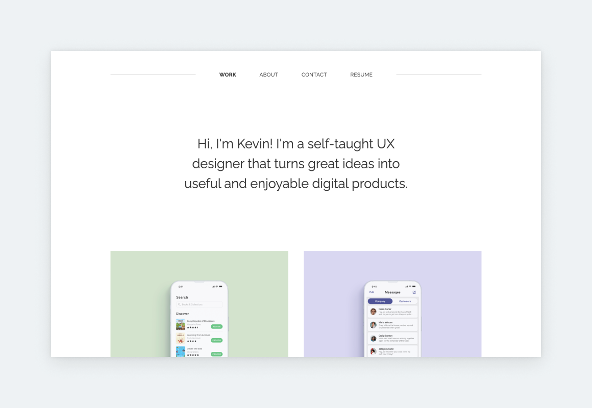
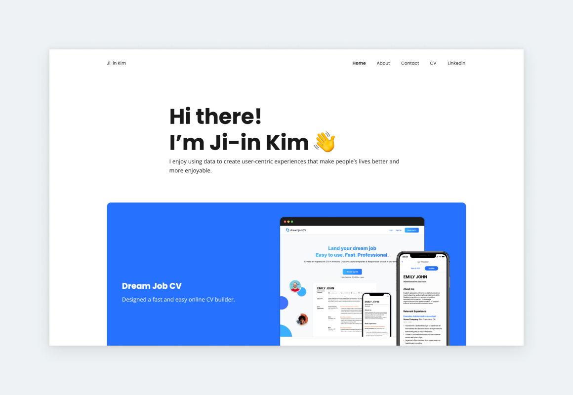
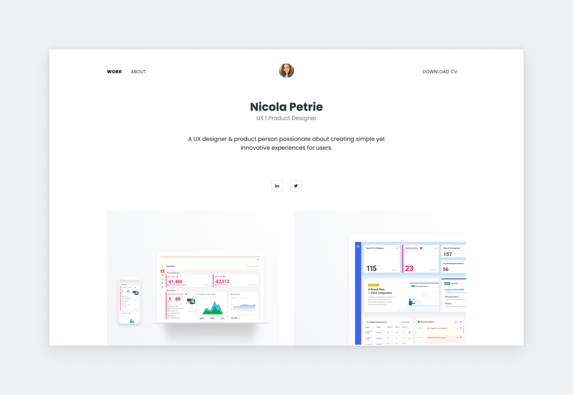
The cover page is the first page of a portfolio, therefore, it’s the first thing people see when handling a physical portfolio, opening a portfolio document, or landing on a digital portfolio website. Its purpose is to hold together the various pieces and parts of a portfolio and to introduce the portfolio’s owner to the visitor/user.
From a UX perspective, the cover page acts as a navigation and orientation layer. It helps users quickly answer three questions:
- Who is this designer?
- What kind of work do they do?
- Where should I click next?
A strong cover page does not try to answer everything. It simply makes the next step obvious.
Our research findings
As part of our research at UXfolio, we’ve interviewed many decision-makers to learn about their routines and perspective.
Most of them paint a similar picture about the hiring process: they get dozens of applications in a matter of days and they have limited time to make a hire. For design leads the situation is even worse because reviewing candidates is a task on top of their regular duties.
This means that they have to make quick decisions and be very selective.
Can you change that? The answer is no. But you can optimize your portfolio front page to capture their attention in that limited timeframe, so your application makes the cut and advances to the next stage of the hiring process, like the UX designer interview.
What this means for you is simple: your portfolio cover page needs to support fast scanning, not deep reading.
Every visual and structural decision should reduce effort and uncertainty for the reviewer. If your cover page creates friction, most visitors will not push through it.
Why should you care?
A lot depends on your portfolio’s cover page since it’s your virtual first impression. If it’s up to par, your visitors will go on and explore your content, like your projects and about page. And this should be your key objective because it’s your projects that seal the deal by showcasing your expertise, talent, and process.
A strong cover page does not get you hired on its own. What it does is increase the likelihood that your projects and case studies will actually be reviewed. And those are the parts of your portfolio where recruiters evaluate your thinking, process, and impact.
If you are building your first portfolio or updating one that has not yet gotten traction, exploring beginner UX portfolio examples can help you understand how effective cover pages are combined with project selection and narrative.
Made with UXfolio
Your portfolio is a product
Your portfolio is a testament to your personal taste. When working for a client, company, or agency it’s part of the job to make compromises and adjust to the project. But in the case of your portfolio, you get a free hand.
Yet, you must remember that you’re not the user of your own portfolio. It’s the potential client, recruiter, or design lead who’ll be interacting with it. So, designing a portfolio means balancing your personal taste with their needs.
Made with UXfolio
The 2 pillars of a cover page
If your portfolio title page makes a great first impression, your user feels compelled to dig deeper. To do that, they have to interact with your portfolio. Based on these facts, we can define two areas of focus:
- Look -> for the first impression.
- Structure -> so they find everything they want.
Easy-peasy, right? Yet, so many designers get it wrong because they get carried away while working on their portfolio, losing sight of its use cases and their own goals.
To avoid this, we’ve gathered a few straightforward rules that your can follow while working on your portfolio cover page design:
1. Look: optimizing for the first impression
The first impression is all about the look of your portfolio’s cover page. The goal is to make something beautiful, universal, and professional. Fonts, colors, whitespace, layout, and visual hierarchy all influence this. Together, these elements are responsible for the first impression your portfolio – and you – make. Therefore, you need to get it right:
Rule 1: Make your user feel at ease
Overdesiging is a common portfolio mistake. Many designers – especially juniors – believe that in order to show their personality every pixel of their portfolio needs to make a statement. The result is usually anxiety-inducing and very of its time.
Meanwhile, simplicity and minimalism are timeless qualities that evoke a sense of familiarity, making your user feel at ease. This is why many portfolios look so similar: people feel more comfortable with things they can pinpoint and categorize: ‘This is a portfolio because it looks like a portfolio.’
Made with UXfolio
What’s even more important is that a simple portfolio cover page will direct your users’ attention to your project thumbnails.
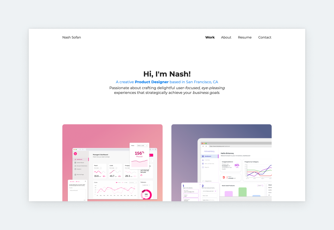
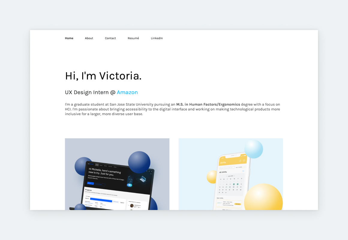
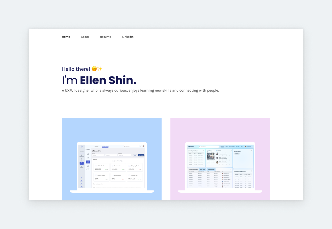
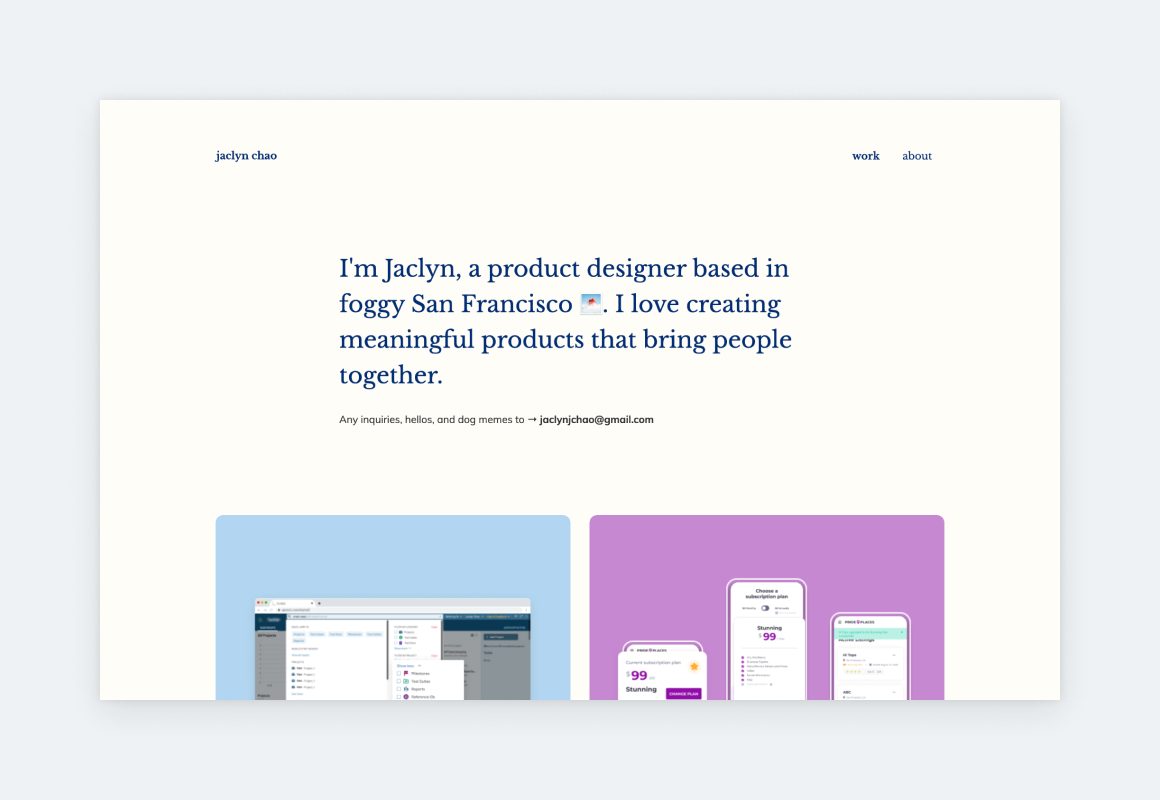
Rule 2: Focus on your project thumbnails
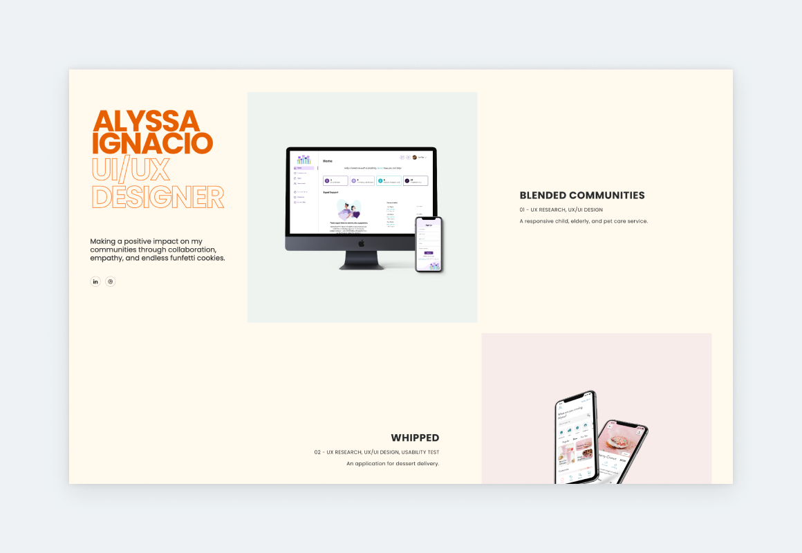
Your portfolio’s cover is a hub from where your users navigate to various content such as projects, about page, contact page, and so on. From these, your projects are the most important because they reveal your talent, process, and experience.
In digital portfolios, projects are usually linked through thumbnails which take up the largest space on the cover page. So, they need to look amazing on their own and as a group.
The biggest project thumbnail mistake is using thumbnails with different styles. Just think about it: your thumbnails are in close proximity on the same page. If they’re not in harmony, you end up with a messy effect, indicating that you’ve failed to consider your portfolio as a whole.
Therefore, if you must prioritize one task above all from your portfolio front page design tasks, it should be your thumbnails.
What to feature on your thumbnails?
Project thumbnails are scanned before they are understood. Recruiters do not analyze them one by one. They look at the group and form a pattern-based impression. This is why consistency matters more than creativity at this stage. Your thumbnails should signal cohesion, not competition.
1. Snippets of the project deliverables
If you’re from a visual field – such as UX/UI or graphic design – put a preview of the finished design on your thumbnail. You can frame it in a device mockup or leave it naked, just make sure to use a nice layout that works for the rest of your project thumbnails as well.
2. Screenshots
Even if you didn’t do design on a project, your work has contributed to the design. Therefore, you can use a screenshot of the product on your project thumbnail. Again, you can frame it in a device mockup or keep it low-key.
3. Simple text
There’s something very sleek and professional about thumbnails that include nothing but text: a title and maybe a short description. So, don’t be afraid of this approach. It’ll look fantastic if you choose the right font, with legibility in mind.
4. Logos
Another option is to find the companies’ logos, unify them (with an overlay), and place them on harmonizing backgrounds. But keep in mind that this thumbnail type needs some text (title and short description) for context.
5. Photos
Photos work great on thumbnails too. But, you have to be careful. First, choose photos that are relevant to the project. Second, make sure that each project photo has the same color profile. You can achieve this by applying a filter or preset in an app like Lightroom. Or, you can generate images using AI.
4 simple rules for thumbnail consistency
- Use the same device mockup style on each thumbnail, or
- use the same thumbnail layout.
- Use the same background color on each thumbnail, or
- use harmonizing background colors.
- Match the color profiles of your thumbnails.
- Use overlays, presets, or filters to match clashing visuals.
Made with UXfolio
2. Structure: optimizing for the user
Once you have your users’ attention, they will take a closer look at your portfolio. This means that they’ll start interacting with your cover page. Here’s what you should watch out for:
Rule 1: Follow the beaten path
We’ve already alluded to portfolio cover pages looking similar. This is also true for their structure and information architecture. Most portfolios look something like this:
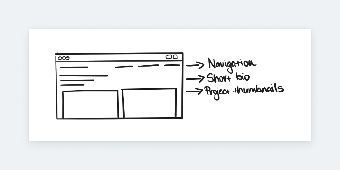
Obviously, there’s some variance to this structure, but the three main elements are almost always constant:
- Navigation
- Short bio/intro
- Project thumbnails
These elements and structure work because the user can access all the necessary destinations in your portfolio right away. It’s their personal choice whether they’ll start with your projects or your about page. What’s important is that they can do so without having to think twice.
Once you start experimenting you risk confusing your users. Here are some of the biggest and most common portfolio cover mistakes:
- Hiding any of the essential elements.
- Over-animating essential elements.
- Forcing users to wait for essential elements to appear or become clickable.
- Making the user work for the information.
This doesn’t mean you shouldn’t experiment or express your creativity. The twist is that you need to be creative enough to create something that feels yours but doesn’t alienate your user.
So, keep it simple. Make your navigation, short intro, and your project thumbnails at least partially visible in your cover page’s first fold. Apply your creative energies to their style instead of their behavior and placement. If you go in with this mindset, you’ll make your and your users’ life easier:
- You dedicate your time to what matters most, and
- the users will have a delightful experience on your portfolio cover page.
Made with UXfolio
Rule 2: Barebones approach
Let’s take a closer look at the 3 elements of the portfolio cover page and how to optimize them:
1. Navigation
Keep your navigation tidy! Your portfolio’s navigation should link only to the cornerstone content of your portfolio. This includes your about page, resume, and maybe a contact page. You can also include your projects here, but they’ll be linked through thumbnails anyways, so it’s not a must.
2. Projects
Keep your projects on your cover page and, if possible, make them visible in the first fold. After opening your portfolio, most users will want to see your work so you should make it easy for them.
The number of projects you need to include in your portfolio depends on the design discipline you’re practicing. However, these are the universal pointers:
- Quality over quantity: include your best work only.
- ‘Best’ stands for projects that bring value to your portfolio:
- Projects that turned out great.
- Projects you’ve learned the most from.
- Projects that highlight most of your skills.
- Projects that have beautiful deliverables.
Everything that you’re second-guessing is better left out or reworked in a way that adds some value to your portfolio.
You can’t predict which project your visitors will click on. What if they choose the half-baked one that you’ve just added to reach a “project count” that some random article advised? That’d be a bummer. So, keep it curated and keep polishing the projects until they add some value to your portfolio.
3. Short bio
‘Tagline’ would be a much better word for the short bio on your portfolio cover page. It’s way more indicative of what it should be: a sentence that describes your perspective. Keep it short, sweet, and – if it’s something that comes to your naturally – witty.
For a long-form introduction, you can use your About page. Based on our research, people will read it if the portfolio makes them interested.
If you are preparing for recruiter or hiring manager reviews, our detailed UX portfolio presentation guidance shows how to sequence and verbalize your portfolio during live or recorded walkthroughs.
Made with UXfolio
Let’s get to work!
Now you have a realistic image of what a portfolio cover page is all about. If you’ve read this far, you already know that we’re not here to sell you anything that’s not based on reality. Portfolio building is a serious business. Your future and livelihood depend on it.
If you’re looking for a portfolio builder that allows you to focus on what really matters, try UXfolio! Our portfolio-building tool comes with stunning, minimal templates that can be customized according to your needs. Also, UXfolio comes with unique features like:
- Case study builder.
- Text ideas.
- Built-in device mockups.
- Various galleries.
Frequently asked questions
What is the main purpose of a UX portfolio cover page?
A UX portfolio cover page helps recruiters decide whether your work is worth a closer look. Its primary purpose is not to explain your entire background, but to guide attention toward your strongest projects and reduce uncertainty during the first seconds of review.
How much information should a portfolio cover page include?
Less than most designers expect. A cover page should include only essential elements: navigation, visible projects, and a short personal tagline. Anything that requires reading, scrolling, or interpretation should be moved deeper into the portfolio.
Do UX recruiters care more about visuals or structure on the cover page?
Both matter, but structure comes first. If recruiters cannot quickly understand where to click and what they are looking at, visual quality will not compensate for that confusion. Visual polish reinforces trust only after clarity is established.
How many projects should be visible on a UX portfolio cover page?
Only your strongest and most relevant projects should be visible. There is no universal number, but every project shown should clearly add value and represent the type of work you want to be hired for. If you are unsure about a project, it does not belong on the cover page.
Should junior UX designers design creative or minimal portfolio cover pages?
Junior designers benefit more from clarity than originality. Minimal, familiar layouts reduce cognitive load and help reviewers focus on your work instead of deciphering your interface. Creativity becomes effective once trust and structure are already established.
You must be logged in to post a comment.