
Finding a platform to build your digital portfolio is easy. Finding one that genuinely helps you create a portfolio recruiters want to review is much harder.
When people search for UX portfolio features, they’re rarely looking for more customization options or visual effects. They’re trying to understand which capabilities genuinely make building, maintaining, and tailoring a portfolio easier.
Over the years, I’ve noticed the same pattern. Designers often spend weeks building a portfolio website before improving the portfolio itself. In my experience, that’s exactly the wrong way around.
A great UX portfolio platform removes unnecessary work so you can focus on the work that actually gets you hired. That’s the perspective behind every feature in this guide, from recruiter-ready templates and AI-powered case study creation to branding, customization, and presentation tools for a professional UX designer portfolio.
Page content
Start with strong foundations
One of the biggest mistakes I see is designers treating their portfolio like another product design project. Before writing a single case study, they’re already comparing website builders, experimenting with layouts, adjusting spacing, and rebuilding navigation. I don’t believe that’s how building a UX portfolio should start.
A UX portfolio shouldn’t begin with technical decisions, instead, it requires a strategic UX portfolio playbook that recruiters already understand. Once that foundation is in place, you can spend your energy on what hiring managers actually care about: your decisions, your reasoning, and the impact of your work.
Use recruiter-ready templates instead of starting from scratch
Most website builders give you one thing above everything else: freedom.
At first, that sounds like an advantage. In reality, it often becomes another design problem to solve. You’re expected to choose a generic template that wasn’t designed as a UX portfolio template, rethink the information architecture, decide what sections belong on the homepage, and figure out how to present your projects in a way recruiters can scan quickly.
That’s a lot of work before you’ve even written your first sentence.
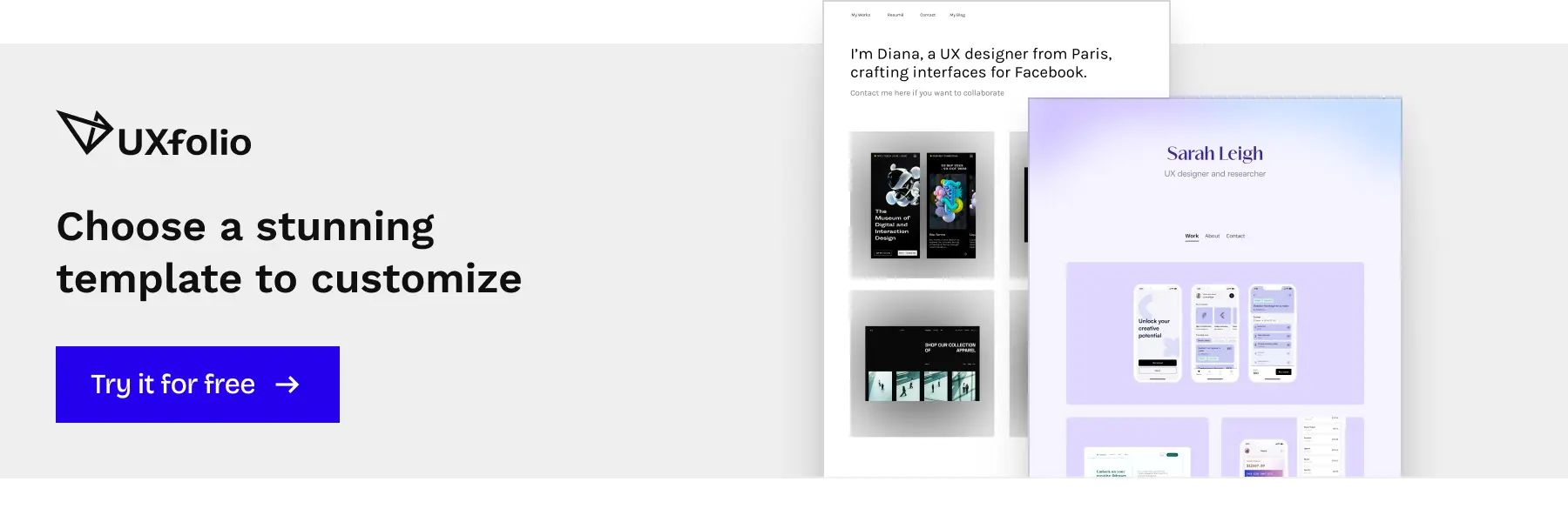
At UXfolio, we’ve taken a different approach. Our recruiter-ready templates were built specifically for UX portfolios, based on years of research, hiring manager interviews, and observing how successful UX portfolio examples are structured. Instead of starting with a blank canvas, you begin with a framework that already reflects how recruiters evaluate UX candidates.
That doesn’t mean sacrificing flexibility. It means removing unnecessary decisions so you can focus on the ones that actually matter.
Create multiple portfolios for different job applications
Very few designers apply for only one type of role. A portfolio that works well for a product design position at a startup might not highlight the same strengths that matter for an enterprise UX role or a research-heavy position. Sending exactly the same portfolio everywhere often means forcing recruiters to search for the projects most relevant to them.
To me, that’s unnecessary friction.
Instead of rebuilding your portfolio every time you apply somewhere new, UXfolio lets you create multiple portfolio versions from the same account. You can duplicate your existing work, adjust project selection, rewrite introductions, or emphasize different skills without maintaining several independent websites.
It turns tailoring your portfolio into something you can realistically do for every important application.
Build once, publish everywhere with automatically responsive portfolios
Recruiters review portfolios in very different contexts. Some open them on large desktop monitors, while others quickly browse them on laptops between meetings or review applications from a tablet while travelling. Your portfolio needs to communicate your work equally well regardless of where it’s viewed.
The most important lesson? This shouldn’t be your responsibility. Finding the best tool for the job is all you need to do, and I have great news for you on that front.
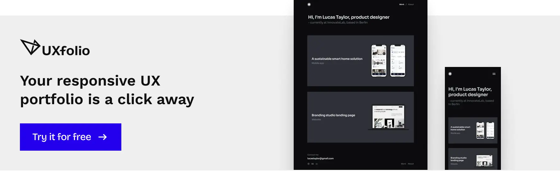
Every UXfolio portfolio is automatically responsive, so the layouts adapt across devices without requiring you to manage breakpoints, duplicate components, or test multiple screen sizes manually. You build your portfolio once, and the platform takes care of presenting it consistently wherever it’s opened.
Connect your own custom domain
Your portfolio is your professional identity. Using your own domain helps reinforce that identity while making your portfolio easier to remember, easier to share, and more credible during the hiring process.
Connecting a custom domain in UXfolio takes only a few steps, allowing you to publish under your own address without moving your content or rebuilding your website elsewhere. You keep the portfolio optimized for UX hiring while presenting it entirely under your own brand.
Password-protect your portfolio or individual case studies
One concern I hear repeatedly is confidentiality. Many projects involve internal tools, unreleased products, sensitive business information, or research that simply can’t be published publicly. Unfortunately, that often leads designers to remove some of their strongest work from their portfolio altogether.
Password protection offers a better alternative.
With UXfolio, you can protect your entire portfolio or individual case studies while still sharing them with recruiters during the hiring process. Public visitors only see what you publish, while recruiters can access protected case studies using a password you share.
You no longer have to choose between confidentiality and showcasing your strongest work.
Build stronger case studies with AI
If there’s one place where I’ve seen designers lose the most momentum, it’s the moment they start writing. Not because they don’t understand their project, or because they don’t remember what happened.
But because translating weeks or months of design work into a clear, structured case study is surprisingly difficult. Suddenly, you’re staring at a blank page wondering where to begin, what recruiters actually care about, and whether you’re explaining too much or too little.
To me, this is where AI actually makes sense. It shouldn’t write your portfolio for you, that completely defeats the purpose. But it can help you get past that blank-page anxiety so you can start writing it yourself. That’s the exact approach we took with every AI feature inside UXfolio.
Generate a structured case study draft with AI
One of the biggest misconceptions about AI writing tools is that their job is to generate finished content. Personally, I don’t think that’s particularly helpful.
Recruiters aren’t looking for perfectly polished AI-generated paragraphs. They’re trying to understand how you approached a problem, what trade-offs you made, and why your decisions mattered. No language model can invent those experiences for you.
What AI can do remarkably well is eliminate the intimidating first step.
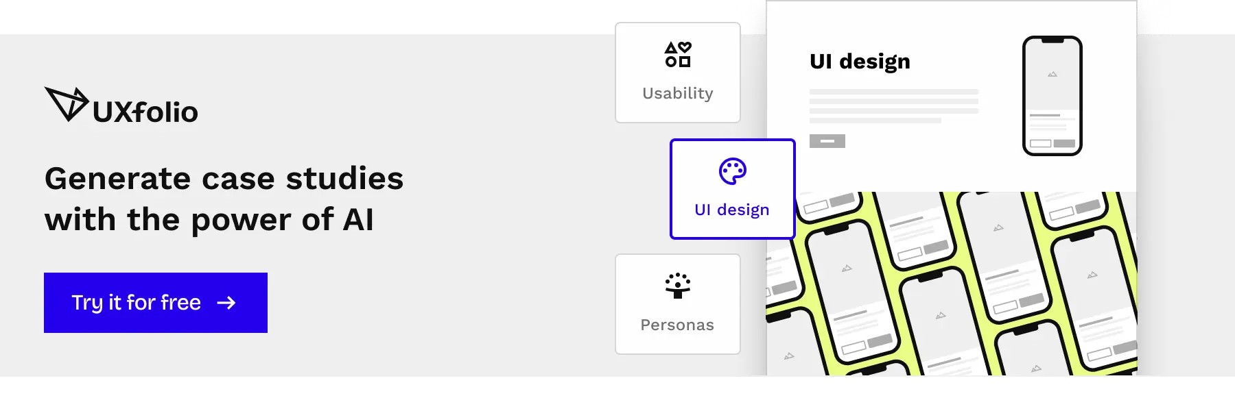
By establishing a smart AI case study workflow, UXfolio’s Case Study Generator helps you build a structured starting point based on a UX case study template that maps to the UX methods you actually used in your project. Instead of opening an empty document, you begin with a logical framework that already reflects how successful UX case studies are typically organized.
Even more importantly, every section comes with expert text ideas and guiding questions designed specifically for that part of the design process. Rather than asking generic questions, the prompts encourage you to explain your decisions, constraints, iterations, and outcomes, exactly the details recruiters are trying to uncover while reviewing your portfolio.
Instead of figuring out how to structure your story, you can spend your energy telling the story only you can tell.
Improve your storytelling with AI
Writing is rarely the difficult part, communicating your thinking usually is.
I’ve reviewed enough UX portfolios to notice the same pattern over and over again. Designers often know exactly why they made a decision, yet their case study somehow fails to communicate that reasoning clearly.
Important trade-offs disappear. Design rationale gets buried under process descriptions. Strong insights become vague summaries, which is why mastering UX storytelling is so difficult, and exactly where AI should act as an editor rather than an author.
UXfolio’s AI Text Enhancement helps refine what you’ve already written by improving clarity, readability, and structure while preserving your original ideas. It doesn’t replace your voice. It helps your voice come across more clearly.
And that distinction is everything. The point isn’t to hand your professional story over to a chatbot. The real goal is to make your actual thinking so clear and structured that a busy recruiter instantly gets your logic on their very first read.
Tailor your portfolio to a specific job description
We all know the gold standard advice: tailor your portfolio for every job you apply to. It’s great advice, but let’s be honest, hardly anyone has the time to actually do it.
Manually tweaking case study introductions, re-emphasizing specific skills, and rewriting summaries for five different job applications is exhausting. It’s why most of us eventually give up, send the exact same link to everyone, and hope for the best.
That’s why we built UXfolio’s Job Fit Checker.
Instead of writing generic filler, it acts as a second set of eyes. The tool analyzes your portfolio against a specific job description and points out where you might be missing the mark.
You’re still the one in control. You still write the copy, make the edits, and decide how to represent your work. The AI simply highlights the blind spots you might have missed, letting you make fast, focused adjustments that keep your portfolio relevant and completely authentic.
Use AI without losing your own voice
Should you use AI for your UX portfolio? My answer is simple: Yes, but only to articulate your own reality.
Hiring teams are tired of seeing common case study mistakes, they aren’t looking for a textbook case study that follows a flawless, imaginary process. They want to see how your brain works when things go wrong in the real world.
That’s the exact boundary we set when designing UXfolio’s AI features. We didn’t build them to replace your thinking. They’re here to help you organize complex ideas, clear up messy drafts, and structure your arguments. The mistakes, the pivots, and the actual decisions still have to come from you.
In an industry flooded with robotic, generic copy, the portfolios that stand out are the ones that sound human. Our goal is simply to help you clear away the writing block so your actual voice can come through.
Showcase your work professionally
I’ve always found it ironic how much care designers put into creating pristine interfaces for products, yet how often they settle for messy presentations in their own portfolios.
Your work deserves better than a dumping ground of static screenshots.
Presentation isn’t decoration, it’s communication.
The goal isn’t to look flashy. It’s to remove visual friction so recruiters can stop trying to decipher your layout and actually start reading your case studies.
Create polished layouts without coding
Generic website builders promise complete layout freedom.
That sounds great in theory, but in practice, it means you’re suddenly stuck managing spacing systems, responsive grids, and font scales. These are endless, micro-level design decisions that have nothing to do with proving your UX process.
Every hour you spend adjusting Webflow breakpoints is an hour you aren’t spending on your content, which is the only thing that actually gets you hired.
UXfolio handles the underlying system for you. Instead of starting from a blank canvas, you build on templates engineered specifically for UX portfolios. The grids, hierarchy, and navigation are already optimized for scanning. You don’t have to wrestle with CSS, you just focus on writing your decisions.
Design consistent case study thumbnails
Before a recruiter reads a single word, they scan your homepage. Most of that first impression comes down to your project thumbnails.
But building consistent project thumbnails is surprisingly tedious. You jump into Figma, find some device frames, export them, realize the sizing is slightly off, and repeat the process for every single project. The result? A chaotic homepage that looks like a collection of projects from five different designers.
We built UXfolio’s Thumbnail Designer to kill that loop.
You create cohesive cover images directly inside UXfolio. Whether you want stylized device mockups, clean minimalist cards, or color-coded backgrounds, every thumbnail stays perfectly aligned. It’s a subtle difference, but it signals attention to detail before anyone even clicks a project.
Present your screens with built-in device mockups
Showing your work inside device frames is a standard expectation. The problem isn’t whether to use them, but how much repetitive work usually goes into creating them.
The old workflow is absurd: find a mockup, download it, place your screen, export the image, upload it, and repeat the entire cycle every time your design changes.
That’s why UXfolio has built-in Device Mockups.
You drop your screens directly into native device frames inside your portfolio. No switching tools, no endless exports. Even better, full-page screenshots stay interactive. Instead of looking at a squished, static image, recruiters can actually scroll through your interfaces naturally.
Edit every page visually
With generic builders, even a tiny change can turn into a technical headache. You move one section, and another shifts unexpectedly. You adjust the desktop spacing, and now the mobile version is broken. Suddenly, you’re not refining your work, you’re debugging a website.
UXfolio’s Visual Editor keeps things simple. You can rearrange sections, update copy, and polish your layout directly on the page, without worrying about breaking the code behind the scenes. Your portfolio stays easy to iterate on, which is vital because a portfolio isn’t a one-time project, it’s an evolving record of your career.
Organize projects into clear case study grids
As you gain experience, organization becomes just as critical as the individual projects. I’ve seen incredibly strong work get completely lost because it was presented in an unstructured, overwhelming list. The recruiter has to work too hard to find what’s relevant. That’s an information architecture failure.
UXfolio’s Case Study Grid automatically organizes your projects into clean, balanced layouts designed for scanning. Instead of manually arranging cards, you can trust the system to maintain a professional layout while keeping the spotlight on your decisions.
When your portfolio’s structure feels effortless, recruiters can actually focus on what matters: how you think, how you handle constraints, and how you deliver impact.
Make your UX portfolio unmistakably yours
There is a threshold where a portfolio stops looking like a collection of student projects and starts feeling like a standalone professional product.
That transition rarely comes from adding more case studies. It comes from consistency.
When your spacing is uniform, your typography is intentional, and your work lives on your own domain, recruiters stop seeing “a profile on a platform.” They see a committed professional. Personal branding isn’t about making your portfolio louder. It’s about making it unmistakably yours.
Connect your own brand with logo, favicon, and custom domain
Moving your portfolio to a custom domain is one of the easiest ways to establish credibility. It’s not because hiring managers memorize URLs. It’s about signaling.
A default platform URL can unintentionally signal a casual, unfinished project. A custom domain, paired with a matching favicon and logo, creates continuity. From the moment they open the browser tab, the recruiter knows they are in your personal portfolio, not a generic directory.
UXfolio lets you map your domain, upload your logo, and add a favicon in a few clicks, no technical setup required.
Remove UXfolio branding
This might sound like a small feature. Personally, I don’t think it is. Your portfolio is your storefront. It shouldn’t double as an ad for the software you used to build it.
White-labeling might seem like a minor detail, but it makes a massive difference in how your professionalism is perceived. When you remove platform branding, the tool becomes invisible, leaving the spotlight entirely on your work.
Customize navigation and case study cards
Not every designer wants to structure their homepage the same way.
A junior designer might want to lead with their most intensive end-to-end case study. A senior designer might want to split their homepage to highlight writing, side projects, or mentoring alongside their main work. Your platform shouldn’t force you into a rigid template.
UXfolio gives you granular control over your navigation and case study cards. You can easily adjust layout styles, labels, and card presentation to guide the recruiter’s eye exactly where you want it to go, without rebuilding your site.
Apply fonts and colors globally
A button color that changes unexpectedly. A heading that uses a slightly different font because you copied the text from a Google Doc three months ago.
Individually, these small inconsistencies won’t ruin your chances. But collectively, they erode the feeling of quality.
Manually hunting down hex codes across dozens of pages is a terrible use of your time. UXfolio applies your typography and color settings globally. When you want to tweak a font size or shift a primary color, you do it once, and every page updates automatically. It prevents design debt from piling up as you add more projects.
Generate a professional color palette automatically
Choosing a color palette sounds simple until you’re staring at a color picker trying to find three shades that look distinctive, professional, and accessible.
Too many options often lead to decision paralysis.
UXfolio’s built-in Color Palette Generator is designed to break that deadlock. Instead of endlessly tweaking hex codes, you can instantly generate harmonious, accessible color pairings, pick one that matches your personal brand, and refine it from there.
The goal isn’t to take away your creative control, but to get you past the setup phase as quickly as possible so you can focus on your case study content.
Add interactions that elevate your portfolio
The best interactions in a UX portfolio are invisible.
When motion is used to guide a recruiter’s eye instead of screaming for attention, it makes your work easier to digest. Microinteractions shouldn’t be gimmicks to impress recruiters, they should be functional tools that reduce cognitive load while presenting your designs.
Animated section backgrounds
Motion can bring energy to a portfolio, but it can also become a distraction remarkably quickly.
I’ve seen portfolios where heavy animated backgrounds completely overwhelmed the actual design decisions. Instead of guiding my attention, they fought for it. In the end, I remembered the floating bubbles rather than the user research behind the project. That’s why subtlety is so critical.
UXfolio’s Animated Section Backgrounds let you introduce movement without swallowing your content. Instead of blanket effects, you can highlight specific transition points, create visual rhythm, and give important moments a little more weight while keeping the focus exactly where it belongs.
Ultimately, animation should guide the recruiter’s eye to your decisions, not make them dizzy.
Custom cursors
Custom cursors are one of those features designers tend to have incredibly strong opinions about. Some love them, some avoid them entirely.
Personally, I don’t think they’re a must-have for a hire-ready UX portfolio. But I do think they can become a memorable part of a coherent visual identity when they’re used intentionally.
UXfolio includes built-in Custom Cursors that you can toggle without hunting down extra plugins or writing custom code.
Whether you prefer a subtle dot or a slightly more playful interaction, it lets you reinforce your personal brand while keeping the actual navigation smooth. The important part isn’t the cursor itself, it’s making sure every microinteraction feels like it belongs to the same design system.
Animated logo carousel
Your portfolio is entirely about your work, but sometimes, a little social proof can make those projects feel much more credible.
If you’ve collaborated with recognized companies, contributed to notable products, or designed for established clients, showing those names helps recruiters instantly understand the scale you’re used to designing for.
UXfolio’s Animated Logo Carousel offers a much cleaner way to show off those collaborations. Instead of a heavy block, you can integrate logos into a lightweight, continuous scroll. It’s a quiet detail, but in my experience, it often communicates seniority before a recruiter has even clicked on a project.
Prototype embedding
Static screenshots can only communicate so much, some interactions simply need to be experienced.
Whether you’re showcasing a high-fidelity prototype, a complex design system component, or an interactive user flow, letting recruiters explore your work directly inside the page creates a much stronger understanding of your craft.
UXfolio supports native prototype embedding, meaning you can integrate interactive Figma prototypes right into your case studies. Reviewers can tap through your actual flows without leaving the portfolio, keeping your narrative unbroken.
Sometimes, just seeing static screens isn’t enough. Letting a recruiter tap through a prototype is the fastest way to prove your layouts actually work in real life.
Portfolio review mode
Publishing a portfolio rarely means it’s finished. In fact, I would argue that’s when the real work actually begins.
The strongest portfolios I’ve ever reviewed have almost always gone through multiple rounds of candid feedback. Small, incremental iterations are what make your explanations clearer and your decisions easier to defend.
That’s why I love UXfolio’s portfolio review feature. Instead of gathering feedback through a messy mix of screenshots, emails, and red-circled Slack messages, reviewers can leave comments in context. You generate a single link, and your peer or mentor can leave pinned comments directly on your live canvas, no account required on their end.
A great portfolio is rarely built alone, it’s the result of getting feedback from people who have actually hired designers before.
Expert text ideas and guiding questions
One feature I probably don’t talk about enough is also one of the most valuable when you’re stuck.
Knowing what to write is often much harder than writing itself. Every stage of a product design project raises tough questions:
- What user research mattered most?
- Which constraints shaped the solution?
- Why did you pivot?
Throughout UXfolio’s editor, you’ll find expert text ideas and guiding questions built directly into the writing experience. Instead of generic placeholder text, each prompt acts as a quiet guide, prompting you to reflect on the specific decisions recruiters actually look for.
Personally, I like this feature because it teaches while it guides. Over time, many designers find themselves needing these prompts less and less, simply because they’ve started thinking about their design decisions in a much more structured way.
Small interactions that make your portfolio feel alive
None of these features will get you hired on their own. And honestly, that’s exactly the point.
A great portfolio isn’t the result of one flashy animation, one clever interaction, or one beautiful hero section. It’s the cumulative effect of dozens of small, thoughtful decisions working together to support your work.
That’s exactly how we’ve approached interactions at UXfolio. Every animation, transition, and layout option exists to reduce friction, establish your personal brand, or help recruiters stay focused on what matters most: your design decisions.
When interactions support communication instead of fighting it, your portfolio doesn’t just look polished. It feels deeply intentional.
Why these UX portfolio features matter
After everything we’ve covered, I think it’s worth taking a step back.
This article wasn’t actually about templates, AI, or custom domains. Those are just tools. The real question is why they exist in the first place.
Over the years, I’ve become convinced that many designers are accidentally solving the wrong problem when they try to figure out how to make a portfolio. They invest weeks designing the website around their work, instead of focusing on the case studies the website is supposed to showcase. They disappear into page builders, margin tweaks, responsive layout issues, and custom code. When they finally publish, the portfolio looks polished, but the actual UX thinking hasn’t changed.
I’ve never believed that’s a good trade-off. A UX portfolio shouldn’t test your ability to configure a CMS. It should prove your judgment as a designer.
And that’s the guiding principle behind how we build UXfolio. Every feature in UXfolio’s editor exists to take away a technical task that steals time from your writing.
Our templates remove the structural guesswork so you can focus on information architecture. The Job Fit Checker and Case Study Generator are there to clear away the blank-page block, prompting you to write about real trade-offs and decisions. UXfolio’s presentation tools and scrollable mockups make it easy for recruiters to scan your layouts without distracting them with heavy, flashy animations.
Individually, these features save an hour here or there. Collectively, they shift where your energy goes. Instead of investing your limited time in building a website from scratch, you can invest it in building a stronger argument for your work.
To me, that’s the defining difference between a generic website builder and a dedicated UX portfolio platform. A website builder gives you unlimited freedom which often leads to over-customization and bad UX. A UX portfolio platform gives you purposeful constraints.
These constraints aren’t limitations. They are the accumulated lessons we’ve learned after many years of studying successful portfolios, analyzing recruiter scanning patterns, and continuously refining our platform alongside the designers who use it every day.
Personally, I don’t think the best portfolio tool is the one with the longest feature list. I think it’s the one that quietly removes every technical barrier so you can cross off every item on your UX portfolio checklist, leaving nothing for a recruiter to focus on but your thinking, your decisions, and your impact.
Because in the end, hiring managers aren’t looking for websites. They are looking for designers.
Frequently asked questions
What features should a UX portfolio builder include?
A dedicated UX builder needs recruiter-proof templates that protect your information architecture, native mockups that keep full-page screens scrollable, and writing prompts built specifically to pull out your design decisions and trade-offs. The only goal of a good builder is to quietly handle the technical maintenance so you can focus entirely on your content.
Can AI help me create a UX portfolio?
Yes, but only if you use it as a sparring partner, not a ghostwriter. AI is incredibly effective at clearing away initial writer’s block, organizing messy thoughts, and flagging blind spots where your portfolio doesn’t match a job description. Use AI to structure your thinking, but keep your real mistakes and pivots entirely your own.
Do I need a custom domain for my portfolio?
You don’t absolutely need one to publish, but it’s a vital professional signal. A default platform URL can make your portfolio look like a temporary, casual project. A custom domain tells hiring teams that this is a dedicated, permanent professional space. It’s a small investment that instantly elevates how seriously your application is taken.
Can I create multiple UX portfolios?
Yes, and in a competitive market, it’s one of the smartest strategies you can use. You might want to highlight your deep research skills for one position, and your high-fidelity UI execution for another. Creating multiple versions allows you to adjust project selection, introductions, and messaging to match specific job descriptions without having to constantly rebuild your homepage.
Should a UX portfolio be responsive?
Absolutely. Recruiters review portfolios on everything from massive desktop monitors during team meetings to mobile phones while commuting. If your mobile layout is broken, it signals a lack of attention to user experience, which is a massive red flag for a UX designer. The key is using a platform that handles responsive layouts automatically, so you don’t waste hours debugging container widths and mobile margins.
Can recruiters access password-protected case studies?
Yes, and this is a necessity for most designers dealing with sensitive cases. Password protection allows you to keep confidential company data or pre-release work hidden from public search engines, while still giving hiring managers secure, temporary access during the review process. It’s the standard way to showcase real-world work without violating legal agreements.
You must be logged in to post a comment.