Crafting a UX designer resume that recruiters actually read is challenging. Many applicants struggle to surface impact, skills, and project evidence efficiently. This guide shows how to structure your UX resume layout so hiring managers can quickly assess your fit.
You’ll learn layout strategies, section hierarchy, and presentation tactics tailored for junior UX designers, ensuring your resume communicates both competence and potential.
Page content
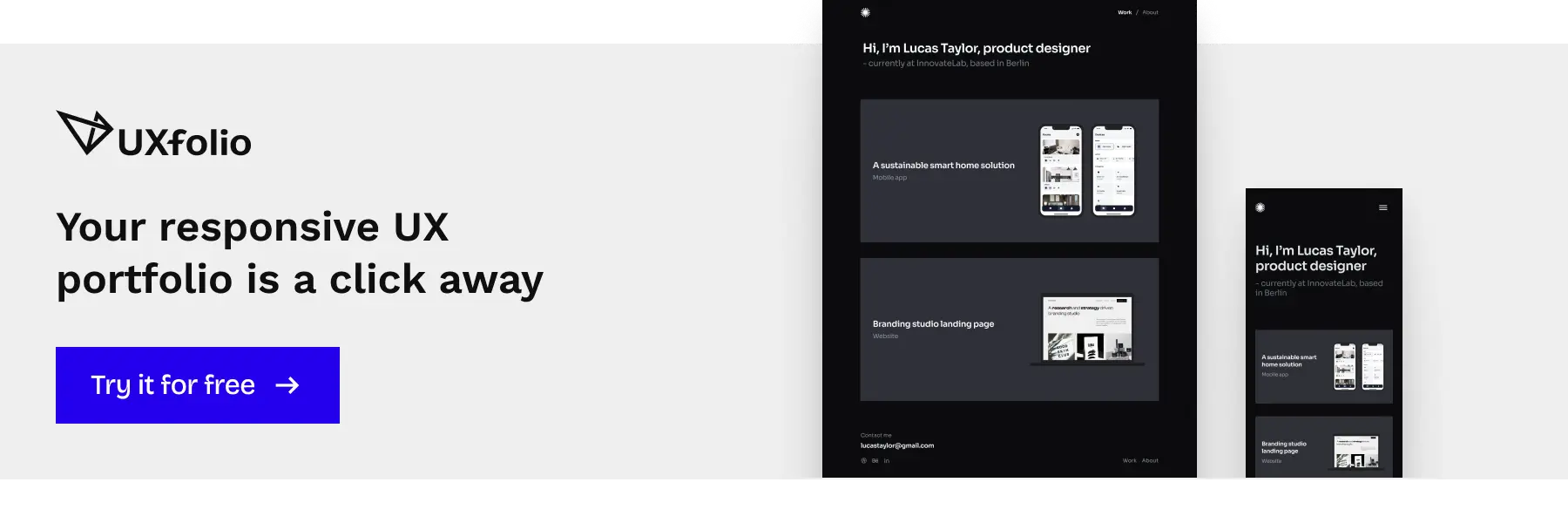
Don’t forget: tools like UXfolio make it easy to present projects in a structured, visually compelling way that highlights measurable outcomes!
How recruiters scan a UX resume
Recruiter scanning behavior follows predictable cognitive patterns. The first pass usually lasts between six and ten seconds. During this time, recruiters are not evaluating quality in depth. They are validating fit.
Eye-tracking research shows that resumes are often scanned using a vertical column pattern. In this case, the left edge and upper third of the document receive the most attention. This means that hierarchy, alignment, and placement determine visibility.
Cognitive load plays a decisive role. Dense paragraphs, inconsistent alignment, or buried metrics increase processing effort. When processing effort increases, perceived candidate risk increases. A well-structured UX resume reduces cognitive load by making role, specialization, and impact immediately identifiable.
This scanning logic explains why layout decisions directly affect interview probability.
Vertical scanning and signal strength
Recruiters typically scan resumes vertically, moving down each section to quickly identify role titles, companies, dates, and portfolio links. The structure must allow key information to stand out immediately. Poor hierarchy, inconsistent formatting, or buried portfolio URLs create friction, delaying decision-making and reducing your qualification probability.
For example, a junior UX designer highlighting an internship that increased user onboarding completion by 20% immediately signals impact. The resume should structure this outcome as a primary signal, not hide it within dense text. Signal strength matters: the most relevant evidence of your skills and achievements should appear first, guiding the recruiter’s eye toward proof of capability.
Using UXfolio, you can embed projects directly in your resume, ensuring portfolio links are prominent and outcomes are easy for recruiters to scan.
Outcome-focused statements vs. responsibilities
Recruiters skim hundreds of resumes quickly. Generic responsibilities like “created wireframes” or “participated in usability testing” rarely stand out. Instead, outcome-focused statements demonstrate your contribution in measurable or observable terms.
A strong support column tip for junior designers: whenever you describe a project, always link action to result. For example:
- Instead of: “Redesigned onboarding flow.”
- Use: “Redesigned onboarding flow, increasing task completion by 25%.”
This approach ensures your resume communicates value efficiently, aligning with both human readers and ATS parsing.
UXfolio simplifies this process by allowing you to structure each project with context, action, and measurable results, making outcome-focused statements clear at a glance.
Portfolio alignment
Your resume signals credibility, but the portfolio confirms it. Recruiters often cross-reference projects listed on your resume with your portfolio. If the link is not easy to find or projects lack measurable outcomes, the resume fails to guide them effectively.
In the context of a support column, emphasize strategic positioning of portfolio links. For junior designers, place a clear, clickable URL near the top, ideally in the header or summary.
As a tip, mention the type of work included, for example:
“See my UX case studies demonstrating user research, interaction design, and measurable outcomes.”
This alignment reinforces trust and encourages the recruiter to dig deeper into your work.
UXfolio allows you to link structured case studies directly from your resume, making it easy for recruiters to see detailed process, decisions, and measurable outcomes without extra searching.
UX resume sections order
Structuring your UX resume in the right section order is critical for clarity, recruiter efficiency, and junior designer impact. Each section should build logically, allowing the recruiter to process your strongest qualifications first and supporting credentials afterward. This approach reflects how real recruiters read UX resumes and serves as a practical guide for junior designers aiming to optimize scannability and impact altogether.
Identification and summary
Start with your name, title, and contact information. Include a brief, targeted summary that emphasizes your UX focus, core skills, and design philosophy. This is not a long narrative, it’s a signal amplifier, giving recruiters context for the rest of your resume.
Example for junior designers:
“Junior UX designer with experience in user research and prototyping. Passionate about designing intuitive onboarding experiences that increase user retention.”
Placement here ensures your strongest signals, role alignment and core capabilities are visible immediately.
Skills and tools
Next, organize your UX skills and tools. Separate UX methods (user research, usability testing, interaction design) from general design tools (Figma, Sketch, Adobe, etc.). Present them in a scannable format: short lists, columns, or grouped categories. This clarity allows recruiters to quickly identify whether your skill set matches the job requirements.
As a tip, instead of simply listing tools, pair them with evidence of application:
“Figma – wireframed high-fidelity prototypes for a mobile onboarding flow”
This reinforces signal strength without overloading the section.
Using UXfolio, you can connect each skill listed with a project case study, so recruiters instantly see how you applied it in real work!
Experience / projects
This section forms the heart of your UX resume. Present work in reverse chronological order, prioritizing the most recent and relevant projects. Each entry should answer four questions:
- Context: “What was the project or role?”
- Challenge: “What problem were you solving?”
- Contribution: “What specifically did you do?”
- Result: “What measurable impact did your work have?”
For junior designers, internships, volunteer projects, or well-structured personal projects are valid substitutes for extensive professional experience. Outcome-focused statements and metrics, even small ones, significantly increase credibility.
UXfolio streamlines presenting these projects with clear context, challenges, contributions, and results, ensuring your work is immediately scannable and credible!
Education and certifications
Position education and certifications after experience, especially for junior UX designers. Highlight degrees, bootcamps, or specialized training relevant to UX. This section supports credibility but does not dominate the resume unless you have limited practical experience.
Optional sections (awards, publications)
Include optional sections only if they add clear value. Awards, speaking engagements, or publications should reinforce your UX expertise or highlight transferable skills. Avoid clutter or unrelated information. In a support column context, you can briefly note recognitions like:
“Winner, Student UX Challenge 2026 – redesigning mobile checkout flow”
This keeps the focus on meaningful professional signals rather than decorative content.
UX resume layout patterns
Layout patterns function differently depending on the hiring environment.
- In agency contexts, recruiters often evaluate range and adaptability. An impact-focused layout can work well because it highlights outcomes across varied projects.
- In startup environments, business impact and ownership matter most. Experience-led or impact-focused structures that foreground measurable growth signals tend to perform better.
- In enterprise environments, familiarity and clarity reduce risk. Traditional experience-led layouts with strong keyword alignment often outperform experimental structures.
Portfolio-forward layouts can carry strategic risk. They work only if the portfolio is highly structured, outcome-driven, and easy to navigate. If the portfolio lacks measurable impact or structured storytelling, elevating it too aggressively can weaken credibility instead of strengthening it.
Layout pattern choice should match hiring context, not personal aesthetic preference.
Experience-led layout
The experience-led layout is the most common and safe choice. It foregrounds professional roles, presenting them in reverse chronological order. Each entry emphasizes your responsibilities and measurable impact, which helps recruiters quickly understand your career progression.
This pattern works well if you already have internships, freelance work, or full-time roles that demonstrate ownership and outcome-oriented contributions.
Example for junior UX designers: an internship redesigning an onboarding flow should highlight measurable outcomes, like increased user completion rates, rather than just listing tasks.
Impact-focused layout
The impact-focused layout focusing on results over tasks. Every role or project highlights measurable outcomes first, followed by context and responsibilities. This structure aligns with how recruiters scan for quick signals: they look for evidence that you deliver tangible results.
For junior designers, this layout works best when you can quantify achievements in projects, even personal or academic ones.
Example: “Redesigned checkout flow, improving conversion by 15% during usability testing” communicates impact faster than a list of activities.
Portfolio-forward layout
For candidates with limited professional experience, a portfolio-forward layout positions project work above employment history. Each project is presented with context, challenges, your contributions, and results. This layout surfaces applied thinking early, signaling potential and skill even if traditional roles are sparse.
Example: Personal UX projects, hackathon contributions, or volunteer work are given prominence with clear evidence of design decisions and problem-solving.
UX resume vs. traditional CV
Unlike traditional CVs, which may be long and comprehensive, a UX resume prioritizes scannability, brevity, and outcome visibility. A CV can document every role, award, and course, but recruiters scanning UX resumes focus on patterns, measurable impact, and relevance to the role.
The UX resume is designed for comparison, enabling decision-making within seconds, not for exhaustive documentation.
This section reinforces the principle that your resume layout should guide interpretation, maximize signal strength, and surface your strongest qualifications first.
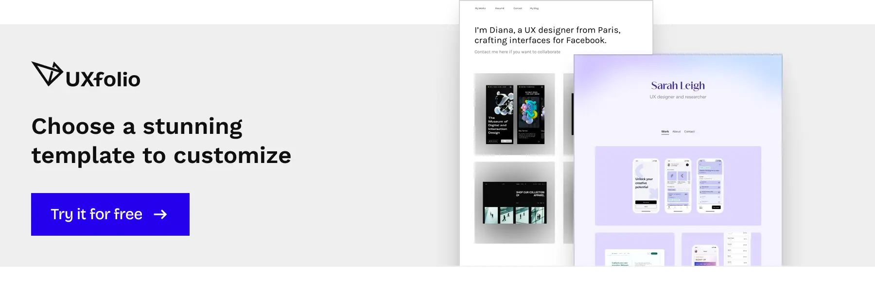
UXfolio templates make it easy to implement this layout, showcasing measurable outcomes and structured projects even with limited experience!
UX resume layout best practices
Designing your UX resume goes beyond content; the layout itself must guide the reader and reduce interpretation effort. Best practices ensure your resume communicates impact clearly, even in a 6–10 second scan. For junior UX designers, following these principles makes your projects and skills immediately visible and understandable.
UXfolio automatically formats content in visually aligned columns, helping skills, tools, and projects stand out clearly without manual effort.
Grid-based layout and columns
Using a grid structure organizes content visually and allows vertical and horizontal alignment. Two-column layouts are particularly effective: one column for skills, tools, and contact info, the other for experience and projects. This separation reduces clutter and helps recruiters match skills to examples quickly.
Example: place your Figma, Sketch, and user research skills in the left column, while showing a recent project redesign in the right column with measurable results.
Typography and section hierarchy
Consistent font size, weight, and spacing establish hierarchy and signal importance. Section headings should be clear and bold enough to separate content but not overwhelm the body text. For junior designers, consistent hierarchy communicates attention to detail.
Example: project names in bold, outcomes italicized, and dates aligned right create a predictable visual rhythm.
Visual signs without clutter
Minimal visual signs, such as subtle lines, spacing, or icons, can improve readability. Avoid decorative graphics that distract from the content or confuse ATS parsing. The goal is clarity, not creativity for its own sake.
Example: a small icon for “Research” or “Prototyping” next to project tasks can reinforce categories, without drawing unnecessary attention.
Consistency across sections
Uniform spacing, alignment, and formatting across all sections maintain professionalism. Inconsistent headings, irregular bullet styles, or varied font sizes reduce scanability and can signal a lack of polish. Consistency reinforces hierarchy, making it easier for recruiters to follow your narrative.
Example: all project entries follow the same order: project name, role, challenge, approach, outcome. Skills sections use the same bullet style throughout.
Following these best practices ensures that your UX resume is readable, scannable, and emphasizes measurable results, which are critical for making a strong impression in a limited review window.
UX resume layout for junior designers
Junior UX designers face a specific challenge: you often have more potential than formal job titles. Your resume layout must therefore compensate for limited professional history by surfacing applied thinking, structured problem-solving, and measurable outcomes as early as possible.
At this level, layout is not just visual preference, it is a strategy. You are shaping how recruiters interpret your experience. A clear hierarchy, project-first emphasis, and a visible portfolio link help you shift the focus from “years of experience” to “quality of thinking and impact.”
Instead of trying to mirror senior-level resumes filled with long employment histories, design your structure around evidence. Projects, case studies, internships, and research should be positioned to demonstrate how you approach problems, make decisions, and measure results. When supported by a well-structured UXfolio portfolio, this approach allows you to compete on clarity and credibility rather than tenure.
The following sections break down how to structure your resume so that your strongest signals appear first and your growth potential is easy to recognize.
Project-focused approach
For junior UX designers, your strongest signals often come from projects rather than full-time experience. Emphasize internships, volunteer work, or well-structured personal projects. Each project should showcase your design thinking and applied skills in a way that recruiters can quickly assess.
For example: if you redesigned a mobile onboarding flow, briefly state the context, your design challenge, and the outcome. Use concrete metrics whenever possible: “Redesigned onboarding flow, increasing task completion by 18%.”
Tools like UXfolio make it easier to present these projects as structured case studies, turning visuals and notes into narratives that highlight your process, decisions, and outcomes.
Context, challenges, contributions, results (CCCR)
To make project experience readable and impactful, structure each entry using the CCCR framework:
- Context – Describe the product or situation briefly.
- Challenge – Highlight the problem or goal you addressed.
- Contribution – Specify your role and what actions you took.
- Results – Quantify the impact or lessons learned.
For example: “During a 4-week internship, I conducted usability testing on a new e-commerce checkout. Identified friction points in the payment process, proposed design improvements, and helped increase checkout completion by 12%.”
This method communicates both your thinking and your measurable impact. Junior designers can use UXfolio to structure this information visually, ensuring projects are immediately understandable to recruiters.
Ats-friendly formatting and keywords
Even a project-rich resume can be overlooked if it’s not ATS-friendly. Use standard headings, clear section titles, consistent font sizes, and concise descriptions. Integrate UX-specific keywords naturally, such as:
- user research,
- wireframing,
- prototyping,
- interaction design,
to ensure both human and system readability.
Visual simplicity aids scanning. For example, two-column layouts can separate skills/tools from projects/experience, while maintaining clarity.
This structure aligns with how recruiters read resumes, letting them quickly connect your skills to real work evidence. Linking to your UXfolio portfolio within this format reinforces both ATS compatibility and recruiter trust, creating a dual-layered approach to career presentation.
Summary and actionable tips
A strong UX resume layout is not about decoration. It is about reducing cognitive load for recruiters and making your most relevant signals impossible to miss. Every section should serve a single goal: help the reader quickly understand what you can do, how you think, and what impact you’ve already created.
- At the junior level, clarity beats complexity.
- Structured projects outperform generic job descriptions.
- Measurable outcomes outperform task lists.
- A visible portfolio link outperforms vague claims about skills.
Before sending your application, step back and evaluate your resume the way a recruiter would. Can someone scanning it in under ten seconds identify your role, your core skills, and at least one measurable achievement? If not, adjust the hierarchy, tighten the language, or reposition your strongest project higher.
The checklist and common pitfalls below will help you pressure-test your resume so it functions not just as a document, but as a strategic career tool that supports your portfolio and strengthens your overall application.
Quick UX resume checklist
To finalize a strong UX resume, use this concise checklist to ensure every section maximizes recruiter impact:
- Contact and Summary: Clear name, title, contact info, 2–3 line UX-focused summary.
- Skills and Tools: Separate UX methods from software; ensure keywords match job descriptions.
- Projects / Experience: Prioritize relevance, include CCCR structure, highlight measurable outcomes.
- Education and Certifications: Include degrees, bootcamps, or specialized UX courses.
- Portfolio Link: Prominently feature your UXfolio portfolio for verification.
- ATS Readiness: Standard headings, concise formatting, and keyword alignment.
Using UXfolio simplifies creating visually consistent and structured case studies that map directly to these checklist items. Recruiters can instantly see your skills, thinking process, and results without additional explanation!
Common pitfalls to avoid
Junior designers often make mistakes that reduce resume effectiveness. Avoid these pitfalls:
- Listing responsibilities without impact: Only include outcomes and contributions that demonstrate measurable results.
- Cluttered formatting: Overuse of graphics or inconsistent typography distracts from your skills.
- Hidden portfolio links: If recruiters cannot find your portfolio easily, they cannot verify your work.
- Keyword mismatch: Omitting UX-specific terms may prevent your resume from passing ATS or initial screening.
- Ignoring project structure: Failing to use the CCCR approach can obscure your process and thinking.
By systematically addressing these issues and integrating your UXfolio portfolio, you ensure your resume not only communicates your capabilities but also guides recruiters to see your potential quickly and convincingly.
Frequently asked questions
1. How long should a junior UX designer resume be?
One page is ideal for junior designers. Focus on relevant projects, measurable outcomes, and key skills. Two pages are acceptable only if every entry adds value and demonstrates UX thinking.
2. Should I include personal or school projects?
Yes. For junior designers, well-documented personal or academic projects can be your strongest signals. Use the CCCR method to show context, challenges, your contributions, and results.
3. How can I make my resume ATS-friendly?
Use standard headings, consistent formatting, and keywords that match the job description. Avoid images or complex layouts that ATS cannot parse. Prominent UXfolio links ensure recruiters see your work.
4. What is the best way to showcase impact on a UX resume?
Highlight measurable outcomes rather than responsibilities. Include metrics like conversion improvement, reduced task time, or usability success. Link these outcomes to corresponding portfolio examples for verification.
Link your UXfolio portfolio to demonstrate these outcomes clearly.