I just checked our HR spreadsheets, over the last few years more than 2000 people applied to work with us at UX studio and UXfolio. We are a 41-person product design team, full of great, enthusiastic designers. As the CEO, I reviewed exactly 743 UX designer portfolios, some good, some bad, and a very few outstanding ones.
Whether you want to land a junior, mid-level, or senior UX job, start your freelance business, or just build an online presence, having a portfolio is a must. But in an increasingly competitive field such as UX it isn’t enough to just have one; you will have to be strategic when creating it.
If you put in the effort, your UX portfolio will land you the job of your dreams or enough clients to fill up your calendar. What’s more, it will be a blueprint of your strongest suits, your achievements, and who you are as a designer.
But what makes a good portfolio? Take it from someone who has experienced both sides – the applicants’ and the employers’: A good UX designer portfolio reveals who you are as a designer through your design process.
Strong UX designer portfolios are evaluated primarily on design thinking and decision-making, not visual polish. Hiring managers want to understand how problems were framed, explored, and solved.
Contents:
- UX designer portfolio examples
- Prove that you are user-centric
- UX designer portfolio template
- 3 things to remember
- Junior UX designer portfolio
- Senior UX designer portfolio
- Freelancer UX designer portfolio
- NDA protected works in a portfolio
- Frequently asked questions
UX designer portfolio examples
Let’s get some inspiration before we get to work! Check out some of the best UX designer portfolios made with UXfolio:
Example #1: Mina
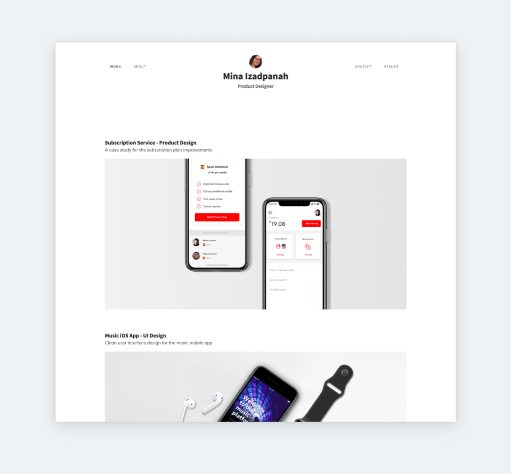
Mina identifies as a product designer, and she has UI and UX projects in her portfolio as well. Like most designers, she also features 3 case studies on her home page, which is the ideal number, according to recruiters. The gray background she uses for her thumbnails ensures visual consistency between the different case studies. Her ‘Music iOS App‘ case study is a textbook example of a great UX case study.
Example #2: Carol
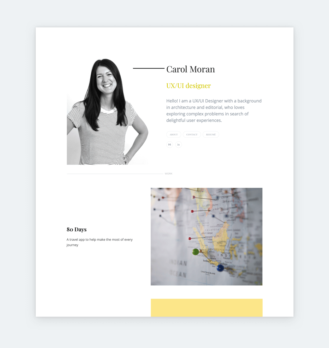
Carol created an elegant senior UX designer portfolio home page in UXfolio by combining the right typefaces with the right amount of whitespace. She links to her blog and LinkedIn, which are probably the most important platforms for senior designers. Her case studies are introduced by large thumbnails and short descriptions of the product featured inside.
The Yellow Bird case study proves that Carol is indeed an experienced UX professional, as it features wholesome content. The case study is also heavy on visuals, none of which stand without appropriate content. Follow Carol’s example if you want to create an enticing case study.
Example #3: Theodora
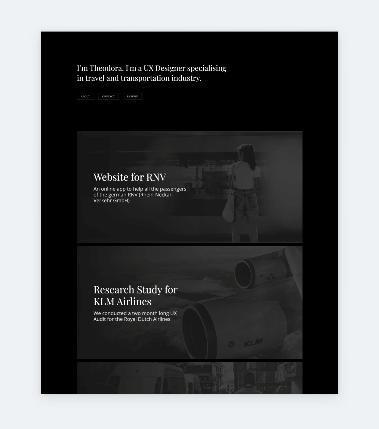
Theodora’s portfolio follows all UX designer portfolio best practices. We are greeted with a concise, and descriptive introduction, that tells exactly what Theodora does. This is a good tactic, especially for freelance UX designer portfolios. Using grayscale as the overarching color-theme exudes a very put-together vibe.
Right on the portfolio cover page, you see three eye-catching case study thumbnails with titles and short descriptions. Theodora uses password protection on all her case studies, which is a baseline feature in UXfolio. Many designers use password protection as a workaround to feature NDA protected and sensitive work in their portfolios.
Now that we have seen some great UX portfolio examples, let’s see what can we learn from them:
Go beyond UIs: prove that you are user-centric
Don’t mix up a UX designer position with a graphic designer one! While tasteful visuals are important to grab the viewers’ attention, you will have to go beyond that to make a lasting impression.
There are way too many good designers out there to stand out with only UI design skills. Instead of using your portfolio to present nothing but beautiful things – like a print designer would do in an offline portfolio – act as a proper UX designer and emphasize your work’s UX side.
We don’t hire people for having a unique looking portfolio, we hire them for the right UX mindset. When I’m reviewing portfolios, I focus on the actual screens presented in the portfolio, not the portfolios’ decoration.
If I like a design in a portfolio I want to learn the details of how it came to be. What is the story behind the design? What design decisions were made? Why did they choose to go with the design I’m seeing? This background information is the most valuable for me when recruiting a new designer.
You can’t stand out with visual design skills anymore. It’s time to highlight design stories instead!
Creating a UX designer portfolio website that achieves the above goals can take considerable time and planning. This can be cut in half with a tool like UXfolio, that provides numerous crutches to guide you through the process. Once you are done, your portfolio will serve you well for years to come, with only minor upkeep. So let’s get to building your portfolio, starting with the template!
UX designer portfolio template
A UX designer portfolio template is made up of a portfolio cover page and case studies. Ideally, it is extremely simple to move between the two.
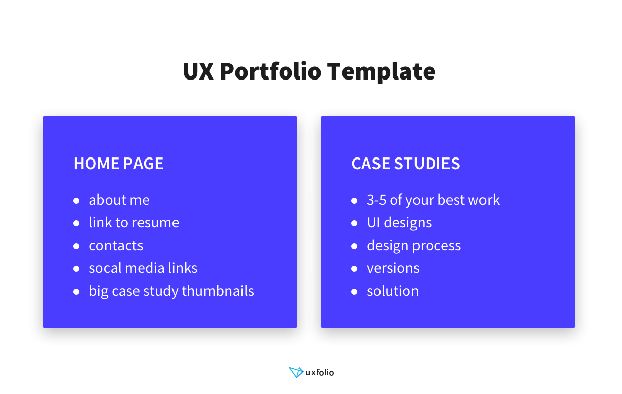
1. UX portfolio home page
When I open a portfolio that was submitted with an application, I ask myself two questions in the first few seconds:
- Is the designer good enough in UI and visual design?
- Does the designer have relevant experience?
Your portfolio home page should be straightforward. If I see big images of great designs on the home page, and the overall design of the page is good, I know that the answer to the first question is yes. Furthermore, if there are at least 3 UX related case studies included, I also know that they have the experience. Consequently, the goal of your home page should be to provide a clear overview of your work and a good first impression.
The importance of case study thumbnails
First and foremost, case studies should be presented on your home page in huge thumbnails, so recruiters or clients don’t have to wander around to find the most valuable content. Make sure that your case study thumbnails contain big images of your best work, descriptive titles, and attention-grabbing subtitles. If you don’t have enough case studies, use bigger thumbnails to fill up some of the empty space in your portfolio.
On top of case studies the case study thumbnails, you should provide the following information on your portfolio’s home page:
- Your name
- Position (or level)
- Short introduction
- Contacts, links
- Resume.
A UX portfolio best practice is to provide easy access to your case studies right from the home page.
UX portfolio ‘About me’ and introduction
If you find it difficult to write about yourself, rest assured: most of us do. You can overcome this by using simple tricks that can help to outline your copy. For example, a portfolio about me section should answer some generic questions that recruiters want to know:
- What are your strongest suits?
- Keep it professional, do not list generic personal traits
- Instead of stating banalities, go for specifics
- For example: “High-fidelity prototypes are my bread and butter.”
- Why are you passionate about UX?
- Don’t just say “I am passionate about…”
- Specify exactly what part of UX you are passionate about and why
- How much experience do you have
- If possible, identify as a junior, mid-level, senior, etc.
- Mention notable projects and your role within those projects
First of all, write up the answers to these questions. Don’t hold yourself back, it is not a problem if the answers seem too long at first, we’ll deal with it in the next step.
Then highlight the keywords from what you have written down and forget the rest. Take those keywords and write concise, descriptive sentences around them. If the second iteration is still too long, find the filler words, focus on your strong suites and get to editing again!
Eventually, you should arrive at a good, 60-word about me that you can use on your home page. A longer version can be used for your dedicated portfolio about page, which can also act as your UX designer cover letter.
2. UX case studies
If I like what I see on a candidate’s portfolio home page, I’m excited to know more about their work. At this point, I begin to look for UX case studies in which I can get to know the backstory of a design project, and follow the process that leads to a great design.
Overall, the purpose of your whole portfolio is to host your case studies that effectively showcase your skills and your design process in action. The rule of thumb is that there’s no UX portfolio without case studies, not even if you are fresh out of school.
How many case studies to include in a UX designer portfolio?
Do not go overboard when adding case studies into your portfolio: 3 to 4 of your best projects will be enough. If you have enough to pick and choose from, go for the ones that showcase the impact your work has or the ones that point towards a direction you want your career to move. Here are a few guidelines that can help you narrow down your projects to the best ones:
- What do you do the best
- What you like to do the most
- What makes you stand out
- Show the extent of your capabilities
- Show the impact of your work
- Have good stories
- Fit the position you are eyeing.
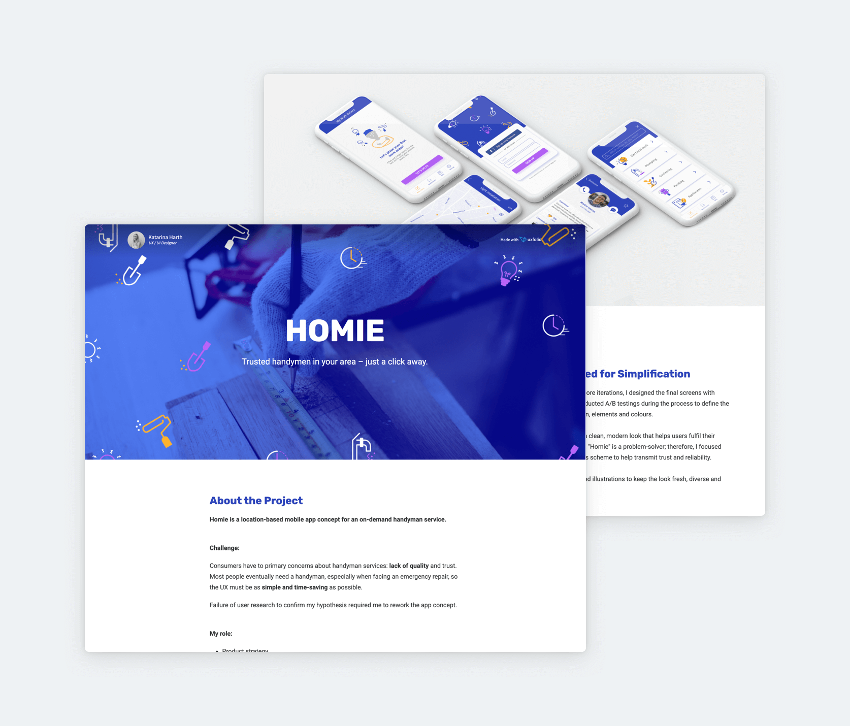
Be prepared to build a UX case study
Before you start putting a case study together, collect all the materials you can use: prototypes, wireframes, notes, and photos. When you are on a project get into the habit of documenting as much as you can. This way you’ll always have enough material for an engaging case study that tells the story of a project.
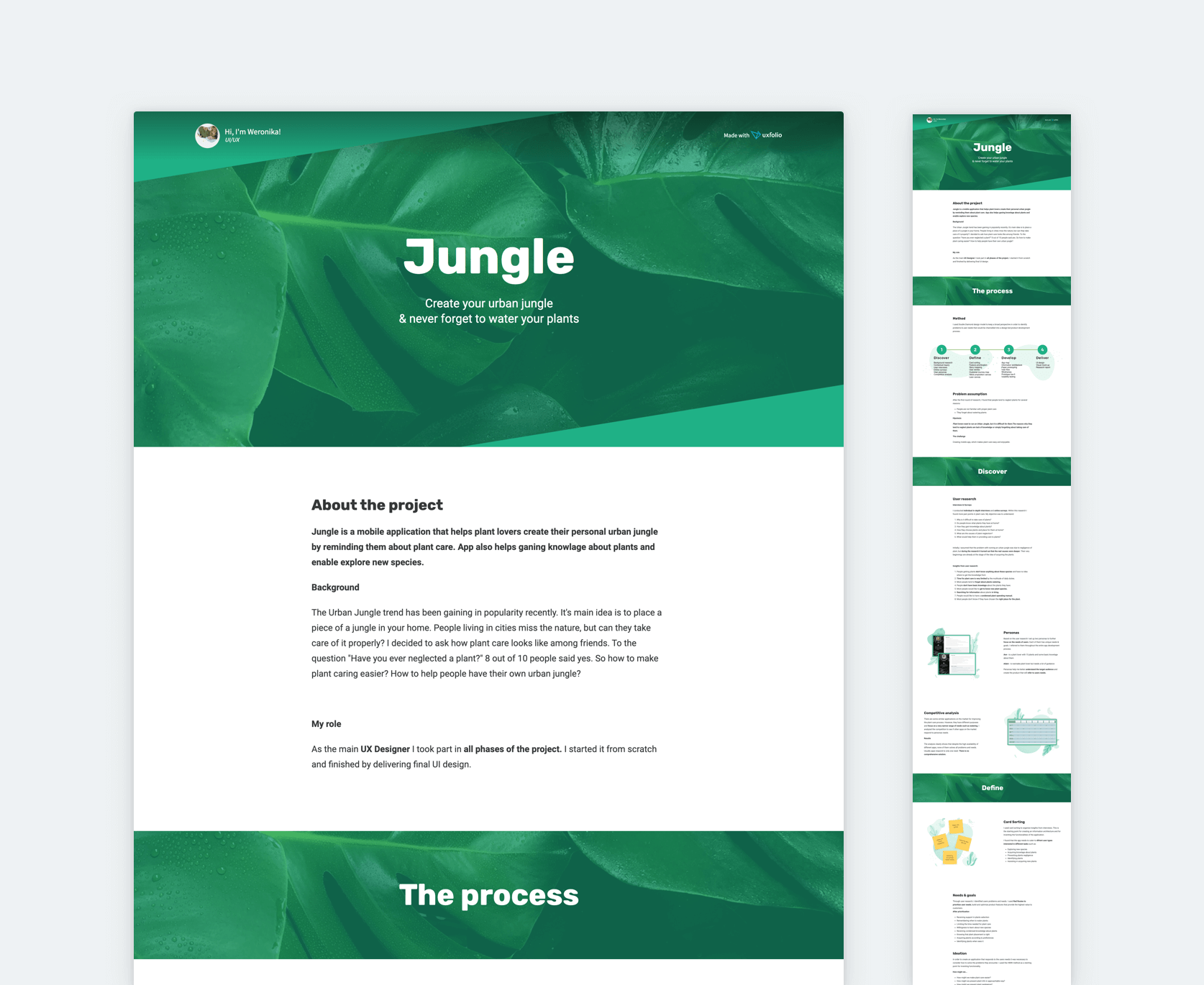
Sorting through and organizing the material first, will help you to organize your thoughts as well. You will end up with a well-structured UX case study that tells the story of your design, which is essentially your goal.
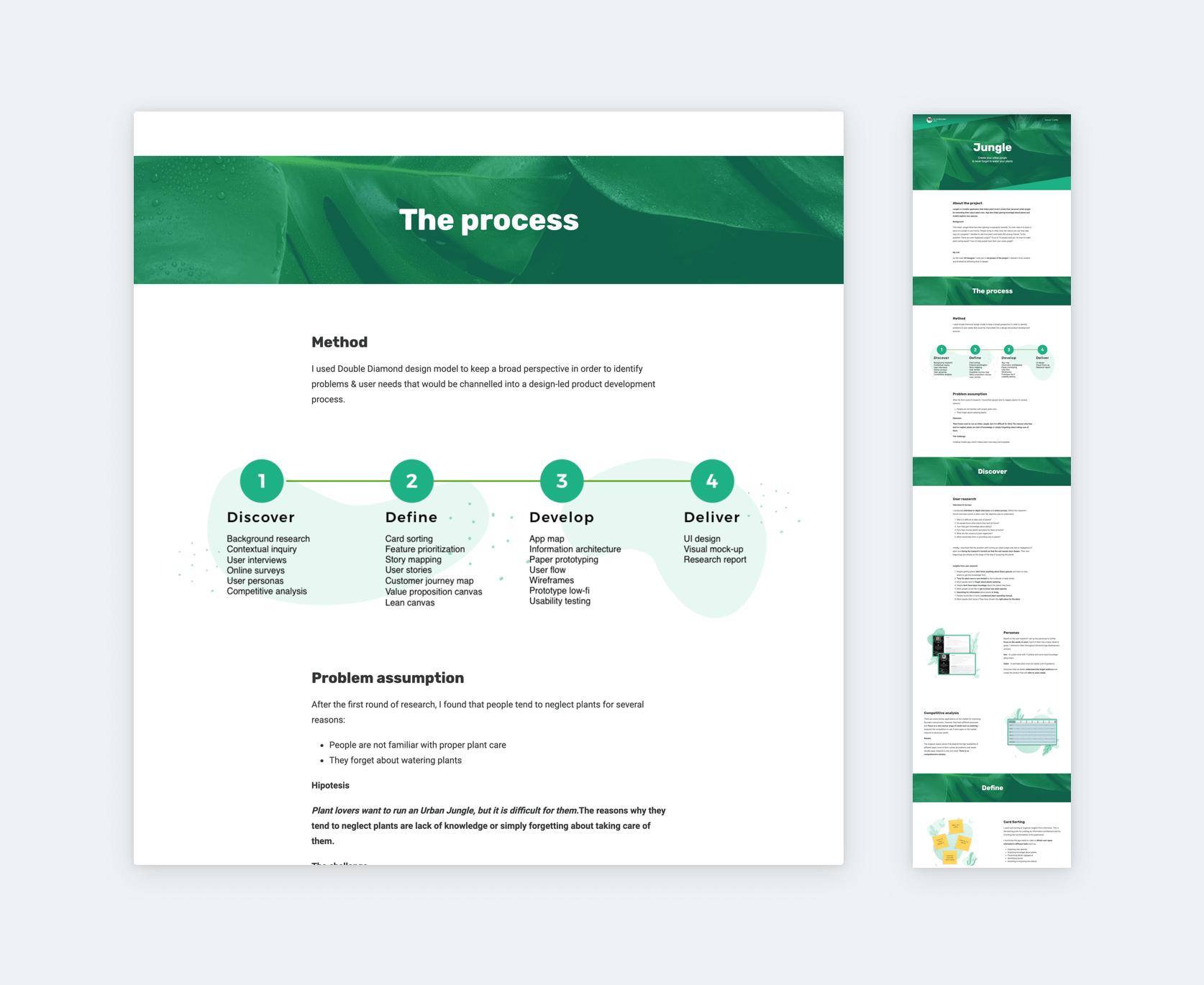
How to write UX case studies for your portfolio?
There are way too many guides out there that forget to mention important elements, therefore, leaving you with an unfinished case study. While you are building your case study always remember that the readers were not there, they do not necessarily use the product you are writing about, and they cannot make sense of images without explanations. Therefore you should always provide context.
You can tell the story of your design by answering some questions and providing background information:
1. The project
- Who was the client/brand/company?
- What is the product about?
- What is its purpose?
- What is its selling point?
2. Problems
- Why were you brought into the project?
- What problem was presented to you?
- What problems did you discover on your own?
- What was the business problem?
3. Your role and the team
- What were your responsibilities and tasks?
- What did the client expect of you?
- Which other roles were part of the project?
- Which roles did you collaborate with?
4. Methods
- Showcase your toolset
- Include user insights
- What methods did you deploy? (Interviews, user testing, personas, surveys, etc.)
- What did you achieve by deploying these methods?
5. Challenges – Solutions
- Showcase iterations
- Tell what and why did you have to change
- Present design decisions you had to make
- Showcase abandoned ideas
- How does your design solve the challenges?
6. Impact
- Show analytical data
- Screens (UI)
- If the product is live, link to it
- Quote user feedback.
7. Learnings
- What did you learn throughout the project?
- Show gratitude
- End with testimonials from the client if possible.
If you feel stuck with the copy of your portfolio, try UXfolio’s writing prompts and questions! They can save you hours. We have 19 different text ideas sections prepared for topics such as competitive research, card sorting, and A/B testing.
3 things to remember while building your UX designer portfolio and case studies
Before opening up a blank case study, consider a few general truths that and keep these in mind while working on your portfolio:
1. Recruiters and clients are busy
One important portfolio best practice is to keep your audience in mind, exactly the way you would when working on any other product. Recruiters can receive hundreds of applications for a single position, so they won’t have too much time to spend with your portfolio. The same applies to potential clients.
I have a standard process of reviewing UX designer portfolios. After opening a portfolio, I just scroll from top to bottom very quickly to see if the candidate fits the really basic criteria. At this point, I’m looking for digital interfaces with visual quality that hits the bar of the position. If I like what I’m seeing, I will go deeper and spend some time reviewing the portfolio.
In the next phase, I search for things such as process, methods, user insights, design decisions, challenges you have faced, and results you have achieved. If you present that, you’ll be invited to an interview immediately.
2. All visual content should be in context
Inserting screenshots, images of walls with post-its, whiteboards, hand-drawn sketches, and whatnot without providing context is the most obvious sign of a haphazardly created UX case study.
Did you deliver these things to the stakeholders without any explanation? Probably not. Therefore, you shouldn’t assume that a recruiter will understand how those elements affected the design process.
So when you start collecting materials for your case study, always think of ways to give them context. Aim for the following strategy:
- Use nice visuals of your work to grab the readers’ attention
- Keep their attention by explaining your thought process behind your designs.
3. The UX of your UX portfolio
Closely related to the shortness recruiters’ time recruiters have, your portfolio should be easy-to-use and to comprehend. There are way too many stunning portfolios and case studies out there that don’t have the balance between their visuals and content.
Finding the case studies in your portfolio should never be a challenge. They must be readily available right as your portfolio opens up, as they provide the substance. Tools like UXfolio can help structure UX case studies consistently, ensuring that reasoning and process are clearly documented.
Once a case study is opened, it should be easy to scan as the recruiter has to find all the relevant information in a short amount of time. Things that make a case study hard to scan are embedded PPTs or other presentations, small images, images without context, and unnecessary decoration.
Junior UX designer portfolio
No need to worry if you are just at the beginning of your career! Junior UX designers are not expected to have a huge selection of projects in their portfolio. The best strategy is to make the most of what you have. If you only have one or two projects, do not hesitate to include them, even if you think they are messy.
Don’t forget to include what you have learned through working on those projects, and what would you do differently now.
“A junior designer’s portfolio should be about learning, how you go about learning all the things you did.”
– Jared Spool, co-founder of Center Centre.
If you don’t have any projects at all, go with the mock project approach: choose an app or website and redesign it while documenting your process. This is a great opportunity to showcase your toolset and strengths as some of the boundaries that exist in a real-life project will not be in your way.
Pro tip: If you don’t have referrals from real-life clients, ask your professors to give you some quotes that you can use.
Senior UX designer portfolio
As a senior UX designer, your portfolio should emphasize the impact that you have made throughout your career and the knowledge that stems from your experience. When it comes to picking projects to showcase, use the above-mentioned method, but also make sure that you choose from your more recent projects.
Share your experience at mentoring junior UXers and how you have advocated for UX in various projects. Also, don’t forget to shine some light on your leadership skills, as those are what differentiate you from a junior.
Freelance UX designer portfolio
A freelance UX designer portfolio is not much different from a senior UX designer portfolio. You must showcase the impact of your work and how efficient you are. As a freelancer, you might want to create separate portfolios for different client groups that you are regularly working with.
Through targeted curation, you will have a better chance of winning over a client. UXfolio’s multiple portfolio feature makes it very easy to create and update such curated portfolios. Take the time to upload all your new UX design projects, even if only in draft-format at first.
If you do other types of work as well, such as branding or photography, make sure to keep those in a separate portfolio and always send the relevant portfolio to the relevant client.
NDA protected work in your portfolio
NDAs are a common obstacle for UX designers when putting their portfolios together. Non-disclosure agreements are written with the contractors’ interests in mind, so the designers’ hands are tied when it comes to including these in their portfolio. How to create a UX design portfolio with work under NDA?
The first two things you should consider are:
- The terms of an NDA
- The expiration of the NDA
If and NDA expired, you are free to publish the details, unless otherwise stated. Also, certain NDAs allow you to re-use the material if you don’t specify the client or brand. Make sure to give a thorough read to the agreement to have a clear understanding of your obligations.
If you have NDA protected UX design projects that you find to be important for your career, your only option is to turn them into case studies by replacing everything with dummy content. This way you can still present your design decisions and your process. When you are creating such case studies, make sure to communicate the situation right in the intro.
A common workaround is password protection. There are many designers who publish NDA protected work using password protection. This way they can control who can access their work. This is why UXfolio offers portfolio- and project-level password protection.
Build your UX designer portfolio today
We created our product to support UXers in portfolio building. UXfolio makes it ridiculously easy to create a UX designer portfolio with impressive case studies. It creates your entire portfolio website for you without coding or hassling with hosting plans.
You can use UXfolio to generate a nice home page as well as your studies in the matter of minutes. Our platform also helps you do the copywriting part, by providing great example sentences and guiding questions for various UX methods.
With UXfolio you can build a portfolio that recruiters, clients, and design leaders will love. Consequently, get more recognition for our shared profession, and for yourself, too. So don’t hesitate and start building your awesome portfolio! If you liked what you read about our product here, give UXfolio a try:
Click here to sign up and try it out!
Frequently asked questions
What should a UX designer portfolio focus on?
A strong UX designer portfolio focuses on reasoning, process, and decision-making. It should clearly explain the problem context, research insights, design choices, trade-offs, and the impact of the final solution rather than showcasing visuals alone.
How many case studies should a UX designer include in a portfolio?
Most hiring managers expect 3 – 5 well-structured UX case studies. Fewer high-quality projects that clearly demonstrate thinking and process are more effective than many shallow or visually driven examples.
What do hiring managers look for in UX designer portfolios?
Hiring managers look for evidence of structured problem framing, user-centered decision-making, collaboration, and reflection. Clear storytelling and logical progression through the design process are often more important than polished UI visuals.
Do UX designer portfolios need to include visual design skills?
Visual design skills can be helpful, but they are not the primary evaluation criterion for UX roles. Portfolios are mainly reviewed to understand how designers think, validate assumptions, and make informed design decisions.
Should UX designers use a portfolio template?
Using a UX portfolio template can help designers focus on content quality and structure instead of layout decisions. Templates are especially useful for ensuring that each case study consistently explains the problem, process, and reasoning behind design choices.
Why is storytelling important in UX designer portfolios?
Storytelling helps hiring managers follow the designer’s thinking from problem definition to solution. Well-structured stories make complex decisions easier to understand and demonstrate how designers reason under real-world constraints.
How often should a UX designer update their portfolio?
UX designers should update their portfolios whenever they complete a meaningful project or gain new insights into their process. Regular updates help ensure that the portfolio reflects current skills, thinking, and career direction.
