Fresh out of school, excited to get your hands dirty, just to find “2 years of professional experience” under the requirements of a junior UX designer job post. Then there’s the portfolio paradox: needing case studies for your UX portfolio without real-life experience.
We’ve been there, and we remember how frustrating it is. Junior UX designers have a hard time, but you can make it work, and in this article you’ll find out how.
We took our experience, scoured through 68 junior designer job descriptions, interviewed HR managers, design leads, and our colleagues, and merged all the info we could gather into this article. What you’ll learn about is:
- What do Jr. UX designers do?
- How much Jr. UX designer make?
- Freelance vs office work
- 6 important bits of realistic advice
- Preparations before applying
- Where to search for and where not to search for jobs?
- Application tracking
- The hiring process
- After the interview
What do Jr UX designers do?
Traditionally, jr. UX designers work alongside a team of UX designers. But, that doesn’t mean they don’t have their own crop of work. Junior UXers have to
- conduct user research and usability testing,
- organize and analyze research findings for a better understanding of user insight,
- assist in wireframing, sketching, prototyping, and creating user flows,
- deliver smaller designs.
The difference between juniors’ and seniors’ responsibilities is that jr. UX designers are delegated routine problems while higher levels work on more complex issues.
How much do Junior UX designers make in 2024?
Jr. UX designer salaries are highly dependent on location. For the purpose of this article, we focused on the US only. According to Glassdoor.com, the average is $65k per year, which is in line with the average on UXdesignsalaries.com. Merged with other sites’ data, the average is between $59-65k per year. $45k is considered low, while $99k is the upper limit.
Freelance vs office work
Starting a freelance UX designer business is tough even for seniors. That’s one of the reasons why experienced UX designers advise juniors to start their careers in an office setting. Also, in an office setting, you can work alongside seniors, gathering invaluable experience. Just check out a few of our interviews, and you’ll see how essential it was to many successful designers to work alongside their more experienced peers.
Now that you know what to expect from the job, let’s see how you can get it.
6 important bits of realistic advice
Reading job descriptions should be the first step of your preparation before applying to jr. UX designer jobs. A small market research will open your eyes to what’s in demand. It’ll also reveal which features and skills you need to highlight in your resumé and portfolio, or the skills that you should acquire to raise your “market value.”
These six points are based on our analysis of 68 junior UX designer job descriptions from the US market, and supplemented with the advice of our designer colleagues and their design leads.
1. Be prepared for unrealistic expectations
The majority of jr. UX designer job descriptions are not aligned with reality. This has been the same for years. They list the exact same requirements as some medior- or senior-level job descriptions. And they do so without even mentioning anything related to entry-level jobs, such as mentorship.
You’re the only one who knows whether you fit those requirements. But beware: there are many jobs advertised as entry-level just because the company doesn’t want to pay a medior or senior colleague. In these jobs, you will be expected to deliver according to higher-level requirements for much less money than you’d deserve for your work.
2. Follow the trend on UX tools
You know those 3-4 tools that every designer uses. The ‘Heathers’ of design software. If you want to maximize your appeal on the market, make sure that you are familiar with at least one of them. Preferably the most popular one.
You might be using a more niche or obscure tool because you’re ahead of the trends. But if we’re realistic, you cannot expect an entire company to switch to that tool just because of you.
Also, it’s a huge plus during the hiring process if you’re familiar with the tool that the rest of the company uses. So, look around, find out what tools are in vogue, and familiarize yourself with them.
3. Get some experience!
Though jr. UX designer is the entry-level job title of the industry, sometimes it’s not where you actually enter the UX industry. After you check a few job posts, you’ll see that most of them require 1-2 years of experience. Even if you find some that don’t, you can be sure that having some experience will give you a headstart.
There are two ways to meet this requirement. The first is to begin your career with a UX design internship. The other option is to do lots of freelance or pro-bono projects.
4. Think ahead and specialize yourself
If your dream is to design for the fintech industry, start specializing yourself as soon as possible. For instance, do fintech redesigns, keep your eye on internship opportunities, and network with designers who’ve made it in that industry.
The former is especially important. Don’t be afraid to DM a designer on LinkedIn to ask for some advice. We’ve interviewed many designers from top companies, and most of them are happy to help up-and-coming designers.
If you manage this part, you’ll have it much easier on the market, since you’ll hold the accreditations, experience, and specialization. Ask any HR manager: That’s an irresistible triad.
5. Most companies think in “UX/UI”
You know the difference between UX and UI. We know it too. But that won’t change the fact that most companies are looking for a UX/UI designer instead of one UX and one UI designer.
Again, you should read the job description carefully! If it requires you to create UIs, your visual design skills will be judged throughout the application process. So be prepared for that. Also, most design leads confirm that showcasing UI design skills will put you ahead of other candidates even if it’s a UX position.
6. Understand the limitations and possibilities of frontend
This might seem way too specific, but stay with us! No, you don’t have to know coding to land a jr. UX designer job, but you’ll need to understand the limitations of code. In most companies, design and frontend work closely together, so it’s good to know what the devs can and cannot do, for the collab to go smoothly. So, take a dive into some CSS and HTML just so you understand the basics and limitations.
At this point, you know what to expect from the job and how to increase your chances of getting it. Next, we’ll talk about supercharging your application material.
Preparations before applying
There are three things you’ll need to apply for UX jobs:
You can read about these topics in-depth in our dedicated articles. Below, we’ll include a few things that apply mostly for juniors.
Jr. UX designer portfolio & case studies
Most design leads will skip your resume and jump right to your portfolio. This is not an exaggeration. Your portfolio is where they can see your skills in action. It’s where they can learn whether you are capable of communicating research findings and the design process. These are important because in a professional setting you’ll have to utilize these skills when presenting ideas, findings, and work to stakeholders and higher levels.

So, look at your portfolio as your ticket to the interview. Without an outstanding portfolio, you won’t proceed to the subsequent stages of the hiring process.
Here’s how to approach the design of your jr. UX designer portfolio:
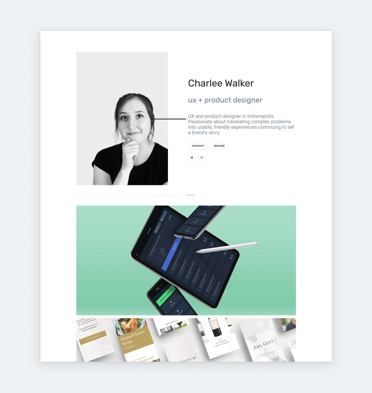
Design leads will not spend hours with a single portfolio, so keep it simple and easy-to-navigate. Present your case studies right on your homepage and make sure that they have enticing thumbnails and revealing descriptions. Always remember: you are a designer, so your taste-level will be judged based on everything you present.
You can make sure that your portfolio is optimized for maximum impact, by checking the marks below.
Your portfolio…
- is nice to look at
- looks organized
- is easy to navigate
- has an about page
- has a contact page
- contains 2-3 of your best and most relevant projects only
- directs attention to your case studies.
Use tried-and-true portfolio templates if you don’t feel confident
If you don’t want to design and build a portfolio from scratch, you can always rely on templates. Check out UXfolio’s customizable portfolio templates, which are based on the listed principles and the most popular layouts.
How to build and write UX case studies:
Case studies present an incredible challenge, especially since jr. UXers are not loaded with projects to cherrypick from. As a junior, aim for 2-3 top-notch case studies, each revealing as much of your skills as possible.
In a case study, your main task is to storify your design process by relating all your steps to the users, the product, and your experience. If you are not sure how to do it, we have an article on the topic, and also some amazing examples, and a great template.
If you’re still not sure, try UXfolio’s case study generator. It allows you to choose from various UX-specific sections and creates a custom template that you can use for your case study.
The golden 3 rules for junior UX designer portfolios
1. Use the tried and tested layout
Portfolios are like any other product: they need to solve a problem for a clear target audience. If you check out a few, you’ll find that many of them use a very similar layout. This is because the target audience – design leads, hiring managers, team leads, etc. – is comfortable with this template. They instinctively know how to navigate it and how to find the information they need. If you change this layout, you risk confusing them, which can lead to confusion and frustration.
Remember: you don’t need to reinvent the wheel to prove how creative you are! Instead, you should work with the already existing patterns and focus on the content of your pages (About, Contact, Resume) and the contents of your case studies.
2. Minimalism is universally liked
In the current job climate, your best chance as a junior designer is to cast a wide net. For portfolios, this means building something that will be universally liked by your target audience. While a Y2K or vaporware portfolio might look awesome to you, you have no idea how the hiring manager or design lead will feel about that aesthetic.
Your best bet as a designer is to infuse your personal taste into something minimalistic. Minimalism is universally liked and it’s easy to work with. What’s more, it goes very well with the classic layout of UX portfolios. The outcome is something that will be liked by your audience while providing a glimpse of your personal taste.
3. Make it pretty
The old attitude that UX designers should focus on process instead of visuals is completely outdated and harmful to your chances of landing a job. You need both. Good storytelling supported by beautiful, coordinated visuals and consistent components are what make a successful portfolio. If you don’t feel confident in your visual vocabulary, you should try templates. They are perfect for juniors for many reason:
- They save you time.
- They are still customizable, so you can add your own personality.
- You can build on them according to your own plans.
Jr. UX Designer Resume
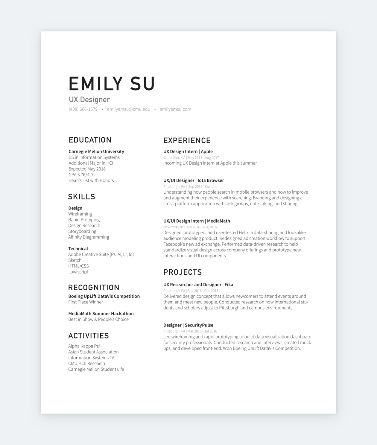
Customize your resume for the job you’re applying to – this is still the number one UX designer resume advice, regardless of level. Don’t get it wrong: by customization, we don’t mean lying. It’s more about reordering your resumé based on the job description and highlighting your most relevant skills. This doesn’t take too much effort, yet it has a huge impact.
If you don’t have any experience, focus on your studies and list the relevant skills and experience you’ve gathered. If you are making a career switch to UX, list responsibilities and achievements from your previous jobs that could be relevant in the realms of UX.
Think in keywords
Many companies, especially bigger ones, rely on Applicant Tracking Systems. This means that submitted resumés get scanned for keywords by bots. Therefore, when you are putting your together, it’s best to always think in keywords. So don’t try to be fancy with your vocabulary! Be as generic in your word choice as possible.
If you’re not sure what keywords to emphasize in your resumé, check the job description and highlight:
- Verbs (collaborate, conduct, identify, prioritize, etc.)
- Jargon (user flows, iteration, quantitative research, etc.)
When you have both, just match them in a sensible way that’s reflective of your experience. For example, if you have ‘conduct’ as a verb, you can match it with ‘quantitative research’ and add the purpose of your research right after it. You’ll arrive at something like: “Conducting quantitative research to validate and test… .”
Jr. UX Designer Cover Letter
A jr. UX designer’s cover letter is usually more important than a medior’s or senior’s. As a junior, you have much more to prove, from skills to professional traits. A cover letter, when required, can be a great opportunity for you to prove your enthusiasm and willingness to learn and improve yourself.
In your cover letter, you can mention internship, volunteer, and freelance experiences alongside your skills pertaining to the position. Quantify every achievement that you can, because numbers can be extremely convincing. Make sure to proofread your writing. Let it rest for a day and review the copy with a fresh eye. Also, use tools like Grammarly to find elementary mistakes.
Once you have everything that’s needed to start applying, the hunt can begin!
Where to search for junior UX jobs?
Let’s begin with the basics: LinkedIn, Glassdoor, Indeed, and such sites have hundreds of designer jobs posted every day. But, the general consensus is that they have low reply/success rates. If you can apply to jobs posted on these sites in around 3 minutes, go for it! You have nothing to lose. But if it would take longer, focus on more effective sources, with higher success rates. Here are a few:
Strategic, direct outreach
- Make a list of companies that you’d like to work for.
- Make it as local as possible (unless you’re ready to move).
- Don’t get lazy with the list: collect as many companies as possible.
- Look for new product launches, new business, etc. depending on your preferences, and keep adding to the list.
- Most of the companies on your list have a ‘Jobs’ or ‘Careers’ page. Save these to a neat list, and make checking them a weekly habit.
- Get in touch with the HR managers of these companies. Add them on LinkedIn, tell them that you’d like to work with them, and why.
- Refrain from generic, mass messages. They make you look desperate.
- Don’t be too pushy! You shouldn’t beg for a chance or a job. Instead, just share why you find their company inspiring, and tell them that you’d love to join their team when there’s an opportunity.
- If there are no relevant openings at the moment, you could ask for advice, as to what skills should you improve in the meantime. But keep the question limited.
- Whenever there’s an open position send your application directly through the company website or the HR manager you’ve added.
Attend meetups and build a network
Another great way to find offers or land interviews is to attend local UX and tech meetups where you can network with other professionals. Referrals are still the most effective way to secure interviews. Your connections might alert you of new openings before they get published. Or, they can directly refer you to their company.
UX job boards and newsletters
UX-specific job boards and newsletters can be also helpful. Since their posts are curated, you’ll only see the options that are worth your time. Such job boards or newsletters include Smashing Mag, Designer News, and UX Writing Hub.
Avoid Facebook groups and Slack channels
Sometimes you might bump into some great opportunities in UX groups and Slack channels. However, this shouldn’t be your primary source of job posts, unless you are looking for freelancing opportunities. What’s more, there’s no way to know how trustworthy are the people who post these jobs. We’ve heard many horror stories of people being tricked out of money or time. So, generally, we do not recommend Facebook groups or Slack channels for job hunting.
Track your applications
As an active job seeker, you’ll be sending out lots of applications. To save time and energy, you should keep everything organized. You’ll need at least two tools:
- Kanban board app for tracking.
- Calendar app for interview scheduling.
You can use Kanban boards like Asana or Huntr to track all of your applications. Start organizing and documenting your progress as soon as possible. Believe us: it’s worth the effort. Tracking will make everything smoother, and more organized, and you’ll have it under control. The standard columns we recommend for a job-hunting kanban would be:
- Wishlist/Job posts
- This step takes the most effort, but it’ll be worth it in the end.
- For each card, add the name of the company, the position, the deadline, the contact, and a link to the post (or the text of the post).
- Applied
- After applying to a job post drag it in this column, and attach all your application materials.
- Interviews
- You can break this section into phone interviews and in-person interviews.
- Tasks
- In UX design it’s common to receive a design task to solve at home.
- Tag each section ‘to-do’ or ‘done’ and add reminders or set yourself deadlines.
- Offers
- After dragging an item into this column, add the details of the offer.
- Replied
- Reply to all job offers, even the ones that you won’t accept, and drag them into this column.
Obviously, these sections are just suggestions. You can make the kanban much more detailed, you can break up some of the sections, or change their order. After all, the purpose of this is for you to easily oversee your progress.
The hiring process
Once you start applying, you’ll become part of the hiring process of various companies. This process might differ from company to company, but there are a few steps that are considered universal:
Phone interview
If the submitted material is up to par, you’ll be contacted by the company’s hiring manager, who will ask you general questions. It’s best to prepare some general answers beforehand, so you’re prepared whenever the call comes.
Solving a design problem
Sometimes this step happens after the in-person interview, other times it precedes it. Regardless, your task is to describe how you’d solve a design problem. You can ask questions. What’s more, sometimes these tasks are designed in a way that you are expected to ask at least one question. If you don’t go overboard, asking about every little detail, you’ll be fine.
In-person interview
Just be your best self and prepare your answers for some of the most common UX designer interview questions.
Portfolio presentation
You’ll be asked to give a walkthrough of your favorite project from your portfolio. The best advice we can give is to make sure that you don’t just read aloud what’s written in your case study. Talk about your experience, the users, the stakeholders, and provide some reflections (otherwise, you’ll be asked to do so.)
Q&A
This is your opportunity to ask for portfolio feedback. If you are asking questions for which you are expecting to receive longer answers, take notes. It shows that you really care about what they have to say.
After the interviews
Many guides will recommend you to send a thank you mail to everyone who was present at your interview. We would advise otherwise. Most people we’ve asked about this find this habit annoying, and just “too much.” Just be polite during the interview, and wait for them to contact you. Nobody needs another email in their inbox.
What you’ll need to do is reply. Reply to all offers and communications you receive from each company. Regardless of the outcome of your decision, they have invested their time in you.
Use UXfolio to create a stunning and meaningful Jr. UX designer portfolio!
If you are looking to build your portfolio, try UXfolio! It’s not just any other portfolio builder, it’s a UX portfolio builder that was created for UXers by UXers. In UXfolio you can choose from stunning, clean portfolio templates, that you can customize to your liking. What’s more, we have a case study generator that will save you lots of time and headaches. Our case study editor offers guiding questions and text ideas that will help you with copywriting. Oh, and you’ll have other features, such as autogenerated device mockups, breathtaking masonry and carousel galleries, and much much more. Sign up to UXfolio for free!


