You have found it! This article will share a great UX portfolio template which we designed after reviewing hundreds of portfolios and talking to the best design leaders worldwide. People have been hired by Google, Spotify and Facebook with this template.
Step-by-step I will show you how to build an awesome UX portfolio that gets you hired. I’ll also share a tool that will help you build this portfolio in half the usual time. Besides the template, I’ll also share some goodies to download and use in Sketch or Adobe products. And if you have ever worried about the writing part of portfolio building, I have a solution for that too. Your copywriter friends will just say wow! You know, the envious wow.
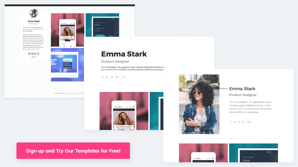
So how did we come up with this UX portfolio template? What makes me so confident it will help you get your dream job?
We talked with world-famous designers and recruiters to build this UX portfolio template
Before I introduce our UX portfolio template and we build your portfolio, I want to tell you about my obsession with UX portfolios. I run a 30-person design team, so over the past five years I have reviewed more than 600 applicants’ UX design portfolios. And oh boy, most of them… Well, they didn’t make the grade.
It really hurt to look at these portfolios again and again and see designers agonize over awful WordPress templates. We decided to build a tool to banish this nightmare and provide a platform to build awesome UX portfolios. We’ve made it our mission to help designers tell better design stories in their portfolios. If we can achieve this, we can help a lot of designers. That, in turn, will let us gain more recognition for the whole design profession as well.
A template based on research
So we interviewed 37 recruiters and talked with the best UX leaders worldwide. You can read our interviews with them on this blog. We talked with UX industry veteran Jared Spool, Design Sprint inventor and Google designer Jake Knapp, Basecamp product head Ryan Singer, renowned behavioral scientist Susan Weinschenk, and former Twitter design principal and Abstract co-founder Josh Brewer. And the list goes on. All to create this UX portfolio template for you.
We also checked the best portfolio templates for designers and researchers, and the best UX portfolio website templates as well. Actually, we collected a few hundred of free UX portfolio templates circulating around the internet. We found some great solutions out there, but most showed quite low quality.
From all this research we did with our team past years, we managed to distill this UX portfolio template.
Understand that we’re not offering a portfolio template file to download and fill out, or a WordPress theme. We provide you much more. Reading this post, you will understand the background of why we do things the way we do. Understanding this will allow you to build a great portfolio.
I will suggest a tool, but you can build your portfolio in any other tools you like. Follow this template and you will see great success. And with our method, you will not just build a portfolio, but prepare for your interviews at the same time.
What does your future design lead want to see in your UX portfolio?
As I said, we met with many design leaders who hire UXers. We likely talked with your future boss while creating this portfolio template. And after all these interviews and research, it all came down to one simple idea. Literally, everyone mentioned it, and the best UX portfolios we found all build on this idea.
Design leads and recruiters want to see your design process and design decisions in your portfolio. They want to see the thought process you went through designing a product, not just images of the final UI design. They want to see why you did things and how you came up with the design.
To make this happen, you have to tell design stories in your portfolio, of projects or work you have done and how they happened from the beginning to the end. Tell them step-by-step, following your design process, explaining why you did things, the background of your decisions and the results.
And this separates great portfolios from the rest. In my experience, only about one-third of the UX portfolios fulfill this need. So this provides you a great chance to stand out.
The structure this UX portfolio template follows, and your portfolio should as well
Although we found telling design stories and explaining your process and decisions the most important, some other essential ideas also came out of our research.
- You need an digital portfolio, but you don’t have to code it yourself. A portfolio always available online just looks more professional. When we asked UX leaders, no one cared about how they got built. Don’t worry about coding it yourself, as long as people can find it.
- You need a portfolio cover page with basic info and big images about your projects. This will give a nice first impression, provide your contact details, and showcase your visual design skills. Those interested can click on your projects to take a deep dive into your projects and read the detailed design story.
- You need three to five projects in your portfolio, not more and not less. This amount of information proves you can achieve results over and over again.
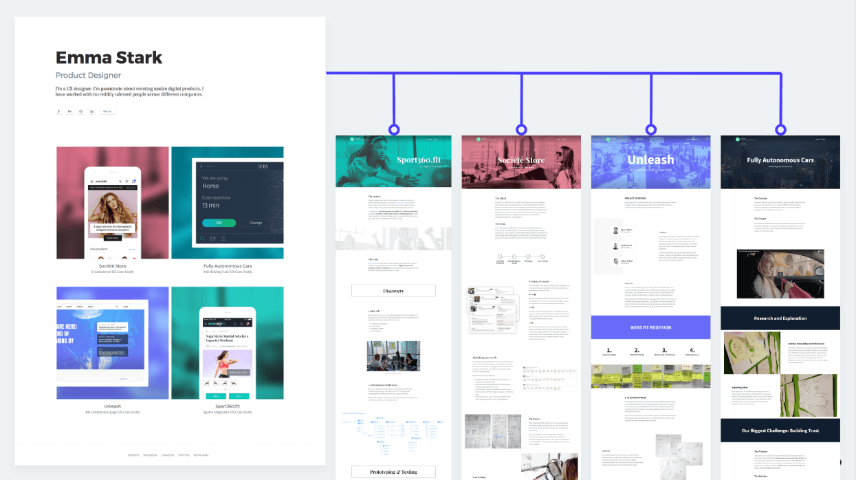
Many web designer portfolio templates have slots for tens of different projects, a bad practice. Remember, they will judge you by the worst project in your portfolio. Better to leave the not-so-good, and hmm-maybe projects out. Show the best of yourself, and don’t sweat leaving out stuff.
To repeat: When you think “While not my best, that kind of work might interest someone as well”, definitely leave it out.
What projects should make it into your portfolio?
Employers usually look for proof that you have already done similar work to what they want to give you. So if you have a project in the same industry, for the same platforms, or you used the same methods they want to hire you for, include that in your portfolio.
It holds true for the other way around as well. If you have preferences, an industry, a platform, a method, or anything you want to do in your future workplace, don’t forget to include your previous work in these fields in your portfolio.
So you have to showcase your best three to five projects and make sure you have projects that fit your future employers’ needs or your personal preferences.
What if the project that fits your future employer or the project that represents your favorite topic doesn’t count among your best work? Let’s say you did it two years ago, and it doesn’t look that good anymore. Either redesign this project or some part of it to make sure it represents your current skills, or leave it out.
How to use this UX portfolio template
So now we know the most important ingredient (design stories) and the basic structure (front page with three to five projects and detailed project pages), we can start building your portfolio.
As I said, you can follow this template and build a portfolio with any tools you want. I suggest you use ours, UXfolio. It will save dozens of hours while you build your portfolio.
Here is how UXfolio will save you days:
- It has beautiful, built-in templates you can fully customize. Don’t spend so much time making your portfolio pretty. Spend more time with the content and your design stories. That gets you hired in the first place. You know, focus on the designs you present and not the decoration.
- You don’t have to code or deal with hosting. We do it for you. We make sure it looks good everywhere and works responsively all the time. Install no upgrades or anything; they come seamlessly. And for all this, you don’t pay more than for a good hosting solution. You can even show your portfolio under your own domain.
- It helps you write and structure your design stories and case studies. With the mindset of the best UX leaders, we structured it in the way they want to see your work. We have built-in templates for all kinds of design and research methods you might have used during your projects.
- We help you a lot in writing because we know how many designers find it painful. Example sentences and guiding questions makes copywriting flow much more easily. Some designers who originally hated writing now have to cut their copy back because they get so inspired and write so much about their projects.
- We have built in mock-ups and screen galleries so you don’t have to spend hours hunting for mock-ups, downloading them, playing with them, then trying to add them somehow to your portfolio. You just upload your images and display them in great mock-ups with one single click.
- You will receive personalized feedback on your very own portfolio from the community or our senior experts. If you get stuck, need another set of eyes or reassurance about something, just use the review feature. You will get useful feedback on your work and great ideas on how to make it even better.
- Embed your prototypes from Axure, Marvel or InVision so your readers don’t have to leave your portfolio to click through them.
- Password-protect sensitive work you want to show just for selected people. This great solution avoids the NDA trap.
If you want to give UXfolio a try, sign up now to take the next steps right there and start building your actual portfolio. Just click here and sign up.
One single click in UXfolio makes most of the templates I mention here accessible, but you can recreate them in other tools as well.
So now I will walk you through our template.
Ready to start? Here we go. 🙂
UX portfolio cover page template
OK, we must display this information on the front page of your portfolio.
- Your name, title, and photo.
- Three to five big, beautiful images of your projects.
- A short bio to highlight the most important information about yourself.
- Your social links.
- Your resume. This portfolio website forms the central hub of your online identity, so people should download your UX designer resume from here.
- Your contact details, or even better, a contact form so people can reach out to you.
Choose from three sleek portfolio cover page templates:
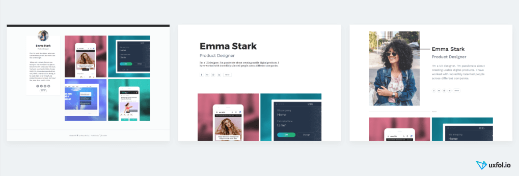
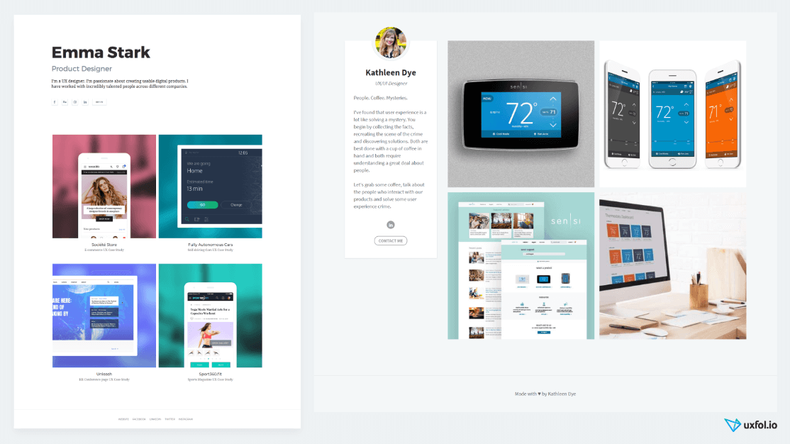
The first layout highlights your name with big bold letters on the top, with a simple white background in a clear, modern layout. Below your name you can put your details. Projects come after that.
Or highlight your photo. The second, two-column layout has a big photo of you on the left with your name and details on the right and the projects below. This layout with the big photo aims to highlight your personality.
The third layout highlights your work. In this case, put your photo, name, and bio all on the left side, so the actual images of your work fill the majority of the screen.
In UXfolio, you can select each template easily. Just sign up, log in, and click on the “Change Template” button on the top.
Fill up your cover page with relevant information
Whichever template you choose, you can also quickly fill in the personal information on UXfolio’s easy interface. You can also add social links and upload your resume. If you don’t have one yet, just find a UX designer resume template online, fill it in with your information and upload it.
In all layouts, we use big images to showcase your projects, exactly why I don’t recommend Behance or Dribbble as a portfolio. Their old design will collect tiny little images on your profile page. By design, they promote the platform, not you. So use something else, where people can see beautiful big images and fall in love with your work at first sight.
I have seen many good examples of these main page images. In UXfolio we generate a few for you automatically, but you can create them in your favorite design tool and upload them as well. Many people use images from the final, polished design from their projects. Others use brand logos here to highlight the cool companies they have worked with. Both can work quite well.
If you use UXfolio, don’t create these thumbnails at the beginning. Just create your account, choose a template and build your first project. Leave these images as the last step.
And how to structure and build your project pages? Case studies should tell your design stories. So let’s talk about the case study template design.
UX case study template for your portfolio
Finally, we have reached the most important part. If your portfolio front page impressed the viewers, they will click on a project and check your work in detail. If they like what they see, you will get invited to an interview. So we will put a lot of effort into designing these project pages or case studies.
One very clear template can tell your project’s story.
It actually resembles telling a tale. You know, when a hero sets off on a journey with friends and they meet many obstacles and monsters. After dealing with them, they finally get the prize they fought for.
In this story, you and your team play the heroes. Your journey aims to solve a business challenge or customer pain. And with its obstacles, the design process represents the journey itself.
The best UX portfolios follow this structure. Let’s break it down and see how a case study page should look from top to bottom.
The essential elements of storytelling
Big hero image on the top with a title. We use this to lure the viewers in and to set the tone and the atmosphere of the project.
Explain the challenge. Start by explaining the challenge you faced. “When I started working on our product, I realized most of our users hate the photo-sharing function.” Describing the situation already generates tension. It will interest your readers how you solve this situation.
The best case studies start with a personal story. In most UX case studies, a business risk (“We lose too many users somewhere”) or a customer pain we solve with the product represents the challenge.
Introduce the team and your role in it. After you have set the scene comes the time to introduce your heroes. Talk a bit about your team and your role in it. Many design leaders we talked with noticed this part lacking in the portfolios they get from candidates. Clarify what exactly you did in this project, what others did and who you collaborated with.
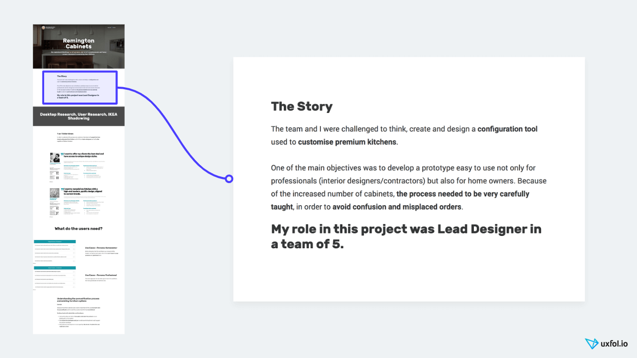
Tell your design process step-by-step. In this part, talk about your journey. How did you interview your target group to identify their pain points? How did you build personas or use jobs-to-be-done? How did you hold workshops to brainstorm with your team? How did you prototype your ideas and test them with someone from your target group?
In most cases, you will talk about a UX method at each step, like prototyping or testing. When you talk about these methods, tell why you chose them and how they turned out. Add photos and images to make it easier to imagine the story.
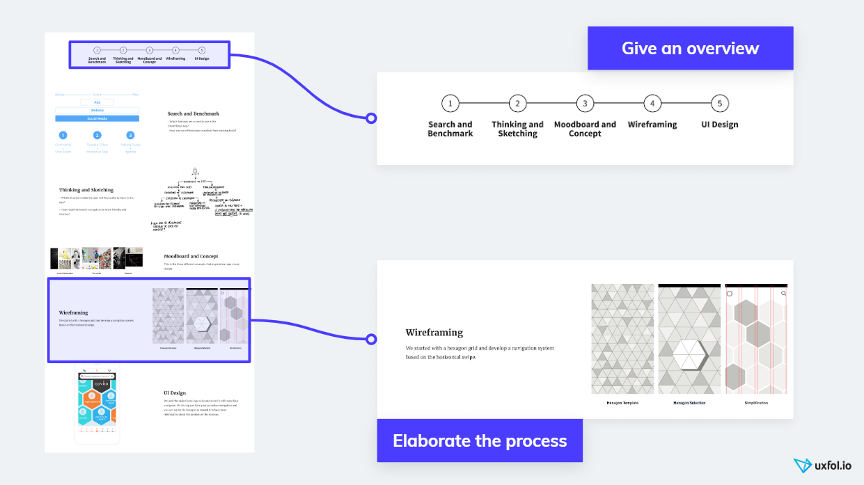
Use images that support the story. Imperfect first sketches pose no problem; include them anyway. Including imperfect photos from that client workshop will build trust and credibility.
And for god’s sake, when you tell the design story, show some courage and talk about the dead-ends as well, the things that didn’t work out. Many CEOs told us they actually hunt for people who can identify if something goes wrong and change things accordingly.
When you tell the story, you should use text and images together, usually in a two-column format.
Show the results. After telling the story of your work, showcase the results. First, present the final product or feature. Include images of the final UI design. Use nice mock-ups and screen galleries. Using UXfolio, it will be just a click: upload your images, choose the mock-up and boom! Done!
When you talk about the results, share numbers as well. If you measure the performance of the product you work on, collecting some great numbers that represent the effect of your work comes easy.
Quotes can build trust as well. Quote your boss or even your users.
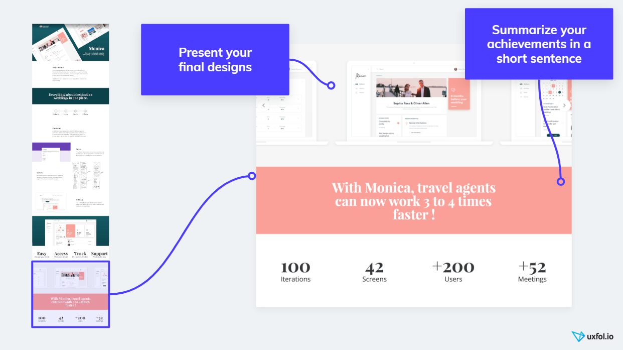
Finally, share your learnings. At the end of the project page, summarize your personal learnings. This will tell your readers that you constantly want to improve yourself and your methods.
So your case studies will look like this. You might consider it a lot of work, and you even have to write a lot to create these case studies. Well, I have good news! As I promised, I will show you how to do it quickly and easily without any compromise on the quality.
How to put together quality case studies quickly
If you want to build awesome UX case studies with our template, but don’t have weeks for it, follow these steps to get there quickly.
I assume you have already signed up for UXfolio.
First, decide on your first project. We know you need three to five case studies, but let’s just choose one to start with. Don’t bother with the rest now. Choose the most exciting project from the last 12 months.
Selected the first project to build? Now comes the easy part. Just log in to UXfolio, and add a new project. It will ask you what UX methods you used, so just select everything you want to include in this story.
When you hit “Generate Project”, UXfolio generates a beautiful project page for you with all the sections you need. Just scroll through this page to see how awesome it will turn out. Of course, you have to fill it in with your content later.
But before we do anything else, just scroll to the top, click on the main title, and write the name of your project. Don’t spend too much time writing the title at this point. You can always come back later. Just write the name of the app and what you did with it: “Redesign of the SuperAwesome app” or “Photo sharing in the SuperAwesome app”.
OK, got a title? Now comes something more exciting. Collect images from your project. Time has come to dig deep into your folders.
Remember, aim to tell the story of your project with these images. Collect the images and upload the ones you like to your uxfol.io project into the right section. You can also add new sections for them if you wish.
When you have uploaded a few photos, scroll through the project a couple more times. While you scroll through your project with only images in it, try to tell the design story to yourself. Tell it like you would to a friend or for a presentation. If you feel a gap somewhere in the story, find an image to fill it or create a new one. Add a new section and upload the new image there.
Scroll through the project again and again, and try to figure out the most natural way to tell your story. If needed, reorder your sections. Once you have your storyline with the images, writing the text will come quite easily.
With the images there and you can tell a great story with them, start writing. At this point, our product will help you a lot. Probably you already noticed the guiding questions at each section you added. Well, you don’t have to do anything difficult, just answer them.
If you haven’t got the luck to use UXfolio, read more about UX portfolio copywriting here.
When you have prepared your case study, don’t forget to click on the “Publish” button on the top. Here you can also ask for a review. Our community loves to give feedback, so don’t hesitate. The more feedback you get, the better your portfolio will become.
Download portfolio template pieces
While you build your portfolio, you might want to add some cool diagrams or illustrations to your design stories. I know this feeling, and I know why you might hesitate. It takes a lot of time to draw custom diagrams.
So we prepared a few templates in Sketch and PSD formats to use and build some cool diagrams for your case studies. These also come included in UXfolio. Just download and use them as you wish.
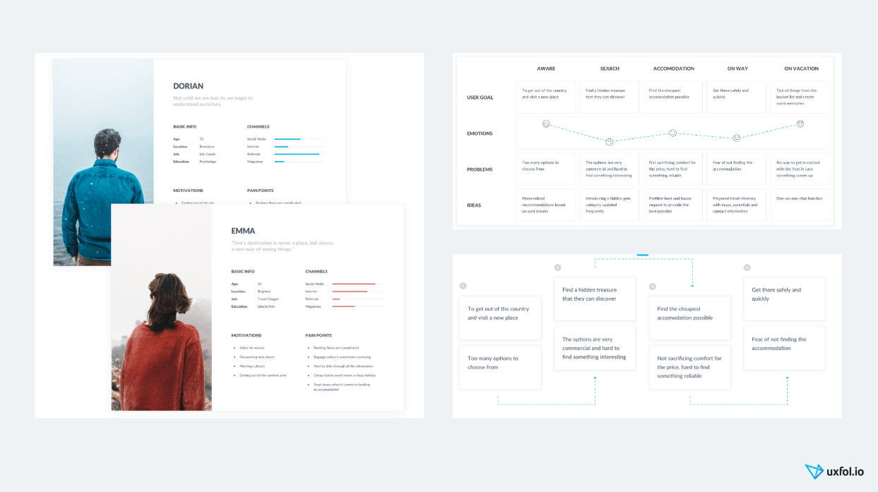
Download our persona, user journey and customer journey templates. (Sketch and PSD files in a Zip)
Now you have these, so nothing will stop you from building an awesome UX portfolio. 🙂
Who can use this UX portfolio template?
One last open question that I got a lot remains. Does this UX portfolio template make a good choice for senior designers? Or on the other hand, can junior UXers use this?
I can answer both as “yes”.
Perfect for seniors, it needs you to just make sure you highlight your senior skills in your design stories – how you lead your team, for example. You can read more about what to include in a senior UX designer portfolio here.
You can build up a beginner UX portfolio with this template as well. Juniors might want to include the stories of some side projects or training projects. I also wrote an article for juniors on how to get your first UX jobs. Read that for some good advice.
Summary and how to get started
So now you have everything.
You have the template structure you can use:
- A front page with your name, title, short bio, resume and social links.
- Three to five projects with big images on the front page and a detailed project page for each.
- Project pages with a detailed case study, a story on how your design was born step-by-step.
- And each story contains the challenge, the team setup, the UX methods and steps you took, the results you achieved and your personal learnings.
You also know how to get started quickly and how to save days with UXfolio:
- Sign up for UXfolio.
- Choose a front page template.
- Fill in your bio and contact info.
- Decide what project you want to build first. (Tip: the most exciting work from the last 12 months.) Add a new project for that.
- Edit the title.
- Collect images for every phase of your design process and upload them.
- Write the copy by answering the guiding questions.
- Publish and ask for a review.
It goes that easily. It actually takes less time than you think. So now you’re up. Get like Nike and don’t hesitate too much; just do it!
