Demonstrating your UI design process doesn’t require long descriptions of user research and a plethora of research material. Even if you don’t actively participate in those parts of the process, your UI designer portfolio can still reveal the thought patterns behind your solutions. This article will help you achieve exactly that, using UXfolio or any other portfolio building tool.
Nowadays there are many different UX and UI positions, each interpreted differently by the industry. Some UI designers work only on final, pixel-perfect screens and fully functional prototypes. Others get involved at an earlier stage, for example sketching.
While you might be tempted to just show UIs inside snazzy mockups in your portfolio, there is a better way to present yourself and your work. Design leads and recruiters want to see the thinking and reasoning behind designs. So, you have to make sure that on top of your skills, your thought patterns are also intelligible based on your UI design portfolio.
In this guide, I’ll cover the three main elements of a great UI designer portfolio:
- How to get started with a UI designer portfolio? – What to include and how to present yourself to get the job you want?
- How To Structure a UI Designer Portfolio Case Study? – How to write a case study when you haven’t done any research in the process?
- How To Design a UI Designer Portfolio Home Page? – How to build an eye-catching front page that will persuade the recruiter to click on your case studies?
What is a UI designer portfolio?
A UI designer portfolio is made up of your portfolio homepage – that contains general details about you – and your case studies. Your bio should be telling of your personality without trying too hard, and your case studies should show your visual design skills, thought patterns, and your design process.
Unlike UX portfolios, UI designer portfolios are not evaluated based on research depth or process storytelling. Hiring managers focus on visual decision-making, interface clarity, and how well design systems are applied across screens and states.
UI designer portfolio examples
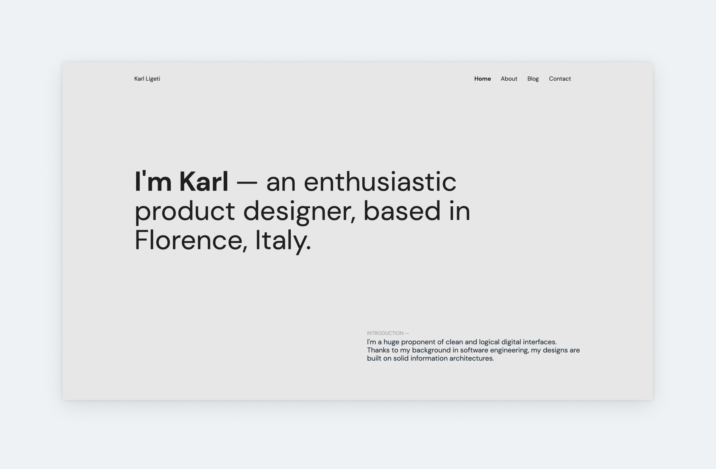
Karl Ligeti
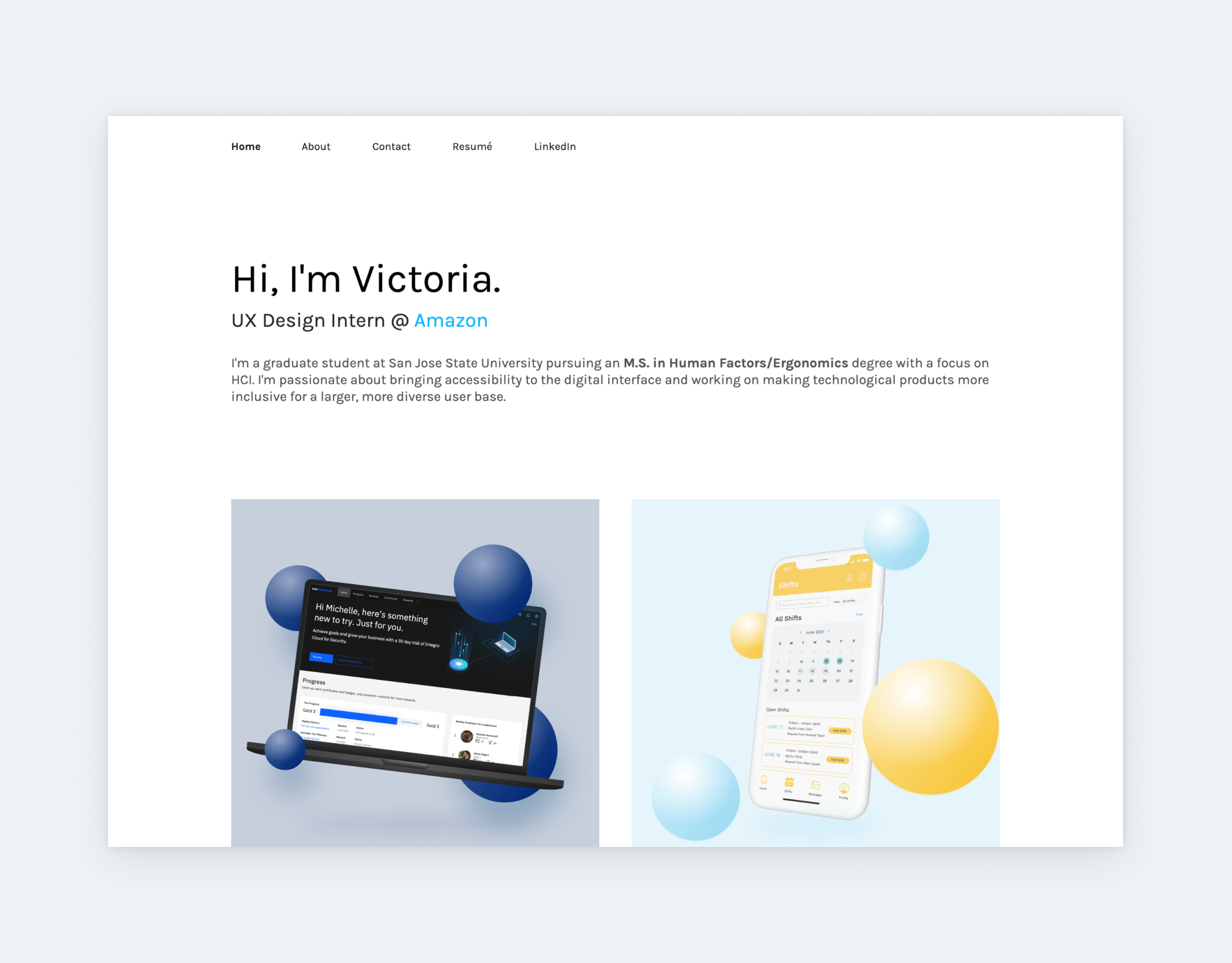
Victoria Tu
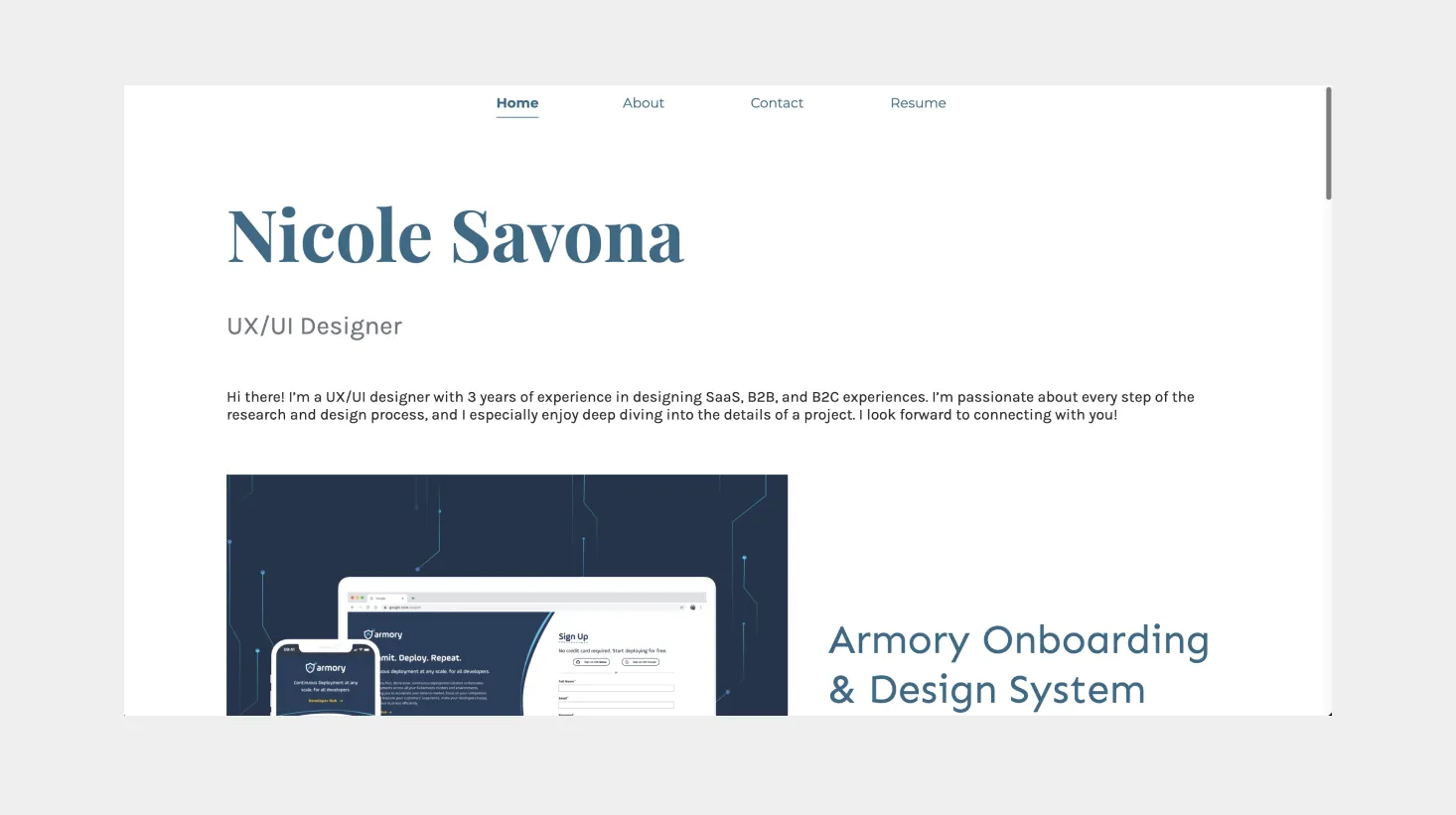
Nicole Savona
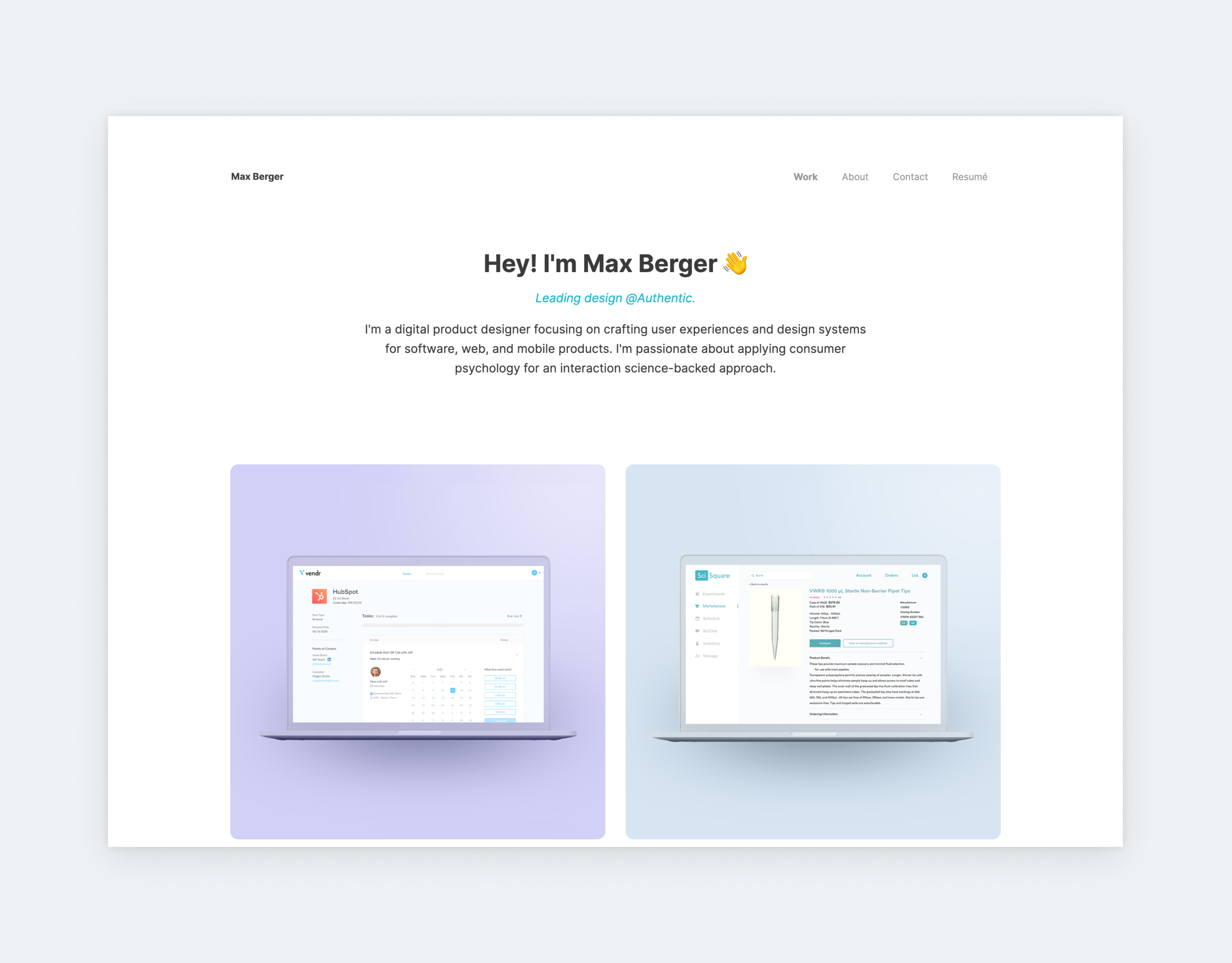
Max Berger
How to Get Started with a UI Designer Portfolio?
- Choose your best and most relevant projects
- Allow your unique personality to shine
Choose your best and most relevant projects
While working on your UI designer portfolio, you should always remember to present yourself in the best light possible. Design leads will look at your portfolio first when considering you for a job, so this will be their first impression of you as a designer.
If they open your portfolio and can’t tell whether you work as an illustrator, animator, UI designer, or UX researcher, they probably won’t bother to find out. If you are applying for UI design jobs, call yourself a UI designer. Once they are pulled in and think “Oh what a great UI portfolio!”, they will scroll further and check out your case studies.
My previous point comes into place here: Ensure your projects reflect you and as well as the job you are applying for. Let’s say you’ve been working as an illustrator but want to transition into UI design. Show recruiters that you can get the job done. So, no matter how much pride you have in your illustrator work, you should probably not include those projects in your portfolio.
This approach is the portfolio equivalent of “Dress for the job you want, not the job you have.” And if you have just arrived on the design scene but you already know what sort of design jobs you want, make sure your redesigns and hobby projects reflect that sort of work.
Or say, you mostly worked on mobile applications your whole designer career and mastered every design pattern known to man. You can also recite the Google Design Guidelines by heart and want to continue this way. Amazing! Include the pride-and-joy mobile projects and toss those not-so-great desktop projects from your top five.
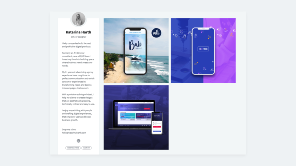
Show some personality
Besides requirements and salary, you probably read about the company atmosphere and way of working to get an idea of what you can expect.
This goes the other way around as well because generally companies are not just hiring your design skills but you as a person. They want to hire people who fit their team, goals, and mentality. In most cases, they will measure your compatibility with the right UI/UX designer interview questions.
When someone opens your portfolio, they should get a feel for the person behind the work.
However, you can get a head start and make a memorable impression with your UI portfolio. This doesn’t mean you have to struggle to appear vastly different from all other candidates. It just means that when someone opens your portfolio, they should get a feel for the person behind the work.
Imagine your portfolio as your brand and online presence, not just a list of your works:
- Pay attention to your copy and try to match the company’s tone,
- Don’t forget to introduce yourself in addition to your work,
- Add some personal details to your description, like hobbies and such, that show you away from the computer and pixel pushing.
Now that we have covered the basics, let’s dive into building the perfect UI designer portfolio!
How to build a UI designer portfolio case study?
- Start with your designs
- Give context
- Detail the design process
- Help comprehension with visuals
- Show versions
- Explain the solution
- Close with learnings
1. Show designs early on
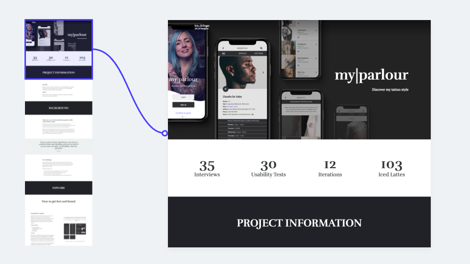
When building a UI case study in order of the process – which is best practice – avoid the mistake of writing a lot upfront without sharing any visuals from the project. Visual design constitutes a UI designer’s strongest skill. Grab the reader’s attention by presenting the final UI design right at the beginning.
Grab the reader’s attention by presenting the final UI design right at the beginning.
While eventually you must write about your process and might also show some sketches, recruiters will look for UIs.
What’s more, presenting your final designs earlier can help the reader better understand your process, as it gives them a clear idea of the end product. What’s more, this will help their understanding of the different iterations that come later.
So, the best is to start a UI case study with UIs. Showcase them in nice device mockups to grab the reader’s attention right away. In UXfolio you have a built-in mockups feature, so you can showcase your screens in mobile, desktop, or tablet mockups without the need for another software.
UI designers are evaluated primarily on visual decision-making, not on research documentation. Strong portfolios explain why a specific layout, component structure, or interaction pattern was chosen, how it improves clarity, and how it scales across the interface.
2. Give context
Recruiters and hiring managers look for the perfect fit. If they come across your UI orUX portfolio and can’t decipher what sort of projects those screenshots come from, they won’t bother to find out.
Introduce the project in one paragraph, without writing hundreds of words right at the beginning. Provide a summary of the project and explain the main problem and challenge that kickstarted it. Next, write about your role and responsibilities, and the parts of the project you consider really yours, especially if you worked in a team.
3. Detail the design process
Even if you are only creating visual designs, don’t forget to tell the story of creating them. Include this in your case studies because simply displaying final screens won’t hold any meaning your portfolio’s visitors. Simply put: Presenting nothing but screenshots in your portfolio makes you appear lazy.
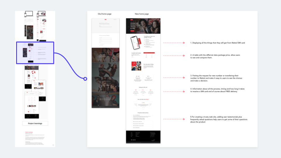
Highlight parts of your designs, or place them side by side for comparison, pinpointing what changed and why.
The readers did not partake in the project so they have limited to no background knowledge. They can’t figure out your expertise from looking at a screen design, no matter how nice it looks. For this reason, you have to help them understand the ‘whys’ behind your decisions. Do it by walking them through the design process step-by-step.
So what makes up this process that you can showcase, you might ask. Whenever I finish a project and look back on the very first sketches, 90% of the time they have nothing to do with the final product. You might also be familiar with this concept.
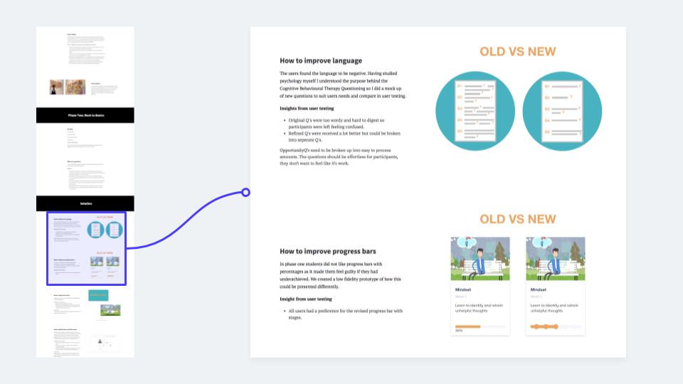
Direction can change at many different stages. Sometimes you have to consider business decisions. User feedback can completely alter the scope. You may opt for another solution simply by spending more time on the project and getting immersed in the topic.
Now, you don’t have to scan all of your sketches and upload everything. Just pick one or two favorite screens and explain how and why they changed the way they did. Highlight parts of your designs, or place them side by side for comparison, pinpointing what changed and why. And this brings us to our next point.
4. Help comprehension with visuals
Don’t shy away from presenting projects visually. A UI design case study doesn’t have to be all words with only a few images here and there. Reading loads of text about a project can get really tedious. Break the monotony in the case study so it doesn’t put the reader to sleep.
Most people are visual beings and you are writing a case study about a visual project. When you want to explain something complicated, first think: “Would an illustration instead of text make it easier for the reader?”
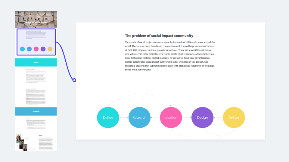
Present your design process, intricate concepts or features in a visual way for the sake of clarity. Go for specifics: Summarize the user insights on cards, or demonstrate a whole iteration process by laying out all the screens next to each other. For even easier comprehension, present versions side by side. (We will go into more detail on versions in the next section.)
Obviously, this kind of case study building takes more time and more effort on your part. You have to go back to the project after finishing it and create some additional materials. However, recruiters and readers will have a much better experience while reviewing your work. Ultimately, it results in a more exciting UI case study.
5. Showcase versions
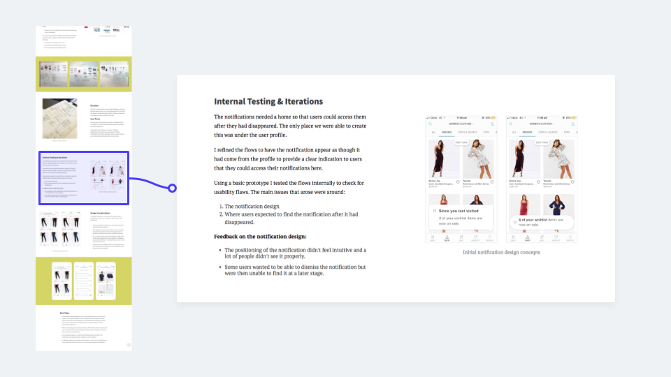
Nothing highlights your problem-solving skills better than including versions in your case studies and the reasoning behind them. You likely come up with more than one solution to a problem. Maybe a client requested you to come up with more than one version. These could come as simple as rounded or not-rounded buttons, or as elaborate as three different visual explorations. Perhaps you even presented different mood boards to the client.
Showcase these in your portfolio just like how you go about presenting these to the client. After all, the reader might also become your client. Display the versions you have side by side to make them easy to compare. Then highlight differences and similarities, what worked and what didn’t, or pros and cons for each version. Keep this easily skimmable by opting for a list format rather than long text. Finally, don’t leave your audience hanging: Share how and why did you end up with the winner.
6. Explain the solution
Many designers make the mistake of presenting the final designs without any explanation and storytelling. Even if you showed versions and wrote about your process, the final solution might need more details. If you only present the final designs, you miss the opportunity to showcase how innovative you can be.
A recruiter or designer might look at the problem you described and the final solution, and still not see the connection. Explain why you went with a specific decision. Depending on the project, these can range from layout through typography. Let’s take a closer look!
Layout
Holding responsibility for the layout of a project opens up many opportunities to write about your solution. You probably didn’t open up Sketch and finish the whole project two hours later with the first version for every page you could think of. When writing about the layout, think of these questions:
- Why does this layout work?
- How did you come up with it?
- Why did you place certain elements where you did?
- Did any user behaviors or UX patterns influence this layout?
Visual Hierarchy
Visual hierarchy can be a very fickle thing and many elements can influence it. You’ve likely set your brain on autopilot when making a card’s subtitle smaller or the grey a bit lighter than the title itself. But to position yourself as a conscious designer, explain some of these decisions in your UI designer portfolio.
That card probably looks like it does because the title needs more prominence than the subtitle. You set the sizes and colors with purpose and not because someone else did it on another design. (Well… maybe you peeked at the hex code of that grey because it had a very different bluish hue you’d never seen before.) The bottom line: Try highlighting details and the thoughts behind them even if they come second nature to you.
Overall style
Showcasing and explaining the overall style can take many forms. Most of the time, UI designers insert fancy mood boards and random UI kit parts. They probably show how you sort-of designed in a system in an adequate way, but they don’t really touch on the ‘whys’.
Mention why you picked the colors you did and why you went with that font family. Probably a lot of external variables influenced your decision, like average users or personas or the already established brand of the product. Try justifying these decisions by writing how you came to these conclusions.
If you made the UI dark because most people use this app before going to sleep and you don’t want to blind them, write about it. When showing colors and fonts for the app, explain how they strengthen the brand itself and why you had to use them.
7. Close with learnings
Recruiters love to read reflections on projects. It shows them how you felt and what you learned. In this part, use that information to prove that you want to get better. Junior UI designer portfolios really need this because they most probably don’t have many projects to back up their skills. Fear not, they won’t think, “Oh, they didn’t even know this?” More likely they’ll get a sense that you keep improving.
You may take pride in a project which for some reason didn’t go the way you planned. This gives you the perfect opportunity to reflect. Write about how it went off the rail and what would you do differently a second time. Include your personal feelings. Showing personality will distinguish from you from all the dry portfolios.
So to sum up, use this skeleton as a UI designer portfolio template:
- Context and the problem
Describe the overall topic of the project and the problem you needed to solve - Final visuals
Present some finished designs early on to serve as a solution to the problem you described and also as a teaser for the readers to read further. - Your design process with different versions
Walk your reader through your design process and describe some versions and decisions you faced during this process. - Final solution and its explanation
Describe your final solution and explain what makes your designs the best. - Learnings
Share what this project taught you and the most important takeaways for you.
Hiring managers look for evidence of system thinking in UI portfolios. Showing how components adapt across different contexts, states, and screen sizes is often more valuable than presenting isolated, polished screens.
Designers who document UI systems often use tools like UXfolio to present components, variants, and screen flows as part of a cohesive interface system rather than disconnected visuals.
How To Design a UI Designer Portfolio Home Page?
- Don’t try to reinvent the wheel
- Create eye-catching case study thumbnails
- Introduce yousrelf
- Make your contact info accessible
1. Don’t reinvent the wheel
Look through some UI designer portfolio examples and you’ll find that most of them follow the same structure. A simple bio or introduction text with a photo filling the top half of the page. Underneath they list their projects with eye-catching projects thumbnails. Some close with additional info further down the page.
These portfolios do at least a few things well: simple navigation and no unnecessary animations. Their owners already know that recruiters only have a couple of minutes to look through UI designer portfolios. If they come across something that is hard to navigate or skim, they might simply give up and leave.
You can create a completely unique portfolio without sacrificing basic UX principles.
As tempting as it might seem, difference for the sake of difference is a losing approach. Having similar patterns to other designers is not necessarily wrong. On the contrary, it might prove a good strategy. Users, and in this case, recruiters got familiar with patterns over the years, so they feel comfortable navigating this kind of portfolio. Don’t make their work harder and accessing your works more difficult, by trying to be drastically different.
Instead of going completely against this template, consider its merits and their degree. Play with the colors, the fonts, the mockups or the layout of your UI case studies. Don’t attempt to reinvent the wheel: You can create a completely unique portfolio without sacrificing basic UX principles.
2. Create eye-catching case study thumbnails
If you follow the template above (bio on the top, projects underneath) your projects will take up most of your portfolio. If you send an application, you probably want one thing: recruiters to engage with your work, and not just scrolling through the portfolio and then closing it. To grab the attention of the recruiter or the design lead who looks through your work, they need to see either something that interests them or something they think looks nice.
For the former, choose your projects carefully. Then make sure your thumbnails or project previews represent the project itself. Display final UIs on the thumbnails so recruiters won’t have to guess what sort of projects they are looking at.
A stock photo of two people talking could come from a project in a number of different fields and for a number of different platforms. Recruiters are looking for your visual UI skills on a specific platform or for a specific field, so don’t leave them hanging. Present your work on your portfolio cover page in a way that explicitly highlights your strengths and previous work experience.
For the second (something that looks nice), carefully design your project thumbnails. Not only the UI you place on them but the whole section. Think about the composition of the different thumbnails next to each other and the mockups you use to display your final UIs in.
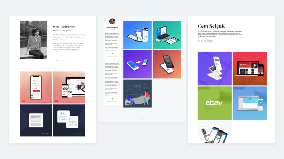
Your project section should look coherent even if the projects themselves are not related. In most cases, you don’t want to overcrowd the thumbnails. A simple background with a mockup and a UI screen makes an excellent choice. Of course, you can always spice things up with slight animations, continuity, or a color scheme.
If you find yourself struggling to create nice project previews, take a look at our blog post on how to create eye-catchingproject thumbnails.
3. Introduce yourself
We’ve already touched on this above: Your portfolio represents you in a webpage form. Just like in a social situation, start by introducing yourself. Make your intro prominent and easy to find on your UI portfolio home page. Besides your name, explain the sort of design you do and the jobs you seek. Furthermore, show some personality by writing a bit about yourself or your hobbies.
A warm copy can make the recruiter feel like they have met you. Go one step further and include an ‘About’ page that describes you as a person or explains how you became a UI designer. If you feel like it, you can also display your photo at the top.
4. Make your contact info easily accessible
Last but not least, make your contact info easily accessible. If someone wants to contact you right from your portfolio, it is usually for a good reason, so make it as easy as possible. Include any kind of social media that you use for professional purposes. Also, don’t forget to display your email or use a built-in contact form so they can reach you. Don’t hide it under an intricate menu system!
So to sum up, use this skeleton as a UI designer portfolio template:
- Introduction and short bio
A short paragraph dedicated to your basic info, what sort of design you do and some personal additions. - Contact info
Display your email address where they can contact you and optionally links to social media. - List of works
A well-designed, carefully selected list or grid of projects which takes the reader to individual case studies.
In case you need a great platform to build your UI designer portfolio, giveUXfolio a try!
It is a UX portfolio builder platform designed for UX and UI professionals – with many special features that will help you to create your portfolio quickly and easily. Click here to sign up to UXfolio and try it out!
