When I started in UX, I hated copywriting. Everyone kept talking about its importance – “Copy makes up part of the design” – but I just didn’t get it. It took quite a while to recognize their point.
I know that many UX designers out there feel the same way: they just hate copywriting. Nonetheless, we cannot skip this part in a professional UX designer portfolio.
You want to include your best work in your portfolio to impress impress future emploeyers, potential clients, or your followers. Most of them know that UX is goes beyond UI. Therefore, you must prove that you can design an easy-to-use digital prodcut, and not only beautiful screens. Also, we all know that pretty UI does not necessarily mean good UI.
If you want to present the story and your way of thinking behind you design, write it all down in your portfolio and case studies. Think of the result as the summary of your work. It is good note to end on, but it doesn’t tell the whole story. Through the copy, you can present your writing as well as problem olving skills. Both of these are just as important as your visual design skills.
Fundamental tips on UX portfolio copywriting
- Don’t be a bad marketer. Don’t attempt to sell yourself with some superficial, meaningless copy. Your UX portfolio copy says a lot about you. Don’t try to pretend to be anyone else but yourself.
- Write down every detail. Some things might be evident to you, but not for your readers. Your UX portfolio copy should provide an easy-to-follow overview even to readers who work in different fields and don’t have the same knowledge of UX.
- Explain things as you would explain them to a friend. Imagine recording a presentation of a project and then write down the script. Creating case study copies this way, gives them a natural flow and simplicity.
- Use a catchy title. The title has to pull in people, it has to make them curious about the case study. How? Highlight the brand you worked for, the result you reached, a new technology you used, or anything else that helps you stand out from the crowd. First impressions count a lot. If you grab the readers attention in the first few seconds, they will be invested in your case study.
- Don’t try to stuff everything into one case study. That would make it too long, complex, and hard to follow. UX leads don’t have the time to read book-length texts. Pick a problem you faced, then present the design process you followed and how you solved that specific problem.
Design Process
First, before starting to dig deep into the UX methods you used, give an overview of your design process. Explain your design process, the story of your design, your way of thinking, and present your workflow.
Give an overview of what you did in the project, present the steps you took.
Even if you didn’t do the whole process, you can still talk about it. Your readers will understand better if you present the process end-to-end and talk about your role in it. For example, if as a UX researcher, you didn’t design anything, you can still present the final product. Just tell how you contributed to it.
UX methods
After giving an overview, dig deeper into the steps taken. Elaborate the process and share insights, writing about each step in detail. What did you do at each step and why? Present the UX methods you used and the insights you got. Make the process understandable and easy to follow. Present your way of thinking and create a logical flow in your UX design portfolio for your readers.
Presenting the methods used in the different steps of the design process can take many different forms, from crafting personas to doing usability tests, prototyping, running workshops or design sprints. Include every important outcome you have, such as a customer journey, personas, prototypes etc.
When you write about the methods used, don’t just cover what you did, but also why.
UX leads and recruiters want to see more than your expertise in using many different methods. Also show your knowledge of the best method to use in a specific situation and that you can make decisions and changes based on the outcomes.
The ideal structure for presenting UX methods in your portfolio
1. What did you do?
Which UX method did you use and in which phase?
Write about the UX method used and share all the details you find important. Present it to your readers as if they had no clue about the method itself. Make it easy to follow even to they have no deep knowledge of UX.
2. Why did you do it?
Why did you choose these specific methods? What did you aim for with the method?
Explain your way of thinking behind your process. Telling why you chose a specific method holds as much importance as presenting the method itself.
UX leads look for problem-solvers. Highlight your ability to use the right method to solve the actual problem you face.
3. What did you find out?
What results did you get? What did you find out? Did it prove useful?
Tell about the outcomes and the insights about your users. This shows your concern for the people you design for. Have you talked with them? Have you discovered anything weird or interesting about their behavior? Have you observed them using your design? If so, share your learnings and any tangible findings if you can.
4. What did you change based on this?
What design decisions did you take?
Last but not least, explain your design decisions based on the UX method presented above. UX leads want to hire people conscious of their decisions. While you design, you improve the user experience in every iteration. In many cases, you have to choose between different solutions. We want to see the different design decisions, to read the pros and cons of each, and the reason why you chose the winner.
We also created a UX portfolio template, check it out if you want to learn more about it.
Guiding questions and examples for UX portfolio copywriting
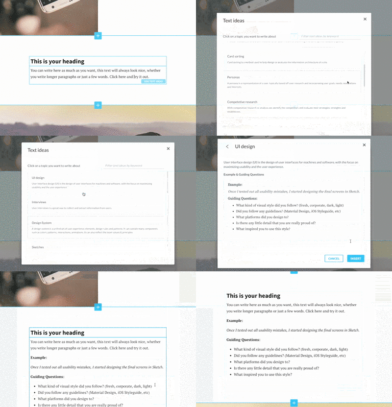
To help you follow this flow I just explained, we added a copywriting feature in UXfolio. It helps you write about your design process, UX methods, user insights and design decisions by giving you guiding questions and examples.
So let’s see some examples and guiding questions for UX methods you might want to showcase.
Interviews
Example:
At the discovery phase of my project, I conducted user interviews in order to get a better understanding of the problem.
Guiding Questions:
– What research questions did you ask? What aroused your curiosity the most?
– How many users did you interview?
– What main insights did you get from the interviews?
– What did you change on the design based on the insights?
Competitive Research
Example:
I gathered information about the competition in order to forecast a potential for the market.
Guiding Questions:
– How did the competitive research affect the overall strategy?
– What aspects did you consider while doing it?
– Which products did you consider the main competitors (direct and indirect)?
– What advantages and disadvantages did competing products have?
– Did you find a niche market?
Surveys
Example:
After we launched the MVP, we wanted to gather feedback from the existing users. We set up an online survey and asked them to fill it out.
Guiding Questions:
– What type of surveys did you use? (in-depth, short, on-site, external)
– How many people filled out the survey?
– What results did you get?
– What decisions did you make based on the results?
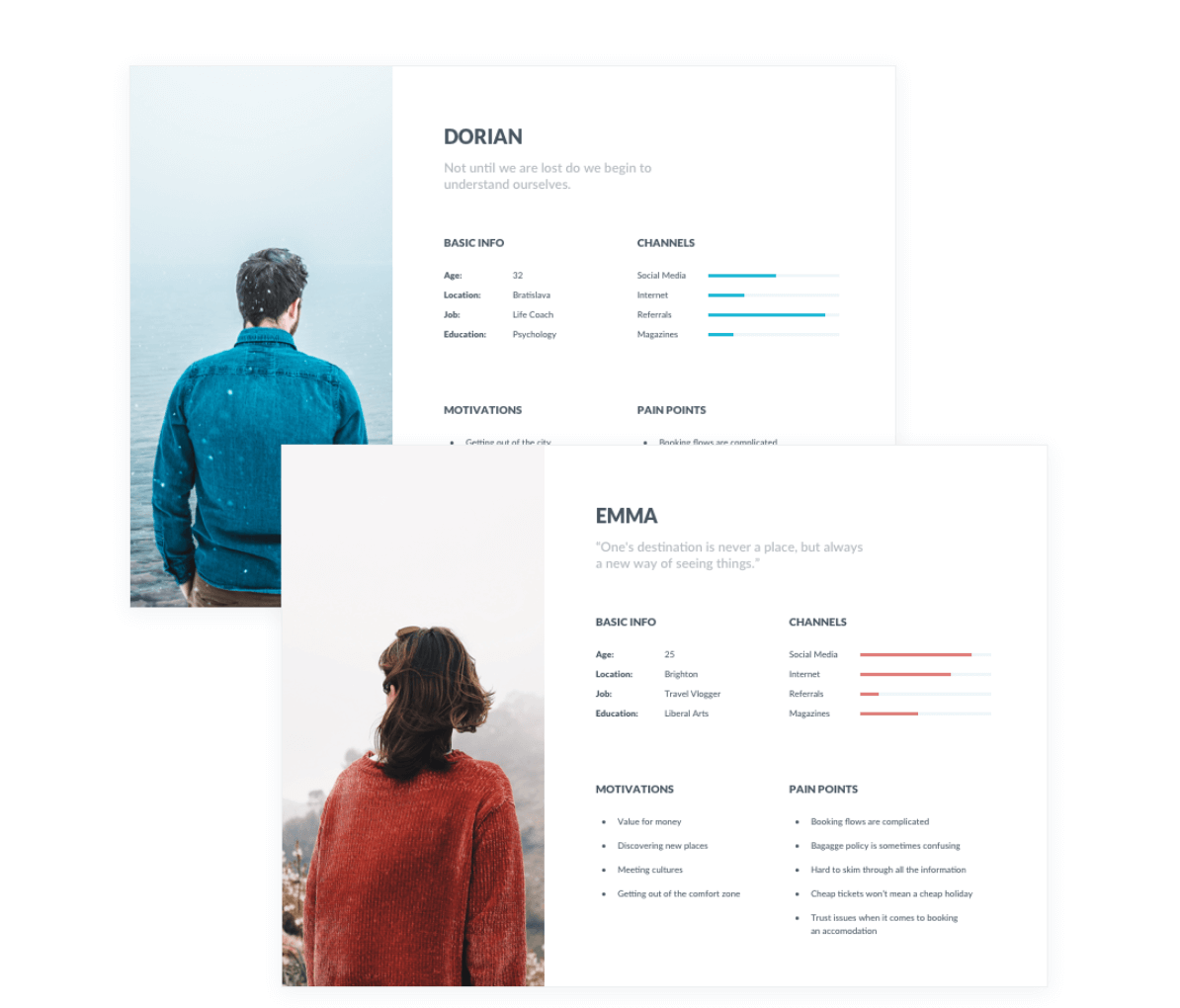
Personas
Example:
Based on the interviews/workshop, we set up three personas. We referred to them throughout the entire product development process.
Guiding Questions:
– What kind of methods did you use while developing the personas? (user research or involving stakeholders?)
– At what point did you decide you needed personas?
– What information did you provide about each persona? (demographics, problems, motivations etc)
– What did you do to give this information to the product team?
– How did it affect design?
User Journey
Example:
I devised three versions for the user journey of the same task and tested them with prototypes to find out which worked best.
Guiding Questions:
– How did you determine the process?
– What did the user feel about each step of the process?
– How did you test the process?
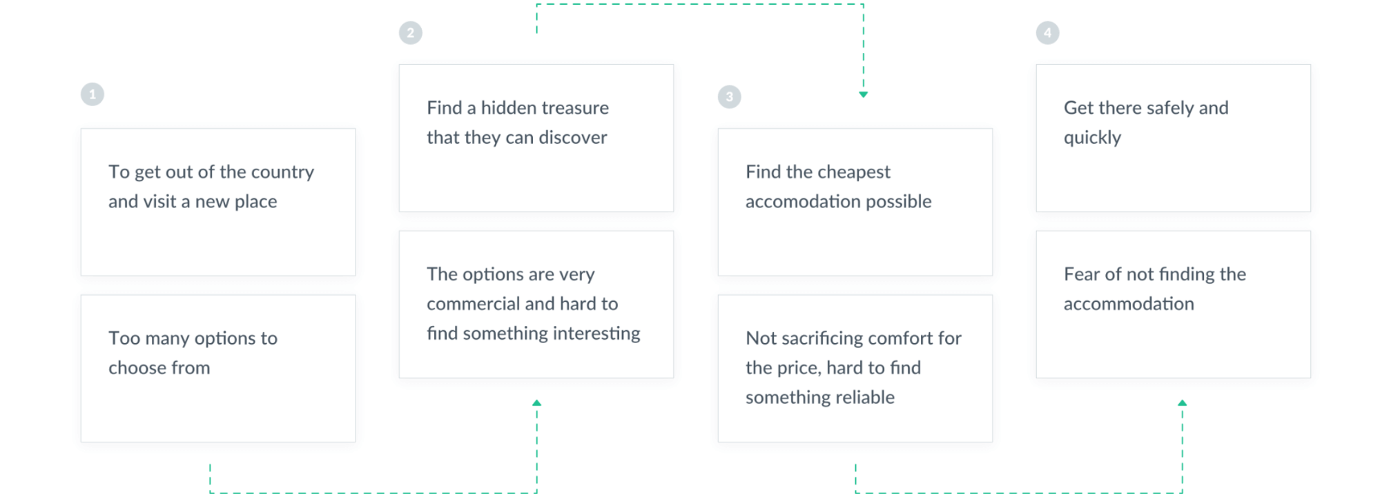
Customer Journey
Example:
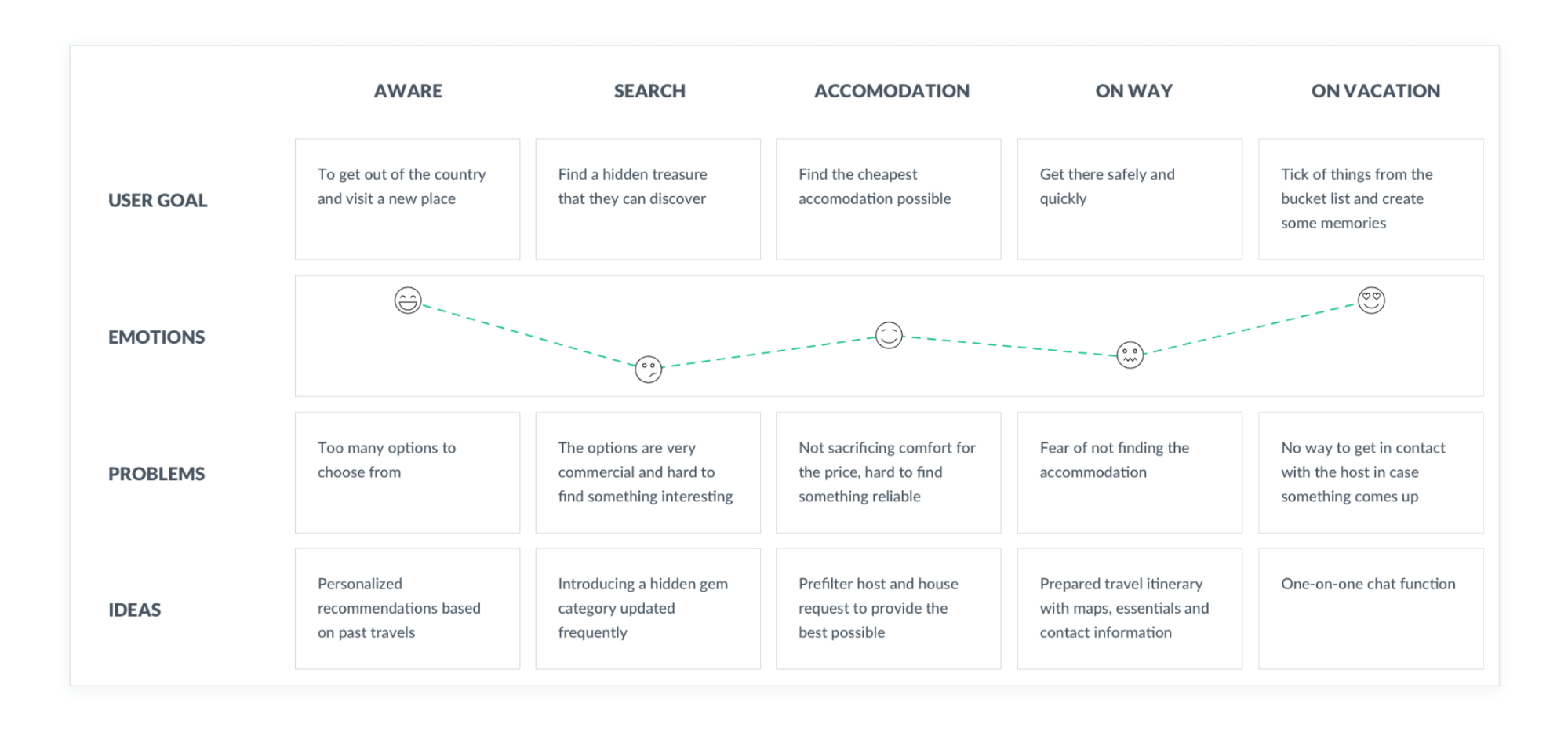
In order to better get to know our users’ behavior, we created a customer journey map.
Guiding Questions:
– Describe the whole buying process from the point when the user does not even know of the product. What happens after using the product?
– At which main touch points did the user make contact with the service?
– Which main pain points did the user experience while using the service?
– What functions or solutions did you come up with to treat these pain points?
Business Requirements and Goals
Example:
The company wanted to increase new user sales conversion by 15% without affecting retention.
Guiding Questions:
– What challenges did your client face?
– What main trends occurred in the field?
Key Performance Indicators
Example:
We agreed that increasing the retention rate held the greatest importance since it formed the product’s most important KPI.
Guiding Questions:
– What quantifiable goals did you want to achieve with your design?
– How did you measure these goals?
– What method did you use to define these goals?
– What have you changed in the design to this end?
Heuristic Review
Example:
As the first step of my redesign process, I evaluated the website with the heuristic review method.
Guiding Questions:
– Which criteria did you base evaluate the design evaluation?
– Which big problems did you find?
– What kind of suggestions did you make based on these problems?
Card Sorting
Example:
I decided on the main categories of the webshop with a card sorting session.
Guiding Questions:
– What main purpose did you have?
– What navigation problems did the website have?
– What type of card sorting method did you work with? (closed or reversed, online or in person)
– How did the participants gather the information?
– What kind of new navigation structure did you suggest?
Sketches
Example:
I usually start the design process with low-fidelity sketches. This way I iterate through many design options quickly.
Guiding Questions:
– What main purpose did your sketches have? (presenting, testing, brainstorming?)
– How many different versions did you make?
– Which version did you choose to go with and why?
Wireframes
Example:
At the beginning of my design process, I created wireframes for testing purposes.
Guiding Questions:
– How did it prove useful to do this?
– What kind of wireframes did you make? Low-fidelity or high-fidelity?
– What tool did you use for this?
– Did you use them for testing?
– How many iterations did you have?
User Testing
Example:
Before launching the product, I did a testing round in order to reveal possible usability problems.
Guiding Questions:
– At which phase of the project did you test the design and why?
– Which subjects did you test? Did they meet the target group?
– Which method did you use for testing? (remote, moderated etc)
– What tasks did you give the test subjects?
– Which remarks proved most important?
– What has changed in the design?
Design System
Example:
As we implemented new features into the product, the project got more and more complex. We decided to set up a design system to get a unified set of rules to follow.
Guiding Questions:
– Why did you decide to work with a design system?
– What did you include in the design system? (UI elements, animations, interactions?)
– What proved the most challenging part of designing this system?
– Did you use any frameworks to create the design system (Atomic Design principles etc)?
Look and Feel
Example:
As a first part of the UI design process, I presented three different look and feel plans to the client. This helped us narrow down the options to the one they really liked.
Guiding Questions:
– How many different look and feel versions did you make?
– In what way did the versions differ most?
– Why did they choose the one they did?
UI Design
Example:
Once I tested out all usability mistakes, I started designing the final screens in Sketch.
Guiding Questions:
– What kind of visual style did you follow? (fresh, corporate, dark, light)
– Did you follow any guidelines? (material design, iOS style guide, etc)
– What platforms did you design to?
– Did any little detail really make you proud?
– What inspired you to use this style?
Takeaways
The most important things design leads and recruiters would like to see in your portfolio:
- Design process
- UX methods
- User insights
- Design decisions
Make sure you include all of them and explain everything in an easy-to-understand way. Following this UX case study structure will provide your reader a logical flow.
The ideal structure for presenting UX methods in your portfolio:
- What did you do?
- Why did you do it?
- What did you find out?
- What did you change based on it?
If you need a little help showcasing these essential ingredients in your UX portfolio, try out UXfolio’s copywriting feature!
It will save you tons of time and make the copywriting process easy-peasy.
Let’s work on your UX portfolio – with the great help of UXfolio’s copywriting feature. Click here to sign up and try it out!
