What is the recipe for perfect product design case studies? The dozens of design leads and HR managers we’ve interviewed say that they expect a blend of
- storytelling
- stunning visuals and
- personality.
This article will guide you through the steps of creating case studies that check all those marks, and more! This is your one-stop source of tips and steps based on actual research, and real-life examples.
Let’s be honest: putting together a case study can be rather difficult. However, there are some techniques and tools that can help you along the way. One of those tools is UXfolio, our portfolio builder that makes the whole process faster and easier. Obviously, these 8 tips apply regardless of the tool you are using to build your product designer case studies.
1. Inject your personality into your case studies
Showing personality in a product design portfolio, case study, or resumé can be challenging. Finding the balance between just enough and too much takes time and experimentation. Still, if you want to set yourself apart, you have to find ways to inject your personality into everything you submit with an application.
Here’s a pro tip: whenever you relate something back to yourself, to your personal experience with the project, you’ll allow a small bit of your personality to shine. If you don’t go overboard, you will show just enough of yourself for recruiters to see the type of person and designer you are.
Define what you do
There are ways to sprinkle tidbits of your personality into everything you make. Start by clearly defining what you do. Do this in your portfolio and at the beginning of every case study: In what quality were you part of the project?
Find personal connection to the product
Next, you can share your connection with the product. Your case study intro is perfect for this. Answer questions such as:
- How did it relate to you (if it did)?
- Did you have any experience in this niche before?
- Were you using similar products before?
Talk about your experience throughout the process
In the body of your case study go on and talk about your experience throughout the project. Maybe this was your first time using a specific UX method. Let your readers know! Then go on and share what you liked about it, and what you didn’t.
Juniors have it easier
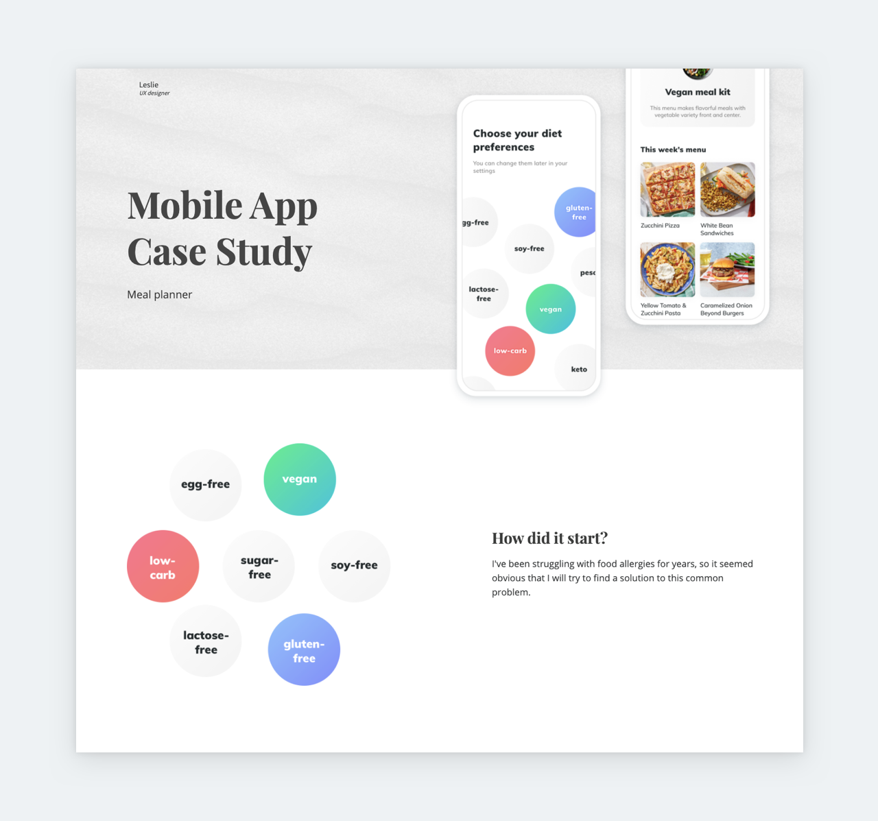
Leslie’s Meal Planner case study is the perfect example of a product designer case study based on a mock project. Putting together a portfolio as a junior designer – who doesn’t have real-life projects yet – is challenging to say the least. Most design leads advise juniors to build a portfolio based on
- internship experiences,
- mock projects, or
- redesigns.
The secret is to treat these mock-projects exactly as you’d treat real-life projects. Put in the research, testing, and the same effort you’d put in a real-life project. The best thing about mock-projects is that they provide plenty of room for your personality to shine. Just base them on topics or apps that interest you and let your readers know.
Check out Leslie’s introduction:
“I’ve been struggling with food allergies for years, so it seemed obvious that I will try to find a solution to this common problem.”
Immediately in her intro, we learn something personal about her. It is easy to see why she’s passionate about the topic. By kicking it off on a personal note, she pulls in the readers immediately.
This approach aligns with the advice that Marc Greenberg, UX lead of Robotics at Postmates, gave to junior designers:
“Start close to you. Everyone can identify where their own frustrations, troubles, and difficulties lie. The first step is to design solutions to those things.”
2. Put everything in context
Both HR managers and design leads list ‘lack of explanation’ as a common reason for rejection. Our experience through expert reviews supports their statement.
Stop defining UX methods in your case studies
Many designers will list the methods they have used during a project. They do a good job of explaining the general purpose of said methods. The only problem is that both HR managers and design leads are aware of what ‘A/B testing’ is and what purpose it serves. What they don’t know is:
- Why did you choose that method for that specific project?
- What did you learn (or did not learn) by using that method?
- How did your findings influence the project?
By failing to answer those questions, your case study will fail to fulfill its purpose. The key is storytelling. In the context of UX portfolios, the word storytelling refers to the story of a specific design project and not the story of UX design in general. Storifying your design process is not that hard of a task. Just follow the golden rule:
Whenever you mention something in a case study, explain why it’s relevant to the project at hand and how it influenced your process.
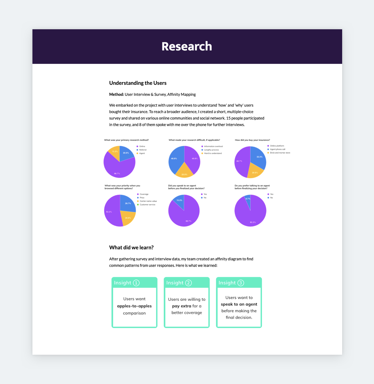
Better Cover, a product design case study by Joanna Yoon, illustrates how to place research in context. Joanna lists the methods she used, then goes on to provide numbers and results. She presents the results in a visual way, which makes it even easier to digest all the data. And this takes us to our next tip: visuals.
3. Keep it visually consistent
Your taste level will be judged based on your portfolio and case studies, and not only the products that you’ve designed. Ideally, while working on something, you think in personas, mood boards, and design systems. Do the same when putting your portfolio together! After all, it’s a product designed by you.
Stop over-designing
Don’t go overboard with your portfolio design. The more stuff you add, the higher your chances of not matching the tastes of others. What’s even worse, you’ll ruin the UX of your portfolio. Check out what Spotify’s Paul Farino had to say about over-designed portfolios:
“I see some portfolios that may take ten seconds to load and it’s very flashy and there’s a lot going on on the screen. But those animations and that extra flare don’t contribute to the story you’re trying to tell. It actually just makes it a poor experience.”
You might think that things floating into the screen left and right show that you are tech-savvy and on-trend, but you are actually over-designing, which ruins an experience that would be seamless otherwise.
There are many well-written product design case studies out there that fail because of presentation. Design is the easiest part of case studies, especially if you are working from a template, such as the templates that you can generate via UXfolio.
Be mindful of colors
Keep in mind: your case study will already include some colors from the product itself. The safe thing is to use matching colors. Introducing new colors on top of what you inherit from the product is a risk that you should not take. It creates a mess, especially if your viewer doesn’t have the time to take it all in. Focus on keeping your fonts and colors consistent throughout the case study, portfolio, and resume.
Make it easy to skim
UX/UI Recruitment Consultant, Joe Jackson, advises UX designers to
“Make it digestible, skimmable, and impactful.”
Your case studies’ users – recruiters and design leads – spend a maximum of 3 minutes with one portfolio. If you have 3 case studies, that’s less than a minute per one. This means that you have to prioritize visual hierarchy.
Take the text of your case study, and see how it would work without the images. Did you use enough headings? Are they applied consistently for the same type of content? Can you organize some of your data into tables or illustrations? Did you use matching colors on your visuals?
Visual consistency checklist:
- Is my content organized into logical chunks consistently?
- Are my fonts consistent throughout the case study?
- Do I have a good text-to-image ratio?
- Is the style of my illustrations and images consistent?
As you can see the keyword here is ‘consistency’
4. UIs matter
When you ask HR managers whether UIs matter in UX portfolios, the answer will be ‘yes’. They know that UI and UX design are not the same. But that doesn’t change the fact that having stunning UIs in your case studies will increase your chances of landing a job. It’s not right, but it’s true. If you want to maximize your chances of success, accept the fact that UIs matter.
Here’s what Tony Aube, Google AI’s Sr. Product Designer had to say about this:
“I believe UX portfolios have too much text and explanation about the design process, while they don’t have enough visuals. The truth is — and I have learned this the hard way — recruiters respond a lot more to visuals than to text.”
The thinking process behind this is very simple:
“If you can’t figure out something as simple as proper drop shadows, I doubt you will do a good job on a multimillion-dollar purchase flow redesign.”
Reasonable.
Just leave them out
If your UIs are not yet polished, it’s better to leave them out of your case studies. Remember: you will be judged on everything you present. It doesn’t matter if you explain right next to it that you have just dipped into visual design. The image will linger. If you don’t do UIs, stick to wireframes and protos, otherwise, you risk shooting yourself in the leg.
5. Deliver on the promises you made in your resume
Your resume, cover letter, about page, and case studies must be aligned both visually and content-wise. If you promise serious research-game in your resume, your case studies should stand proof for that. This way, by the time the HR manager finishes with your submission, they will be convinced that you are indeed big on research. But for this to happen, your entire application must reinforce the statements you make.
Make everything match
When you are eyeing one specific position at a company, align everything you submit with the job description. From your resume to your case studies, everything should support the fact that you are the best candidate. It might seem like too much effort, but in the end, it’ll be worth it. The least, you’ll end up with a brilliant portfolio.
There are plenty of UXfolio users who make great use of the multiple portfolios feature. They create different (password-protected) portfolios, tailored for different applications, and even different positions, such as product designer and UX writer. They understand the impact of a customized application.
6. Show your best work only
If you do a bad job with your own ‘product’, how could they trust you to do a good job with theirs?
Avoid showing mediocre or unfinished work. As mentioned before, you will be judged on everything you present, regardless of any explanation you provide. If your case study is still “in the works” or “coming,” do not feature it in your portfolio! If a case study doesn’t feel right to you, it won’t feel right to the HR manager either. And so on. You get the message: if it’s shaky it doesn’t have a place in your portfolio.
Apply this to everything
The same applies to the visuals you present. If they are shabby, you will be the applicant with the shabby visuals. You must treat your portfolio like you would treat a client. If you do a bad job with your own ‘product’, how could they trust you to do a good job with theirs?
Ask your teacher, your peers, or literally anyone to give feedback on your portfolio. Spam hundreds of Facebook groups with your case study, ask your teachers to review it, send it to HR managers for review. In UXfolio, you can request peer reviews as well as expert reviews. The latter will be given by our designers, who have seen thousands of portfolios.
Here’s Trevor Denton’s advice on the matter:
“Quality over quantity. Many designers oversaturate their portfolio with projects. You don’t need to show me every single thing that you’ve done. Show me the things that you’re most proud of!”
7. Reflect and plan
Close your case studies with reflections and learnings. We work in an industry that evolves at a rapid pace. We must do the same to keep relevant. And openness to learn new things is at the core of evolution.
Mention what you’ve gained professionally from each project, even if it’s a mock-project.
Even the most mundane projects can bring something that contributes to your professional growth. It’s all just a matter of perspective. So, mention what you’ve gained professionally from each project, even if it’s a mock-project.
End with ‘Next steps’
As a product designer, you are well aware that a product is rarely finished. There are always tweaks that could make it even better. There are things that you find important but you couldn’t accomplish. Collect all of these into a ‘Next steps’ section, to show your awareness. Such a section also proves that you think ahead.
So, give your reflections and lay out your plans and ideas for future improvements.
8. Give credit for good karma
Paul Farino, Spotify’s Sr. Product Designer put it best:
“A lot of times we see case studies at a large company and you know they had a ton of other designers, whether researchers or product folks involved. It usually makes for good karma to give credit.”
Not only is it good karma, but it is also extremely beneficial for you. Most positions require the candidate to be a good team player. What better way to show that you fit that criteria than giving credit to the people that have contributed to your work? However, there is a way to do this right.
Let’s say, you have been working closely with front-end developers. When you mention this, describe what type of a collaboration it was. What did it involve? How did you make it work? Maybe you had a dedicated researcher to help you collect all the data. Mention how did you align the research and design. How did the researchers’ work influence yours? It’s all about giving context.
Take the advice of Google UX Design Lead, Koji Pereira:
“No good product gets created by one person. So you don’t have to mention names, but it makes for good practice to just say, ‘In this project, I had two designers and five engineers working with me.’ (…) We at Google want to know if you’ve ever worked with a researcher. Have you ever worked with an engineer or a PM?”
Build meaningful case studies with UXfolio!
UXfolio is a powerful portfolio and case study building tool that’ll save you hours of work. Our pre-made case study sections come with image ideas and text prompts that’ll guide you through the entire process. Your only job is to focus on the content! Try UXfolio for free!
