This is a living UX Portfolio Playbook built from insights shared by 74 UX recruiters and experienced design leaders. Created after strong demand for our UXfolio guidance, it turns real-world portfolio reviews into a permanent, always-on resource.
It focuses on how portfolios are evaluated in practice: what matters, what gets ignored, and how recruiters make sense of your thinking under time pressure.
Use this playbook whenever you build or update your portfolio, or review and refine a case study. It’s designed as a working reference you’ll return to throughout your career.
Page content
- I. What recruiters are really looking for
- II. Choosing and shaping your projects
- III. Showing process, thinking, and impact
- IV. Storytelling & copy in case studies
- V. Visual presentation & artifacts
- VI. Navigation, structure, and the UX of your portfolio
- VII. Personalization, branding, and polish
- VIII. Feedback, analytics, and growth
I. What recruiters are really looking for
What do recruiters actually look for in a UX portfolio? As part of our continuous research about UX portfolios, we surveyed 74 UX recruiters to find out what they want to see in a UX portfolio.
Their answers were remarkably consistent and focused less on polish and more on thinking, honesty, and growth.
Advice from UX leads and recruiters:
“I’d rather see one project explained really well than five explained quickly.”
“Show us your vector of growth. We want people who are willing to learn.”
“Explain your work in detail. I want to know how you arrived at those conclusions.”
“Be honest about the work you’ve done, the lessons you’ve learned, and what you’d improve.”
“We search for people with a passion for solving problems.”
“I’d like to know about the process of a project that had unexpected turns.”
Taken together, these insights paint a clear picture. Recruiters are not looking for perfection or volume. They are looking for clarity of thinking, self-reflection, and evidence of learning.
Give them what they want.
Apply their advice to your portfolio, and you’ll significantly improve your chances of moving forward in the hiring process
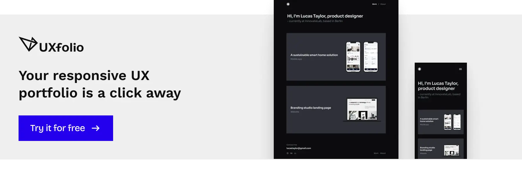
Leading UX voices keep their portfolio online
Leading UX voices don’t keep their portfolios hidden or “almost ready”. They understand that opportunities don’t wait for perfect timing.
All influential UXers keep an online portfolio because they understand the importance of online presence. It’s not only a matter of image. It’s about allowing opportunities to find you.
That means:
- keeping your portfolio public,
- making it accessible even when it’s not “finished”,
- and treating it as a living professional surface, not a one-off deliverable.
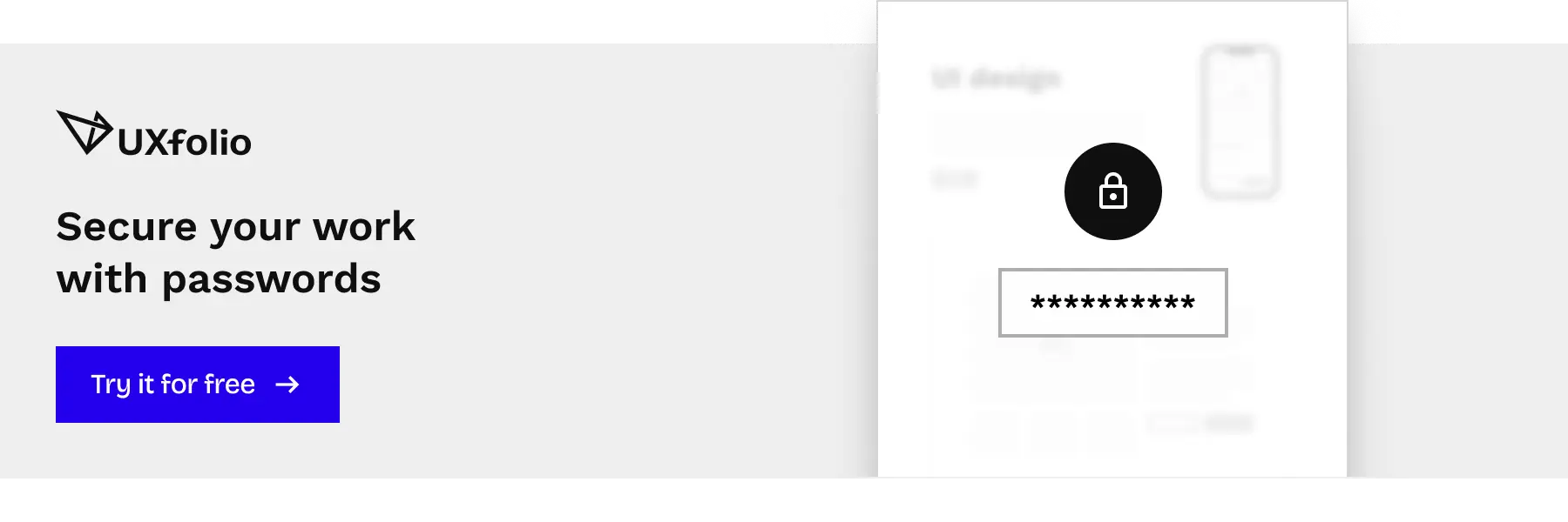
If you feel like some case studies are not reflective of your career’s current state, you don’t need to hide your entire portfolio. You can protect specific projects with passwords until you have time to refine them.
Even without uploading new case studies, UXfolio remains a hub for your contact details, about, and resume.
Visibility compounds. Silence doesn’t.
Your journey to the top
Influential designers have a few things in common. Most importantly, they put themselves out there and build their reputation brick by brick.
Becoming one of them is not about waiting until you feel “ready”. It’s about taking intentional, visible steps:
- Use social media extensively.
- Share your portfolio and case studies on all platforms.
- Network with other designers.
- Get involved in local and worldwide UX communities.
- Present at local meetups.
What else do design leaders have in common?
Their portfolio is available at all times.
Your portfolio is not a reward for seniority. It’s the tool that helps you get there.
II. Choosing and shaping your projects
One of the most common blockers designers face when building a portfolio is not lack of skill, but indecision.
- Which projects should I include?
- Are they good enough?
- Do I need more before I can publish?
The truth is: recruiters are far less interested in what you worked on than in how you frame and explain it.
How to choose the right projects for your UX portfolio
There’s no need to overthink what you share in your portfolio. First things first: if you don’t have a lot of experience, the rule is simple: everything goes.
Instead of ruminating on the perceived quality of your projects, spend your energy on how you present what you already have.
A simple strategy that works:
As your first project, choose
- your best project (based on the process and outcome), or
- your favorite project (to show your passion).
Then shape it deliberately:
- Write with a conclusion in mind.
- Pin down the phases of the project.
- Focus on your impact: your process, decisions, and their outcomes.
The project itself is rarely the limiting factor. The clarity of your explanation is.
Quality over quantity, always
When it comes to the number of case studies in your portfolio, less is more.
- Choose three to five projects at most, and present them in detail.
- Make sure everything you include presents quality as you will be judged by your weakest work.
- Instead of definitions, focus on reasons, iteration, and impact (outcomes).
Don’t worry: the final faith of the project doesn’t matter. What’s more important is to showcase design thinking and impact. And impact doesn’t only mean business results. It can be as straightforward as an improvement in UX, like a simpler flow, cleaner design, or better information architecture.
Recruiters look for signals, not success stories.
Choosing your very first portfolio project
Which project is the one? Choosing the topic of your first case study can be hard. But Design Sprint inventor, Jake Knapp, has some great advice for you:
“What was the most interesting thing you’ve worked on? Which project do you understand best from start to finish? That’s your project.”
Don’t forget, depth beats novelty every time.
You don’t have enough projects for your portfolio yet? No worries! We’ve all been there.
If you’re short on real-world work, try one of these options:
- Redesign: Find a site you think you could improve, and do it! You’ll have a project to present in your portfolio and you’ll also practice.
- Side-project: Come up with an idea for an app or website and start working on it! You’ll have a unique project for your portfolio and your creativity can shine too.
- Design challenges: Participate in design challenges and turn your experience into case studies, detailing your struggles, your learnings, and to-dos.
A portfolio is not a retrospective of your career. It’s a proof of how you think today.
III. Showing process, thinking, and impact
Great UX portfolios aren’t convinced by outcomes alone. They are convinced by how clearly they expose thinking, decisions, and trade-offs.
Recruiters don’t need you to prove that UX methods exist. They need to see how you apply them when things are unclear, constrained, or messy.
Show your process, not only the results
Employers are looking for design decisions backed by UX principles and research findings in your portfolio. That’s why showing your final screens without context is rarely enough.
To make your thinking visible:
- Describe the problem, your approach, and the solution.
- Emphasize your understanding of user needs and pain points.
- Show before and after states to highlight your impact.
A strong case study makes it obvious why a design looks the way it does, not just what it looks like. Built specifically for UXers, UXfolio is the ideal tool to do this. You can choose from various UX methods and text ideas to create expert case studies!
Tips for writing about your research
Many UX portfolios fail at the research phase for the same reason: they explain what methods are, instead of how and why they were used.
UX leads already know what card sorting or usability testing is. What they don’t know is:
- Why did you use that method for that specific problem?
- How did you customize the method for the project?
- How many users participated?
- What conclusions did you draw?
- What problems did you define?
- How did your findings translate into design decisions?
Answering these questions turns research from decoration into decision-making evidence.
How to present iterations – “make it visible, not implied”
Design leads appreciate seeing iterations and different design versions in UX portfolios. It reassures them that you’re willing to improve on your initial concepts.
Here’s how to present iterations:
- Include your different design iterations in your case study,
- Write some pros and cons to each version, and
- Explain how and why you selected the winner.
Iteration signals maturity. Silence suggests guesswork.
Don’t forget: UXfolio’s gallery and image + text sections are ideal for showcasing versions & iterations. Try both in the case study editor!
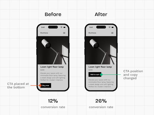
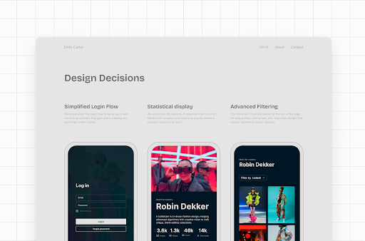
Show your impact with numbers and statistics
One of the simplest ways to validate your design choices is through numbers. You can do this in UXfolio through a dedicated Stats section:
Impact doesn’t have to mean revenue or growth charts. You can highlight it with concrete signals.
Add some of these numbers to your case studies:
- interviews conducted,
- usability tests run,
- iterations created,
- workshops facilitated,
- time invested,
- screens designed,
- sign-ups, downloads, or conversions,
- other relevant KPIs.
- revenue growth
Numbers anchor your story in reality. They make your contribution tangible.
Optimize your case studies for maximum impact
Recruiters typically spend three to five minutes skimming a portfolio. Your job is to make those minutes count.
You can do that by:
- using descriptive subtitles for each phase,
- highlighting key parts with text styling,
- adding captions to visuals,
- and removing everything that doesn’t support the core narrative.
Every extra sentence competes for attention. Keep only what helps the reader understand your role, thinking, and impact.
IV. Storytelling & copy in case studies
Strong UX work can still fall flat if it’s poorly explained. In portfolio reviews, copy is not an accessory. It’s the medium through which your thinking becomes legible.
Design leads don’t just scan visuals. They read selectively, looking for clarity, structure, and intent. That makes storytelling and copy a core UX skill, not a soft extra.
Copy is part of your design
Copy is the glue that holds your text and visuals together into a coherent story. Yet for many UX designers, writing feels like a chore rather than a design task.
The shift happens when you approach copy the same way you approach products.
These 6 practical writing principles will help:
- Editing and writing are separate tasks. Write freely first, edit later.
- Use simple words and keep it brief. Concise copy is more impactful and persuasive.
- Treat copy like a product: logical, structured, and intentional.
- Make it easy to skim by using lists, subheadings, bold, and italics.
- Start with a brief description of the design problem, and move towards the eventual solution.
- Walk through all project milestones, explaining reasons, expectations, and outcomes.
Well-structured copy doesn’t just describe work. It guides attention!
Pro tip: Try the Text ideas and Text enhancer in UXfolio!
Our expert guiding questions and example sentences will make copywriting even easier. Meanwhile the AI-powered Text enhancer feature will help you perfect your copy.
The recipe for memorable design stories
Well-rounded stories leave a lasting impression. That’s why you should storify your case studies. If you need some extra help, try the Boost storytelling feature in the case study editor! Double-click any textbox, choose the ✨-icon, and choose Boost storytelling.
If you think about storytelling as structure rather than drama, it becomes much easier.
A simple framework as an example:
- The hero starts a journey
Describe the goals of the project. - The journey unfolds
Explain your design process. - A major challenge appears
Highlight the hardest or most unexpected problem. - The confrontation
Describe how you tackled the challenge and adjusted your approach. - The resolution
Show the results and the impact of your work.
This structure helps recruiters follow your reasoning without cognitive effort. They don’t need to guess what mattered. You show them!
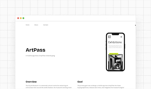
How to write great case study introductions
Your introduction is the only part of your case study where you still have your reader’s full attention. You can either capture it for the rest of the case study or lose it. Let’s aim for the former!
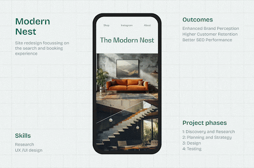
A strong case study intro does five things clearly and quickly:
- Describes the product,
- Explains your role and responsibilities,
- Introduces the target audience,
- Reveals the main challenges,
- Highlights project limitations.
This sets expectations early and prevents misinterpretation later. A good intro doesn’t tease. It orients!
V. Visual presentation & artifacts
In UX portfolios, visuals are not decoration. They are evidence!
Recruiters don’t just look at how polished your UI is. They look at how clearly your visuals support your story, your process, and your decisions. Good visuals reduce explanation. Great visuals replace it.
Life’s easier with built-in device mockups
Let’s leave the struggle of hunting for device mockups behind. Using consistent, well-chosen mockups immediately elevates perceived quality and readability.
UXfolio comes with built-in device mockups and they work especially well for:
- Your project thumbnails,
- Foreground image of your hero section, and
- Image, Image & Text, and Gallery sections.
Consistency here matters more than creativity. A clean mockup system helps reviewers focus on the work, not the frame.
Entertain your readers with prototypes
A prototype is worth a thousand words. And for recruiters, it’s often the most engaging part of your case study, since they can interact with it. With UXfolio you can embed interactive prototypes from Figma (and other platforms) into your case study, so visitors don’t have to leave your portfolio to try them.
Interactive prototypes allow reviewers to:
- explore flows instead of imagining them,
- validate usability claims faster,
- and stay longer in your portfolio.
Low- or high-fidelity doesn’t matter. What matters is that the prototype supports the story you’re telling and reflects the stage of the process it represents.
Examples of effective visuals in UX case studies
Do not underestimate the power of visuals, especially in text-heavy case studies! They break up the monotony of text while helping with comprehension.
Here are some ideas for potential visual elements:
- illustrate the steps of your process,
- create flowcharts,
- add gifs of your UI in action,
- embed prototypes or GIFs,
- display user quotes.
The key is cohesion! Use consistent styles and accent colors so visuals feel like part of one system, not scattered attachments.
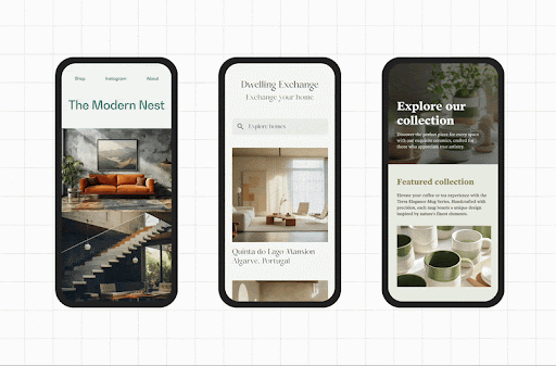
Present your vision in sleek galleries
Galleries are one of the most efficient ways to showcase design output without overwhelming the reader. With UXfolio, it takes only a few clicks:
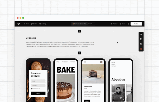
A simple structure works best:
- add a gallery section,
- upload your visuals,
- set layout and device style,
- keep backgrounds consistent.
Pro tip: Don’t shy away from mixing gallery layouts in your projects! Just keep the backgrounds and device mockups styles consistent, and they’ll elevate your work to a whole new level.
Do this for that extra oomph
Presentation matters. If you have some extra time, use it to redesign some of your artifacts so they are visually aligned with the already existing elements in your portfolio.
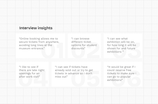
Artifacts that often benefit from a redesign:
- interview insight tables,
- user feedback summaries,
- flow diagrams,
- user journeys,
- personas.
Aligning these artifacts visually with the rest of your portfolio signals care, consistency, and professional maturity.
Scroll through your camera roll
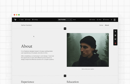
When used correctly, photos will make your case studies feel more personal and immersive.
So, take some time to sort through your phone or camera gallery, or snap a few photos of the sketches and assets you might have.
Creative ways to use photos in your case studies:
- Create galleries,
- Use them as dividers between sections,
- Stack them on top of each other in your fave design, or
- Use them with a subtle overlay.
Getting into the habit of documenting workshops and whiteboard sessions pays off later. These images humanize your process and show that the work actually happened.
VI. Navigation, structure, and the UX of your portfolio
A UX portfolio is not just a collection of case studies. It is a product that gets used under severe time constraints.
Design leads and recruiters often spend only a few minutes reviewing a portfolio. In that context, visual polish alone does not win. If reviewers struggle to orient themselves, they will not invest time trying to decode your work. They will simply move on.
We are looking for something here…
Case study navigation? Yes, please!
Once your case study is more or less ready, it’s time to level it up.
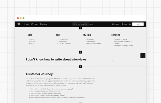
Remember: most design leads do not have too much time to review your work. Therefore, they will definitely appreciate it if you include a process section with anchor links!
On top of convenience, it also makes it easier to grasp the scope of your work and your design process.
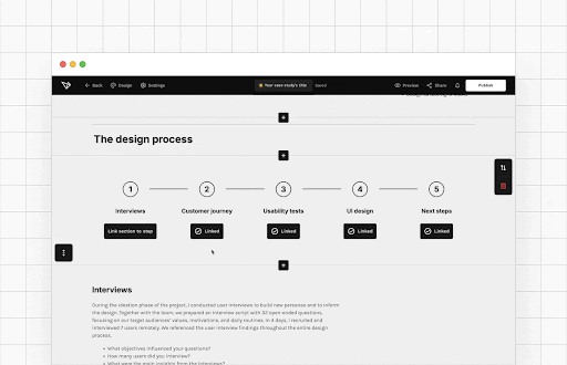
In UXfolio, you can link all your case study sections with a dedicated Process section. This section becomes sticky while scrolling, allowing reviewers to jump between stages without losing context, even in longer case studies.
This mirrors how people actually consume content under time pressure, and aligns your portfolio with real-world UX behavior.
Keep it together with the Navigation and Process section
The navigation section holds your portfolio together. To make it strong, you need to keep it clean. But that doesn’t mean you can’t have some fun with it:
Edit your navigation section
- Rename the elements of your navigation by clicking the pencil icon on hover.
- Add a custom link to your navigation to link to your blog, Calendly etc.
- Change the font style by heading into Design and choosing Fonts.
Turn on anchored navigation in your case studies
Depending on the template you use, navigation may not appear automatically on case studies. In that case, you can enable it by:
- going to the Design panel,
- choosing Header & Footer,
- and clicking the Show Site Navigation toggle.
Insider tip: If certain pages like About or Contact do not serve your current goals, remove them from the navigation entirely. Just go to those pages in edit mode and click Delete in the editor’s navbar. Less friction means more focus on your work.
Why structure is a UX signal
Navigation and structure do more than guide the reader. They communicate how you think.
A clean, intentional structure signals that you:
- understand information architecture,
- respect your users’ time,
- and can design for real-world constraints.
For junior designers especially, this is critical. Recruiters often evaluate how you present your work as much as what you present.
Your portfolio UX is part of your case study, even if it is never explicitly labeled as one.
VII. Personalization, branding, and polish
Personalization is not about decoration. It is about making your portfolio easier to recognize, easier to remember, and easier to trust.
At this stage, recruiters already understand your thinking and process. Now they subconsciously evaluate something else: how intentional and cohesive your professional surface feels.
Small branding and presentation decisions compound quickly. When done well, they don’t distract. They reinforce credibility.
Quick portfolio personalization in UXfolio
Personalization does not require a redesign or weeks of effort. Often, a few targeted adjustments are enough to make your portfolio feel intentional instead of generic.
With UXfolio, you can quickly personalize your portfolio by:
- adjusting colors to match your personal tone,
- refining spacing and layout for better readability,
- and aligning visual elements across pages.
These changes help your portfolio feel like a coherent system rather than a collection of pages.
Consistency here supports recognition and builds trust without drawing attention away from your work.
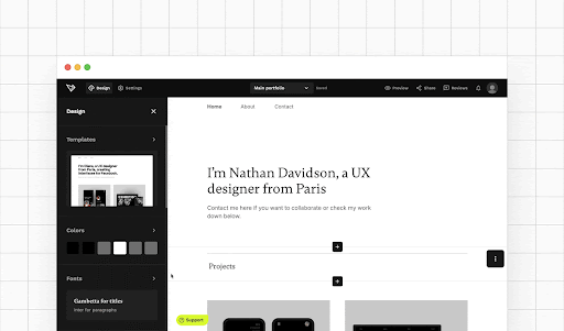
Pro tip: your portfolio home page is all about the thumbnails. Though they represent different projects, you must make sure that they harmonize with each other. Otherwise, you home page will look messy.
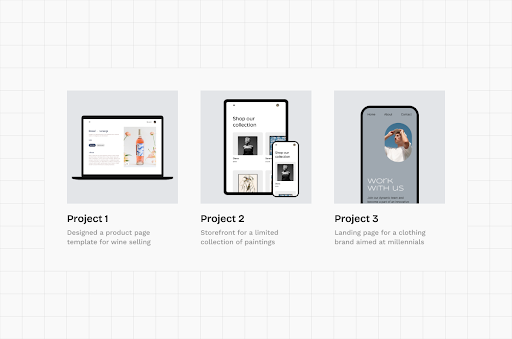
Making magic with thumbnail grid layouts
Case study thumbnails are your secret weapon:
You don’t have much to present yet? Fill up the space in your portfolio with large thumbnails. Do you need to fit years of experience into your portfolio? Use smaller thumbnails to create a fantastic overview of your range and expertise:
Customize your UXfolio thumbnail grid
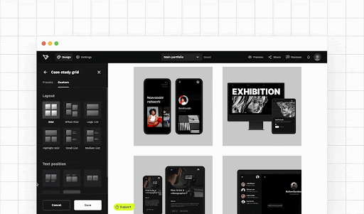
You can customize your thumbnail layout in the Design panel of the Portfolio Editor. Combine these settings to try different styles:
- Size,
- Title visibility,
- Text placement,
- Horizontal & vertical title alignment, and
- Title color.
Don’t forget that you can edit the thumbnail layout of all portfolio templates. Think of thumbnails as entry points, not posters.
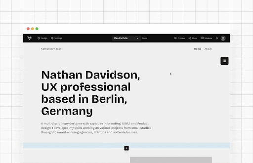
Manage your font styles effortlessly
Typography plays a quiet but powerful role in perceived professionalism. Inconsistent font usage creates friction, even if the reader can’t consciously explain why. Let’s dive into the Fonts panel of UXfolio:
Manage all your font styles from one panel
You can set the font styles of your portfolio in the side panel. To access the panel, just click on Design and select Fonts.
This keeps your focus on content and structure while ensuring visual polish remains intact.
Good typography doesn’t call attention to itself. It supports reading speed and comprehension.
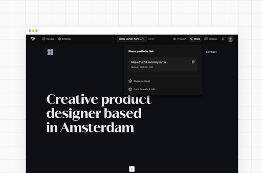
Express yourself with a custom domain
A custom domain is one of the simplest ways to signal ownership and professionalism. Instead of sharing a generic URL, a custom domain:
- makes your portfolio easier to remember,
- looks more credible in applications and emails,
- and positions your portfolio as a long-term professional asset.
With us, connecting a custom domain takes only a few steps, but the impact is disproportionate. It subtly communicates that your portfolio is not temporary or experimental. It’s part of how you present yourself to the industry.
So, go ahead, and purchase or connect yours in UXfolio:
Find your domain in UXfolio
Here’s how:
- Head over to Settings,
- Choose Domain & URL,
- Click Purchase a domain or Connect your own domain,
- Follow the on-screen instructions.
After purchasing or connecting a domain, you can move it between portfolios. What’s more, you can purchase different domains for different portfolios.
Section takeaway
Personalization, branding, and polish are not about standing out visually at all costs. They are about removing doubt. A cohesive, intentional presentation helps reviewers focus on what matters most: your thinking, decisions, and growth.
At this point in the playbook, your portfolio is not just usable. It feels complete.
VIII. Feedback, analytics, and growth
A UX portfolio is never finished. It evolves the same way products do: through feedback, observation, and iteration.
At this stage, your portfolio already communicates your skills and thinking. What matters next is how well you learn from how it is used and perceived.
Growth happens when you stop guessing and start listening.
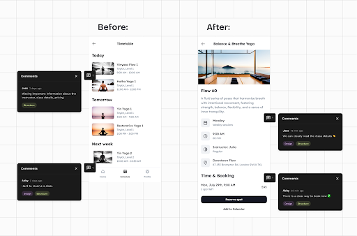
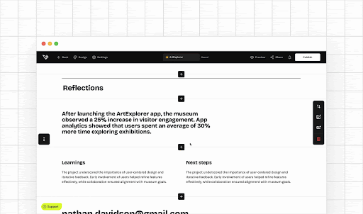
Get contextual feedback with Review mode
Generic feedback rarely helps. “Looks good” does not tell you what worked, what confused reviewers, or where they lost interest. That’s why contextual feedback is so powerful.
With UXfolio’s Review mode, you can share a unique portfolio review link and collect feedback from mentors, colleagues, or friends.
Here’s how it works:
- Click Tools in the nav bar and choose Reviews.
- Copy your review link and share with anyone.
- They can leave comments, highlight the positives, and suggest improvements.
- Follow up on the review if you need more details or clarification.
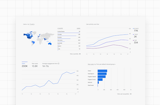
Hook up analytics to learn about your visitors
Once your portfolio is live, it starts behaving like any other digital product. People visit, skim, click, and leave signals behind.
Link your portfolio with Google Analytics to read the minds of recruiters and clients! The analytical data will answer strategic questions, such as
- Which one of your projects excites your visitors the most?
- Do you make a good first impression?
- How much time do they spend reviewing your work?
- Is your resumé good enough for them to check out your portfolio?
Based on all this info you can optimize your portfolio for maximum impact!
Connect your GA account to UXfolio
- If you don’t know how to get your own Analytics ID, check out Google’s guide!
- Follow these steps to link it with your portfolio.
Data turns your portfolio into a learning surface.
Size up your competition
Looking at other portfolios is not about comparison or imitation. It’s about calibration.
Reviewing portfolios from designers at the level you aspire to helps you understand industry expectations, recognize patterns in structure and depth, and identify gaps in your own presentation.
Even a quick competitive analysis can provide plenty of insight, inspiration, and motivation. Here are two great resources from UXfolio:
- You can find the best case studies on our Showcase page
- We have a substantial blog post with the best UX Portfolio Examples
Use this insight to raise your own bar, not to copy styles.
2 pro ways to connect your portfolio & LinkedIn
Your portfolio and LinkedIn should not live in isolation. They reinforce each other.
Your portfolio shows your expertise in action. So, featuring it on your LinkedIn profile will do wonders for your career. Here are two unique ways designers can link their portfolios on LinkedIn:
1. Dedicated portfolio links in LinkedIn
- Go to your LinkedIn profile.
- Click Contact Info in the hero section.
- Click the Pencil Icon to edit.
- Click + Add website under Profile URL.
- Paste your portfolio URL.
- Choose ‘Portfolio’ from the dropdown.
- Click ‘Apply’.
2. Show your portfolio as a tile on your profile
- Go to your LinkedIn profile.
- Click Add section in the hero section.
- Choose Featured from the list.
- Click Links.
- Paste your portfolio URL.
- Click Add.
You can also feature individual case studies in beautiful tiles.
This creates a loop where recruiters can move between context (LinkedIn) and depth (portfolio) without friction. Consistency across these surfaces strengthens your professional narrative.
Pro tip: Customize the appearance of your portfolio links! It takes only a few seconds, but attention to detail is what’ll make you stand out.
Explore the potential in multiple portfolios
As your career grows, one portfolio may no longer serve all purposes equally well.
UXfolio’s Portfolio Manager comes handy for your portfolio experiments. It allows you to create, duplicate, and – drumroll – manage your portfolios. Here’s how:
Create multiple portfolios
Fancy a portfolio for every occasion? We support you in this decision: in UXfolio you can create as many unique portfolios as you wish.
Also don’t forget, you can clone any of your portfolios. Maybe you want a backup, perhaps you just want to test something without touching the original – that’s when you need this feature.
UXfolio makes it possible to manage multiple portfolios without rebuilding everything from scratch. This flexibility supports long-term growth and intentional positioning as your goals evolve.
Now put it to work
- You don’t need more theory.
- You don’t need more inspiration.
- You need a portfolio that helps you start, decide, and move forward.
Everything in this playbook points to the same thing: a clear, focused UX portfolio that reflects how you think, not just what you made.
UXfolio is built for exactly this workflow.
Structured case studies, intentional navigation, and tools that remove friction so you can focus on your work, not the setup.
Start simple. Build deliberately. Improve as you go!
Your portfolio doesn’t need to be perfect to be powerful. It just needs to work.
And now, you know how.
You must be logged in to post a comment.