Every art school now has a UX programme, bootcamps dump out hundreds of junior designers each month, and don’t forget the self-taught kiddies born with iPhones in their hands. At 14 they had used Sketch two years before you even heard about it. Now they are applying for the same positions as you. And they are not doing too bad.
So what can you do as a senior UX designer? How can you stand out? How should your senior UX designer portfolio look?
What differentiates senior UX designers?
Neither drawing nor coding skills, style nor tools differentiate senior UX designers from mid-level designers, rather PEOPLE and STRATEGIC skills:
- Facilitating workshops
- Evangelizing design within your team
- Convincing people to use better UX methods
- Convincing people to focus on users and context instead of current trends
- Involving many different parties in the design process
- Communicating design decisions to people in different roles
- Staying calm and wise in tense situations
- Making sure that UX has a word in the important decisions
- Forming the product strategy
- Driving change in your organization
- Teaching and mentoring junior UX designers
(These mean nothing without a strong foundation of basic design skills. Take no shortcuts. Master the basics first, then move on.)
We call a UX designer senior when we think they can design better digital products, obviously. But after years I realized this success has a lot of factors, and many differ from what people would name UX designer skills. Great, if you can draw pretty screens. But working on a product team and turning that product into a success means something very different.
In most cases a successful designer has to solve organizational issues, communication challenges, stakeholder management and strategic decision making. Senior designers can’t stand out from juniors just with better visual design skills (heck, they already do it so well).
Senior UX designers can stand out with their experience, the people and strategic skills they learn through the years of hard work. Juniors can’t learn them in a three-month bootcamp or a YouTube tutorial. You can earn it only with sweat and sorrow.
And yet, that so many senior UX designers structure their portfolios just like juniors do surprises me. They show a few images of the screens they designed and nothing more. They may include really cool designs, but if you want employers to treat you like a respected senior designer, show some magic.
Not that doesn’t require super-awesome visual design skills, but present the rest of your skillset. That will help you stand out, and earn you some respect way before you first meet your new colleagues.
How should a senior UX designer portfolio look?
You have one simple job: Show examples of the above mentioned senior designer skills.
First structure your senior UX designer portfolio to showcase these design skills. Present three to five projects, your best work and favorites. But instead of just showcasing the end results of these projects, like UI screens, also tell the story of the design’s birth.
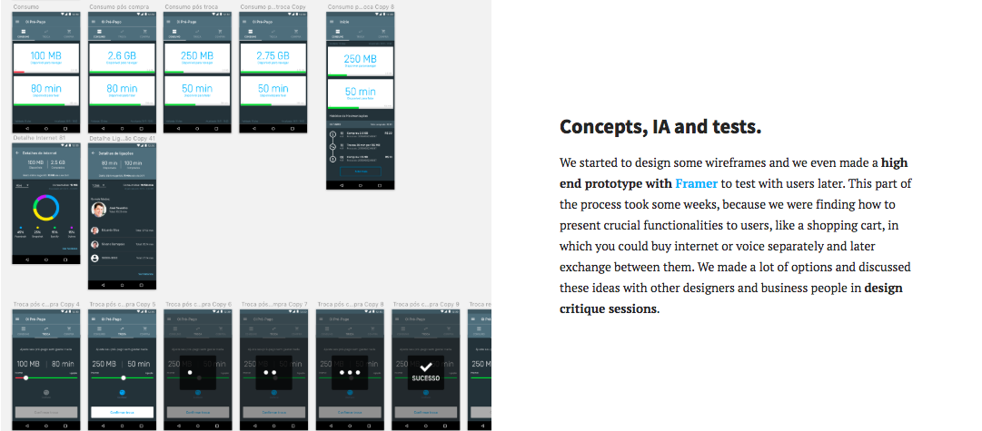
Have a mini case study for each project. In them, present your design process and talk about the senior skills you used.
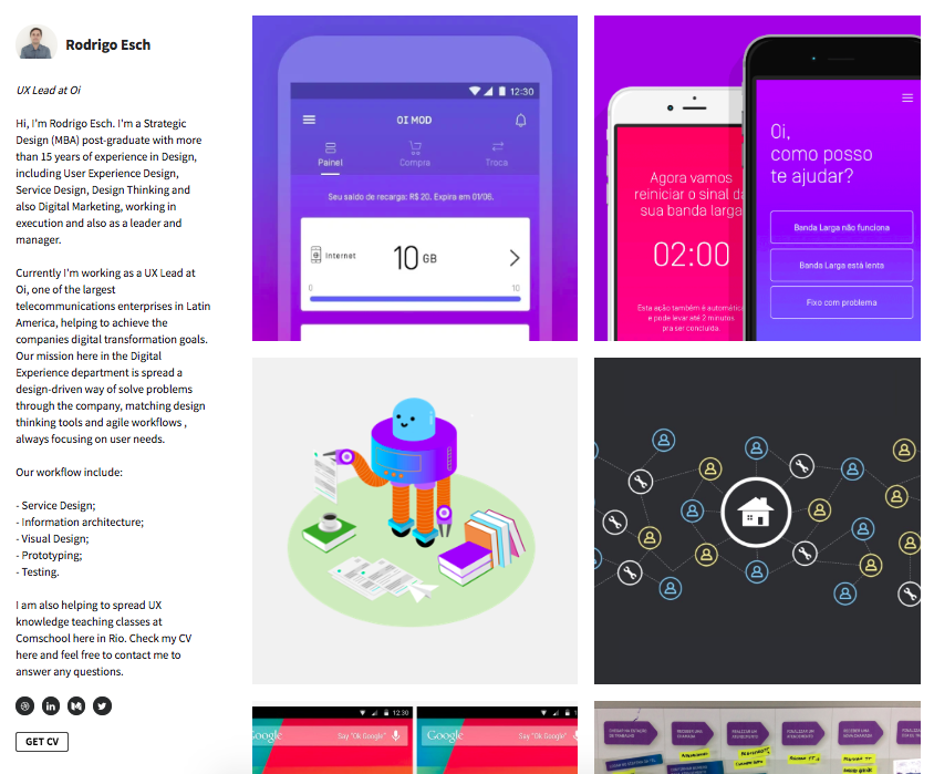
Create an online portfolio. First impressions matter, so present big images of your projects on the front page, use project thumbnails and amaze the audience with the great UIs you designed. When they click on one of these projects, your mini case studies should come up where they can see the tale of the design project and your unique senior design skills.
So include your name, basic contact info and big UI images of three to five projects on your portfolio cover page. Make a separate page for each project to show the birth of that design and how you went from A to B.
This setup will make a very good first impression. When they dig deeper, your professionalism will surprise them because they will see the conscious process behind your work. They will trust you with their most important projects because they will feel you have everything it takes to make it a success.
How to present your unique skills?
When you tell the story of your projects, include sections which talk about your senior skills:
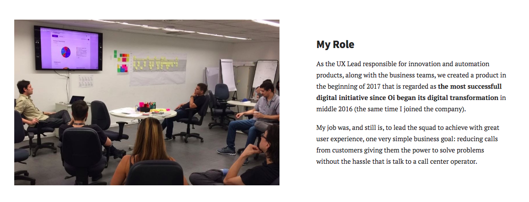
The team you lead: If you participated in the project as a team leader, introduce the team. Describe what different people did, your role, and what did you do to make the whole thing work. Don’t forget to post an image. Fear not, it doesn’t need a formal business image in suits. Use a friendly image of a team working well together.

The workshop you facilitated: If you facilitated a workshop during the project, write a few lines about it. Did you do a customer journey workshop, or run a design studio or design thinking workshop? Tell why you did the workshop, how you built it, and what positive outcomes it had. Again, put a photo next to it. Also include the results in form of different journeys, sketches, canvases.
How you managed stakeholders: In many projects, buy-in from upper management proves crucial. And for some senior positions, they are looking for people who can get that buy-in. Present your experience managing stakeholders in your project case studies too, if you have any. If you did stakeholder interviews, presentations or workshops, mention them. Even better, present your conscious process to manage stakeholders.

How you fostered collaboration with other fields: All designers have to work together with many people from different fields. This holds especially true for senior designers who play some leadership role too. In your projects, mention who you collaborated with and how you managed these collaborations.
How you evangelized design: Mailchimp gained fame for printing posters of their personas and hanging them everywhere in their building so people see their users. In another company I worked with, the design team created small cartoon snippets about users facing a core usability issue of their product. They stick these cartoons everywhere, even in the toilet, so people in the company had to face them a lot. We at UX studio often hold trainings for our clients to teach non-designers about design. If you did something similar to evangelize design within your organization, share it in your senior UX designer portfolio.
How you communicate design decisions company-wide: As a design leader, you have to make important design decisions from time to time that have a huge impact on the future of the product. How you manage and communicate these decisions tells a lot about your strategic and leadership skills. In your portfolio you can describe your main design decisions in a project. How have you involved others in making these decisions? And how did you communicate them, to make sure everybody understood the situation in the company?
How you shaped the product strategy: Senior designers should have a say when it comes to defining the product strategy. Proximity to the users lets designers know what to do and also gives them the power to make change. As senior designers, you can present how your work affected your company’s product strategy, and you can highlight this in your portfolio. For example, if a some UX research activities led to some change in how your team sees its customers and your role in their life, you can tell that story.

How you introduced new methods to the team: As a senior designer, you have probably introduced new methods in your team. Share these stories, so employers will see you as a leader who can do a lot to make things run better.
How you mentored and taught junior team members: Senior designers teach and mentor juniors, so include that in your portfolio.
How you shared your learnings in the design community: The best designers also actively participate in the UX community. If you shared something you learned during a project, mention that on the project’s portfolio page too. Link a blogpost, put in a screenshot, a meetup or conference photo.
What tool best creates a senior UX designer portfolio?
A few months ago, good tools for creating a great UX portfolio with this mindset didn’t exist. Many people use Dribbble, but a few single images can’t present any of these senior skills. Writing a blog or Medium articles seem obvious, but employers and recruiters don’t have time to read them.
Behance has also gained popularity, but on that platform everybody obsesses with the visual representation and decoration. Furthermore, you can only upload big images, so you have to create your UX case studies somewhere else. A recruiter actually wrote on LinkedIn that he doesn’t recommend Behance as a portfolio platform because the site’s poor usability itself will affect your reputation.
And exactly that led us to start building a new UX portfolio platform. We call it UXfolio. This tool helps create online portfolios with the structure I described in this post.
UXfolio helps present your work in a meaningful way, without spending weeks of creating a new UX designer portfolio. You don’t need coding, you don’t have to hassle with webhosting, but you can still use your own domain. You can upload great images of your work, but you don’t have to spend too much time with designing the portfolio itself.
With UXfolio you can create project pages that tell the story, but not as text-heavy as Medium.
Obviously I have my bias, but if you want to create a portfolio and showcase your senior skills in it, give UXfolio a try.

