The demand for UX writers is on the rise, so we will see more and more UX writing portfolios. But what even is a UX writing portfolio and how to make one that is up to par? We have discussed this topic with hiring managers and insiders, such as Yvonne Gando, senior UX writer at Google.
In this guide, you will learn how to create your UX writing portfolio and make it stand out for the right reasons. We’ll walk you through all building blocks, including the
- portfolio home page
- case studies
- work sample presentation
and we’ll also show you some great portfolio examples for inspiration.
What is UX writing?
UX writing is the practice of designing the words of user experiences and interfaces. Good UI copy enables confident interaction between the user and the product. Therefore, it contributes to business goals by driving conversion and engagement. So, the success of UI copy can be user-tested before and measured after implementation.
What is a UX writing portfolio?
A UX writing portfolio showcases your skills and process through work samples and case studies. It is a one-stop professional website, where visitors can get in touch after learning about you and your expertise.
Should you have an online portfolio?
There is something very professional about your portfolio being the first result when somebody searches your name. It proves that you take your profession seriously. That’s why some of the most successful UX writers maintain a digital portfolio. But it goes beyond appearance. Through showcasing your craftsmanship, a portfolio allows for likeminded people to find you with opportunities, instead of the other way around.
UX writing portfolio examples
Before getting to work, let’s gather some inspiration from UX writing portfolio examples from successful professionals!
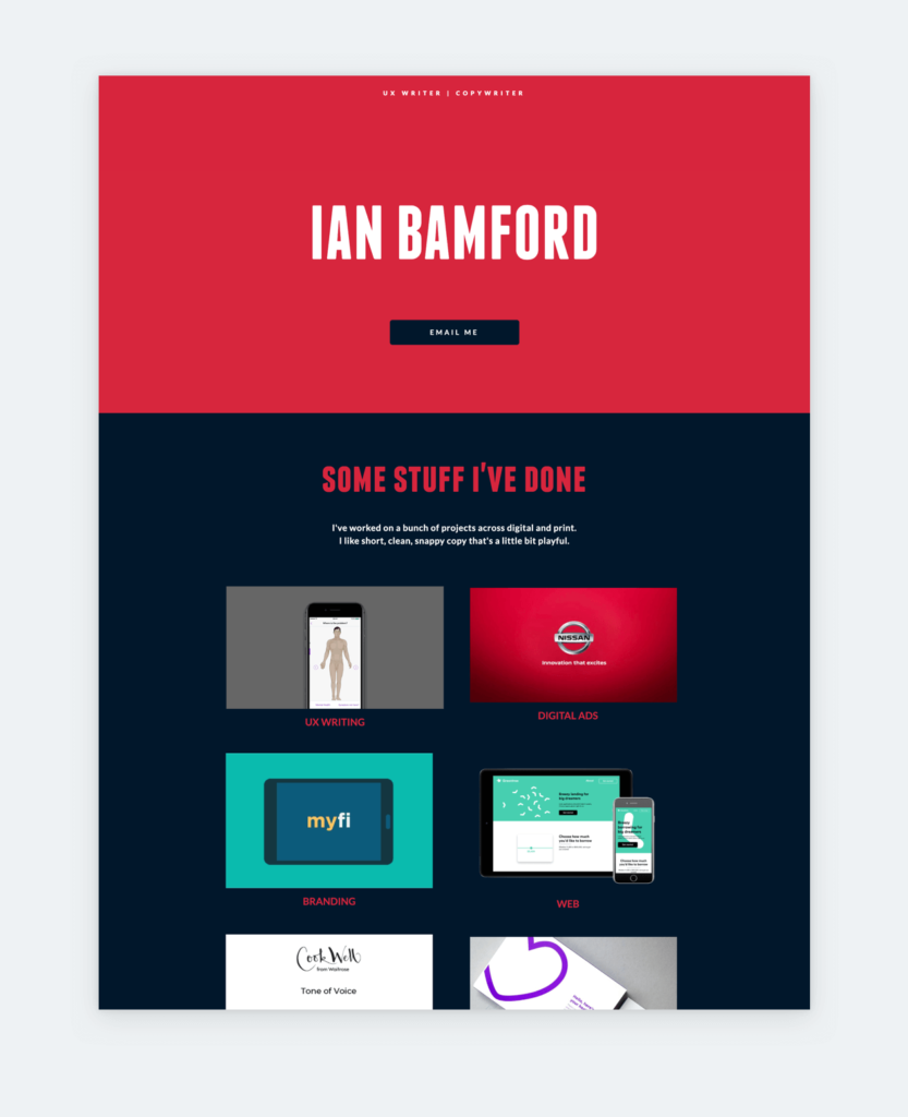
1. Ian Bamford, UX Writer at Google
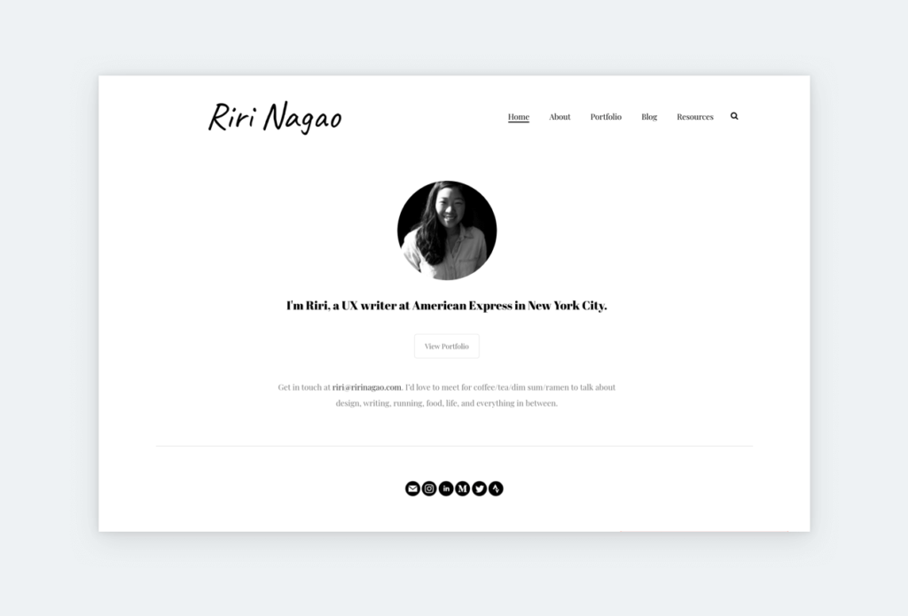
2. Riri Nagao, Sr. UX Writer at American Express
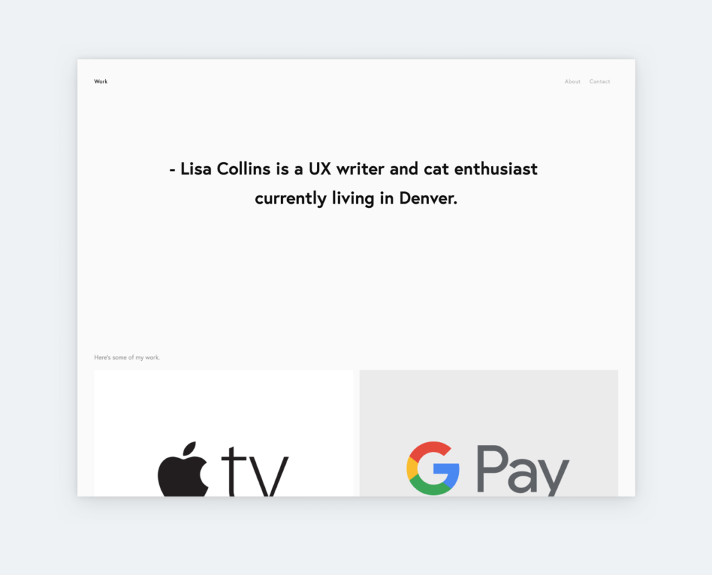
3. Lisa Collins, Sr. UX Writer at Guild Education
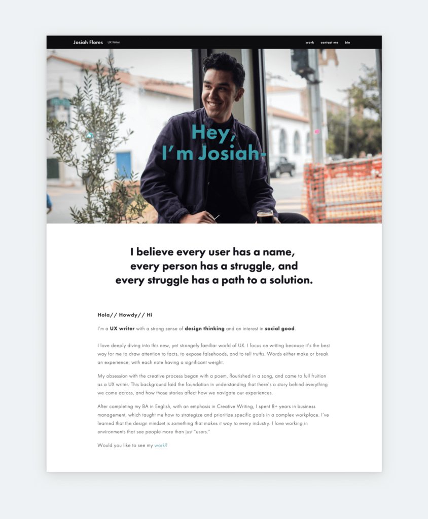
4. Josiah Flores, UX Writer
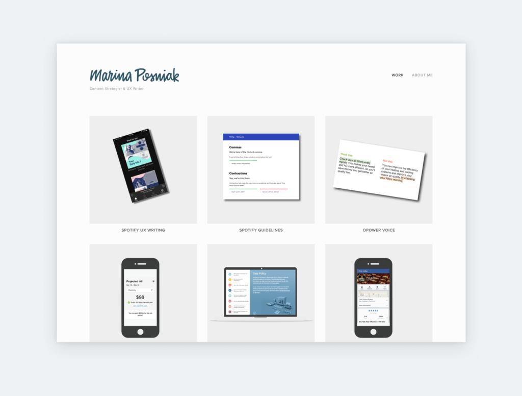
5. Marina Posniak, Principal UX Writer at Spotify
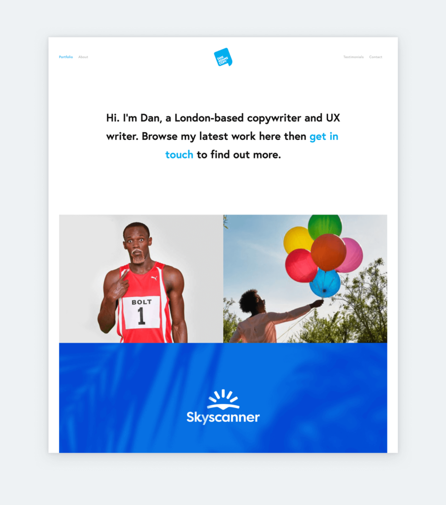
6. Dan Adams, UX Writer/Copywriter
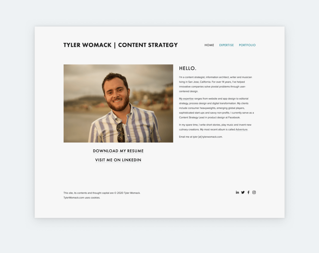
7. Tyler Womack, UX Content Strategy Lead at Facebook
If you consider yourself more of a copywriter, you can draw inspiration from these copywriting portfolio examples.
The structure of UX writing portfolios
Build your UX writing portfolio on a simple structure that introduces you, reveals your process, and inspires action. For that, you need to include a
- Home page
- Contact form or contact info
- About me
- Resume
- Case studies or work samples.
1. Home page
A lot depends on your home page since it’s in charge of the first impression. As a general rule, it needs a short welcome message, a photo, and your navigation. But, above all, it should direct your visitors’ attention to your work where your talent shines. To achieve that, link to your case studies and samples right from your home page through appealing thumbnails and titles.
Since you are not a UI designer, nobody expects you to feature refined mockups on your thumbnails. Instead, go for visual consistency by sticking to a color-scheme and beautiful fonts. If you have a hard time choosing fonts, use curated font pairings, such as those in UXfolio.
Finally, do not forget about the UX of your portfolio! Fancy or funny solutions are great for a novelty, but they get old very soon. Meanwhile, simplicity and usability are timeless.
2. Contact form or contact info
If you want people and opportunities to find you make it easy for them to do so. Display all your contact info and social media links in strategic places. Or take it a step further and add a contact form to your portfolio. In UXfolio you can create a contact form in a few clicks, but it doesn’t take much longer in other platforms either.
3. About me
Your about me page gets more visits than you’d think, and its content shapes your visitors’ opinion of you as a writer. It would be a shame to slip on a few paragraphs after all the effort that goes into the rest of your UX writing portfolio.
When you are open for offers, approach your about me page like a UX cover letter without the formalities. Write about your career, expertise, and passion in brief. Visitors will not have the time to read through it anyway, so aim for impact instead of length: Three paragraphs and a call-to-action will do.
“Sometimes people end up talking too much about themselves and not about the work and the problems they solved.”
Yvonne Gando, Google Senior UX Writer
A good about me page lets your potential customer or client picture how you can help their cause. So, put your ego aside, and cater to their needs. If you are not sure how, check out our guide to UX designer cover letters.
Here’s a simple structure that you can follow on your about me page:
Paragraph 1: Share your professional story
- How and why did you become a UX writer?
- Where have you worked?
- What are your biggest achievements?
Paragraph 2: Show your passion
- Why are you passionate about writing?
- How do you develop yourself professionally?
Paragraph 3: Show them how you can help
- Share the story of your best work
- Direct them to your case studies
- Tell them what you are looking for
Close with a call-to-action
- Encourage your readers to check out your work, contact you, follow you on social media or read your blog.
4. Resume
Make your resume available on your portfolio if you are open to offers. A simple yet visible download link on your portfolio home page is all you need. Make your prospects’ life easier by uploading it in PDF format. Most browsers support PDF, so they won’t need another program to view it. Regarding its content, you should follow general UX resume best practices.
Samples and materials to include
Your work samples will make the most important asset of your UX writing portfolio. So, project by project, collect everything you have written – screen titles, placeholder texts, menus, buttons, labels, error messages, warnings, notifications, sign-up pages, forms, descriptions, confirmation modals – plus their iterations. At this stage, the goal is to collect as much material as possible.
Next, sort out your best work and put aside everything else. Which projects make you the proudest? Which are recent? Which ones show more of your skills? A portfolio’s content needs to be heavily curated because visitors – especially recruiters – will not spend hours viewing it. Do not allow them the chance to see mediocre work! If you have a lot to choose from, go for quality and diversity.
Ask your workmates for personas, prototypes, UIs and other deliverables from the project. You can use them to make your portfolio easily digestible and less text-heavy. In the future try to get into the habit of documenting your process. It will be much easier to create next-level case studies when you have a treasure chest of resources.
Fun fact: The average time spent viewing a case study is 3 minutes, while home pages get 1:15 minutes.
In the next section, we put all your samples and materials to use in case studies and grouped work samples.
How to showcase UX writing in your portfolio?
There are two effective ways to showcase your work in your portfolio:
- Case studies
- Grouped work samples
We will go through both in-detail, starting from the hardest: case studies.
UX writing case studies
Case study is the most effective format to showcase your UX writing process. All great UX writing case studies are based on the same general trinity as UX designer ones: problem/goal – process – outcome. By elaborating on each you will provide an in-depth look into your process and your mastery of writing.
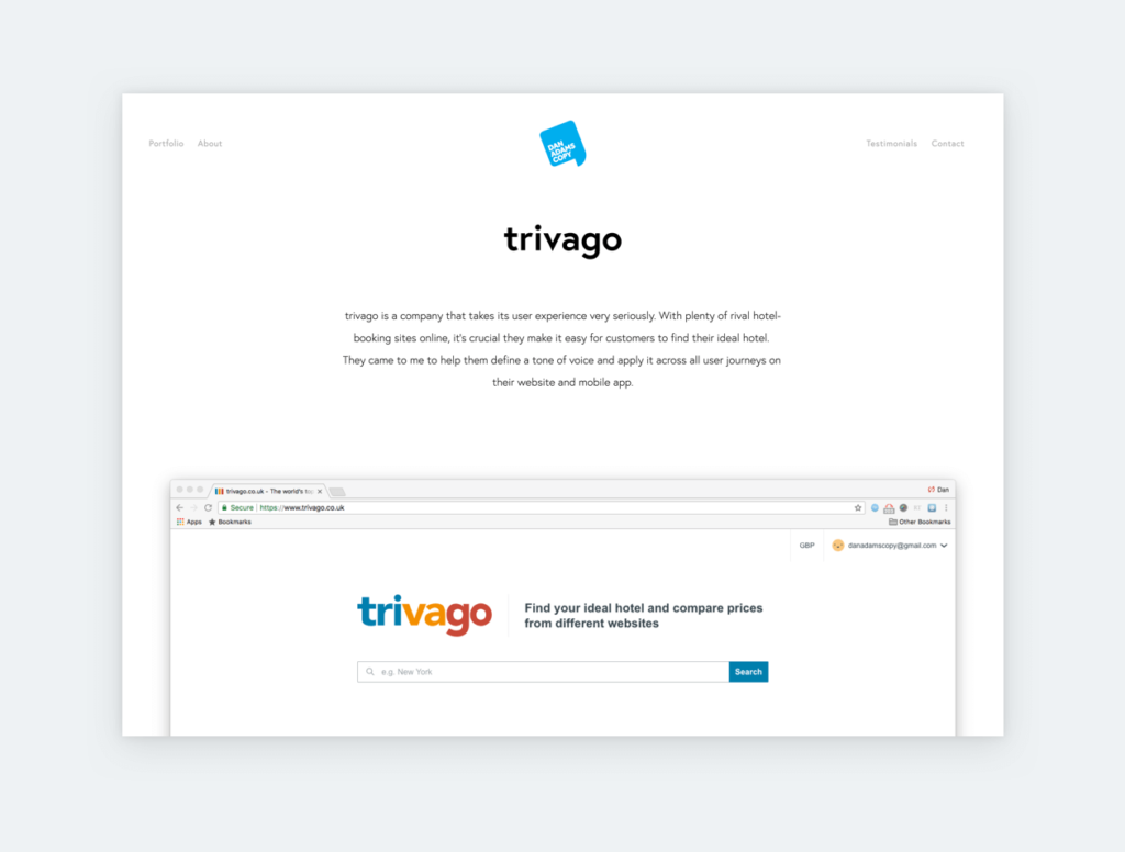
Do not shy away from featuring visual clues in your case studies. From sketches to personas, these will support your readers’ understanding. Just remember that visuals without context are but decoration. So, tell your readers in what way were those visuals helpful to you.
Build your UX writing case study on the following structure:
- Introductions
- Product
- Audience
- Collaborators
- Goal or problem
- Testing and research
- Creative process and iterations
- Solutions
- Learnings and data
Let’s go through each section!
1. Introductions
UX writing is influenced by various factors that are important to understand your process. Let your reader know of these factors before showcasing your copy!
Product
The copy you have written appears in context when users interact with the product. And there is a chance that your portfolio’s visitors don’t use that product and have no idea about its purpose and functions. So, give them a brief intro to prepare them for what’s to come in the case study.
Audience
We design products – and their copy – with a target audience in mind. Introduce your reader to the product’s users so they can better understand and appreciate your decisions on tone and vocabulary.
If you have demographical data feature it! Has your team created personas? Include those as well! These will prove that you make decisions based on research and not only personal preferences. Therefore, you’ll be taken more seriously.
Collaborators
As it is the case with designers, the work of UX writers is shaped and influenced by stakeholders and coworkers from various departments. Mentioning such collaboration will prove that you can cooperate on a multi-disciplinary level.
Also, giving props to your teammates will show you in a good light. A shout out will do, but in case of a substantial collaboration, introduce their role and influence on your writing.
2. Goal or problem
We make design decisions with purpose. Usually, the purpose is to support a goal or to solve an existing problem. Were the stakeholders looking to increase conversions, responses, interactions, or another metric? Let your reader know the goal or problem that you were presented with at the beginning of a project.
- Was it a redesign or a new product?
- What was the goal?
- What was the main problem?
- What caused those problems?
- What were your initial thoughts?
- Have you had a similar project before?
3. Testing and research
Testing is what differentiates UX from more subjective fields of design. It shapes all parts of a product, including its copy. For these reasons, testing must be featured in UX writing case studies.
Have you done A/B tests, cloze tests, highlighter tests, or comprehension surveys? These could be buzzwords for your prospects, so mention them by name and share your findings. A common mistake in UX case studies is listing research methods without elaborating on findings. Let your readers know what have each of the listed methods contributed to your decisions.
Finally, feature a few quotes from your testers to show how important their feedback was to your process. Quotes make case studies much
4. Creative process and iterations
We are yet to discover a creative process that works for everybody, so this part will be the most personal in your case study. What recruiters and readers are looking to see is how you iterated based on all the information that you have collected. So, showcase initial drafts and all subsequent iterations, including failed ones. After each, add a conclusion about your learnings and show the improved version. Just make sure to feature iterations and versions via screenshots of the interface.
4. Solutions
The climax of your case study is where you reveal your solutions and your readers get to see what you are capable of.
The golden rule is to show final copies in their natural habitat! Linking out to a live page will confuse readers. They will not know which copy is yours on the page or in the app. Also, the copy, or even the entire page, can change without your knowledge. Featuring plain text is better, but takes away from your copy’s effect.
“For designers, writers and researchers, showing before-and-afters in your portfolio is really strong.”
Yvonne Gando, Google Senior UX Writer
The best is to show copies via screenshots. Even better, if you can use screenshots of the previous and the improved version to emphasize the change. Everybody loves a good before-and-after. For added effect, you can place your screenshots into sleek, pre-made mockups right next to each other with a short explanation or caption.
5. Closing: learnings and analytics
Close your case study with learnings to show humility and a willingness to learn and improve:
- Have you had any revelations during the project?
- Have you learned anything new?
- Have any of your previous notions been challenged?
- What were the biggest obstacles?
If you have access and permission, share some data about the impact of the copy! This gives credibility to your work and proves that it supports business goals. After all, that’s what recruiters are looking for in a good UX writer.
But remember, going overboard with stats and metrics is overwhelming for the reader. Include only the most important ones in an easily digestible statistics section.
Now that you’ve got a glimpse of UX writing case studies, let’s see what grouped work samples are about.
Grouped work samples
Grouping work samples based on a shared theme is another common way to showcase UX writing. It is more lightweight than a case study but it provides less insight into your process. Still, it is a good option if you are in a hurry, you are a junior, or you haven’t worked on longer projects yet.
The preparation is the same for grouped work samples as for case studies: Collect all your work samples and choose the best. Next, find common themes for categorization:
- Elements
- Collections of onboarding screens, error messages, buttons, etc.
- Company
- Your best work for a selected company.
- Project
- Your best work for a specific project within a company.
You need to choose the one that is best for you based on your professional history. For example, if you don’t have many samples, categorizing based on elements will emphasize your lack of experience. Instead, you should go for project-based categorization. If you have a wealth of experience, each of the above categories could serve you well.
After establishing your categories, pour in your work samples and give them structure. Add a short intro to each example and show a before-and-after. If you are including bigger screenshots, use arrows or underlines to highlight the copy that is yours.
Intern or Junior UX writing portfolio
You need to provide work samples or a portfolio even when applying for an internship even as a complete beginner. But how do you collect work samples without any experience? Try some of these options:
- Participate in the 15-day UX Writing Challenge
- Collect bad UI copy and correct it
- Collect UI copy and improve it
- Create mock projects
Pro tip: Use Google Chrome’s Inspect Tool to temporarily rewrite the copy of any desktop website. For phone applications, you can use apps like the Developer Assistant to achieve the same.
Password-protect sensitive work
Password protection is widely used in UX writing portfolios as it lets you show sensitive work and information to selected people. Though it is an option in UXfolio as well, password protection on the portfolio level should be used with caution. Why would you want to hide your introduction or your contact form?
Protection on the case-study level is a better solution because it allows visitors to read about you and contact you for the password if interested.
UX writing portfolio best practices
Before we let you go, here are a few general rules for takeaway:
- Show screenshots instead of links. Good UX writing shines best in context. Removing your writing from its natural habitat will
- Use before-after samples. They are a powerful way to show what you are capable of.
- Show iterations. It takes a few iterations to arrive at a solution. Be proud of your efforts.
- Highlight your writing. When using larger screenshots, make sure to point out the relevant part.
- Protect sensitive work. Use password protection on the case study or portfolio level.
Build a UX writing portfolio with UXfolio!
UXfolio offers a quick and easy way to build a stunning UX writing portfolio. Our WYSIWYG editor will let you create clean home pages and informative case studies without coding. UXfolio is made for UXers, so it comes with UX-specific sections, mockups, ideas, and downloadable materials. You can set passwords for your portfolios as well as case studies, create a contact page in seconds, use font pairings curated by our designers, and much more! Try UXfolio for free!