Crafting a UX portfolio doesn’t come easy. To stand out from the crowd, sending a bunch of screenshots of projects doesn’t cut it. We collected seven UX portfolio tips for creating the one to get you hired.
1) Show your design process, not just the result
We cannot overemphasize this seemingly obvious point. Most employers look for the design process and decisions in candidates’ product design portfolio because they describe the thinking and the ability to solve problems. Writing case studies does this best.
2) Quality › Quantity
You don’t need a 30-piece gallery of UI mockups in Dribbble to impress an audience. The more projects that feature in a portfolio, the better the chances to show something irrelevant to the viewer who will then misjudge you. So one of our UX portfolio tips is to choose your best three to five and explain them in the best possible way.
Also, recruiters usually don’t have the time look through a long portfolio, so narrowing down their choices helps them.
3) Don’t be afraid to include personal projects
A newbie in UX can find it especially hard to demonstrate their abilities. Maybe you don’t have enough relevant real-life projects or those you do just lack the coolness to demonstrate your UX designer skills. Don’t worry, several things can fill in the gap and prove your greatness as a designer:
Redesign / uninvited design: Find a site or product you could improve, and do it. This grabs attention the easiest, but it has some pitfalls. Ensure you are thinking about functions as well so it doesn’t become a mere UI facelift. Think about the selected product’s business perspective as well. Most redesign projects completely ignore this point of view.
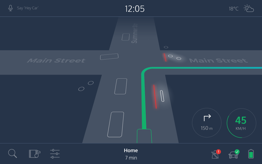
Lab-project: Come up with a new idea and work on it. It doesn’t really matter if it won’t see development. You can showcase not only your design but also your creativity in this type of project. The selected topic itself can arouse interest and show something about your personality and attitude to the profession. It can show your social responsibility if you choose a non-profit or charity topic, or prove that you have a real vision. For an example, check out this lab-project of self-driving cars we really like: The UX of Fully Autonomous Cars.

4) Focus on the content first
Wrong mindset: Collect design materials about a project and create a nicely decorated page around them.
Right mindset: Collect project materials and figure out how to tell the project’s story.
Minimalist portfolios where the design you showcase shines alone – with no decoration around – prove the best.
5) Grab attention right from the beginning
We already mentioned how recruiters and design leads usually don’t have time to analyze every detail of the dozens of portfolios they receive. The first few seconds can prove crucial when they are looking at your portfolio. We always advertise the importance of showcasing problem-solving and writing skills, but don’t completely ignore the visual. The best portfolios manage to find the sweet spot between visual and written content.
Follow these tips to maintain the balance:
- For the list view of your projects, use nice, cool images to impress them right from the get-go. Dive into the details once they open one of your projects.
- A clean typographic structure and hierarchy makes it easier to follow your thinking.
- Highlight the most important elements with a huge quote from your client, relevant facts and figures or a nice mockup that presents your final design.
You can also use a UX portfolio template we created which targets your audience’s, your future employer’s needs.
6) Apply storytelling
Because people remember them, stories have power and build trust. They make a portfolio fly. Storifying a project case-study comes easier than you think. Just use this template:
- The hero starts a long journey (the desired project goal).
- They travel seven days and nights (the design process used).
- On the ninth day, a scary monster attacks. The fight goes long and nasty (detail a difficult challenge, letting the reader feel the struggle).
- But suddenly, they pull out the magic stick and the monster disappears (challenge resolution and its greatness).
- They live happily ever after (the results, using stats and numbers).
Find more details on applying UX storytelling to your portfolio in our previous article.
7) Creating a portfolio never ends
After implementing all the UX portfolio tips above and finishing your portfolio, you may feel no need to deal with it anymore, but you should. You’re doing yourself a favor if you constantly document your work. Ideally, it means you write a case study after closing each project, but that can prove difficult. At the very least, do the following:
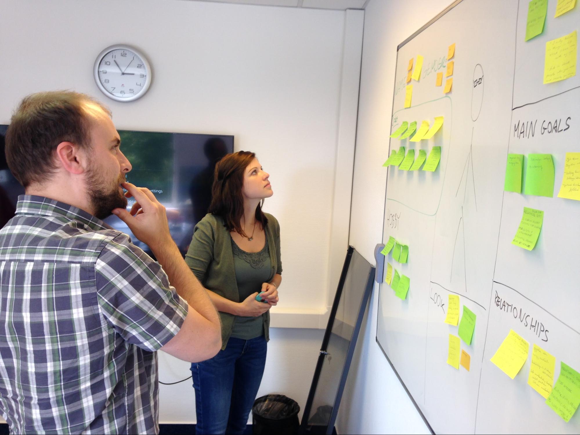
- Take photos of client meetings, workshops or user tests, as they will come in very handy later.
- Scan or take photos of your sketches, otherwise you are going to lose or toss them.
- Take notes on the most important decisions which you won’t remember later.
- Follow up your projects so you can show results in your UX case studies.
Would you add any other UX portfolio tips to this list? Feel free to add them in the comment section below.
We are always looking out for great case studies! Create and publish one on UXfolio. You can even get personalized feedback on your projects.


