Wonder why you’re not getting through to an interview? In most cases, it’s not that you don’t have the skills. It comes down to your web design portfolio.
Presenting yourself in a few pages is not easy. So today, we’re walking you through how to create a portfolio that will get you an interview and ultimately get you hired. We’ll also talk about common case study mistakes and how you can stand out from the crowd. Let’s begin!
Web design portfolio examples
Every week the team analyzes more than 200 portfolios. We’re looking through themes, trends, and of course, noteworthy examples. So before we dive into the actionable tips, let’s look at some remarkable web design portfolio examples.
1. Kai Huang
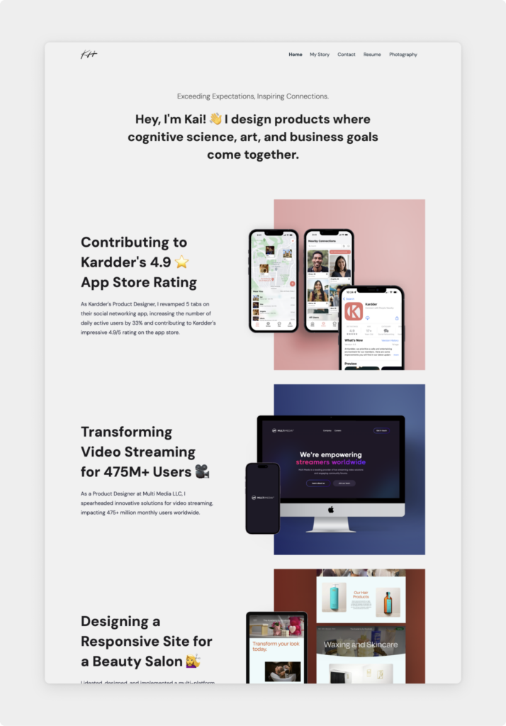
Kai is a skilled designer with an incredible knack for storytelling. While the portfolio itself is also beautifully done, it’s the copywriting that stands out to us the most. The project titles are already building a narrative, which hooks us to find out more.
In his case studies, he included the results, some metrics, and also testimonials from actual users. This conveys a powerful message—that he’s not just a great designer, but he connects the business needs with the user experience and succeeds at it.
2. Laura Saltzer
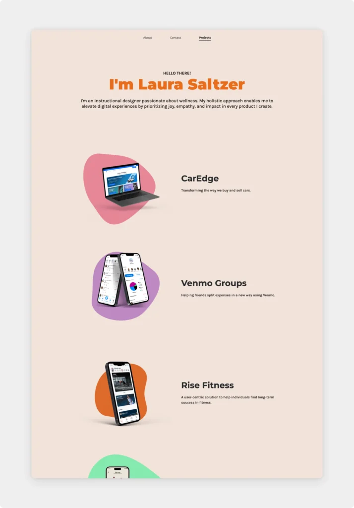
Laura is a passionate UX designer with a background in Biology and a specialization in fitness and wellness. She created a portfolio with an exceptional color palette and with diverse but cohesive project thumbnails.
Her case studies include a video walkthrough of the app, which makes it super convenient for visitors. It showcases the whole flow in an easily digestible way, while also encouraging the audience to explore even further.
3. Margarita Prokofieva
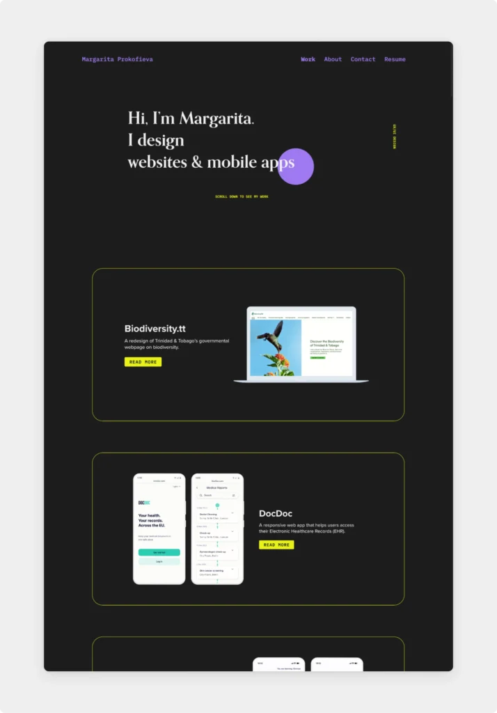
Margarita is a digital creative based in Berlin, Germany. She created a modern yet playful site with a dark background—letting her work shine in the best light possible. In her case studies, she has a clear structure and effortless navigation.
She kept her About page and Contact page to the minimum and included her skills, her outside-of-work (but still relevant) hobbies, and even a picture of her dog for a personal touch.
4. Maxwell Marra
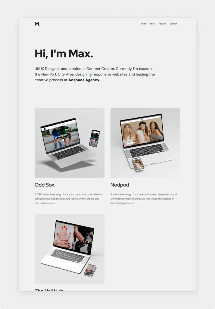
Max is a talented, US-based designer and content creator. Creating a minimalistic portfolio seems easy at first—but you need strong typography, meticulously written copy, and stunning visuals to make it work. Luckily, that’s exactly what Max has done.
In his case studies, he keeps the easy-to-scan layout and highlights the most important parts, along with a large section where he talks about the impact of his contribution.
5. Aniela Carolina
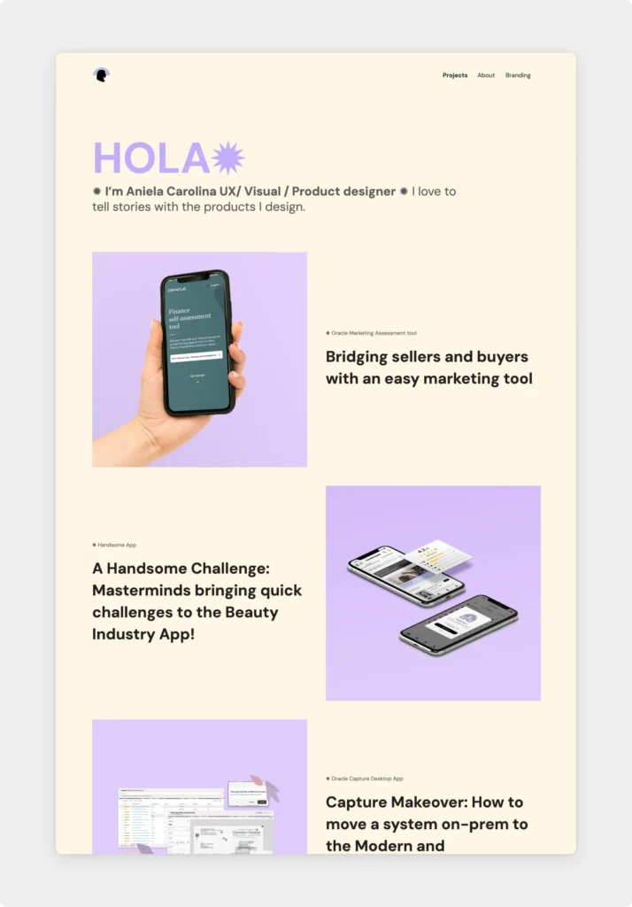
Aniela is a dedicated visual and product designer with a strong background in branding. It really shows, as in her portfolio, she created a memorable look and feel with her personal logo, colors, fonts, and branding elements.
The best part of this portfolio, however, is her ease of showcasing her projects. She tells the real story behind her projects, even with messy or challenging situations. This gives proof of how she handles tough situations. Instant hire!
6. Rachel Baek
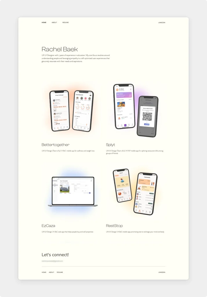
Rachel is a talented designer with an exquisite and balanced portfolio. She crafted a website with a clean layout, harmonizing colors, and easy navigation. Her project thumbnails are in harmony with each other despite the different project colors—which subtly show in the background gradient as well.
7. Ian Chambers
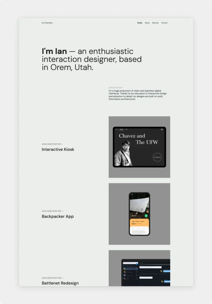
Ian’s portfolio is the perfect example of how your website can be a testament to your mission as a creative individual. He created a clean and seamless web design for his portfolio—just as he promises in his bio.
Besides his home page and clean case study layouts, his About and Contact pages perfectly fit the minimalist aesthetics too.
8. Alesia Ciocan
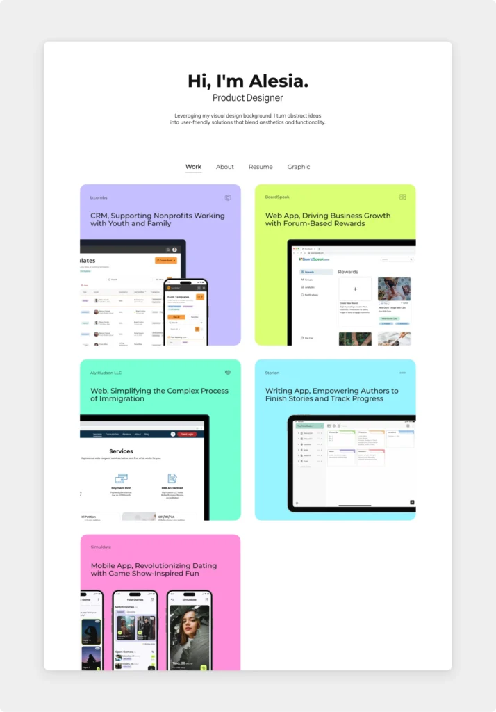
Alesia is a well-rounded, Chicago-based designer with over six years of experience in graphic and web design. Her colorful personality shines through the pages, along with her expertise and professionalism.
Her graphic design skills appear in the tiny details, like the thumbnails. She also cleverly included a clickable prototype at the end of her Storian case study, which makes for an interactive experience—while also showcasing her prototyping skills.
How to create a web design portfolio?
In 2024 a curated and up-to-date web design portfolio is crucial if you want to get a job or attract clients. With the field more saturated than ever, standing out is a must.
Before we go into tips on differentiating yourself from other designers, let’s cover the fundamentals of portfolio creation.
What to include?
As the examples above show, there are many ways to structure a portfolio. However, there are some essential elements that cannot be missed.
Essential portfolio elements:
- Bio,
- Case studies,
- About page,
- Contact information.
These should answer the most important questions people arrive to your site with.
Bio – Who are you? What do you bring to the table?
Your bio or tagline is an introductory statement right on top of your page. Among others it serves a contextual purpose—it tells recruiters that they are at the right place.
This is also your golden ticket to a good first impression. Besides the look and feel of your website, this is the first thing people notice. It might also be the only thing people read on your website. So make it count.
You have to find the intersection between memorable, relevant, clear, short, and authentic to find the perfect bio or tagline.
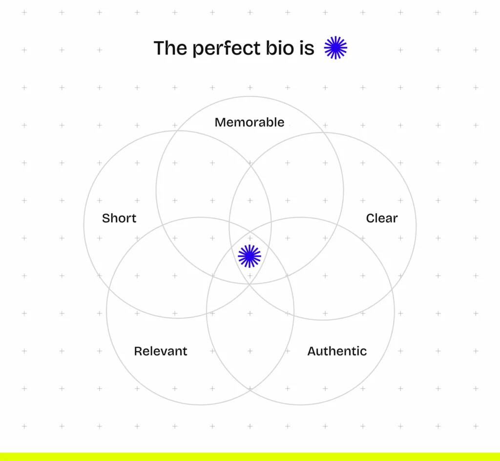
Here are a few templates that you can get started with:
- I’m [Name], a [Profession] on a mission to [Mission] through [Skills & Deliverables].
- Example: “Hello there! I’m Jane Doe, a passionate web designer on a mission to elevate digital experiences through intuitive design and pixel-perfect execution.”
- I’m [Name], a [Profession] with [Years of experience] specializing in [Speciality]
- Example: “Hello there! I’m Jane Doe, a web designer with 5+ years of experience specializing in user-centric design and precision-crafted interfaces.”
Case studies – What sort of work have you done? Can you do the job I’m hiring for?
The case studies are the main event in your portfolio. This is where you walk your visitors through your previous projects and show them what kind of expertise and skills you could bring to their company.
Project curation
The first crucial step is deciding which projects make it into your portfolio and which don’t. The type of work you showcase can influence the outcome of your application.
A few things to keep in mind:
- Align your projects to the kind of work you would like to do in the future.
- Strive for quality instead of quantity. Only include your best work.
- Keep it relevant for the recruiters.
- Don’t be afraid of retouching your old projects. You can always iterate on them to fit your current experience level better.
Here’s a flowchart to decide if a particular project fits in your portfolio or not.
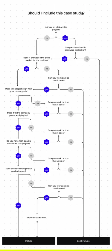
Case study creation
After choosing the projects, it’s time to tell the story behind them.
- Context – Give your audience the background info needed to understand the project (e.g. size of team, client brief, timeframe).
- Your role – Web design is based on collaboration, hence it’s not evident what your contribution was to a given project. Show recruiters that you can effectively work in teams (even multidisciplinary ones), but also highlight what your part was.
- Challenges – Show what obstacles you faced during the design process and how you overcame them. Mention the skills that you used in order to solve problems.
- Results – Show the outcome of the project. Include the visuals of course, but also metrics and KPIs that show the impact of your work.
Keep in mind that the point of the whole portfolio is to sell you, not the product idea. Present your work and the context needed to evaluate it, don’t just pitch the business idea.
Case study design
In web design portfolios the presentation is just as important as the content. Even with an excellent eye for design, some common mistakes seem to come up again and again. Let’s look at them and what you can do to avoid them.
Mistake #1: Going overboard with the design – It’s tempting to create something nobody’s ever created before. But cluttering up the layout and forgetting about white space is something that many designers fall into because of trying to reinvent the wheel. Create a clean layout and consistent alignment of text and images. After all, minimalist portfolios are a trend for a reason.
Mistake #2: Writing too much – Recruiters spend little time reviewing a case study. Thus they don’t read, they skim. Consequently, putting walls of text in your case study is going to provide less information than if you included less information in bullet points and in a skimmable format.
Mistake #3: Neglecting images – Your images will work for or against you depending on how you present them. Only include high-quality visuals (screenshots, sketches, wireframes) and include them in mockups or galleries to make them as appealing as possible.
Mistake #4: Only designing for desktop – In 2024 if your portfolio doesn’t look good on mobile, you may as well not have one. Choose a website template that is responsive by design to save yourself some time.
About page – Are you a good team fit? What is it like working with you?
Designers are storytellers. And there’s no better story than your own.
Your About page is the place to make a lasting personal impression, but it’s not just for that. It can make you stand out from the hundreds of other candidates.
Your resume focuses on your hard skills. But on your About page, it’s time to talk about your soft skills as well. Give a glimpse into what it’s like to work with you. We recommend doing a quick research about the company culture and how you fit into it—not just for your About page.
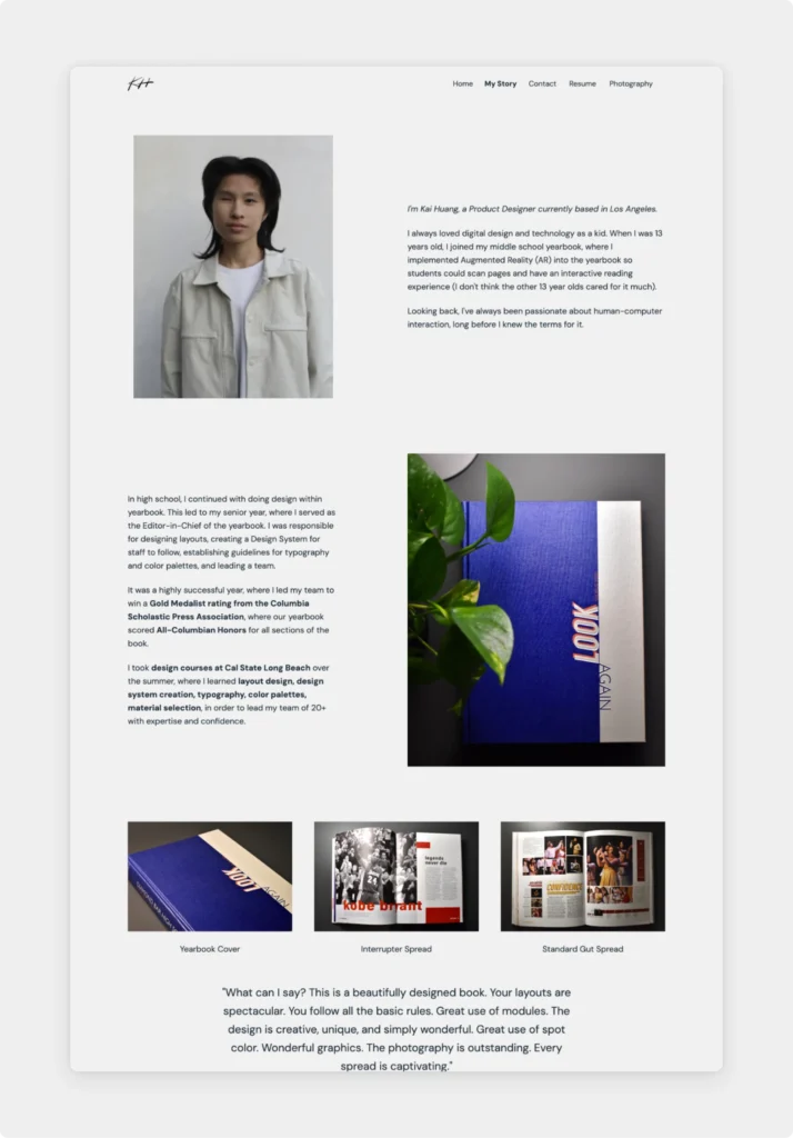
Not sure what to write about? Read Kai’s story from his About page for inspiration:
Contact information – How do I get in touch with you?
When you’re designing screens at work, you have a clear goal in mind, right? It works the same way in your portfolio too. Your portfolio’s purpose is that people can easily get in touch with you afterwards.
It’s all about making it as convenient as possible.
Place your email address (or your preferred contact information) in strategically important places. For example, in the footer, on a separate Contact page, or as buttons after Call-to-Actions.
Freelancers may also opt for a contact form. It can prevent unnecessary email back and forths, not to mention that it just looks super professional.
How can your web design portfolio stand out?
Recruiters are drowning in applications, so to get the interview, you need to make yourself memorable. Here are a few strategies and tips for making your web design portfolio stand out.
- Bring your own style: Infusing your portfolio with your unique design aesthetic can set you apart from the competition.
- Write brief but great copy: Writing as you speak not only makes reading your portfolio enjoyable but also shows your personality. Clever headlines, relevant project descriptions, and witty call-to-actions will make your portfolio more memorable.
- Include interactive presentation: Using tools like Figma prototypes or video walkthroughs allows potential employers to interact with your designs and gain a deeper understanding of your thought process.
- Say hi in a video: Introducing yourself via video adds a personal touch to your portfolio and allows you to convey your passion and enthusiasm for the role.
- Keep it laser-focused: Tailoring your portfolio to your dream job demonstrates your understanding of their needs and increases your chances of standing out. If you’re applying to multiple jobs, create variations of your portfolio to keep it relevant.
- Add testimonials: Including testimonials or recommendations from previous clients provides social proof of your skills and expertise.
How to get started?
All in all, what is the quickest and easiest way to make a web design portfolio from scratch? Our recommendation is to get started with UXfolio. It is a portfolio and case study builder dedicated to UX/UI and web designers to create a website that you can be proud of.
Among other features, you’ll find
- Customizable web design portfolio templates,
- Case study blueprints and example content to personalize,
- Dedicated sections for bios, testimonials, embedded prototypes, contact forms, and much more,
- Text ideas to always know what to write about,
- Built-in mockups to present your work professionally,
- Multiple portfolio variations with project duplication,
- The thumbnail designer for effortless thumbnails, and
- Password protection to keep your work safe.
Ready to get started?
