The best part of our job is that we get to see all the beautiful portfolios and case studies that you create with UXfolio. Day by day we find creative ideas and unexpected solutions in your work. In this article, we will share a few of these alongside our designer, Luca’s tips and tricks.
Some of these hacks can be done inside UXfolio, for others, you’ll need an editor, such as Sketch. But don’t worry, Luca created some downloadable templates for you, to help with that part!
So, if you are ready, let’s get to hacking!
Use bigger thumbnails if you don’t have enough case studies
Not having enough projects is a common struggle among junior designers. The good news is that UX design leads don’t expect juniors to have more than 2-3 projects. Still, a lot depends on how you present the case studies you have.
Here’s the general rule: the fewer case studies you have the bigger your thumbnails should be. This way your portfolio won’t feel empty. It might sound evident, yet many beginners forget to apply this rule to their portfolio.
Alternating Image & text sections
This is probably the simplest tip on this list, but it can have a great impact on how engaging your case study is. We all know by now that creating a balance between text and images is important in storytelling. That’s why we encourage you to include many visual clues in your case studies.
However, the ‘image on the right, text on the left’ formula gets boring after a while. You can zhuzh up your case studies and keep the attention of your visitor by using 2-3 ‘Image & text’ sections in alternating order. Just hover over your ‘Image & Text’ section, and click on the ‘Flip section’ icon. This technique is utilized by many topnotch case studies and it never gets old.
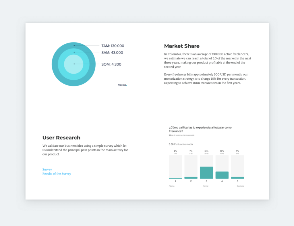
Different uses for the Statistics section
UXfolio’s stats section is a powerful way to prove the impact of your work, but it has an alternative use as well. When you insert one into your case study, just change the example numbers to headings, and you can write text under them. What’s more, you can add or remove columns, according to your needs.
Show your product with autoplay videos
More and more of you want to show products in use via autoplay videos in your case studies. This feature has been around in UXfolio for a while. When used right, videos can make a case study even more engaging. Designers creating walkthroughs or interaction demos at scale are increasingly experimenting with an ai video generator to turn static screens and prototypes into more engaging portfolio content without extensive editing work. If you want a sleeker player, we suggest you choose Vimeo instead of YouTube. Don’t forget to tick the ‘Loop video’ and ‘Mute video’ options when using autoplay, so you don’t annoy and shock your readers!
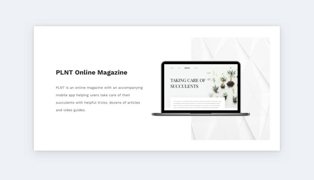
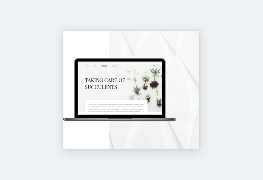
Blend the background of a heading and a gallery
With a simple editing trick, you can merge your gallery and the header before it. In your editing software, create a full-width image (1280px wide) with the same background as your gallery, and upload it as the background of your subheader. What you’ll end up with is a beautiful gallery section!
Adjust the color of the built-in mockups
UXfolio’s built-in mockups can save lots of editing time. Recently, we have updated this feature to give you even more freedom and options. Now, it is much easier to match mockups to the mood of your case study or product.
Just click ‘Mockup style’ (the palette icon) and play around with all the options to see which one is the best match for your case study. You can find a variety of possibilities for desktop, tablet, and mobile mockups. If you want to make sure that it goes smooth, please download our mockup canvases from the same window.
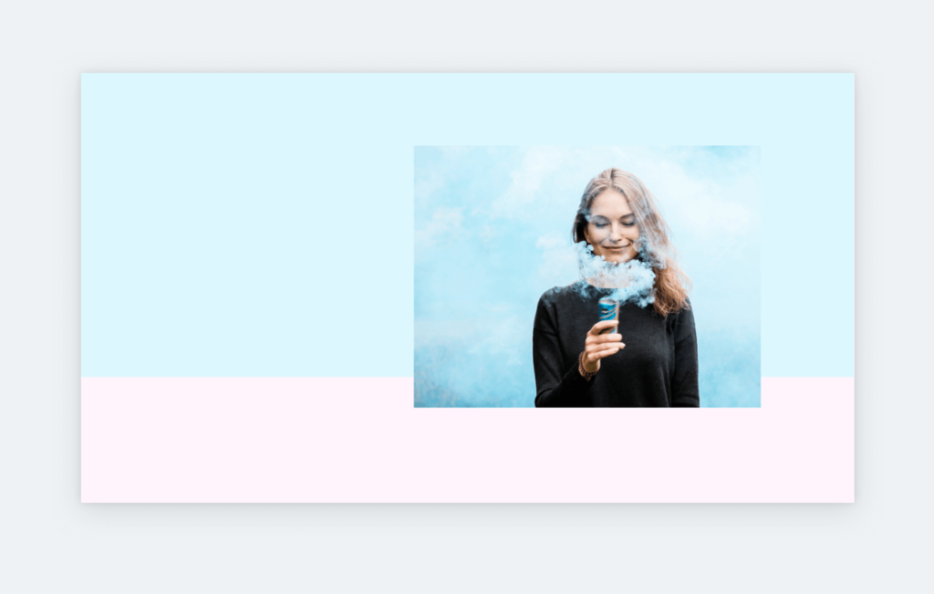
Floating images in your case study covers
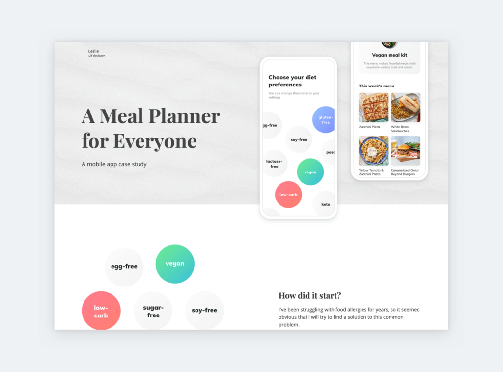
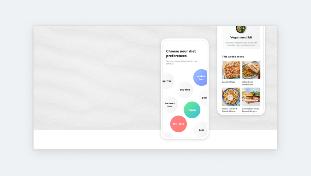
You can achieve a beautiful, floating effect if you upload a full-width hero image to your case studies, such as the one that you can download here. You can even create your own solution based on this idea!
Start with a 1280x640px canvas, leave its bottom 100-200px white, and fill the rest with the color of your choice. Finally, put a device mockup or image on its right side and let it slide down a bit to the white area.
Floating images on your thumbnails
UXfolio has an automatic thumbnail generator that uses your mockups, accent color, and cover image you have added to your case study. Once you are finished with your case study, you can choose from 12 automatically generated thumbnails or upload your own. If you want something different, apply the floating image effect trick!
Create a 520x520px image with half of its background white and the other half colored. Then place a mockup or image to its center and extract your image. Upload the thumbnail to your portfolio and set the thumbnail layout to ‘Small’ and ‘Alternating’. This will create an airy effect on your portfolio home page.
Floating images on your portfolio home page
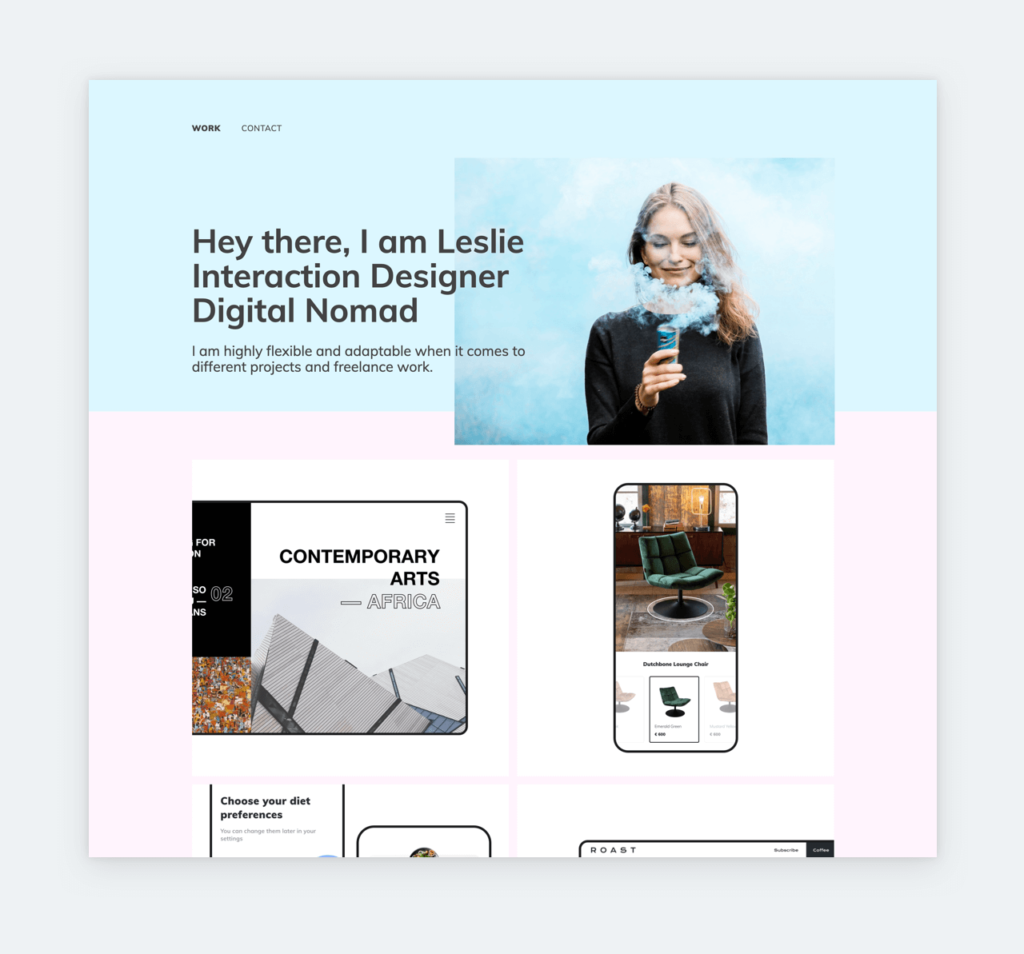
How about some more floating images? You can apply this tip to your home page as well, using your own photo. In your editing software, create a rectangle for the top part of your image. The color of this rectangle can be chosen by you, but the best if it matches with your profile image’s color hue. Then choose another color for the bottom part or leave it white. Last, use a 665x503px mask for your profile image and place it on the right side of your image, overlapping your two-colored rectangles.
Use GIFs for a fun effect
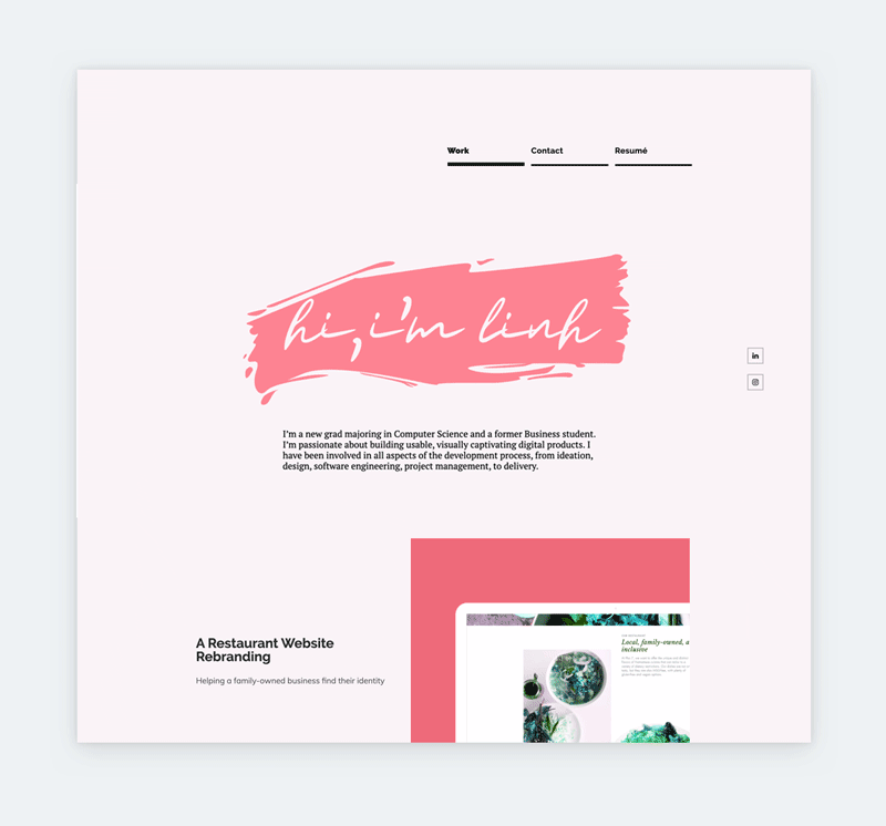
We see more and more GIFs on portfolio home pages and we enjoy them a lot! A GIF will make your portfolio appear more dynamic and fun. We recommend you to animate your name as Linh did. But you can also animate your photo. For example, you can show a serious photo followed by a playful one.
Use UXfolio for note-taking
Let’s be honest: putting together a case study takes lots of effort. Our goal is to help you cut down on this process, that’s why we offer writing prompts and special sections in UXfolio. But, you can make future-you’s job even easier!
We have learned this from you: UXfolio is great for taking notes during projects. If you collect all your images and texts into a draft – or password-protected case study – later all you’ll need is some rephrasing and reorganization.
Upload a unique subheader background
You can make your subheaders pop even more, by creating a unique background for them. You don’t have to do too much: two lines with the main color of your case study will do. Just remember to make the background 1280px wide and approximately 300px tall. The background can be reused for all the rest of your subheaders to create a consistent look.
We hope have enjoyed these tips, and we can’t wait to see some of them applied to your portfolio and case studies in UXfolio! If you need some more inspiration, check a few UX portfolio examples!
You must be logged in to post a comment.