Creating a UX research portfolio is often harder than creating a design portfolio. Why? Because research is messy. It involves spreadsheets, sticky notes, and hours of audio – not polished UI screens.
For inspiration on design-focused portfolios, check out these UX portfolio examples.
Many researchers struggle to translate this process into a visual story. If you are wondering how to build a UX research portfolio that gets you hired, you are in the right place. In this guide, we break down what recruiters look for and provide a UX research case study template you can use today.
In this guide, you’ll learn what hiring managers expect, how to structure your case studies, and how to present research work in a compelling, evidence-driven way.
Let’s get into it!
Page content
UX research portfolio examples for inspiration
Below you’ll find real UX research portfolio examples created with UXfolio – each demonstrating different strengths, structures, and research storytelling styles.
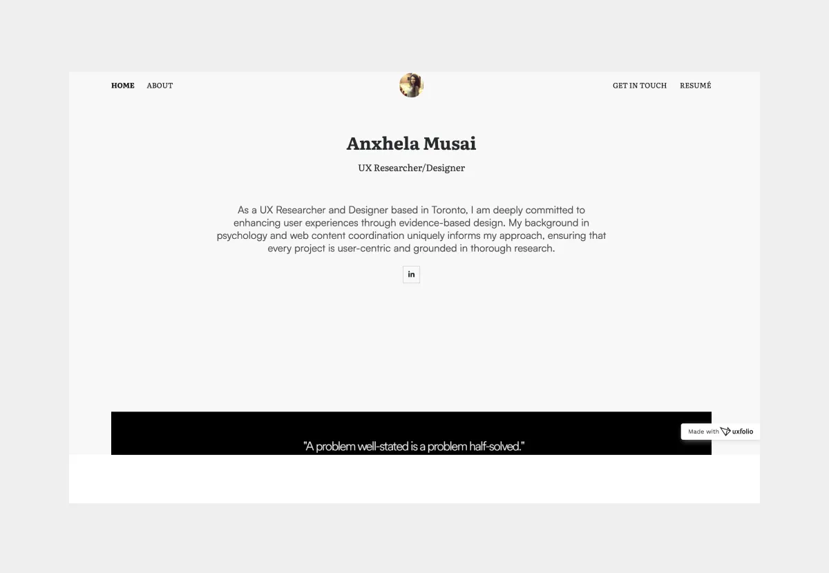
1. Anxhela Musai
Anxhela Musai’s portfolio is a masterclass in storytelling for Senior Design Researchers. She demonstrates how to visualize end-to-end research without overwhelming the reader with text.
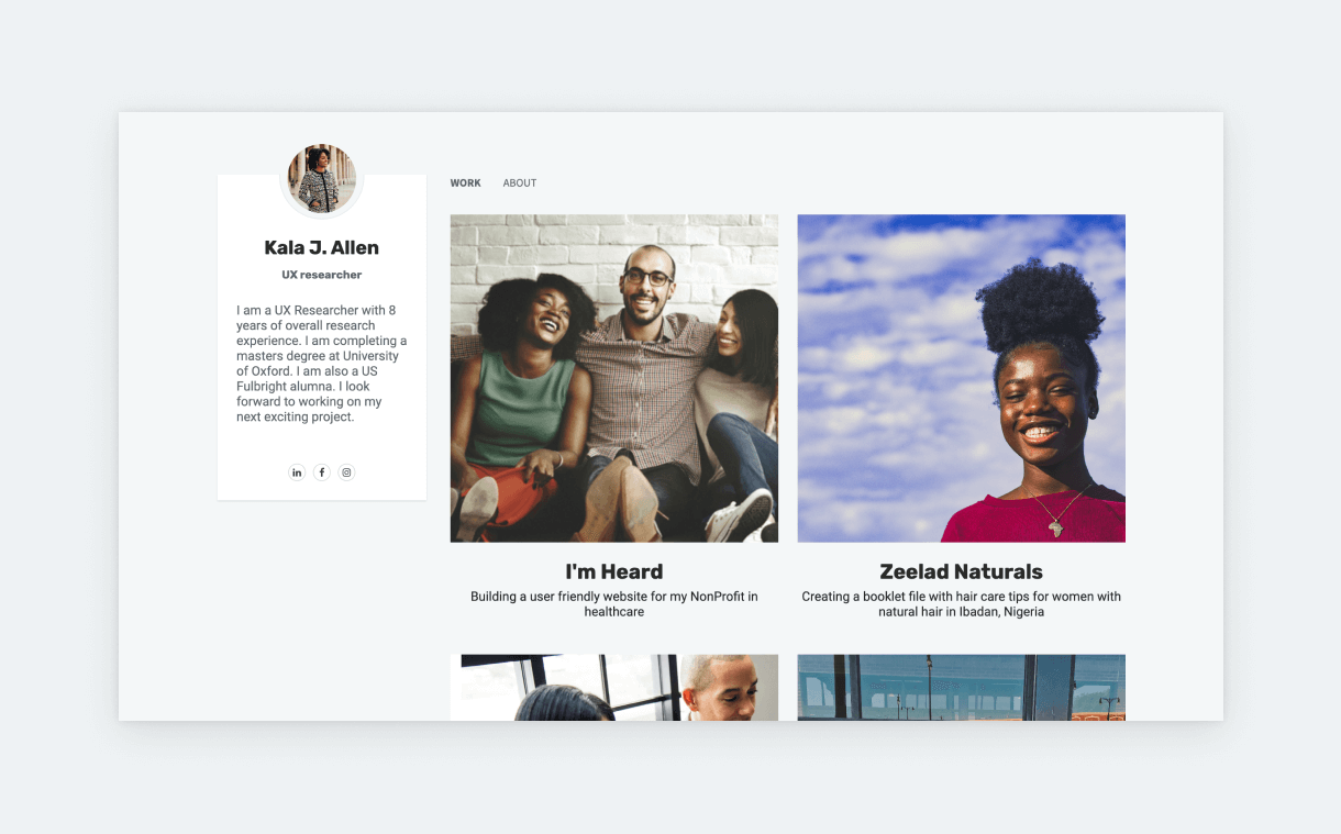
2. Kala J. Allen
Kala J. Allen leverages her background in Experimental Psychology to build a portfolio rooted in empathy and rigor. She shows how to balance human-centric advocacy with structured research roadmaps.
3. Jon Jieh-hen Tsung
Jon Jieh-hen Tsung demonstrates the power of visual storytelling in research. His portfolio proves that research deliverables don’t have to be boring documents; they can be engaging visual assets.

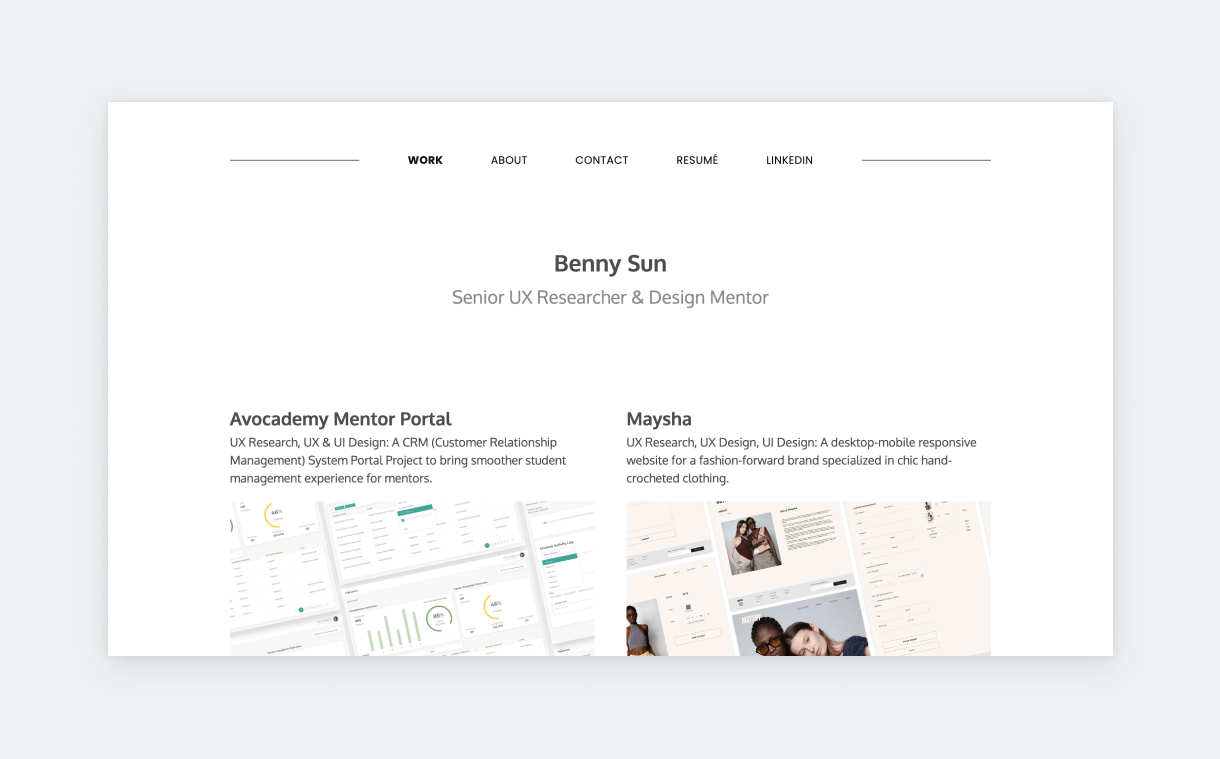
4. Benny Sun
Benny Sun’s Senior UX Research portfolio is all about the bottom line: Business Impact. He strips away the fluff to focus on data-driven recommendations that drive product success. Benny understands that stakeholders care about results.
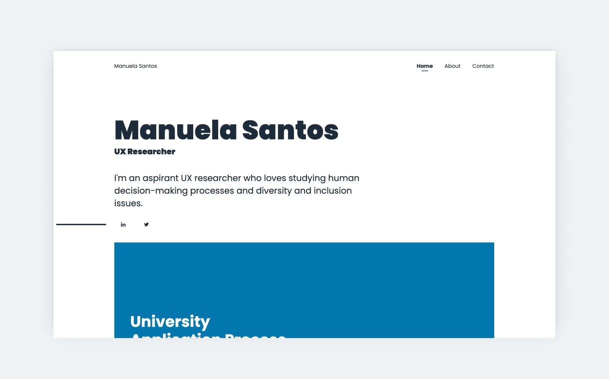
5. Manuela Santos
Manuela Santos proves that you don’t need years of experience to have a professional presence. Her portfolio is a textbook example for aspiring researchers on how to structure bootcamp or concept projects.
6. Theo Johnson
Theo Johnson, a Senior Design Researcher at Microsoft, uses high-contrast visuals to make a bold statement. His portfolio reflects the confidence of a researcher working on enterprise-level problems.

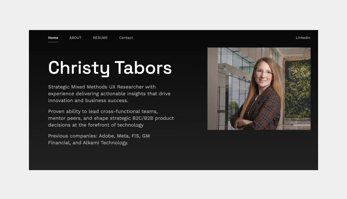
7. Christy Tabors
Christy Tabors shows how to translate academic rigor into industry results. Her UX research portfolio bridges the gap between complex human factors psychology and actionable product design.
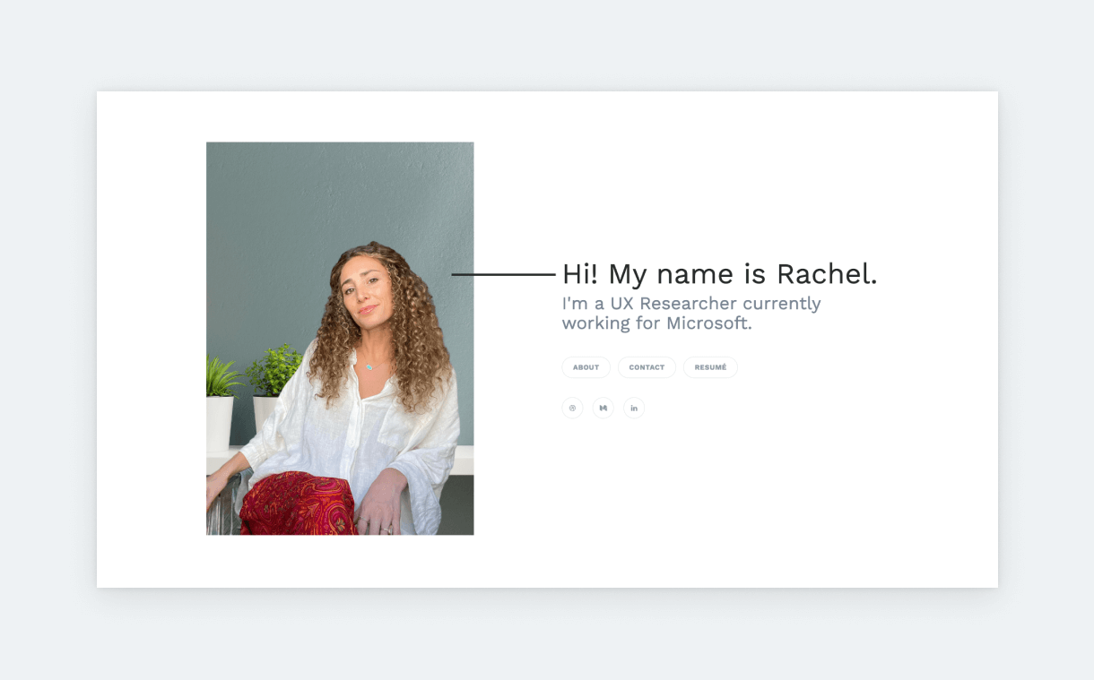
8. Rachel
Rachel’s portfolio highlights the “human” side of user experience. She uses a light, airy aesthetic to frame her qualitative research and user-centric philosophy.
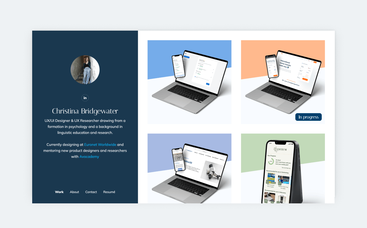
9. Christina Bridgewater
Christina Bridgewater exemplifies the “Full-Stack” UX professional. Her portfolio seamlessly blends deep research findings with high-fidelity UI design, showing the complete product lifecycle.
Key elements of a UX research portfolio
A UX research portfolio is designed to showcase your skills, research methods, findings, and impact on product decisions. Highlighting your process, not just outputs, is crucial. Include user personas, wireframes, research reports, and usability testing results to demonstrate your expertise.
In UX case studies, showcasing your process – rather than just outputs – is especially important. And this is something that UX researchers can leverage since research can be a very intricate process.
If you’ve been working for a while, you’ve probably tried various methods, tools, and even UX software during your research projects. Your portfolio is where you can make these approaches visible and valuable.
UX research portfolio vs UX designer portfolio: Key differences
The most obvious difference between the two is that a UX researcher portfolio has fewer visuals. Instead, it emphasizes research methods, outcomes, and their impact on design decisions.
UX/UI designers have plenty of eye-catching stuff lying around – wireframes, sketches, UIs – to showcase in their portfolio. But researchers have more user stories to tell. And ultimately, UX is about users, and portfolios are about storytelling. So, don’t feel discouraged.
Yes, your portfolio will be more content- and data-heavy, but that’s expected.
Finally, a case study in a UX designer portfolio highlights the design process and design decisions. Meanwhile, a UX researcher portfolio focuses on exploring the users’ motivations and problems and the effects of that exploration on design decisions.
Let’s see some useful tips on how to build a portfolio and some great UX research portfolio examples!
How to make a UX research portfolio (Step-by-step)
1. Select your best projects
The most difficult part of creating a UX researcher portfolio (or any other portfolio) is getting started. This applies to the beginner with little experience, just as much as the senior with tons. But don’t worry! You don’t have to jump in right away. Diligence and attention to detail have led you to work as a researcher, so start with a good plan:
- Write a list of your past projects
- Proceed in chronological order
- List the research methods you’ve used in each
- Identify your best material
- These will be the 3-4 projects that you’ll feature in your portfolio
- Here are a few pointers that can help
- The project that you’re most proud of
- The project that showcases most of your skills
- The project that best showcases your process
- The project where your research had the most impact
- The project through which you’ve learned the most
- Start with the project that checks most of these pointers
- Write an outline for the structure
- This will be the skeleton of your story
- Think about the project’s phases, the methods used, and the findings
- Here’s a researcher case study template that can help:
- The product/client
- The problem/challenges
- Hypotheses
- Solutions: Research methods and processes
- Findings/Results
- Takeaways
- Personal learnings
- Find the highlights
- Think about the main points in each step
- List out a few keywords (e.g., major challenges, goals, hypotheses, findings, learnings, etc.)
- This helps you find the focus point of each chapter and stick to it while writing the content.
- Fill out your outline
- Now that you have a structure and keywords, it’s time to connect it all
- Remember to keep it short and focused
- We’ll share some tips for this part as well
Now, we’ll move on to some tips regarding the content!
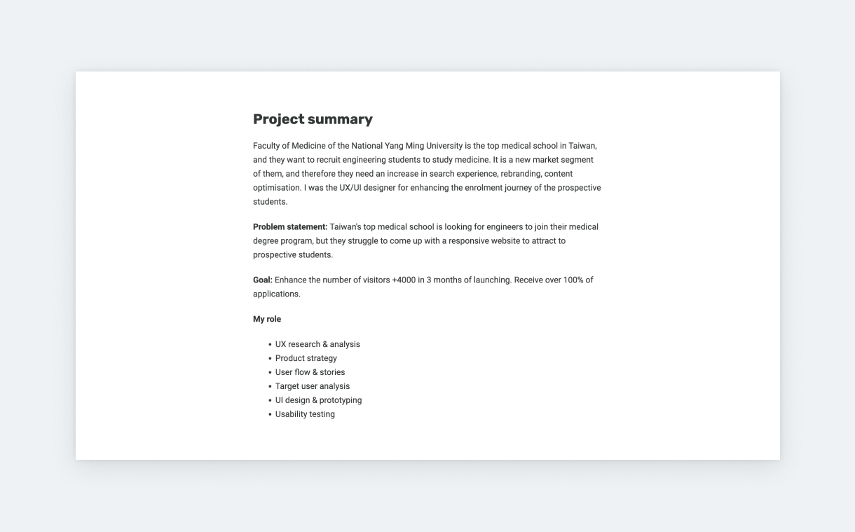
2. Show research process clearly
Showing the results of our work is important but explaining how we got there generates even more interest. Familiarizing the reader with your thought processes is the key to a great UX researcher portfolio.
Introduce your methods
Talk about the exact methods in more detail. But instead of defining the method itself, focus on why and how you used them in the project. If you did something unique or experimented with new methods, share the learnings and what you would do differently next time. Explain how you validated or unvalidated hypotheses.
Show outputs
Show the output of your work wherever possible in a visually appealing way. If it’s a spreadsheet with survey answers, put some effort into cleaning it up, and changing the fonts and colors to match your case study. If it’s a screenshot of a user interview, crop everything unnecessary. And so on. These little things take only a few minutes but have a big impact on your case study.
Share findings
Findings are the highlight of UX research case studies, so summarize them with extra care. A great way to approach this part is using statement + evidence pairs. Write a statement and support it with the evidence you have collected during your research. Whenever possible, Include user quotes. They make everything feel much more personal and, therefore, real.
Include firm results
Dedicate a part of your case study to highlighting the impact of your findings. If you have access to designs, you can take screenshots next to which you can explain what was influenced by your findings. You don’t have to overthink this. Just crop a screenshot, and use a simple Text & Image section, like those in UXfolio.
Even better, if you can share quantifiable business results, such as growth in conversion rates, growth in use, decrease in support tickets, and so on. And you don’t need to design for this either. UXfolio has a handy Stats section that’s perfect for this.
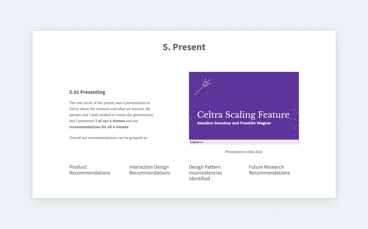
3. Emphasize your skills
Employers and clients really want to know how it would be to work with you. They’ll ask how your research and personal skills can add to the success of their company. So, go ahead and include parts that could answer these questions:
- Your role in the team: Emphasize the role of research in the project and how your work fits into the overall product development process. Show the final product and how it improved, thanks to UX research.
- Cooperation: Tell more about how you communicated and cooperated with other team members, especially with designers and stakeholders. Also, you can share some details about the challenges you faced and how you solved them together.
- Learnings: Share your personal learnings and what skills you developed thanks to this project. You can include a short learnings section at the end of your case study.
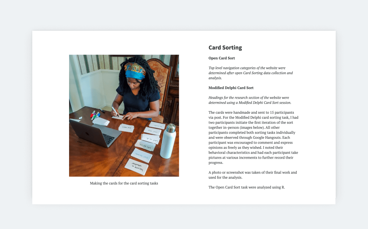
4. Make it easy to read and understand
In the first chapter, we discussed the importance of creating a well-structured case study. Besides a good structure, you can follow some copywriting best practices to make your project more digestible:
Tell a story
Many of us complain about how neglected research is. So, take this chance to tell a story that testifies to the impact of UX research. Talk about your challenges and how you solved them. Make your readers more intimate with the users by detailing what you learned about them. Always explain how you arrived at conclusions, and don’t be afraid to write about roadblocks and overcoming them.
Use descriptive subtitles
Give your sections catchy titles that summarize their content and encourage the reader to learn more. The same goes for the main title of your case study. Good titles add a lot to storytelling and help maintain the flow and your readers’ interest. If you can’t come up with something creative, don’t worry! Just go with something descriptive instead.
Break up your text
Break up big chunks of text into smaller paragraphs. Ideally, a paragraph in a case study shouldn’t be longer than three sentences and 4 lines. Also, take every opportunity to introduce a subheading or a bulleted list. This will make even text-heavy case studies more inviting.
Use simple wording
Whoever reads your case study might not be a researcher. So, whenever possible, use straightforward, descriptive language. You don’t have to dumb it down. Just strive for simplicity. If the project was in a field with lots of jargon (e.g., healthcare), translate those phrases for your readers, so they don’t lose interest while reading.
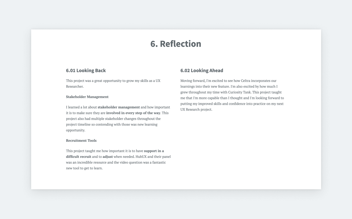
Build an awesome UX research portfolio with UXfolio
We hope that this article gave you the inspiration and boost to start your UX research portfolio!
If you want to build a great research portfolio quickly and easily, try UXfolio! It is a UX portfolio builder platform designed specifically for UX professionals – with many specific features, UX portfolio templates, and guiding questions that will help you on the way.
Click here to sign up for free!
Tell the story of your UX research work today!
Frequently Asked Questions (FAQ)
What should a UX research portfolio include?
Highlight your research process, methods, findings, and impact on design decisions. Include case studies, user personas, usability tests, surveys, and insights. Emphasize storytelling and evidence-based results.
How many projects should I feature?
Most UX research portfolios feature 3–5 projects. Choose work that showcases skills, research methods, and measurable impact. Focus on depth, not volume.
Can junior UX researchers build an effective portfolio?
Yes. Even limited experience can demonstrate research thinking. Include academic, bootcamp, or concept projects, clearly showing your methods, results, and learnings.
How is a UX research portfolio different from a designer portfolio?
Research portfolios focus on methods, insights, and data-driven recommendations, while designer portfolios highlight UI and wireframes. Showcase how research informs and improves design.
How can I make my UX research portfolio stand out?
Use concise storytelling, clear structure, and evidence-based insights. Highlight your problem-solving, collaboration, and measurable impact on products. Showcasing process is more important than polished visuals.
