We’ve reviewed countless portfolios and found so many that are almost there. With a few minor tweaks, they could truly shine.
Having experienced both sides of the hiring process, we understand the frustrations and preferences that come with it. This guide is here to help you improve your portfolio with tiny changes that will make your portfolio miles better and more pleasant for recruiters. Let’s dive in.
1. Cohesive visual theme
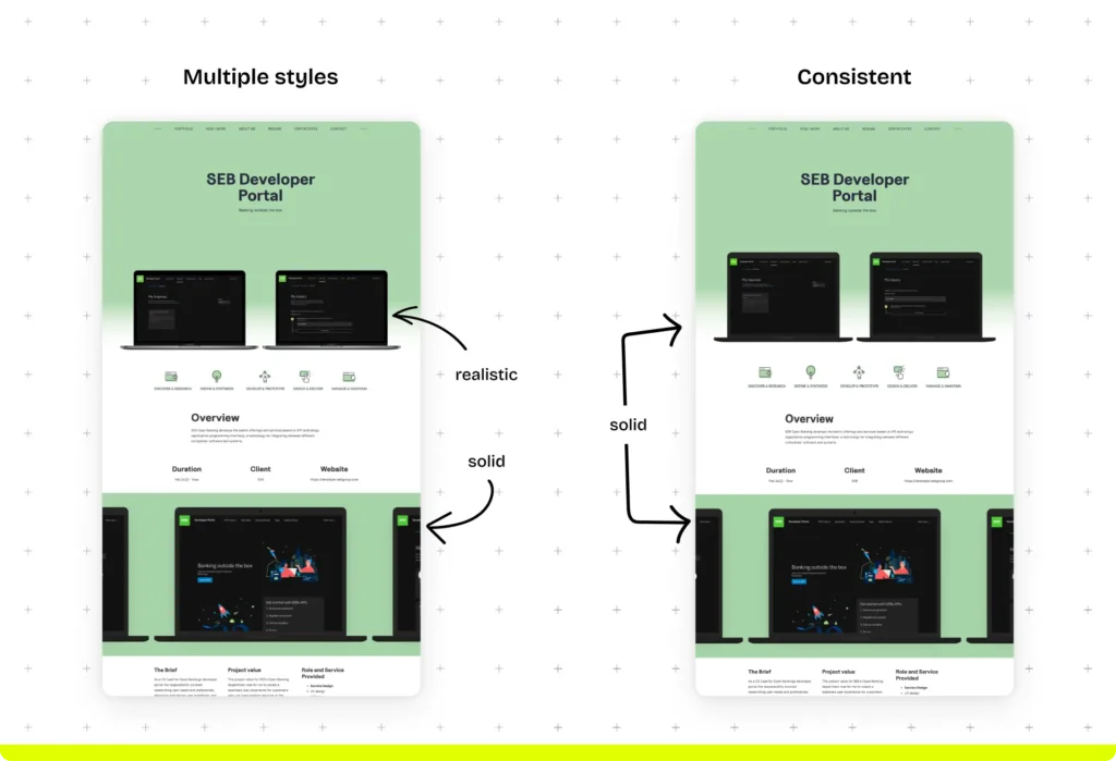
No matter how good, if you simply put all the portfolio visuals on a page, they will instantly look chaotic. But you can tie all of them together with a cohesive visual theme.
You know how colors and fonts can do the trick, so we won’t go into that. But one thing that many designers seem to forget is how much the style of the decorative elements adds to the overall look and feel of the portfolios and case studies.
Find a cohesive theme between graphics and mockups to enhance your portfolio.

Actionable tips:
- Choose and stick with a mockup style that resonates with your aesthetic.
- Include decorative elements only when it adds to the ease of understanding.
2. Portfolio scannability
The uncomfortable truth is that recruiters do not read more than they absolutely have to.
When you have dozens of applicants to review each day, you get started with an exact agenda in mind: Find the most suitable person for the position.
And though as an applicant it’s frustrating, you have to keep this in mind when creating your written content. Highlight everything that ticks the boxes, and make the information that makes you unique easy to find.
If you’ve created something that interests the reader, they will read further on. But you need to convince them before that.
Actionable tips:
- Simplify your navigation bar: Don’t bloat your navigation (and portfolio) with irrelevant information. Ideally, you should only have “portfolio”, “about me”, and “resume”.
- Use your headings to convey your value: For example, instead of writing “Design system” as a case study heading, write “Building a robust design system”.
- Front-load with relevant information: Place the crucial information front and center (e.g. indispensable skills, years of experience in your bio, your responsibility and type of project in your case study overview, etc).
- Use bullet points and numbered lists whenever possible and avoid long paragraphs at all costs.
3. Consistent spacing
Many designers run into this layout inconsistency, making the portfolio feel off.
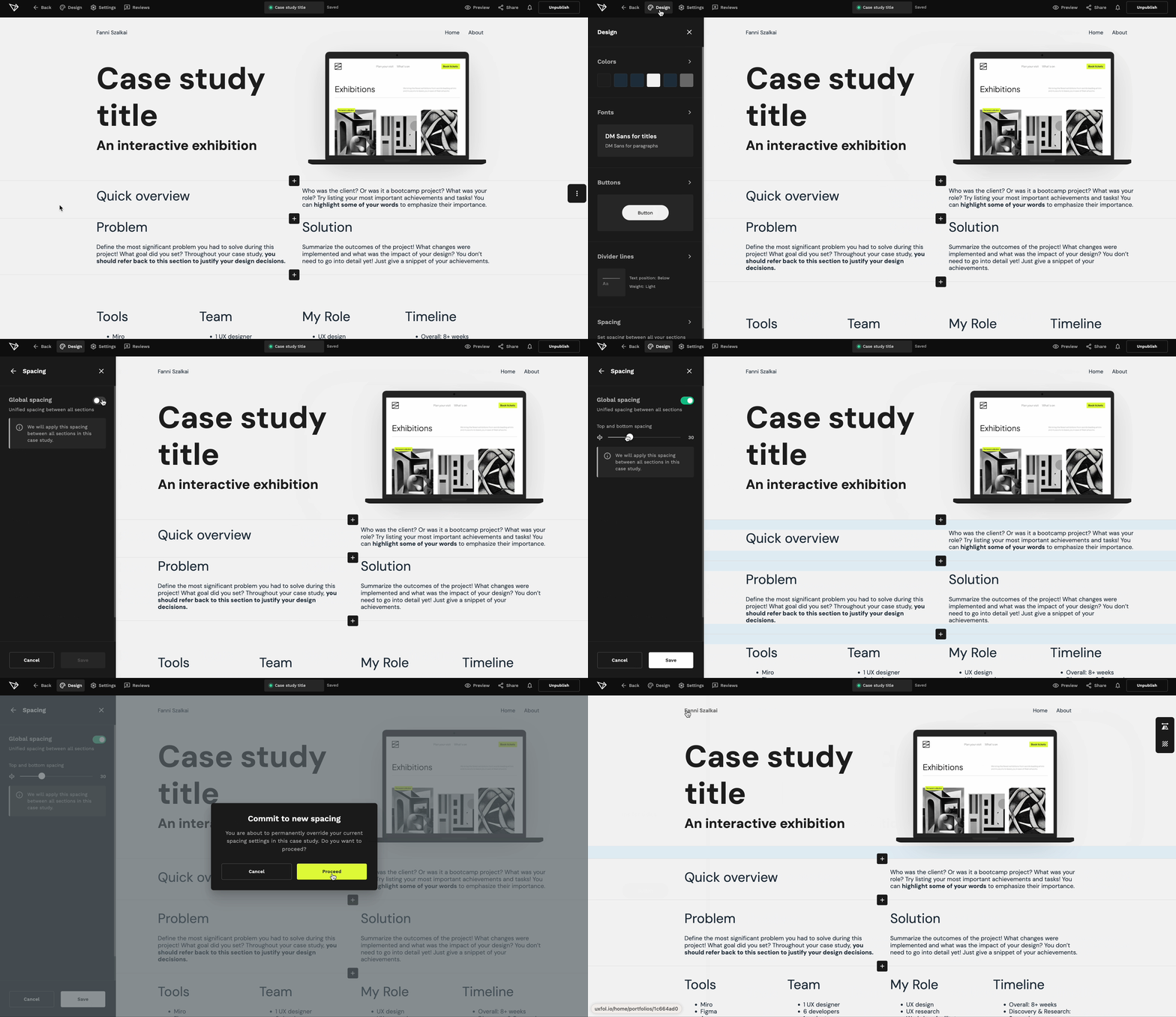
Spacing can be a pain in the neck when you have different types of content with different aspect ratios. But just be as consistent as possible.
Actionable tips:
- Set global spacing: Have a set number of pixels in spacing between two sections and only change it when it really is necessary.

4. Let others vouch for your skills
Testimonials are an incredibly powerful yet underutilized tool in portfolios. Quotes from previous employers, coworkers, or clients add social proof and credibility to your work.
Actionable tip:
- Ask for and include testimonials in your portfolio
If you think it’s easier said than done, don’t worry—we’ve got you covered. Here’s how to effectively ask for a testimonial:
- Identify whom to reach out to. Contact anyone you’ve worked with professionally and had a good rapport with.
- Write a message or call them—depending on how you used to communicate.
- Consider offering a testimonial in return. For example, writing one for a former coworker’s portfolio.
Here are a few message templates you can use to get started. Edit them based on your relationship with the other person.
![Message templates: To a previous employer: "Hi [Employer's Name], I hope you're well. I'm updating my UX portfolio and would really appreciate a short testimonial about my work at [Company Name]. Just a few sentences on my design skills and work ethic would be fantastic.
Thank you for your time! Best,
[Your Name]" To a coworker:
"Hi [Coworker's Name], Hope you're doing great. I'm refreshing my UX portfolio and was hoping you could provide a brief testimonial about our time working together at [Company Name].
A few sentences on my contributions and teamwork would be very helpful.
Thanks a lot! Best,
[Your Name]" To a former client:
"Hi [Client's Name], I hope this message finds you well. I'm updating my UX portfolio and would really value a short testimonial from you. Just a few sentences on my design skills and the impact of our project would be amazing.
Thank you for your time! Best,
[Your Name]"](https://blog.uxfol.io/wp-content/uploads/2024/07/Testimonials-1024x699.webp)
5. Test, test, and then test some more
There’s nothing worse than sending your portfolio and CV only to realize that the hiring managers cannot access/read/view it properly. Test it rigorously—even better if you’re not the only one to do so.
Actionable tips
- Test from different devices.
- Open it from different browsers and incognito mode.
- Send it to a friend and ask them to take a look.
- See if your passwords work (and don’t forget to include them in your application).
- Test the color contrast and check if all your text is a readable size.
- Run your written content through a spell checker.
- Test if all your projects are visible.
6. Get a professional domain name
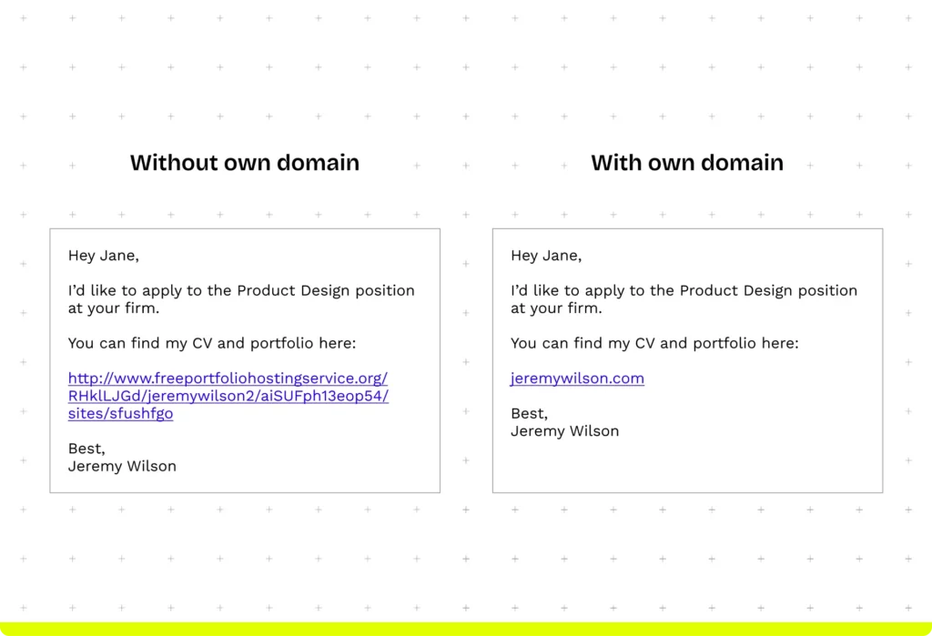
Sharing your portfolio is the whole reason you’re creating it. But the way you send it does matter. Just imagine the two following emails. Which one would you prefer to receive?

In addition, be mindful of the URL structure of your subpages. Clear informational architecture is more than expected in a UX portfolio, and the URLs reveal a lot.
Actionable tip:
- Buy a professional domain.
- Make sure that your URL structure is clear.
+1 Make it authentic and memorable
Above all, the most important thing is that your portfolio represents you authentically. The tips above only help to show your expertise in the best light possible. The recruiters will appreciate most of all an uncomplicated flow that helps them get to know you better.
Actionable tips:
- Write as you speak.
- Differentiate yourself in your tagline.
- Keep your portfolio updated.
Final thoughts
All these small but impactful improvement tips are effortless if you find a user-friendly portfolio builder tool. In UXfolio, you can
- set up your portfolio in a matter of minutes.
- buy a domain in less than 10 clicks,
- set global spacing effortlessly,
- use built-in HQ mockups,
- find UX portfolio-specific sections,
- generate an engaging case study,
- create stunning thumbnails, and
- get guidance on what to include and write about in your portfolio.
Try UXfolio and see how intuitive and fast we’ve made portfolio building for you.
