When you have to build a portfolio without work experience, UX design challenges come to the rescue. They are perfect for filling up your portfolio, especially since you should have at least three projects in there. This article will review the best UX challenges and help you turn them into persuasive UX case studies. Let’s get started!
What is a UX design challenge?
A UX challenge is a task that prompts designers to design a solution to a problem or scenario. UX design challenges are great for practicing UX design skills, design thinking, and whiteboarding.
Can you add challenges to your UX portfolio?
Challenges are a welcome addition to your portfolio if you aim for an internship or junior position. But it’s all about presentation. These projects have to shine twice as much as regular projects for the same recognition.
Participating in UI/UX challenges is a sign of your dedication to and investment in your craft, and your willingness to polish your skills even without a project’s pressure and time restraints.
Quote: Participating in challenges shows that you take this seriously.
It’s true that people will always gravitate toward real-life projects. The reason is that those require collaboration and other soft skills, which companies look for in candidates. But in the end, when they open a case study, their attention is still preoccupied with the deliverables.
It’s all about presentation
So, the secret to showing challenges in your portfolio is that you must go the extra mile to make them look fantastic. If you’re putting half-assed work into your portfolio – let that be a challenge or a real-life project – it’ll reflect on you negatively.
But if you take the time to polish those deliverables, the content, and the presentation, people will overlook the fact that it isn’t an existing product. Stunning visuals mixed with good content have the power to sway people off their feet. So, don’t underestimate them!
How to showcase UX design challenges in your portfolio?
There are two ways to showcase challenges in your portfolio:
1. Compilation project
This is best for UI design challenges that ask you to design or re-design a few screens with a short prompt. Since these are smaller tasks, they would look weird in separate projects. It would give off the impression that you are trying to bulk up your portfolio.
Instead, you should present them in a compilation project. A compilation project is a case study that includes many smaller projects, each separated into sections with visuals and a short description.
The golden rule of compilation projects is that they have to be extra structured: use plenty of headings, subheadings, and whitespace to indicate where one project ends, and the other begins.
As for content, you should give some basic details for each section. Share the prompt, the time frame, what tools did you use, your constraints, and the biggest challenges.
Once you have that sorted out, two top-priority tasks are left:
- Make a stunning project thumbnail.
- Check out how other people present their work on thumbnails
- in UXfolio, on Dribbble, or Behance.
- Make sure that it’s consistent with the rest of your thumbnails.
- The best is to use a variation of the same thumbnail layout for all your projects.
- This’ll ensure
- That your home page looks visually consistent, and
- Your bulk project blends in with the rest of your projects.
- Check out how other people present their work on thumbnails
- Give it a catchy title.
- Go for something attention-grabbing and do your best to sell it:
- My Best Designs
- Selection of My Favorite Designs
- Showcase of My UI/UX Skills
- Go for something attention-grabbing and do your best to sell it:
If you present compilation projects with care instead of just throwing some UIs on an empty page, it won’t feel out of place in your portfolio. It’ll be a project that you can be proud of. Also, if you continue doing challenges, you can add your new best work to the top of the page.
2. Individual projects
When using a brief generator or working on a full-fledged UX challenge, you’ll have enough material to create an entire UX case study. Only a few differences exist between a case study about a real-life project and a UX challenge case study:
In both instances, you begin with an overview, present your process and the outcome, and close with learnings. But when it comes to a challenge, you don’t write about the team (unless you participated in a challenge with a team), and the parts about stakeholder feedback are absent.
The overview is where you’ll see the most significant deviation: instead of introducing the project, you’ll introduce the challenge.
- What was the imaginary product?
- What was the prompt or problem statement?
- Where did you get the prompt from?
The rest of the case study’s structure doesn’t change when you’re writing about a UX challenge as an individual case study.
11 Best UX Design Challenges
1. UXdesigncontest – as close as it gets to a real-life project

- Prompt type: long
- Status: inactive
- Complexity: 8/10
- Link ↗
Though it has been inactive for a while, UXdesigncontest has the most detailed prompts for UX/UI design out of all challenges. Thankfully, the details of past contests are still available on their site. And if you’re looking to make a detailed case study out of a challenge, you should head over and check them out.
Every contest has the following details: context, problem, challenge, and opportunity. You also get a list of the desired outcomes, and criteria like divergent thinking, UX/Interaction design, data-informed decisions, visual design, and case study. These criteria were added for judging purposes, but even without that part, they’re great to give some focal points to your design.
What’s more, you also get a list of tool suggestions for the stages of the design process:
- Diagrams & Wireframes,
- High-Fidelity UI Design, and
- Prototyping
Currently, there are 16 project briefs available on the UXdesigncontest website. Since each contest has been closed already, you can see the best submissions. So, inspiration is covered as well.
We can’t recommend UXdeisgncontest enough, even in its current, inactive state. Let’s hope that they will make a triumphant comeback!
2. Crowwwn – quick UX design challenges
- Prompt type: short
- Status: active
- Complexity: 3/10
- Link ↗
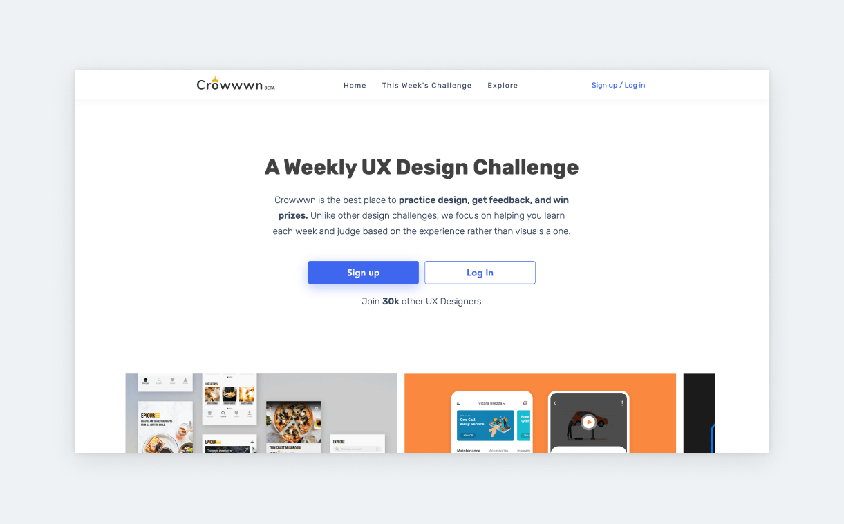
Crowwwn releases UX design challenges that are part of a weekly competition. The project was started by brothers Alex and Cameron Barker as an opportunity for designers to practice, get inspired, and improve their skills.
Every week they release a prompt like these:
- “When I buy gifts for the holidays, I want to be able to select multiple present options, so my friends and family can pick the gift that best fits their needs.”
- “When I watch the world cup, I want to be able to see where I can watch games and which teams are still in, so I can be informed going into each game.”
- “When I have vending machines in multiple locations, I want to see which products are running low in each machine, so my machines are always full and making money.”
- “When I am on my computer, I want to be able to record parts of my desktop, so I can send clips of what I am working on to my team.”
- “When I have an idea for a startup, I want to allow people to invest in my idea in exchange for equity, so I can get the money that’s needed to start.”
The prompts are usually timely. For example, they’ll release a prompt about gifts around the holidays. Also, their challenges have a nice variety. One week it’s a product for the masses, next it’s for internal use.
Since Crowwwn’s challenge is an actual competition, you can submit your design to compete. Submissions are evaluated by the Barker brothers or a guest judge.
Besides submitting your design, you can also give feedback on other submissions (even if you don’t compete in that week’s challenge. The winner, runner-up, and the best feedback author all receive a price.
However, you don’t have to compete to use Crowwwn. You can just use their prompts to turn out projects for your portfolio. You can also use past prompts and check the winning submissions for inspiration.
3. Sharpen.design – Google’s UX challenges
- Prompt type: very short
- Status: fixed
- Complexity: 5/10
- Link ↗
Sharpen.design is the design challenge generator of companies like Google, Shopify, and Amazon. Former Google designers founded it in 2017, and today it’s actually licensed by Google for their UX Design Certificate at Coursera.
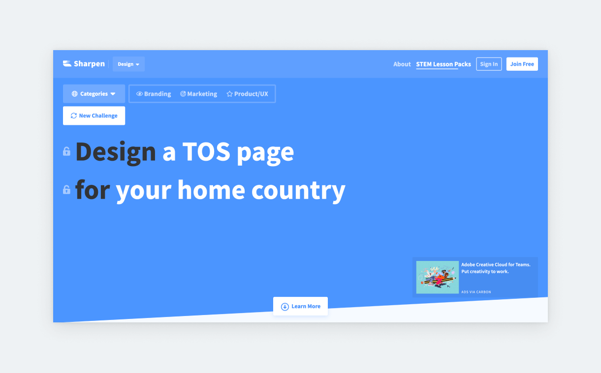
The tool is straightforward. You choose a category (branding, marketing product/UX) and you hit ‘New challenge’ until you get something that can be turned into a case study. Each prompt has 2 or 3 elements:
- Design
- What you’ll design.
- This can range from a UX flow, a full-fledged product idea, to a title slide for a presentation
- What you’ll design.
- For
- The users of your product.
- The can be a very particular group of people (e.g., a gardener in Brussels), a business (e.g., magic shop), or even a brand (e.g., Taco Bell).
- The users of your product.
- Further instruction
- Not every challenge gets one.
- It can be something like “and try Brutalist styling,” “make it minimalist,” or “and tweet us the results.”
- Not every challenge gets one.
If you’re not happy with an element of a challenge, you can lock the element you like, and re-generate the other one.
Our only complaint is that sometimes the prompt is not product design/UX related even if we select that category. But still, with a few clicks, you can generate some nice ideas for small or bigger-scale projects.
4. UIcoach – UI with more direction
- Prompt type: short
- Status: fixed
- Complexity: 7/10
- Link ↗
Most companies are looking for UI/UX designers, and we all know that the best way to polish UI design skills is through practice. However, the freedom that comes with going with your own idea – choosing the theme, fonts, color palette, and so on – can be numbing for some. That’s when a tool like UIcoach comes in handy.
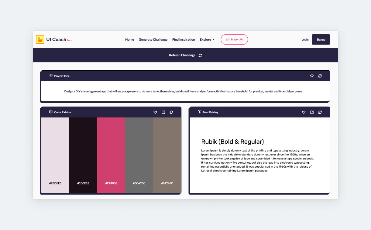
UIcoach will generate three things:
- A project idea,
- a color palette (5 colors), and
- a font pairing.
That’s a great starting point for a smaller-scale UI design project. We’ve used many of their prompts in the past, and their specificity is very inspiring. Here’s an example:
- “Design a different social networking app that will help you plan meet-ups with your selected friends or people. It will have an integrated option to find places to meet and/or events to attend. It can even suggest you new plans based on your group’s social preferences.”
If you don’t like a challenge, you can generate a completely new one. But also, let’s say, you like the prompt and can also work with font pairing, but you loathe the color palette. In that case, you have the option to re-generate the palette only.
5. UXtools – practicing UX methods
- Prompt type: mid-length
- Status: fix
- Complexity: 8/10
- Link ↗
Another great resource for a compilation project is UXtools. Unlike the other challenges, they approach prompts from the UX methods. If you want to build and flex an impressive UX toolbox, these are the challenges for you.
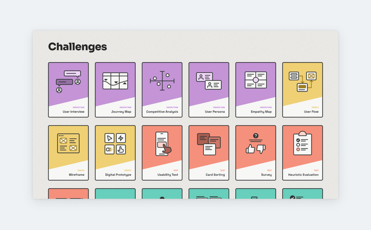
They have 18 challenges in total. Each one is assigned to a UX method like card sorting, user interview, user persona, design system, and more. The challenges have three elements:
- Scenario
- Task
- Tutorials
- Tools
The scenarios are pretty detailed and the asks are straightforward. With each challenge, you’ll clearly understand what’s expected of you. The tool suggestions seem to be affiliates of the site, but nevertheless, they are tools that UI/UX designers regularly use, such as Figma, Miro, or Airtable.
If you feel like you lack experience with UX methods and this hinders your chances on the job market, this is the challenge for you. But be prepared to put in the extra work for recruitment.
6. DailyUI – the go-to UI practice
- Prompt type: short
- Status: active
- Complexity: 7/10
- Link ↗
“Become a Better Designer in 100 Days” is DailyUI’s tagline. Indeed, if you design a UI every day for 100 days, you’ll become a better designer. This challenge has been around for a while, and it’s been cosigned by brands like Amazon, Airbnb, and Disney.
You’ll receive the day’s challenge in your inbox. Each challenge has a title, a hint, and a free resource. The hints (prompts) are open-ended most of the time. Here’s an example:
- “Create a sign up page, modal, form, or app screen related to signing up for something. It could be for a volunteer event, contest registration, a giveaway, or anything you can image.”
That’s all you get. This can be very good for exercising your creativity, especially when it comes to UI design. But you can also use this as a starting point for UX design. After all, sign-up pages need good UX to work. This is also a great opportunity to research what pioneering brands do and to build a repository of design inspiration.
All in all, DailyUI is amazing if you’re looking to build up your UI skills. Their challenges are perfect for a compilation project.
7. Drawerrr – one issue at a time

- Prompt type: mid-length
- Status: inactive
- Complexity: 6/10
- Link ↗
Another inactive, yet still topnotch UX challenge collection is provided by Drawerrr. Their challenges are focused on environmental, health, and social inequality issues. All three topics are extremely relevant in 2023, so no complaints about the selection.
You can choose from 6 smaller topics: commuting, diet, groceries, household, shopping, and travel. We’d suggest you go with commuting, household, or maybe travel, as the other topics have been a bit overused in UX education.
The next step is choosing from 5 prompts connected to your general topic. For the commuting topic, you get prompts such as:
- “Design a search filter for a job seeking app to help people find jobs with green commute routes from their homes.”
- “Design a gamified competition feature for a smartwatch app to encourage people from one office commute to work on foot or cycle.”
- “Design a chatbot for a messaging app to help office workers request a remote day.”
Each prompt is broken down into a 7-day challenge. Drawerrr was just generous with time; it doesn’t actually take a day for each step. Here’s how the challenges are broken down:
- Day 1 – Problem
- Day 2 – Audience
- Day 3 – Products
- Day 4 – Solutions
- Day 5 – Storyboarding
- Day 6 – Test
(Day 7 – Submit your work)
As you can probably guess, many of these steps can be done in less than a day. For example, audience and competitive research (day 2-3). So, depending on your pace, a challenge would take around 3-4 days to complete.
To help with your quest, Drawerrr has also prepared a few references for you. These are articles from various publications addressing the topic at hand.
8. UXchallenge.co – whiteboard exercise prompts
- Prompt type: very short
- Status: fixed
- Complexity: 3/10
- Link ↗
UXchallenge.co offers 15 prompts on topics like fintech and smart homes. The prompts are extremely open-ended, leaving plenty of room for your creativity to shine. If you’re the type of designer who thrives on total freedom, these are the challenges for you.
Most of them are inspired by whiteboard exercises given by companies during the interview process. Here’s an example:
- “Friends keep us company through the ups and downs of our lives and help us grow. But as we grow older, our fear and social anxiety can keep us from making new friends. How can you help people who has social anxiety step out and make new friends?”
However, based on our research, most designers like more direction in their challenges. When a prompt is extremely vague with no expectations or pointers to guide you, it’s easier to get lost in the details. Still, UXchallenge.co can be a great practice, especially for whiteboard.
9. Designercize – classic prompt generator
- Prompt type: very short
- Status: fixed
- Complexity: 4/10
- Link ↗
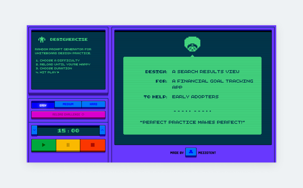
Designercize has digitalized the UX design prompts of Kate Rutter and Laura Klein. These prompts “help designers improve whiteboarding, interviewing, and design thinking skills”. This retro-fun site will generate easy, medium, or hard prompts based on your preferences.
We’ve tried it many times and are confident that not even the ‘hard’ prompts are too hard (unless the generator goes crazy). Each prompt has three elements:
- Design (what should you design)
- For (app/product description)
- To help (target audience)
The harder you go, the more specific details you’ll get from the generator. Here’s an example from the hard setting:
- Design: a user profile view
- For: a habit-tracking app
- To help: foodies
However, as mentioned, sometimes the generator gives rather weird prompts:
- Design: an onboarding process
- For: a music platform that generates new singles by splicing together top 40 hits
- To help: families of ICU patients
We suggest that you keep generating ideas until you find one that’s viable and you’re interested in.
10. 100 Days of Product Design – the whiteboarding veteran
- Prompt type: mid-length
- Status: fix
- Complexity: 8/10
- Link ↗
100 Days of Product Design is another long-standing UX design challenge focusing on whiteboard exercises. You probably know that whiteboard exercises are common during UX design interviews, so it’s worth practicing them. But, just like any other design prompt, they can be used for creating complete designs.
100 Day of Product Design has ten challenges, each consisting of two parts:
- Call to action (what you’ll do)
- Scenario (company, audience, problem statement, feature request)
- Considerations (more specificity)
Here’s an example:
- “Help our employees find their cars in the parking lot.”
- “We have over 15,000 employees and all of their cars in our main campus. Employees have been “losing” their cars in the lot. They forget which of the 5 giant parking lots they parked in and are wandering around clicking their door alarms in order to find their cars. The noise pollution at the end of the day is terrible. We already have a company app. We want to add a feature that will help employees find their cars.”
- Consider
- “Couples often swap cars when driving to work. What if the employee has more than one car s/he drives to work?”
- “This feature should be prominent on the app–but the home screen is already full. How will you make it fit without removing something?”
As you can see, the considerations are what make the prompt special. All ten challenges are unique and good mind-breakers. They have the potential to be turned into complete UI/UX projects, but they’re also great if you’re just looking to prepare for an interview.
11. UIrecipes
- Prompt type: mid-length
- Status: active
- Complexity: 8/10
- Link ↗
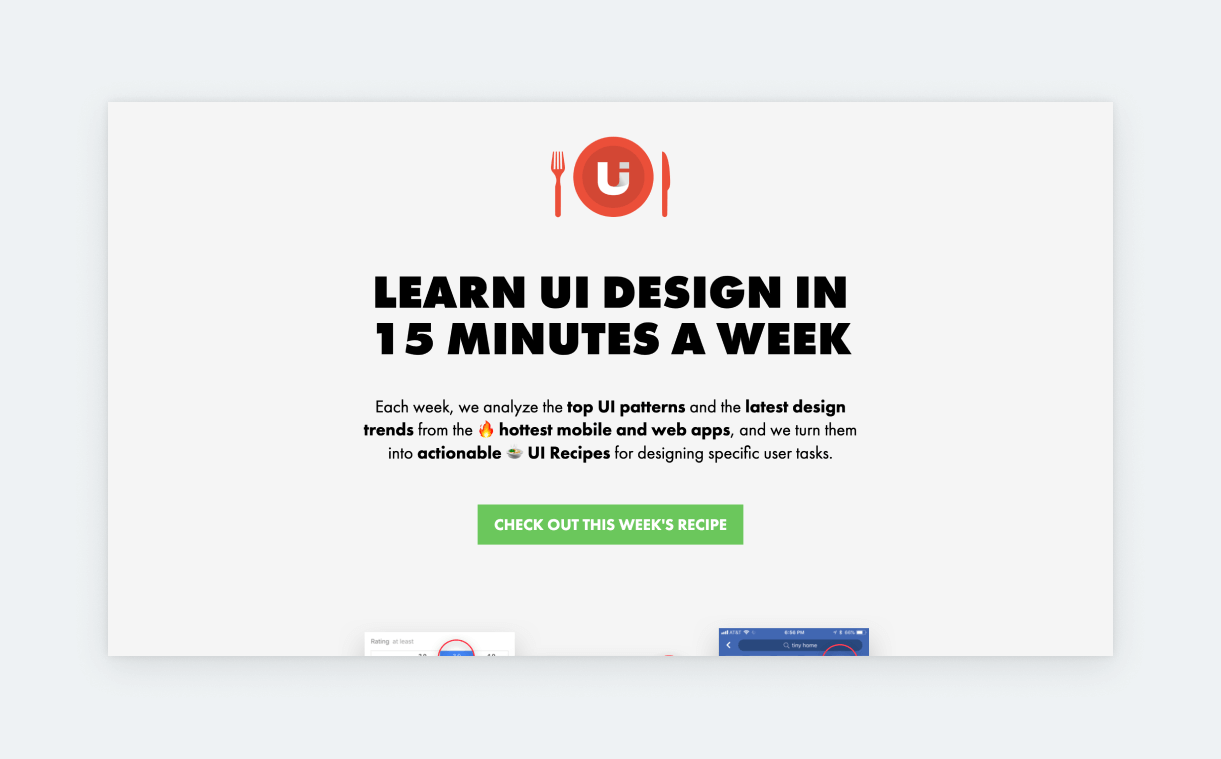
Though its title says UI, UIrecipes covers both UX and UI. Every week they publish a recipe for a UI/UX challenge with tons of pointers and inspirations. The challenge contains both UI- and UX-related instructions, but how you approach it is up to you.
All challenges are based on real products. For each, they “collect hundreds of screenshots from the most popular apps, reverse engineer design them to find common patterns, analyze them from a usability standpoint.” Based on this research, they provide the following details:
- User task (prompt)
- Design requirements
- specifying what elements and patterns you should focus on.
- Featured UI patterns
- how existing applications and websites solved the same task
- Design trends
- trends that should influence your design
- Ingredients
- a set of features that need to be included in your design
As you can guess from this, UIrecipes prompts are very detailed. You can use them to practice wireframing, create intricate designs, or prepare for whiteboard challenges. You can also subscribe to their newsletter to receive the recipes in your inbox every Wednesday. Our only complaint is that past recipes are not available on the site.
Showcase your challenges in a stunning portfolio
If you’re ready to showcase your challenges, try UXfolio! UXfolio is an intuitive portfolio platform that’s designed for UX professionals. It gives you a stunning template, so all you have to do is drop your deliverables and other content. Special features include text ideas, case study writing prompts & guiding questions, built-in mockups, sleek galleries, fast proto embed, and more. Check out UXfolio in action for free!
