Koji Pereira joined Google in 2011 and has been leading new products and teams at Google for five years. As Staff Lead Designer and Manager of the Next Billion Users Team, he has 17 years of experience in the design industry.
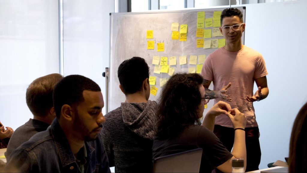
As a professor and lead, he’s made it his mission to help individuals to grow in their careers. He strives to create safe spaces and honest connection with his team. An advocate for structured collaboration to foster empathy with cross functional collaborators, he’s run a dozen workshops and design sprints with engineers, PMMs, PMs and UXers.
He works at NBU team creating new products, with Files by Google as his current product. He’s previously worked on products including Who’s Down, Google News, Google+, Google Spaces, and Google My Business, (20%s) Verily, Daydream, Android Wear.
Before Google, he worked as a design manager, owned a design studio and taught prototyping on the first interaction design course in Brazil. Aorta.Mobi acqui-hired his studio.
I talked to Koji about the skills UX designers need to work at a company like Google, the typical mistakes UXers make when creating a portfolio, and how to build an exceptional UX design portfolio.

Hi Koji! I am really happy to have you on our blog. Could you please share some details of your career path?
I started with graphic design as my first step into the design world, as did many people. I was doing posters, flyers for events and album covers for bands back in Brazil, where I’m from. I moved to the US about five years ago.
My way into UX came basically around 1997 when I heard about the internet becoming a big thing, and starting to get to people’s houses. And at some point I thought, “OK, this seems interesting for design.” Because at that moment design for me meant just designing static images. After that I realized, “Oh, this is not even just moving images, but also actually interactive. So maybe I can learn more about it. It might actually get very big in the future, because I guess this is gonna become more and more popular.”
So I started to work with websites. I had my own band, so I created our website and a few album covers. Then I sent my resume to some “digital” agencies back then and joined one. Also they had a small product to order food online, pretty much like Uber Eats, but a primitive version. So we had a server where people would access the website to order a pizza. The server would send a facsimile to the pizza place. They’d get the order, deliver the pizza, and get the payment in cash. So that was the first project that I worked on in the shop-slash-agency.
At some point, the owners just said, “OK, we are not doing well. Do you guys want to take this over?” So I became a partner of this small agency that later got acquired by a startup.
And then I joined Google around eight years ago. I started in the Brazil office, then transferred to the US office about five years ago. That lays out my trajectory around UX design, and how I ended where I am now.
Sounds exciting. In your opinion, what makes working at Google special or unique, from a designer perspective?
Good question. You definitely can design and work in a project that has a very profound, deep, and also large-scale impact on people’s lives. We’re talking about millions of people using the same product, the same small widget. Whatever you design here will impact millions of lives.
And not only that, but also the impact is very deep. It changes people’s behavior; it affects people’s preferences. So it’s a big responsibility, and definitely a very exciting and interesting way to think about design.
I see. And what has been your biggest challenge so far in your career?
Just looking at where I am right now, and what I want to do going forward. I think de-codifying design is a part of our jobs. Because I’ve been working on design for so long, not saying that I nailed that down, but I almost stressed that as much as I could. And now the biggest challenge for me is to decode people.
And I’m talking not about users but actually thinking about other designers. So how can I help them grow in their careers? How can I work better with people who come from different perspectives, from an engineering point of view or PM point of view? How can I collaborate in a more broad approach since I have been working in design for a long time?
What skills do you think someone needs to work in a company like Google?
I look at least two spectrums of skills.
One: The ability to materialize very user-focused solutions, very user-centric in that sense. Not only easy to use, but desirable to use. Many tools, many methodologies make sure you did a project that has this narrative and to nail it very well. So yes, you want one part of that very user-centric – people love it, people want to use. That’s one skill: Can you do that?
“We [at Google] look at people able to navigate towards different perspectives, learn and address different feedback, but also not losing their own perspective on their own work.”
Then the second: Can you work with design, not you just doing your work and presenting to someone, but more like a collaborative way to build a project? We look at people able to navigate towards different perspectives, learn and address different feedback, but also not losing their own perspective on their own work. Those two arms are the biggest: Product and people.
And how would you suggest someone showcase these in a UX portfolio? Because these partially soft skills can be harder to showcase, if I understand well.
Good point. I really liked about UXfolio, the website, the product you guys are building, that you captured a need that’s been here a long, long time. But designers never had any tool like that.
Most of the portfolio tools focus on images and have a very visual language. This works great perhaps for a photographer, for a visual designer, an advertisement designer or a print designer.
“I really liked about UXfolio […] that you captured a need that’s been here a long, long time. [In a UX portfolio] the outcome makes up just the tip of the iceberg. The process really matters.”
For interaction, or UX design or product design, show you can navigate through all the different perspectives, capture the user point of view, and transform that into a significant outcome.
But the outcome makes up just the tip of the iceberg. The process really matters. And breaking that down into different steps, showing you care about getting those steps well done, and not skipping any. Can this person really articulate their process? That also comprises part of our job – how we can articulate our design process.

Yes, amazing! We think the same, actually. So you mentioned the design process and the steps, basically what they took when they designed a product. Does this include showcasing their design decisions?
Yes. One of the biggest mistakes that designers make: Jumping to a solution too quickly. Also true for a portfolio.
“One of the biggest mistakes that designers make: Jumping to a solution too quickly. Also true for a portfolio.”
If you just present solutions and don’t explain why you decided A versus B, and the rationale behind your choices. Did you base it on data? User research? Did you run a brainstorming workshop or a design sprint to do that? It becomes very difficult to show your work. Because that forms the biggest part of your work – how you make decisions.
That’s just one aspect of it, how you make decisions. But also, how do you advocate for design? How do you convince stakeholders to take a specific research trip or something like that?
All of that. Designers tend to just focus on the special details. Even UX designers, product designers do that sometimes.
That makes our job too simplistic. Yes, the final outcome is very important, but there are definitely other aspects in the table. If you really want to be a product designer, then focus more on a broad view of all the stages and all the layers around design.
Sure, I understand. Now you just mentioned a typical mistake product designers make. Do you have any other typical mistakes in mind that you saw in many design portfolios?
A mistake before any other mistakes is waiting too long to start your portfolio.
“A mistake before any other mistakes is waiting too long to start your portfolio.”
I’ve heard this from different friends and people who worked with me before. They say, “Oh, I don’t have anything good to put in my portfolio”. And I see, actually, people do. They expect something perfect, flushed, millions of users, and so on, so forth. That’s not the point, rather building and resiliency. Go through things you considered awesome, but that didn’t work out.
“Show your openness to sharing your story of a product that didn’t end up that great. But at least you’ve gone through all the steps. You learned something.”
And tell that story. Show your openness to sharing your story of a product that didn’t end up that great. But at least you’ve gone through all the steps. You learned something. What’s your take on that? It turned out not a good seat for the product in the market, but you continue to work in the same field. And you took that further with another product or another project, things like that.
I think I would say, one of the biggest aspects is not embracing fails, and not hiding that. I think it turns out even worse.
So people can talk about the things that didn’t turn out how they wanted in their portfolios? They don’t have to fear doing it?
Yes. I had a friend who one day came to me and said, “I’m having these complex discussions. My team went through a lot of changes. I designed something that didn’t launch. I did a lot of things, but nothing very successful.” And he said, “I have nothing to put in my portfolio now.”
Reframe this as: What did you do during this period that you want to highlight in your portfolio? Maybe you have to rethink your work, what makes a desirable skill. You may have to work into very different features in a product that maybe ended up not launched. But for you it still makes up a very significant design accomplishment, and very user-focused. Maybe you’re not designing directly, but you did some research.
Just reframe the problem and see the essential about that time. And again, not only the visuals or the tangible outcomes. Maybe just about the process. It’s just about the journey.
Sure, I understand. We at UXfolio also often recommend adding a last section, “Learnings” – what you learned, what you would do differently next time.
Exactly. “What I would do different next time” – that’s perfect. That shows your good mindset and that you want to learn more.
Yes. And do you remember specific examples of a very good portfolio? How did those look or what made these great?
I remember seeing portfolios that had very good storytelling. Very good introduction, then development, and then final learnings or next steps – things like that. I think understanding storytelling and learning a little bit about that will help you to build a very good portfolio. The ones that I remember, they had that very clear.
“I think understanding storytelling and learning a little bit about that will help you to build a very good portfolio.”
Another aspect: People will look at your portfolio and have no idea or context about the project you worked on. So spend time setting the context, or words, or parts of it explaining the context. Did it have a tight deadline? Did you have a lot of time to work on it? Did you join that project or work on it as your main project? Did you have more people working with you, project designers, or researchers and all of that?
And people tend to think of portfolios as things you did by yourself. But really, no good product gets created by one person. So you don’t have to mention names, but it makes for a good practice to just say, “In this project I had two designers and five engineers working with me.” That helps you set the context.
And we at Google want to know if you’ve ever worked with a researcher. Have you ever worked with an engineer or a PM? That adds complexity. But also that makes the project more successful. If you don’t have a researcher, you have to do research by yourself. Then it might end up half-baked or not very deep because you don’t have 48 hours per day.
Yes, of course. What would you advise junior designers? Because many times we get this question. What should they do? They don’t have anything to put in their portfolios because they haven’t had a job yet – a vicious circle.
What comes first, portfolio or job, right? Try to find opportunities where you can put something in your portfolio.
One: Find volunteer work you can start. A couple nonprofits are actually creating products or even websites.
Second: the same thing for start-ups. They don’t have enough funding or budget to have someone full time. Join them, help them.
I mentor some start-ups at Y Combinator and see a lot of that – people struggling to find a designer. I also talk with people at MIT $100K. They also have a lot of needs for designers. Try to connect with people like that, startups or incubators you can find on LinkedIn. Offer your work – even for free to begin with – as volunteer work so you can build your portfolio.
A third way: Create your own conceptual work.
A lot of people see an app that doesn’t work well, or maybe love it, but something doesn’t feel right. They go there with design and publish in their portfolio a suggestion to Facebook, Google, Apple, Amazon – something like that. Make that your concept work. And actually, there’s very good conceptual work made by students. If you do that, then you’re building your portfolio. It doesn’t matter if it launches or not. You’re showing your capability.
“[As a junior designer you should] find volunteer work you can start [or] create your own conceptual work. […] It doesn’t matter if it launches or not. You’re showing your capability.”
And just creating your own concept does that. That one is maybe a little harder to connect. If the concept is too blue-sky, it makes it harder to see if your skills on something more down to the ground will work. So I would say: concepts. Try to find stuff that already exists and propose something. That makes good practice.
Great ideas. Thank you very much, Koji, for all the great advice you gave our readers!

As Koji mentioned: “A mistake before any other mistakes is waiting too long to start your portfolio.”
With UXfolio you can start it right away.
We created our product, UXfolio to support both junior and senior UX professionals with portfolio building. It generates you your portfolio website, a stunning front page, and it helps you put together nice project case studies in minutes.
It helps you in the copywriting part with great examples and guiding questions. And you can even ask for detailed reviews on your case studies before applying for your next job.
Set up an impressive UX portfolio simply and quickly with UXfolio.
Click here to sign up and try it out!