A beautifully designed UX portfolio page with three to five case studies sounds like a winning combination. But don’t forget the details; avoid these seven common case study mistakes when writing your next one or even revisiting an older one.
Your summary lacks information
Writing only about the product or the project details misses a crucial opportunity to summarize and structure the whole case study. The first couple of sentences should cover your role, responsibilities, collaborators, methods, and even agreed-upon deliverables. Avoid “sorry, TL;DR” reactions – make sure the beginning provides enough info!

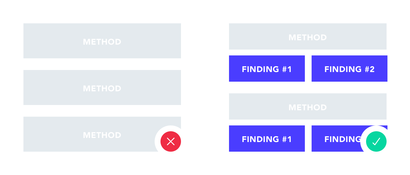
You only share the methods and tools
Showcasing the methods and UX research tools used during the project crucially shows your UX skills and experience. But prioritize presenting tangible findings and outcomes. Let the reader get the problem and the solution of your project by giving them actual details – “We synthesized the information and came up with the best solution” won’t cut it. Plus, sharing outcomes make your case study engaging, not boring because people will empathize and then want to know the solution.

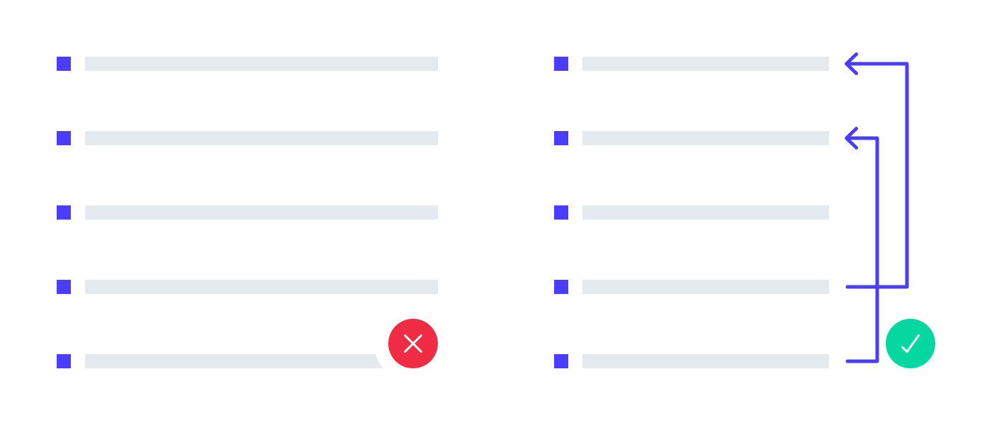
You think in steps only
Describing each step in your UX process and presenting them chronologically makes for a great first start to your case study. But if you intend to make the reader understand the project’s origin and final outcome, spell it out. If your research has influenced the sketches and final UIs (let’s hope so!) pinpoint those parts of the design and refer back to a research outcome mentioned earlier. This lets the reader also understand the cause and effect relations in your project.
You write too much
UX case studies definitely present a longer format to showcase your work. It requires some writing to explain your thoughts and processes, but it’s one of the most common case study mistakes to think you have to write the next Song of Ice and Fire series. Recruiters don’t have unlimited time to look and read through every case study in your portfolio. Either opt for a shorter information-packed project presentation or highlight words or sentences throughout your longer case study. Let a couple of minutes of skimming give the full picture.
Read our blog post on UX portfolio copywriting to learn how to do it.

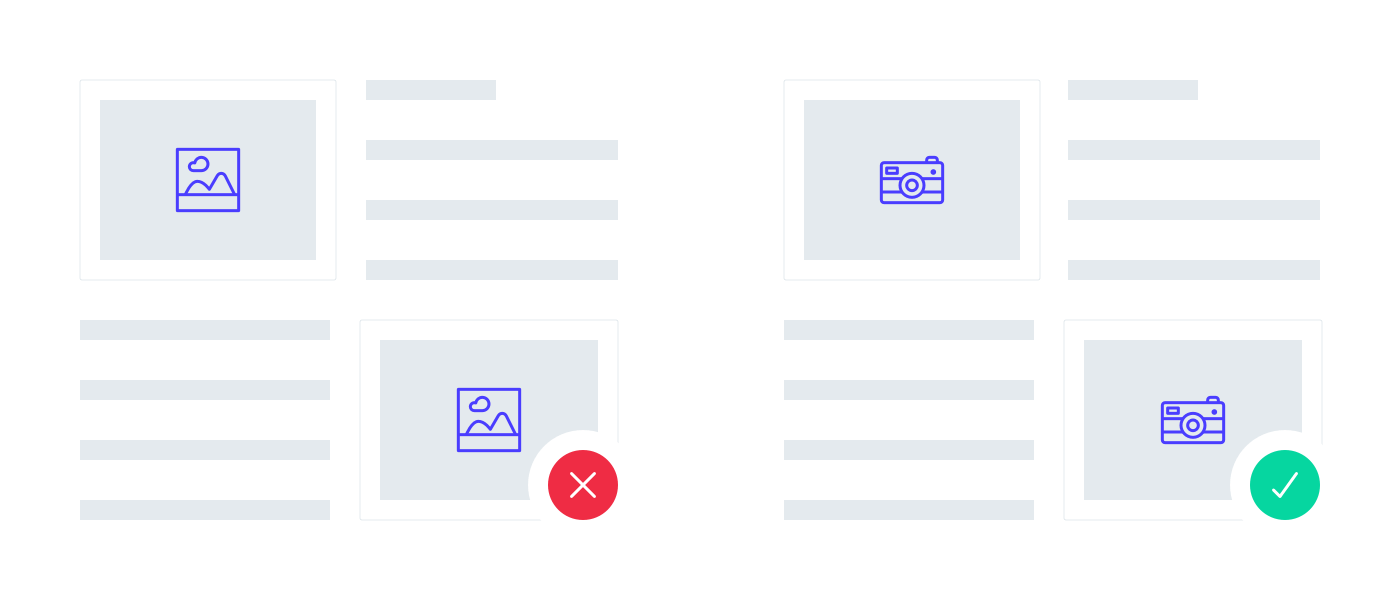
You use stock photos
Ever thought “Downloading stock photos takes less time…” “They look much nicer than the photos I would take…”? Viewers find them boring and overused – do better than a low-budget online magazine. Whenever you work on your project, document it properly! Scan or photograph your sketches and ask someone to take photos of presentations or workshops you facilitate. They will liven up your UX designer portfolio and make it so much more personal – definitely something that could make you stand out from hundreds of applicants.
You forget to close the case study properly
Never sure how to end your case studies? Does the recruiter finish it looking at final designs with no context? This presents the perfect opportunity to reflect on the project and share your personal feelings. Talk about the biggest challenges, the most memorable lessons, limitations faced and how you overcame them or any mistakes you might have made and have learned from. Nobody’s project reaches perfection but we all learn something from them. Emphasize these details because it shows growth and professional progression.

Only you read your case study
You have typos. Some sentences have no real meaning. Your thoughts and problem-solving processes lack clarity. These case study mistakes show a lack of reviewers or even readers. Find someone with time to proofread; see if they grasp the problem and the meaning you wanted to convey. If your peer-review buddy can’t understand it clearly, the recruiters won’t either. If you can’t find anyone, at least give yourself two or three days of rest not looking at your case studies and then proofread them to eliminate typos and incomprehensible sentences.

If you don’t have a peer-review buddy, check out our UX portfolio building tool, UXfolio where you can ask both for community and expert reviews.
Get constructive feedback on your case study and get the most out of it. Our aim is to help you create outstanding UX portfolios.
We created our product, UXfolio to support you with portfolio building.
We made it easy and quick to create a UX design portfolio without making the case study mistakes mentioned in this post.
UXfolio creates you a portfolio website with a front page and then, you can add your best project case studies. Don’t worry, it’s not that hard as it sounds, our product helps you with the copywriting part with guiding questions and examples.
By avoiding all these case study mistakes above you can build an awesome UX portfolio and impress your future employer.
Start building it now! Click here to sign up and try UXfolio out!